You can use the following basic syntax to display percentages on the y-axis of a histogram in ggplot2:
library(ggplot2)
library(scales)

#create histogram with percentages
ggplot(data, aes(x = factor(team))) +
  geom_bar(aes(y = (..count..)/sum(..count..))) +
  scale_y_continuous(labels=percent)
The following examples show how to use this syntax in practice.
Example 1: Basic Histogram with Percentages
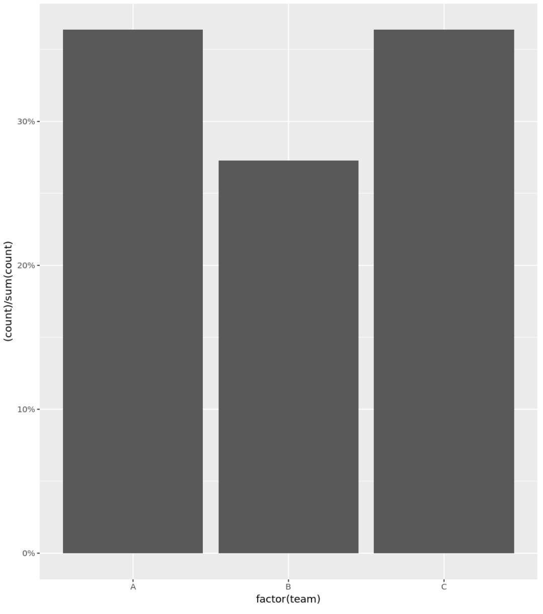
The following code shows how to create a histogram for categorical variables with percentages displayed on the y-axis:
library(ggplot2)
library(scales)

#define data frame
data frame(team = c('A', 'A', 'A', 'A', 'B', 'B', 'B', 'C', 'C', 'C', 'C'),
                   points = c(77, 79, 93, 85, 89, 99, 90, 80, 68, 91, 92))

#create histogram with percentages
ggplot(data, aes(x = factor(team))) +
  geom_bar(aes(y = (..count..)/sum(..count..))) +
  scale_y_continuous(labels=percent)

Example 2: Histogram with Percentages (Remove Decimal Places)
You can use the accuracy argument to only display whole numbers as percentages on the y-axis as well:
library(ggplot2)
library(scales)

#define data frame
data frame(team = c('A', 'A', 'A', 'A', 'B', 'B', 'B', 'C', 'C', 'C', 'C'),
                   points = c(77, 79, 93, 85, 89, 99, 90, 80, 68, 91, 92))

#create histogram with percentages
ggplot(data, aes(x = factor(team))) +
  geom_bar(aes(y = (..count..)/sum(..count..))) +
  scale_y_continuous(labels = scales::percent_format(accuracy = 1L))
Example 3: Custom Histogram with Percentages
The following code shows how to create a histogram with percentages shown on the y-axis and a custom title, axis labels, and colors:
library(ggplot2)
library(scales)

#define data frame
data frame(team = c('A', 'A', 'A', 'A', 'B', 'B', 'B', 'C', 'C', 'C', 'C'),
                   points = c(77, 79, 93, 85, 89, 99, 90, 80, 68, 91, 92))

#create histogram with percentages and custom aesthetics
ggplot(data, aes(x = factor(team))) +
  geom_bar(aes(y = (..count..)/sum(..count..)), fill = 'lightblue') +
  scale_y_continuous(labels=percent) +
  labs(title = 'Breakdown by Team', x = 'Team', y = 'Percent of Total') +
  theme_minimal()

Related: A Complete Guide to the Best ggplot2 Themes
Additional Resources
The following tutorials explain how to perform other common operations with histograms in R:
How to Change Number of Bins in Histogram in R
How to Plot Multiple Histograms in R
How to Create a Relative Frequency Histogram in R