You can use the following basic syntax to create a histogram by group in ggplot2:
ggplot(df, aes(x=values_var, fill=group_var)) +
  geom_histogram(color='black', alpha=0.4, position='identity') +
  scale_fill_manual(values=c('red', 'blue', 'purple'))
This particular example creates a plot with three overlaid histograms that are red, blue, and purple.
The following example show how to use this syntax in practice.
Example: Create Histogram by Group in ggplot2
Suppose we have the following data frame in R that contains information about points scored by basketball players on three different teams:
#make this example reproducible
set.seed(1)

#create data frame
df frame(team=rep(c('A', 'B', 'C'), each=100),
                 points=c(rnorm(100, mean=10),
                          rnorm(100, mean=15),
                          rnorm(100, mean=20)))

#view head of data frame
head(df)

  team    points
1    A  9.373546
2    A 10.183643
3    A  9.164371
4    A 11.595281
5    A 10.329508
6    A  9.179532
We can use the following code to create histograms that display the distribution of points scored by each of the three teams:
library(ggplot2)

#create histogram by team
ggplot(df, aes(x=points, fill=team)) +
  geom_histogram(color='black', alpha=0.4, position='identity') +
  scale_fill_manual(values=c('red', 'blue', 'purple'))
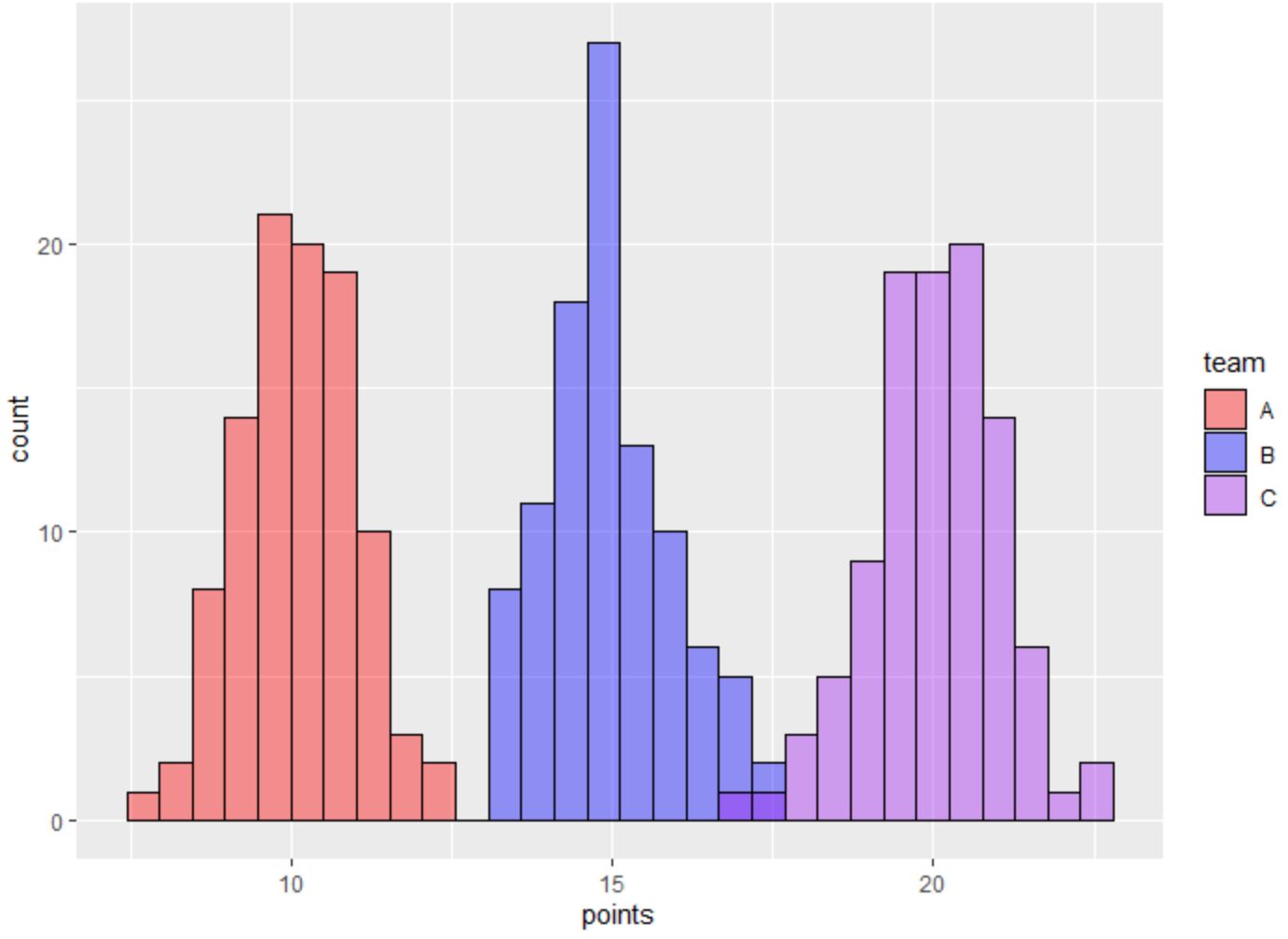
The three histograms represent the distribution of points scored by players on each team.
The legend on the right side of the plot shows which color corresponds with each team.
Note that the color argument specifies the outline color for the bars in each histogram and the alpha argument specifies the transparency (between 0 and 1) to use for the bars.
By setting the value for alpha to be less than 1, we’re able to see any overlapping bars between the histograms.
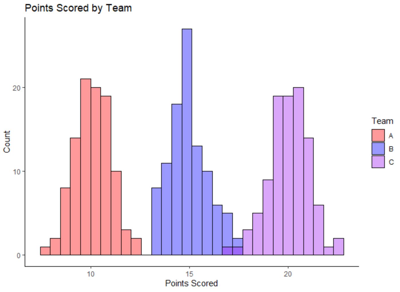
Feel free to use the labs() function to modify the labels in the plot and choose a ggplot2 theme that fits your style:
library(ggplot2)

#create histogram by team
ggplot(df, aes(x=points, fill=team)) +
  geom_histogram(color='black', alpha=0.4, position='identity') +
  scale_fill_manual(values=c('red', 'blue', 'purple')) +
  labs(fill='Team', x='Points Scored', y='Count', title='Points Scored by Team') +
  theme_classic()
Additional Resources
The following tutorials explain how to perform other common tasks in R:
How to Create a Relative Frequency Histogram in R
How to Plot Multiple Boxplots in One Chart in R
How to Plot Multiple Lines in One Chart in R