Logistic Regression is a statistical method that we use to fit a regression model when the response variable is binary. To assess how well a logistic regression model fits a dataset, we can look at the following two metrics:
- Sensitivity: the probability that the model predicts a positive outcome for an observation when indeed the outcome is positive.
- Specificity: the probability that the model predicts a negative outcome for an observation when indeed the outcome is negative.
One easy way to visualize these two metrics is by creating a ROC curve, which is a plot that displays the sensitivity and specificity of a logistic regression model.
This tutorial explains how to create and interpret a ROC curve in Stata.
Example: ROC Curve in Stata
For this example we will use a dataset called lbw, which contains the folllowing variables for 189 mothers:
- low – whether or not the baby had a low birthweight. 1 = yes, 0 = no.
- age – age of the mother.
- smoke – whether or not the mother smoked during pregnancy. 1 = yes, 0 = no.
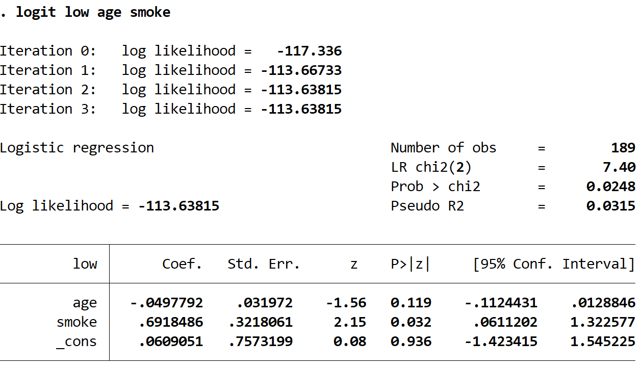
We will fit a logistic regression model to the data using age and smoking as explanatory variables and low birthweight as the response variable. Then we will create a ROC curve to analyze how well the model fits the data.
Step 1: Load and view the data.
Load the data using the following command:
use http://www.stata-press.com/data/r13/lbw
Gain a quick understanding of the dataset using the following command:
summarize
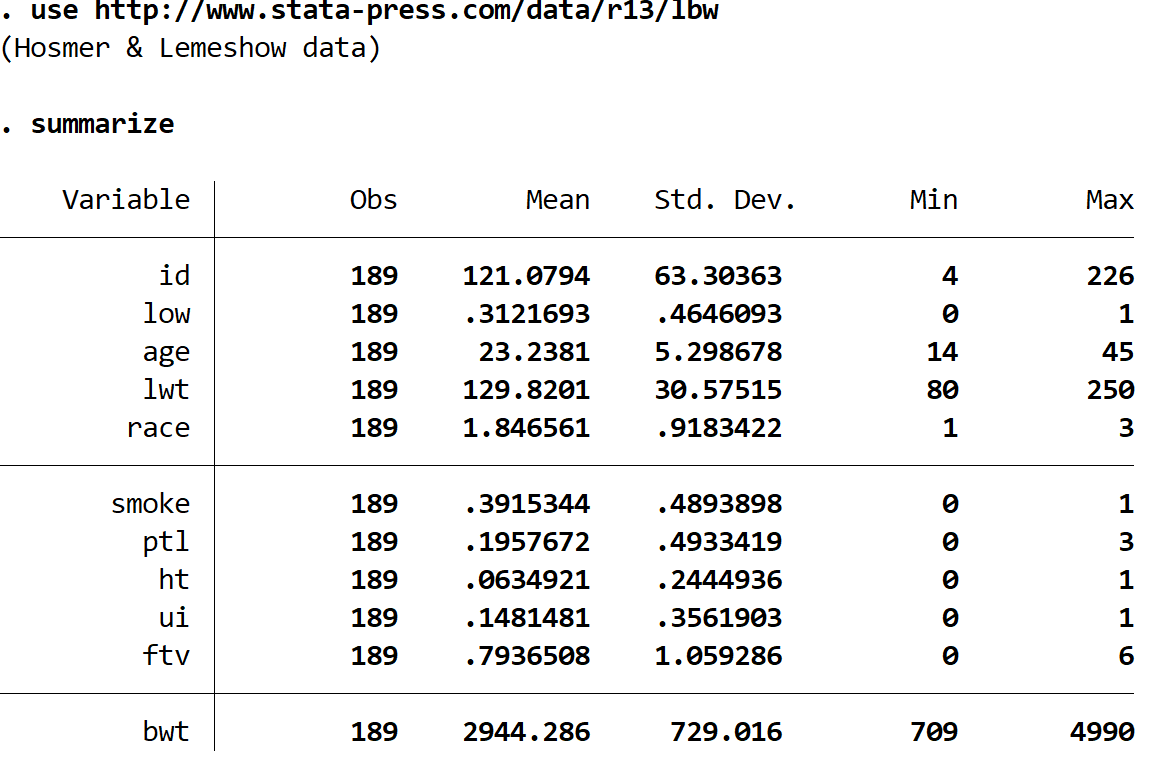
There are 11 different variables in the dataset, but the only three that we care about are low, age, and smoke.
Step 2: Fit the logistic regression model.
Use the following command to fit the logistic regression model:
logit low age smoke
Step 3: Create the ROC curve.
We can create the ROC curve for the model using the following command:
lroc
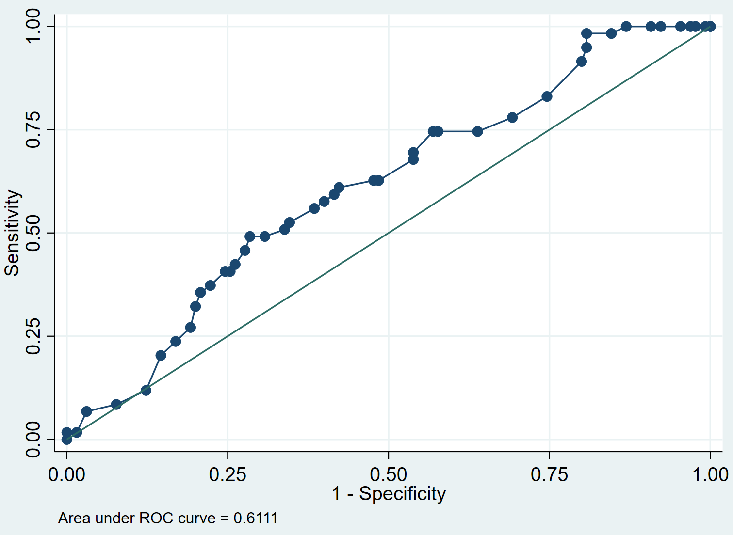
Step 4: Interpret the ROC curve.
When we fit a logistic regression model, it can be used to calculate the probability that a given observation has a positive outcome, based on the values of the predictor variables.
To determine if an observation should be classified as positive, we can choose a cut-point such that observations with a fitted probability above the cut-point are classified as positive and any observations with a fitted probability below the cut-point are classified as negative.
For example, suppose we choose the cut-point to be 0.5. This means that any observation with a fitted probability greater than 0.5 will be predicted to have a positive outcome, while any observation with a fitted probability less than or equal to 0.5 will be predicted to have a negative outcome.
The ROC curve shows us the values of sensitivity vs. 1-specificity as the value of the cut-off point moves from 0 to 1. A model with high sensitivity and high specificity will have a ROC curve that hugs the top left corner of the plot. A model with low sensitivity and low specificity will have a curve that is close to the 45-degree diagonal line.
The AUC (area under curve) gives us an idea of how well the model is able to distinguish between positive and negative outcomes. The AUC can range from 0 to 1. The higher the AUC, the better the model is at correctly classifying outcomes. In our example, we can see that the AUC is 0.6111.
We can use AUC to compare the performance of two or more models. The model with the higher AUC is the one that performs best.
Additional Resources
How to Perform Logistic Regression in Stata
How to Interpret the ROC Curve and AUC of a Logistic Regression Model