A pie chart is a circular chart that uses “pie slices” to display the relative sizes of data.
This tutorial explains how to create and modify pie charts in Stata.
How to Create Pie Charts in Stata
We’ll use a dataset called census to illustrate how to create and modify pie charts in Stata.
First, load the data by typing the following into the Command box:
sysuse census
We can get a quick look at the dataset by typing the following into the Command box:
summarize
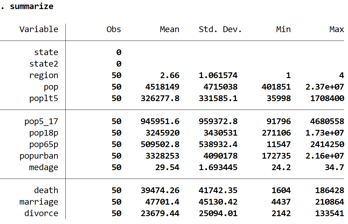
Basic Pie Chart
We can create a pie chart to display the population size of each region using the following syntax:
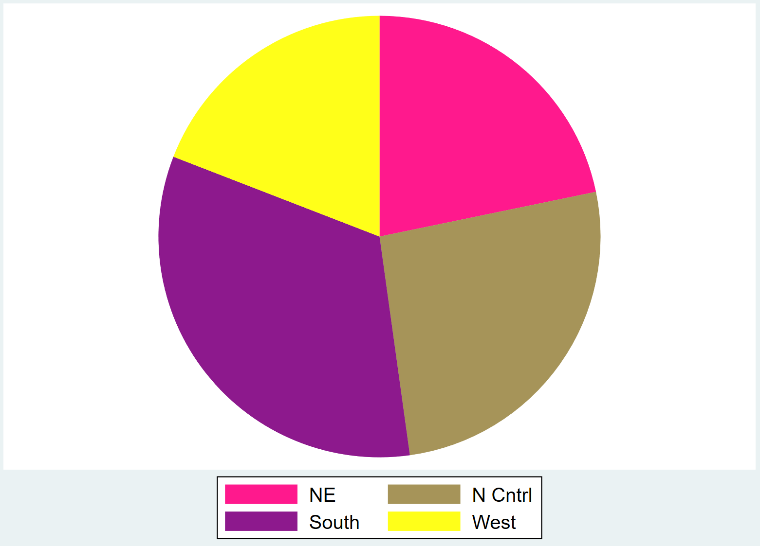
graph pie pop, over(region)
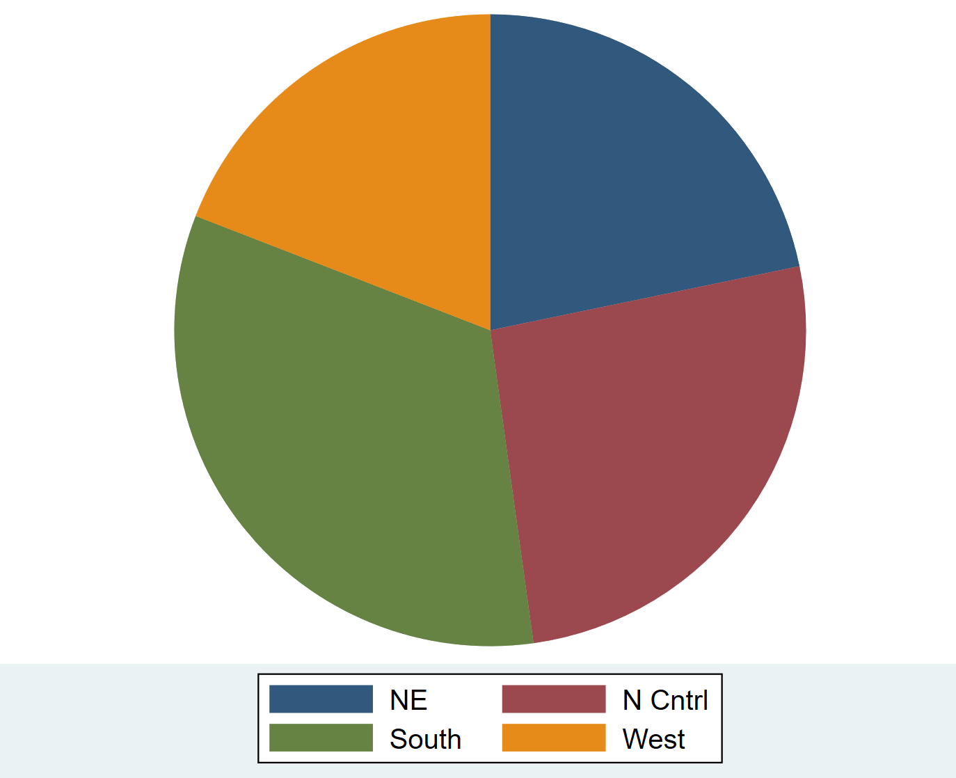
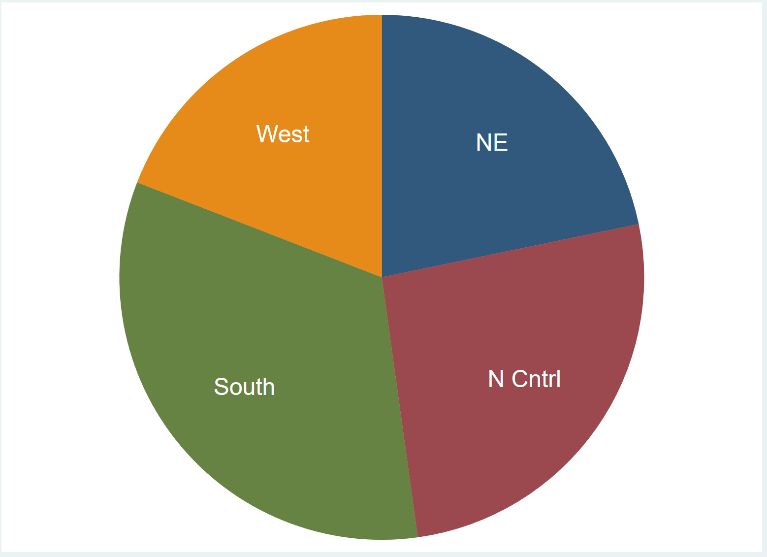
Pie Chart with Labels
We can add labels directly to the pie chart by using the plabel(_all name) command:
graph pie pop, over(region) plabel(_all name)
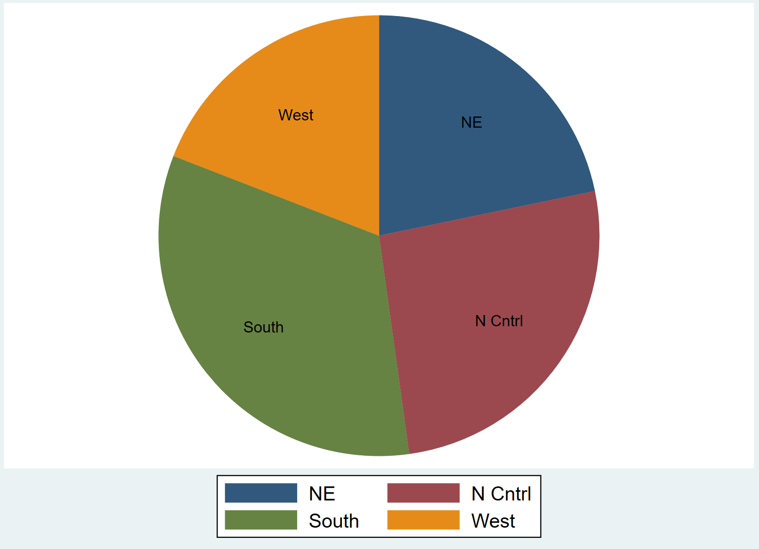
We can also modify the labels to be slightly larger with a white font so they’re easier to read:
graph pie pop, over(region) plabel(_all name, size(*1.5) color(white))
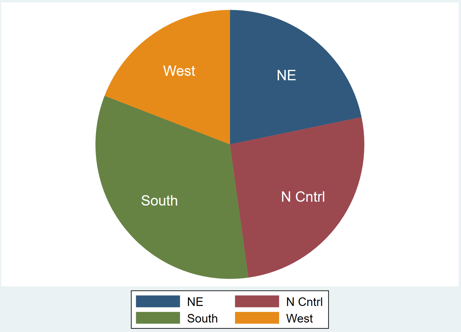
Pie Chart with no Legend
If we choose to use labels, we may decide that a legend is unnecessary. We can turn off the legend by using the legend(off) command:
graph pie pop, over(region) plabel(_all name, size(*1.5) color(white)) legend(off)
How to Modify Pie Charts in Stata
We can use several different commands to modify the appearance of the pie charts.
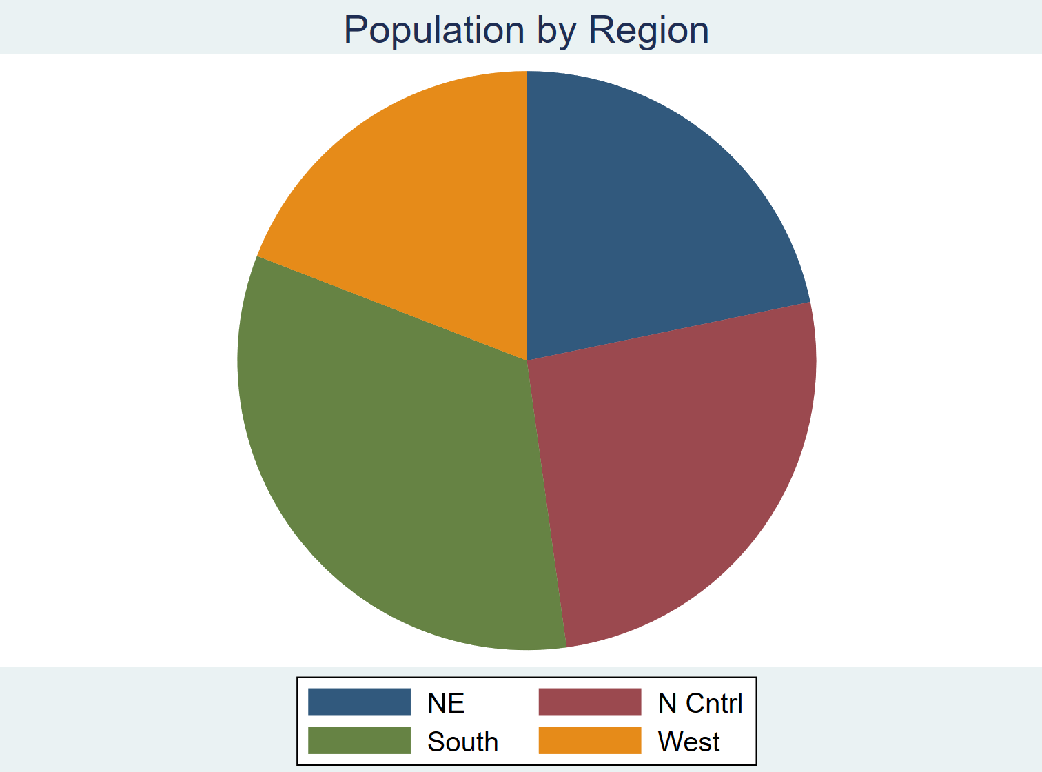
Adding a Title
We can add a title to the plot using the title() command:
graph pie pop, over(region) title(“Population by Region”)
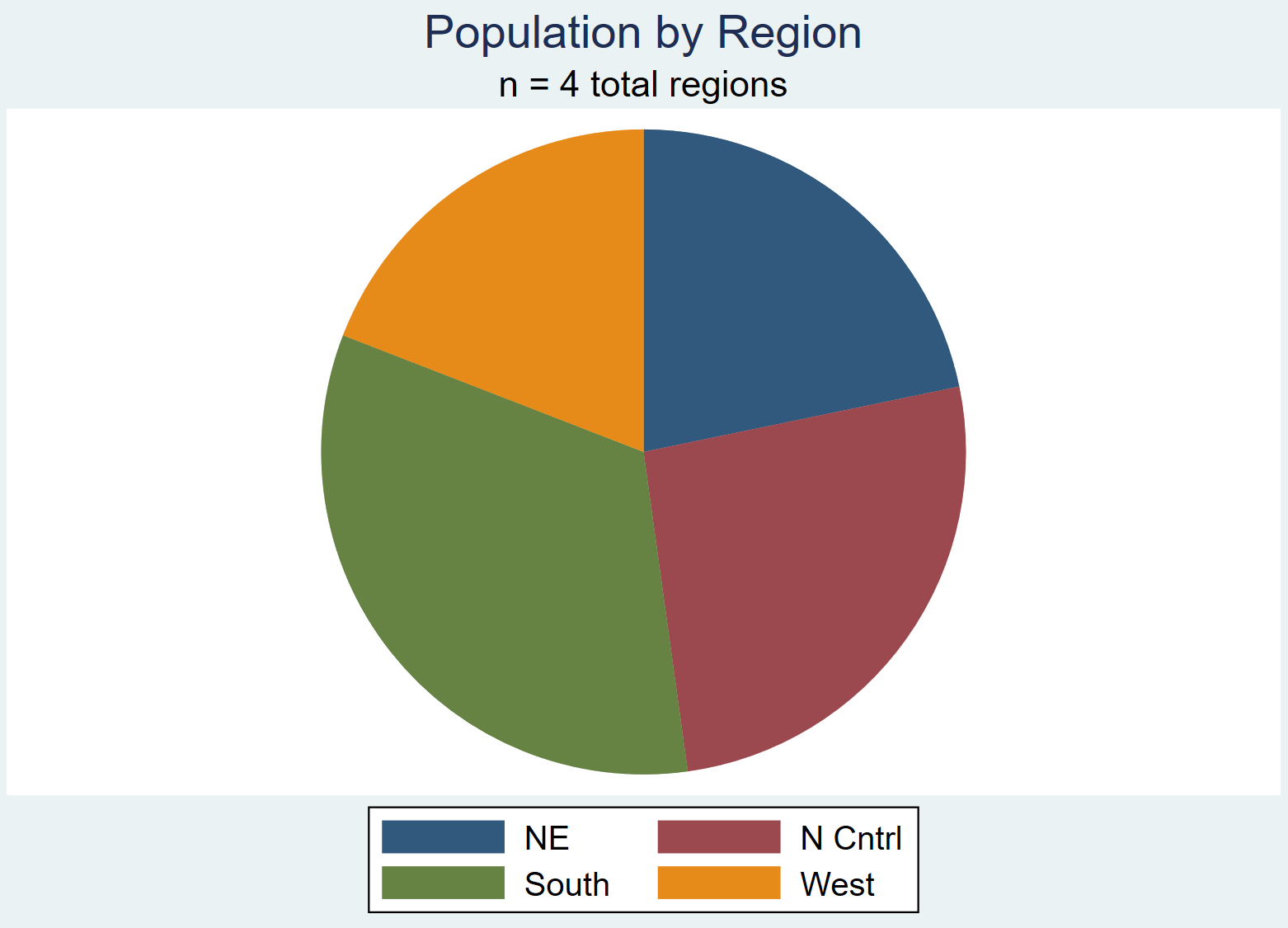
Adding a Subtitle
We can also add a subtitle underneath the title using the subtitle() command:
graph pie pop, over(region) title(“Population by Region”) subtitle(“n = 4 total regions”)
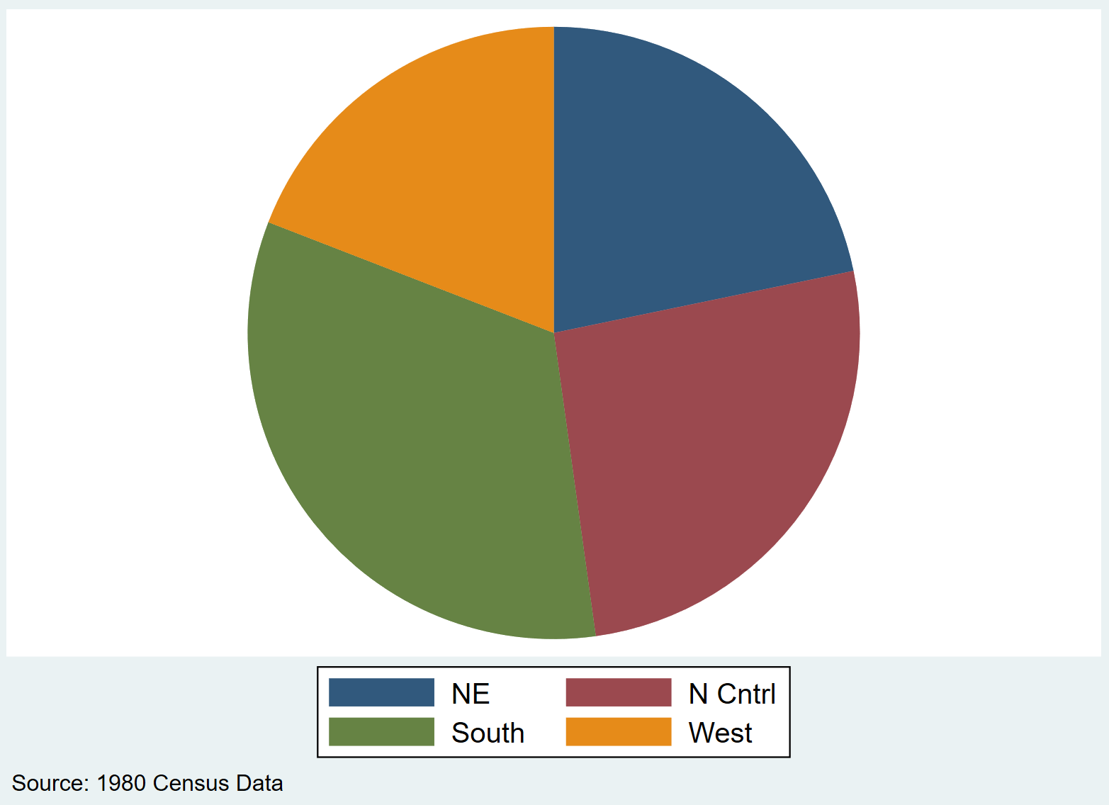
Adding a Comment
We can also add a note or comment at the bottom of the graph by using the note() command:
graph pie pop, over(region) note(“Source: 1980 Census Data”)
Changing Colors
We can change the colors of the slices in the pie chart by using the following syntax:
pie(slice #, color(specific_color)
graph pie pop, over(region) pie(1, color(pink)) pie(2, color(brown)) pie(3, color(purple)) pie(4, color(yellow))
A full list of available colors can be found in the Stata Documentation for colors.