You can use the following basic syntax to add labels to a histogram in ggplot2:
ggplot(data=df, aes(x=values_var)) +
  geom_histogram(aes(fill=group_var), binwidth=1, color='black') +
  stat_bin(binwidth=1, geom='text', color='white', size=4,
           aes(label=..count.., group=group_var), position=position_stack(vjust=0.5))
This particular example adds a white label to display the count for each bin in each category of a histogram.
The following example show how to use this syntax in practice.
Example: Add Labels to Histogram in ggplot2
Suppose we have the following data frame in R that contains information about points scored by basketball players on three different teams:
#make this example reproducible
set.seed(1)

#create data frame
df frame(team=rep(c('A', 'B', 'C'), each=100),
                 points=c(runif(100, 5, 10),
                          runif(100, 5, 10),
                          runif(100, 5, 10)))

#view head of data frame
head(df)

  team   points
1    A 6.327543
2    A 6.860619
3    A 7.864267
4    A 9.541039
5    A 6.008410
6    A 9.491948
We can use the following code to create a histogram that shows the points scored by players on each team with labels that show the count for each bin:
library(ggplot2)

#create histogram with labels for each bin
ggplot(data=df, aes(x=points)) +
  geom_histogram(aes(fill=team), binwidth=1, color='black') +
  stat_bin(binwidth=1, geom='text', color='white', size=4,
           aes(label=..count.., group=team), position=position_stack(vjust=0.5))
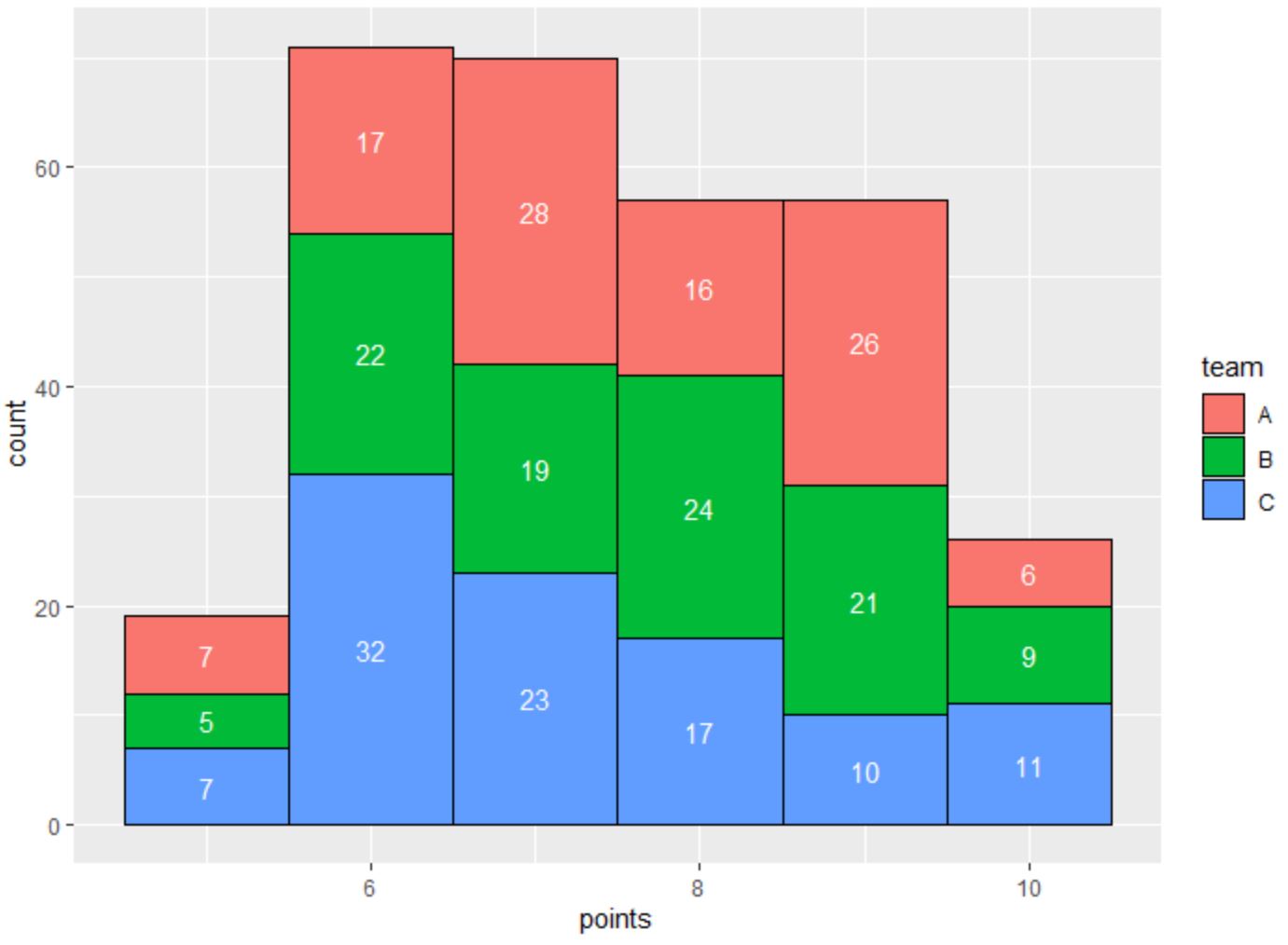
Notice that each bin has a label that displays the count of each bin.
Note that you can modify the values for color and size within the stat_bin() function to modify the color and size of the labels, respectively.
For example, we can use the following syntax to instead use black labels with increased font size:
library(ggplot2)

#create histogram with labels for each bin
ggplot(data=df, aes(x=points)) +
  geom_histogram(aes(fill=team), binwidth=1, color='black') +
  stat_bin(binwidth=1, geom='text', color='black', size=6,
           aes(label=..count.., group=team), position=position_stack(vjust=0.5))
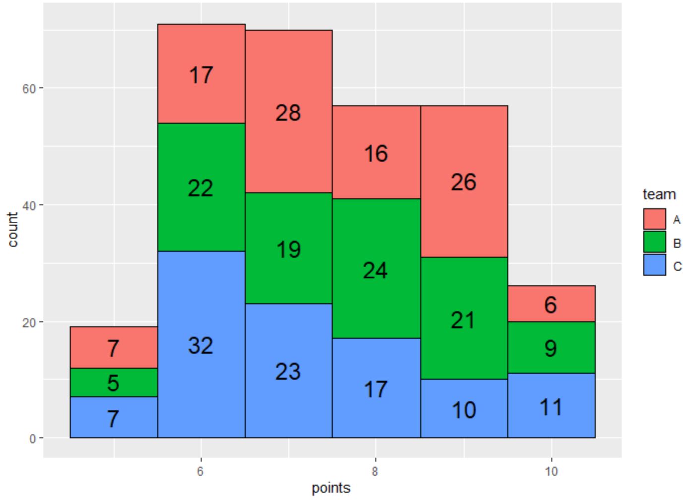
The labels on each bin now use black text and have a larger font size.
Feel free to play around with the color and size arguments within the stat_bin() function to make the labels appear however you’d like.
Additional Resources
The following tutorials explain how to perform other common tasks in R:
How to Create Histograms by Group in ggplot2
How to Display Percentages on Histogram in ggplot2
How to Set the Number of Bins for a Histogram in ggplot2