A box plot is a type of plot that displays the five number summary of a dataset, which includes:
- The minimum value
- The first quartile (the 25th percentile)
- The median value
- The third quartile (the 75th percentile)
- The maximum value
To make a box plot, we first draw a box from the first to the third quartile.
Then we draw a vertical line at the median.
Lastly, we draw “whiskers” from the quartiles to the minimum and maximum value.

In most statistical software, an observation is defined as an outlier if it meets one of the following two requirements:
- The observation is 1.5 times the interquartile range less than the first quartile (Q1)
- The observation is 1.5 times the interquartile range greater than the third quartile (Q3).
If an outlier does exist in a dataset, it is usually labeled with a tiny dot outside of the range of the whiskers in the box plot:
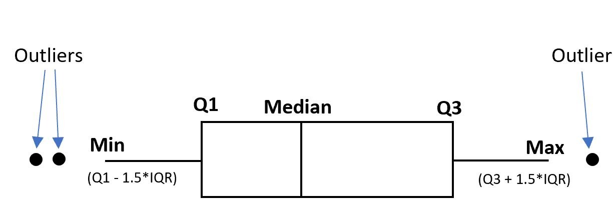
When this occurs, the “minimum” and “maximum” values in the box plot are simply assigned the values of Q1 – 1.5*IQR and Q3 + 1.5*IQR, respectively.
The following example shows how to interpret box plots with and without outliers.
Example: Interpreting a Box Plot With Outliers
Suppose we create the following two box plots to visualize the distribution of points scored by basketball players on two different teams:

The box plot on the left for team A has no outliers since there are no tiny dots located outside of the minimum or maximum whisker.
However, the box plot on the right for team B has one outlier located above the “maximum” and one outlier located below the “minimum” value.
Here is the actual five number summary for the distribution of the “Points” variable for Team B:
- Minimum value: 1.1
- First Quartile: 10.5
- Median: 12.7
- Third Quartile: 15.6
- Maximum value: 23.5
Here is how to calculate the boundaries for potential outliers:
Interquartile Range: Third Quartile – First Quartile = 15.6 – 10.5 = 5.1
Lower Boundary: Q1 – 1.5*IQR = 10.5 – 1.5*5.1 = 2.85
Upper Boundary: Q3 + 1.5*IQR = 15.6 + 1.5*5.1 = 23.25
The whiskers for the minimum and maximum values in the box plot are placed at 2.85 and 23.25.
Thus, the observations with values of 1.1 and 23.5 are both labeled as outliers in the box plot since they lie outside of the lower and upper boundaries.
Bonus: Here is the exact code that we used to create these two box plots in the R programming language:
library(ggplot2)

#make this example reproducible
set.seed(2)

#create data frame
df frame(Team = factor(rep(c("A", "B"), each = 200)),
                 Points = c(rnorm(200, mean = 15, sd = 3),
                           rnorm(200, mean = 12, sd = 4)))

#create box plots
ggplot(df, aes(x = Team, y = Points)) +
  stat_boxplot(geom = "errorbar", width = 0.5) +
  geom_boxplot()

#calculate summary statistics for each team
tapply(df$Points, df$Team, summary)
Additional Resources
The following tutorials provide additional information about box plots:
How to Compare Box Plots
How to Identify Skewness in Box Plots
How to Find the Interquartile Range of a Box Plot