Regression analysis is used to quantify the relationship between one or more predictor variables and a response variable.
The most common type of regression analysis is simple linear regression, which is used when a predictor variable and a response variable have a linear relationship.
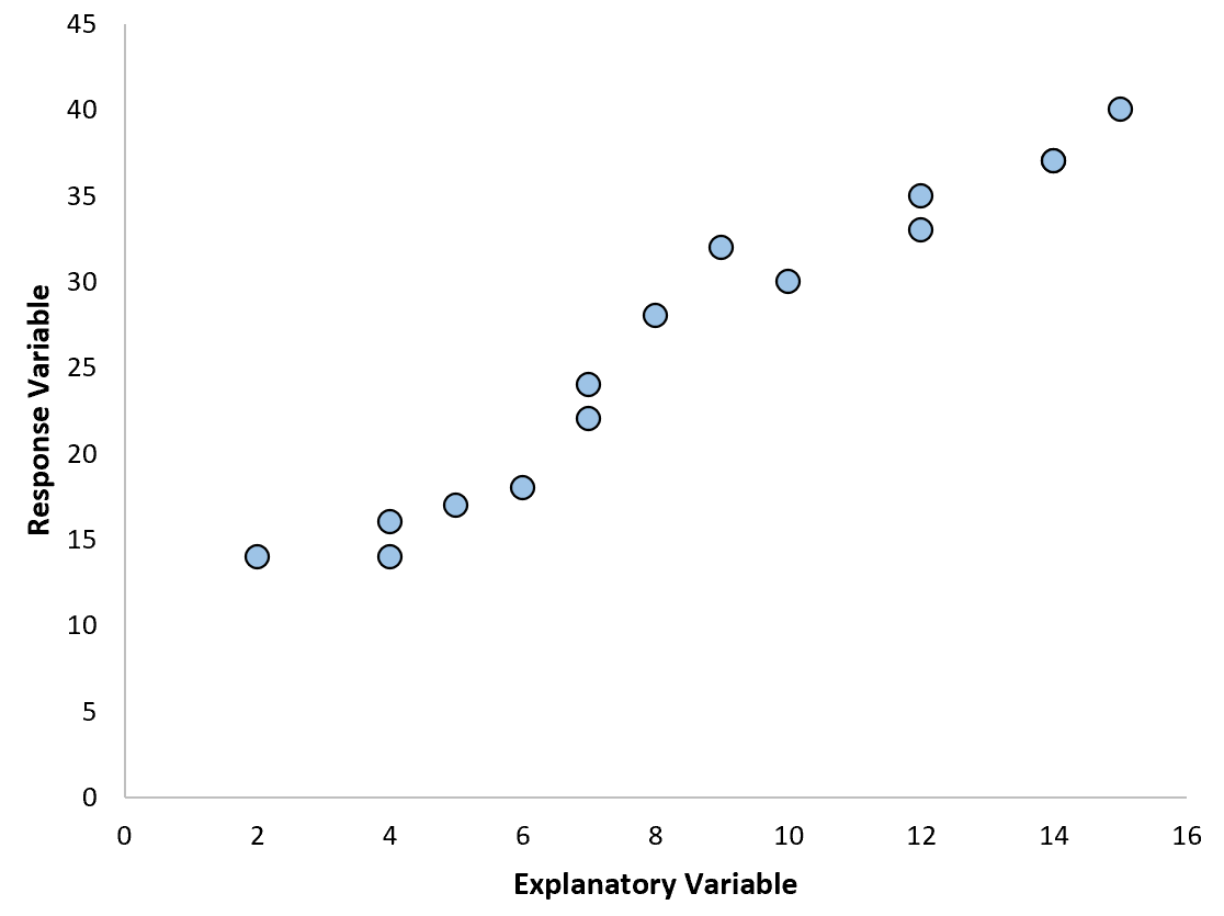
However, sometimes the relationship between a predictor variable and a response variable is nonlinear.
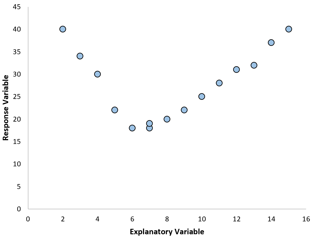
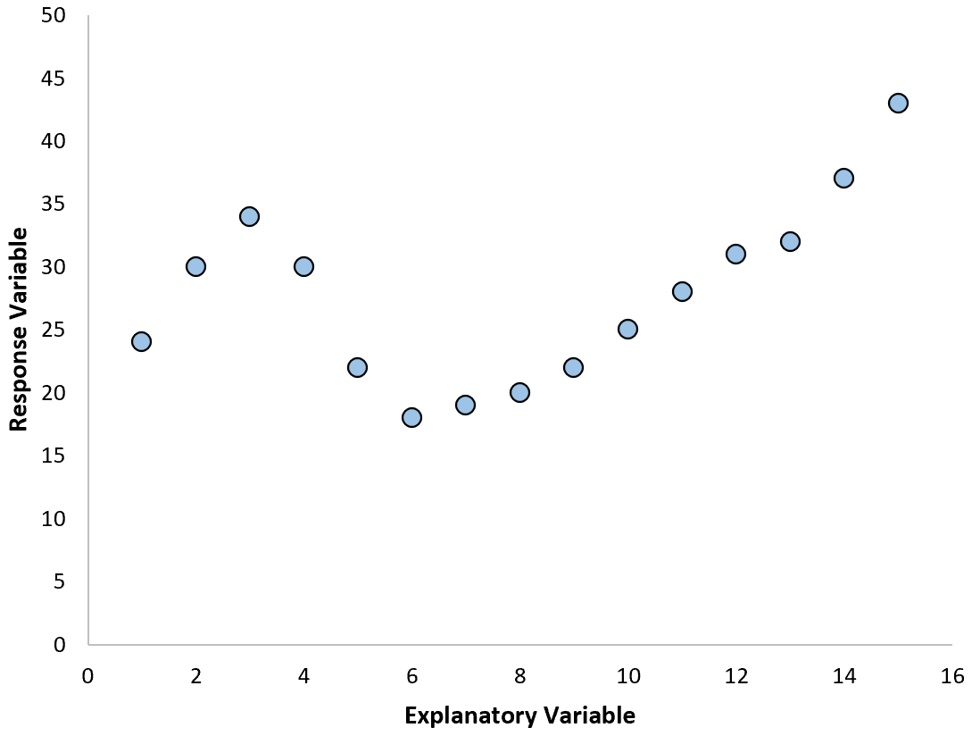
In these cases it makes sense to use polynomial regression, which can account for the nonlinear relationship between the variables.
This tutorial provides a step-by-step example of how to perform polynomial regression in Google Sheets
Step 1: Create the Data
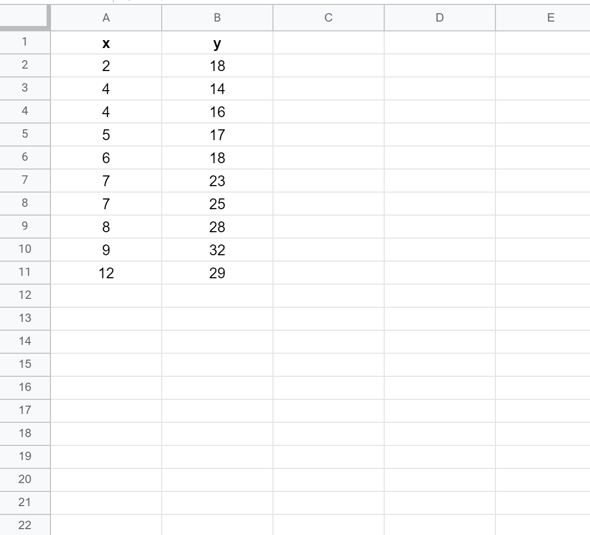
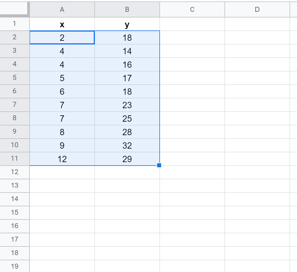
First, let’s create a fake dataset with the following values:
Step 2: Create a Scatterplot
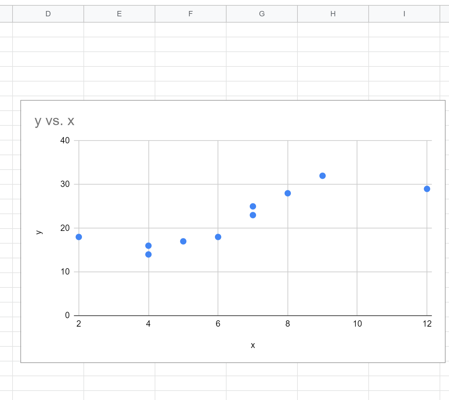
Next, we’ll create a scatterplot to visualize the data.
First, highlight cells A2:B11 as follows:
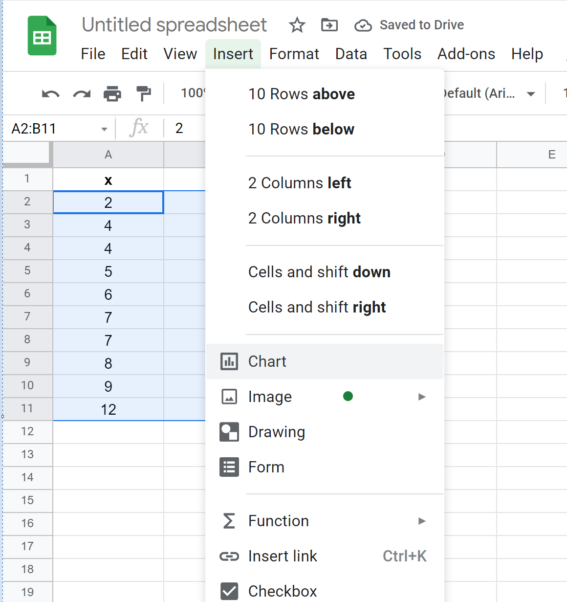
Next, click the Insert tab and then click Chart from the dropdown menu:
By default, Google Sheets will insert a scatterplot:
Step 3: Find the Polynomial Regression Equation
Next, double click anywhere on the scatterplot to bring up the Chart Editor window on the right:
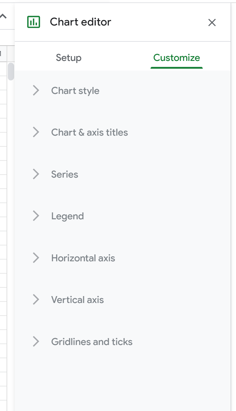
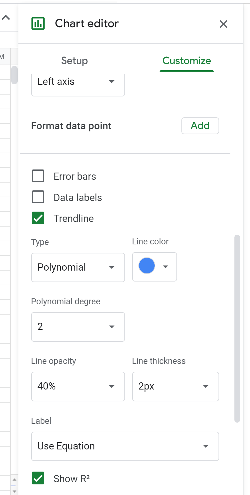
Next, click Series. Then, scroll down and check the box next to Trendline and change the Type to Polynomial. For Label, choose Use Equation and then check the box next to Show R2.
This will cause the following formula to be displayed above the scatterplot:
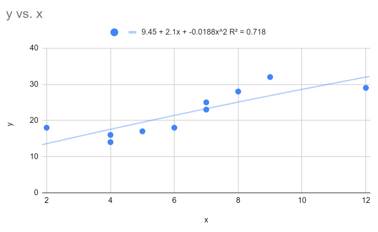
We can see that the fitted polynomial regression equation is:
y = 9.45 + 2.1x – 0.0188x2
The R-squared for this model is 0.718.
Recall that R-squared tells us the percentage of variation in the response variable that can be explained by the predictor variables. The higher the value, the better the model.
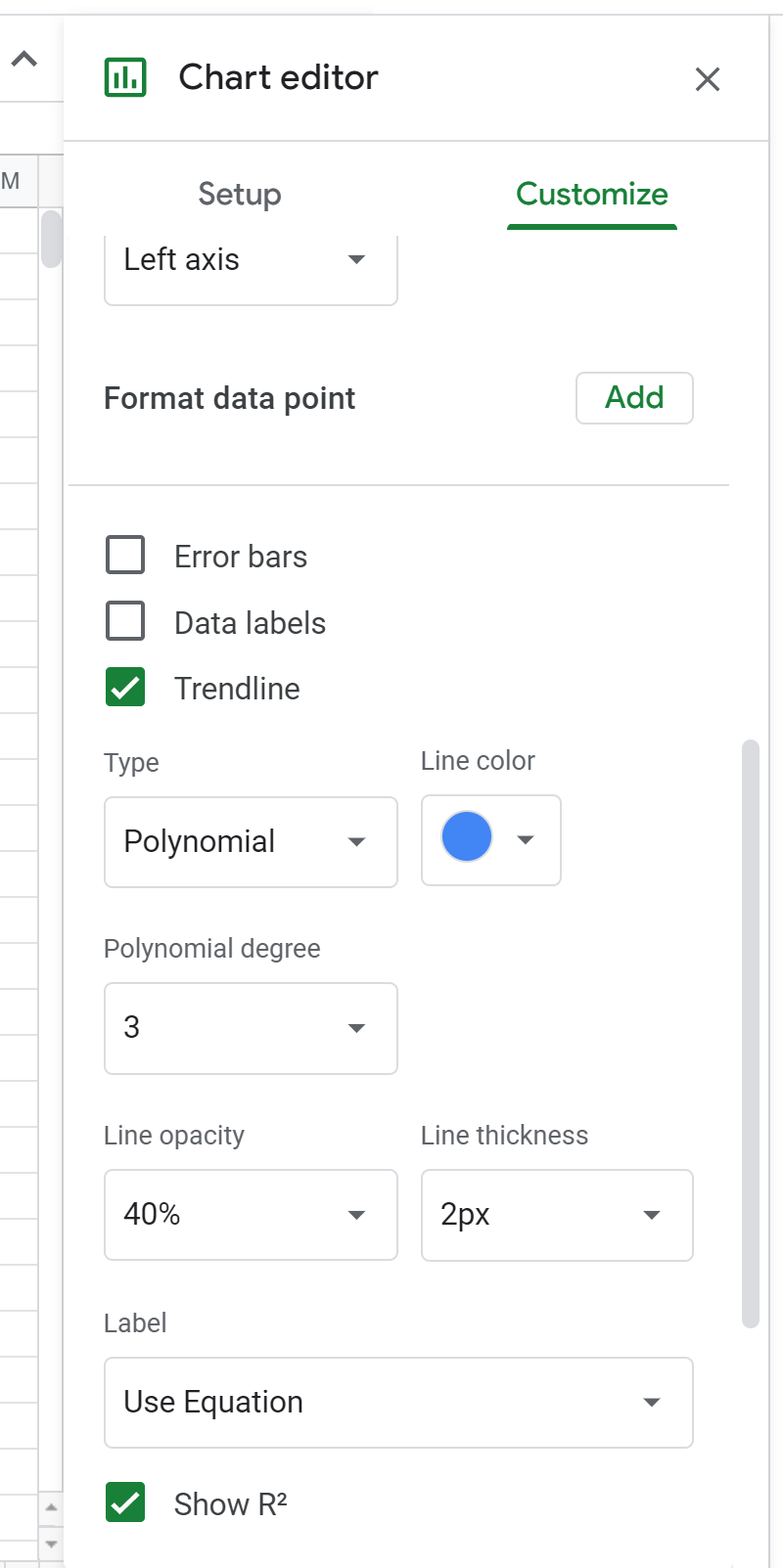
Next, change the Polynomial degree to 3 in the Chart Editor:
This will cause the following formula to be displayed above the scatterplot:
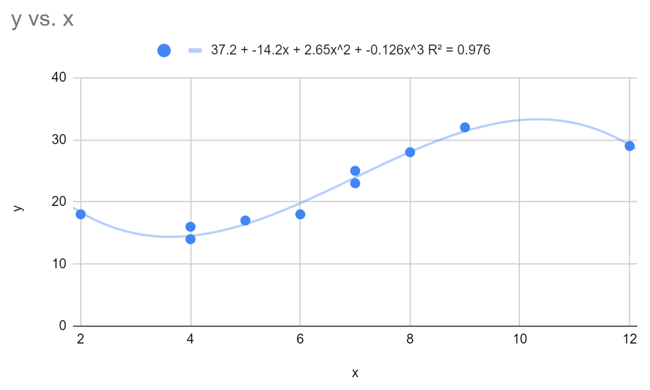
This causes the fitted polynomial regression equation to change to:
y = 37.2 – 14.2x + 2.64x2 – 0.126x3
The R-squared for this model is 0.976.
Notice that the R-squared for this model is significantly higher than the polynomial regression model with a degree of 2. This suggests that this regression model is significantly better at capturing the trend in the underlying data.
If you change the degree of the polynomial to 4, the R-squared increases just barely to 0.981. This suggests that a polynomial regression model with a degree of 3 is sufficient to capture the trend for this data.
We can use the fitted regression equation to find the expected value for the response variable based on a given value for the predictor variable. For example, if x = 4 then the expected value for y would be:
y = 37.2 – 14.2(4) + 2.64(4)2 – 0.126(4)3 = 14.576
You can find more Google Sheets tutorials on this page.