You can use the following basic syntax to plot the mean values by group using the geom_bar() function in ggplot2:
library(ggplot2)

ggplot(df, aes(group_var, values_var)) +
  geom_bar(position='dodge', stat='summary', fun='mean')
The following example shows how to use this syntax in practice.
Note: The fun argument in geom_bar() tells ggplot2 which descriptive statistic to display using bars. You could also pass a different descriptive statistic such as ‘median’ to this argument to instead plot the median value by group.
Example: Plot Mean Values with geom_bar() in ggplot2
Suppose we have the following data frame that contains information on the number of points scored by basketball players on various teams:
#create data frame
df frame(team=rep(c('A', 'B', 'C'), each=4),
                 points=c(3, 5, 5, 6, 5, 7, 7, 8, 9, 9, 9, 8))

#view data frame
df

   team points
1     A      3
2     A      5
3     A      5
4     A      6
5     B      5
6     B      7
7     B      7
8     B      8
9     C      9
10    C      9
11    C      9
12    C      8
We can use the following syntax to create a bar chart in which each bar represents the mean value for points, grouped by team:
library(ggplot2)

#create bar plot to visualize mean points value by team
ggplot(df, aes(team, points)) +
  geom_bar(position='dodge', stat='summary', fun='mean')
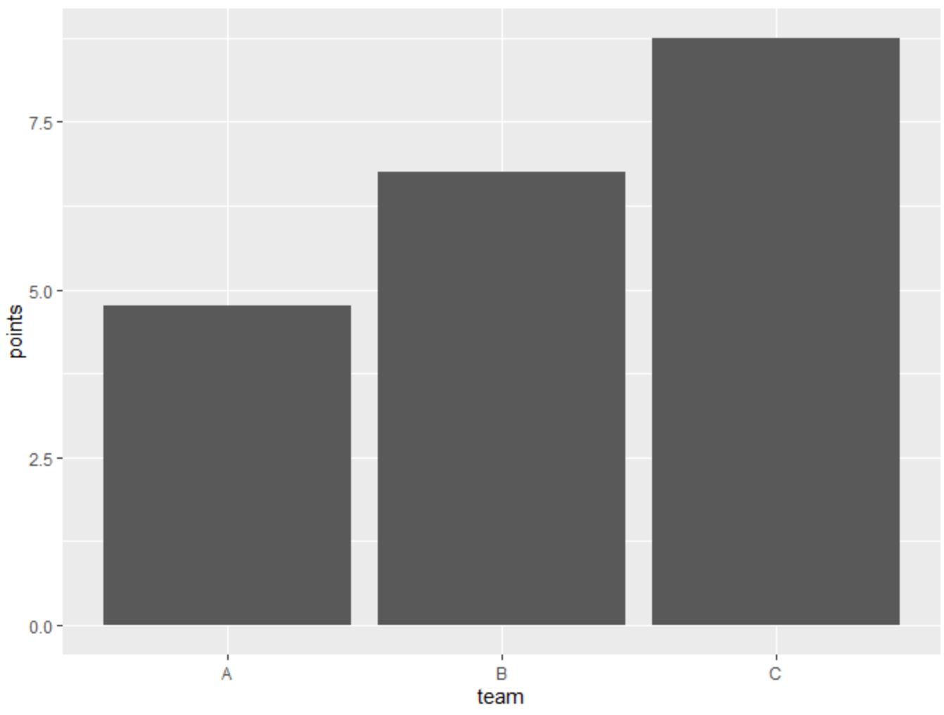
The height of each bar represents the mean value of points for each team.
To display the actual mean value of points for each team, we can use the summarise() function from the dplyr package:
library(dplyr)

#calcualte mean value of points, grouped by team
df %>%
  group_by(team) %>%
  summarise(mean_pts = mean(points, na.rm=TRUE))

# A tibble: 3 x 2
  team  mean_pts

1 A         4.75
2 B         6.75
3 C         8.75
From the output we can see the mean value of points for each team:
- Team A: 4.75
- Team B: 6.75
- Team C: 8.75
These values match the height of the bars shown in the bar plot above.
Additional Resources
The following tutorials explain how to perform other common tasks in ggplot2:
How to Adjust Space Between Bars in ggplot2
How to Remove NAs from Plot in ggplot2
How to Change Colors of Bars in Stacked Bart Chart in ggplot2