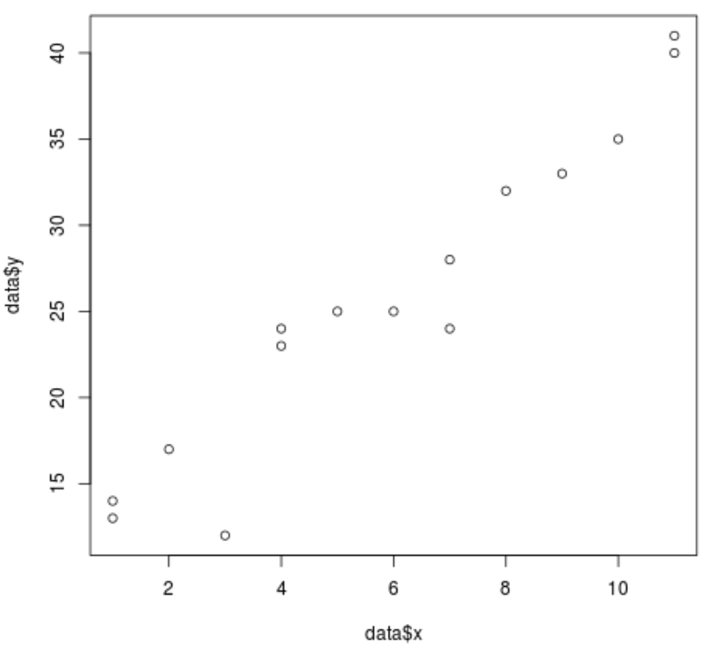
Often when we perform simple linear regression, we’re interested in creating a scatterplot to visualize the various combinations of x and y values.
Fortunately, R makes it easy to create scatterplots using the plot() function. For example:
#create some fake data
data #create scatterplot of data
plot(data$x, data$y)
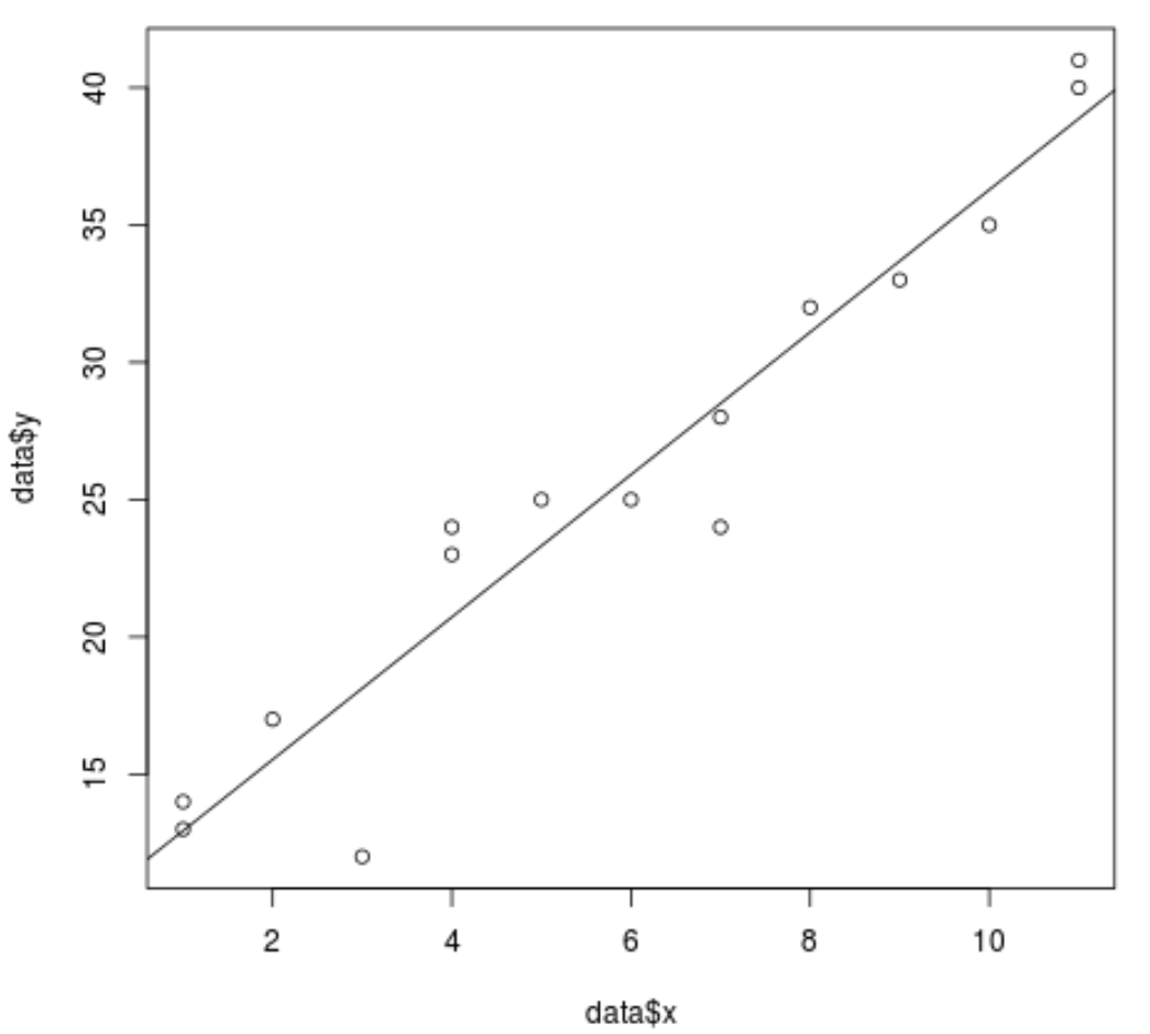
It’s also easy to add a regression line to the scatterplot using the abline() function. For example:
#fit a simple linear regression model
model #add the fitted regression line to the scatterplot
abline(model)
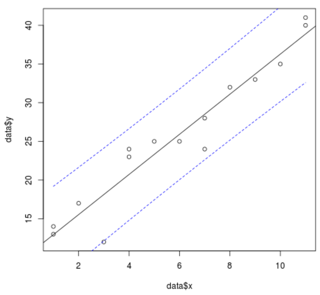
We can also add confidence interval lines to the plot by using the predict() function. For example:
#define range of x values
newx = seq(min(data$x),max(data$x),by = 1)

#find 95% confidence interval for the range of x values
conf_interval
#create scatterplot of values with regression line
plot(data$x, data$y)
abline(model)

#add dashed lines (lty=2) for the 95% confidence interval
lines(newx, conf_interval[,2], col="blue", lty=2)
lines(newx, conf_interval[,3], col="blue", lty=2)
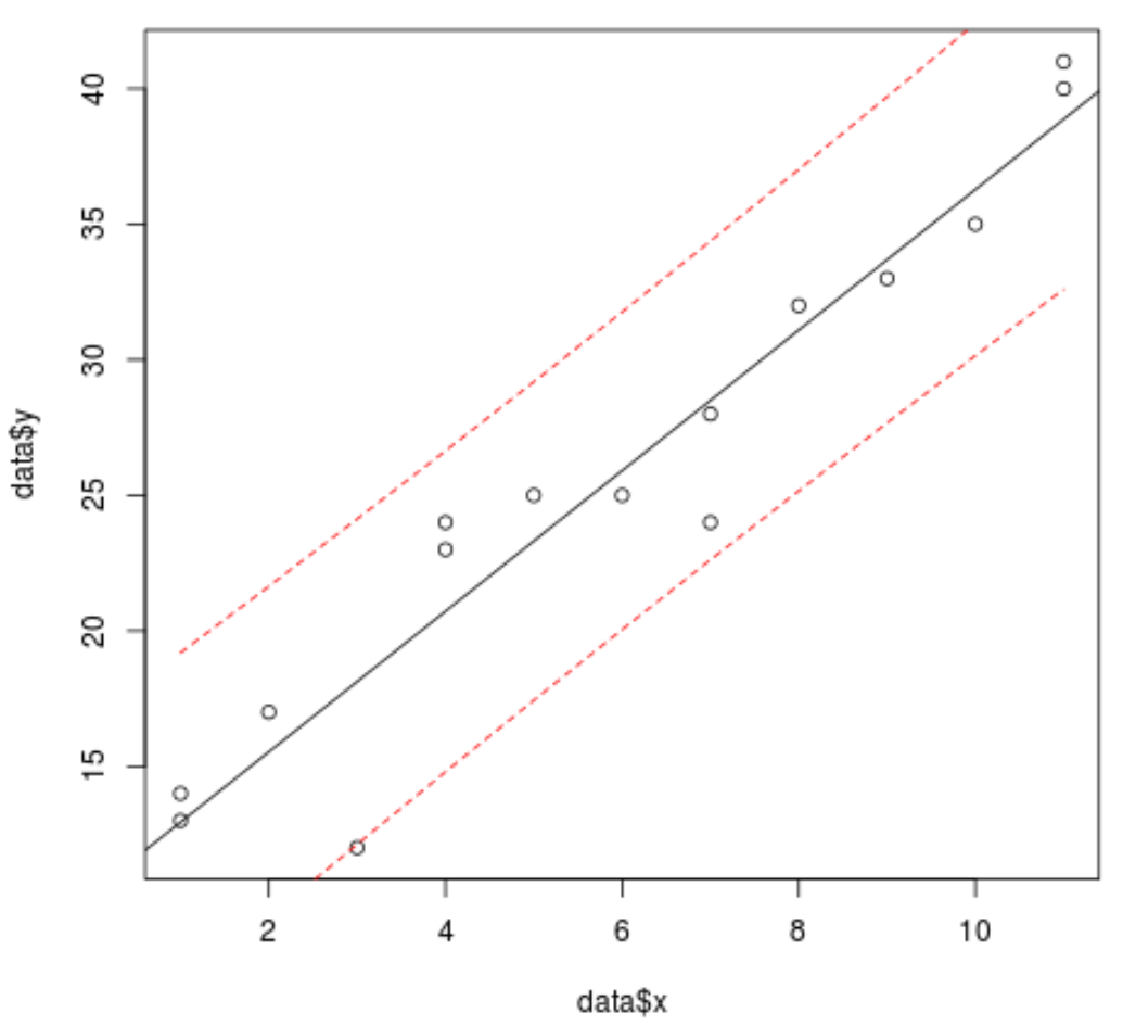
Or we could instead add prediction interval lines to the plot by specifying the interval type within the predict() function. For example:
#define range of x values
newx = seq(min(data$x),max(data$x),by = 1)

#find 95% prediction interval for the range of x values
pred_interval interval="prediction",
                         level = 0.95)

#create scatterplot of values with regression line
plot(data$x, data$y)
abline(model)

#add dashed lines (lty=2) for the 95% confidence interval
lines(newx, pred_interval[,2], col="red", lty=2)
lines(newx, pred_interval[,3], col="red", lty=2)
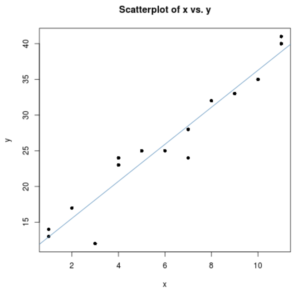
Lastly, we can make the plot more aesthetically pleasing by adding a title, changing the axes names, and changing the shape of the individual points in the plot.
plot(data$x, data$y,
     main = "Scatterplot of x vs. y", #add title
     pch=16, #specify points to be filled in
     xlab='x', #change x-axis name
     ylab='y') #change y-axis name

abline(model, col='steelblue') #specify color of regression line
Additional Resources
How to Label Points on a Scatterplot in R
How to Use the Jitter Function in R for Scatterplots