A box plot is a type of plot that we can use to visualize the five number summary of a dataset, which includes:
- The minimum
- The first quartile
- The median
- The third quartile
- The maximum

This tutorial explains how to create and interpret box plots in Excel.
How to Create a Box Plot in Excel
Perform the following steps to create a box plot in Excel.
Step 1: Enter the data.
Enter the data in one column.
Step 2: Create the box plot.
Highlight all of the data values.
On the Insert tab, go to the Charts group and click the Statistic Chart symbol.
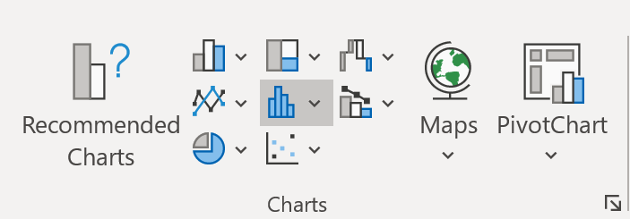
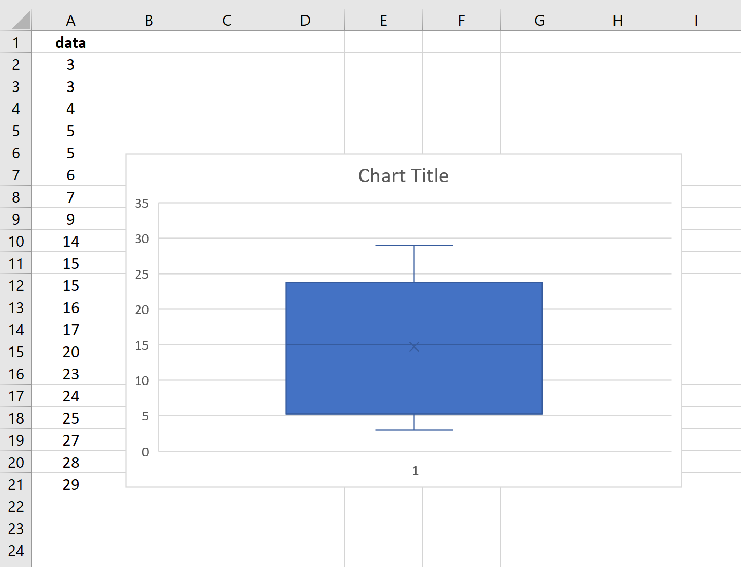
Click Box and Whisker. A box plot will automatically appear:
To see the actual values that are summarized in the box plot, click on the plot. Then click the green plus sign that appears in the top right corner. Then check the box next to Data Labels. The following labels will automatically appear:
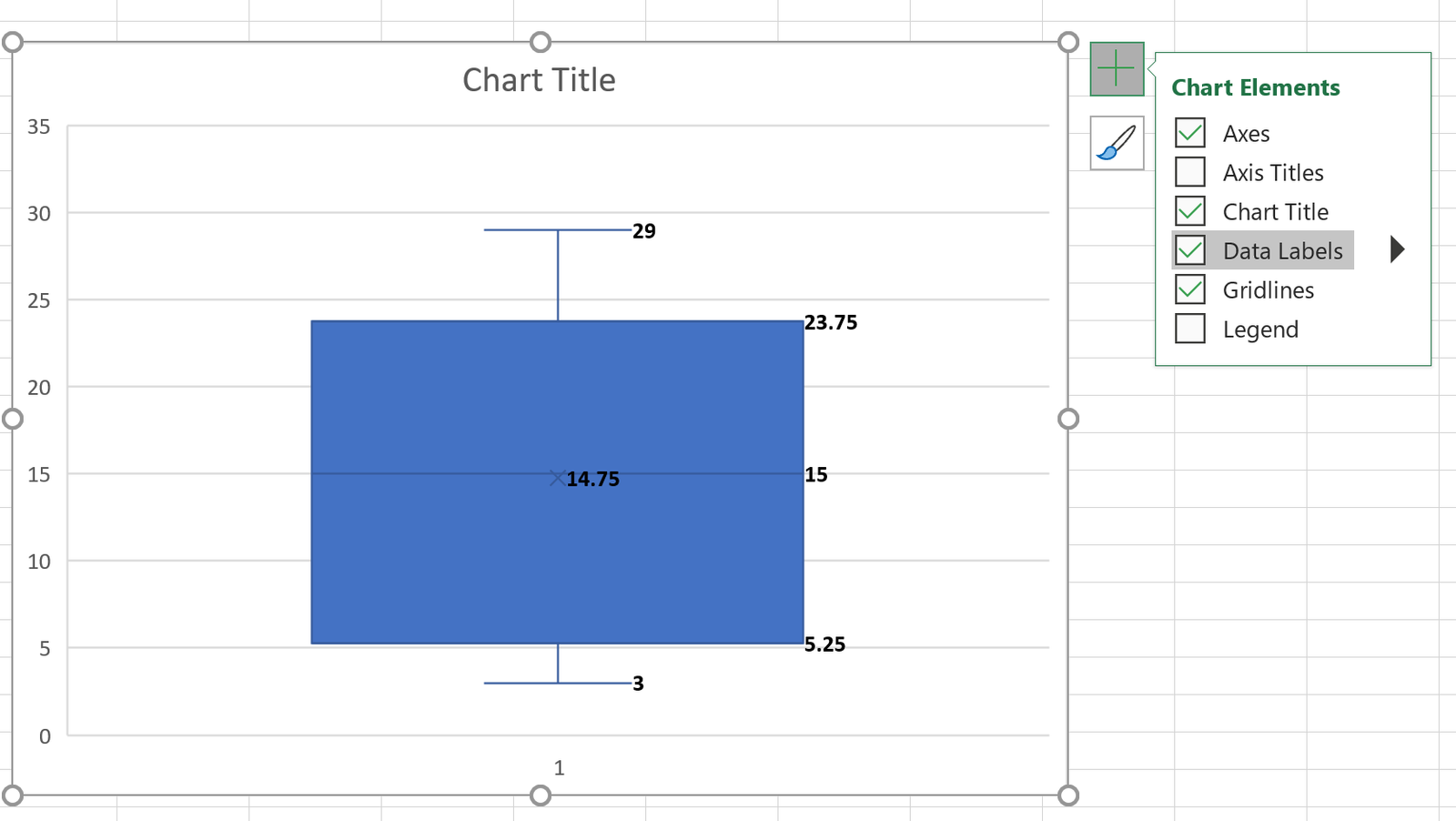
Here is how to interpret the labels in the box plot:
Min: 3. This is the smallest value in the dataset that is not considered an outlier. For this particular example, there are no outliers.
Q1: 5.25. This is the value of the first quartile in the dataset.
Median: 15. This is the median value in the dataset.
Mean: 14.75. The tiny “x” in the middle of the box represents the mean of the dataset.
Q3: 23.75. This is the value of the third quartile in the dataset.
Max: 29. This is the largest value in the dataset that is not considered an outlier. For this particular example, there are no outliers.
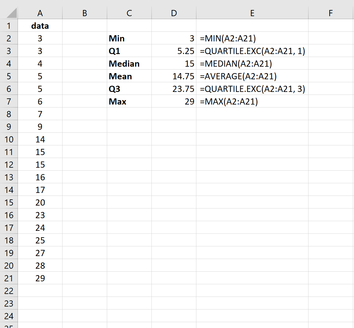
The screenshot below shows the exact formulas you can use in Excel to find each of these values:
A Note on Outliers
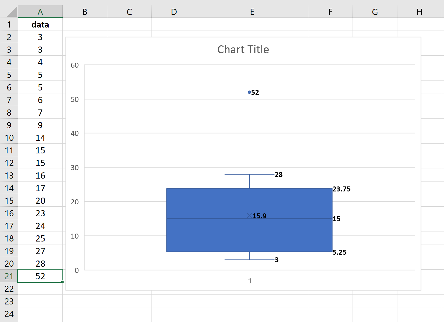
The interquartile range (IQR) is the distance between the third quartile and the first quartile. Excel considers any data value to be an “outlier” if it is 1.5 times the IQR larger than the third quartile or 1.5 times the IQR smaller than the first quartile.
In this example, the IQR is 23.75 – 5.25 = 18.5. Thus, any value smaller than 5.25 – (18.5 * 1.5) = -22.5 or any value larger than 23.75 + (18.5 * 1.5) = 51.5 would be considered an outlier.
Since no value in the dataset is smaller than -22.5 or larger than 51.5, there are no dots that appear in the box plot to indicate outliers. However, if our largest value was actually 52 then the box plot would show a dot to indicate the outlier:
How to Create Multiple Box Plots in Excel
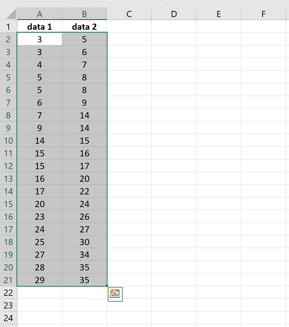
You can easily create multiple box plots in Excel by simply entering more than one dataset in separate columns.
For example, suppose we have two datasets. To create a boxplot for each dataset, we would simply highlight both columns of data:
Then once again on the Insert tab, go to the Charts group and click the Statistic Chart symbol.
Click Box and Whisker. A box plot for each dataset will automatically appear:
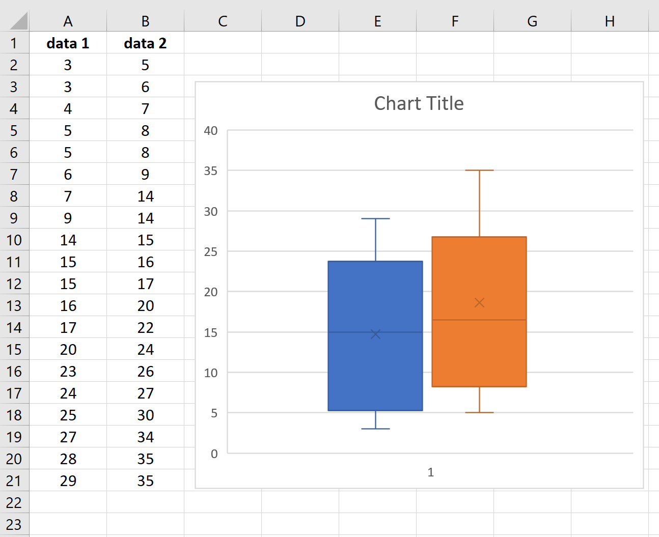
This is particularly useful if we want to quickly visualize the distributions of two or more datasets.