An ogive is a graph that shows how many data values lie above or below a certain value in a dataset.
This tutorial explains how to create the following ogive graph in R:
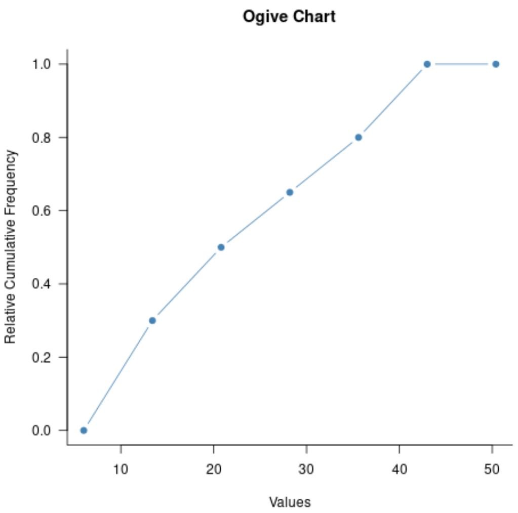
Example: Create Ogive Graph in R
First, let’s define a dataset that contains 20 values:
#create dataset
data
Next, let’s use the graph.freq() and ogive.freq() functions from the agricolae package in R to create a simple ogive graph:
library(agricolae)

#define values to plot
value_bins freq(data, plot=FALSE)
values freq(value_bins, frame=FALSE)

#create ogive chart
plot(values, xlab='Values', ylab='Relative Cumulative Frequency',
     main='Ogive Chart', col='steelblue', type='b', pch=19, las=1, bty='l')
The x-axis shows the values from the dataset and the y-axis shows the relative cumulative frequency of values that lie below the values shown on the x-axis.
Here is how to interpret some of the more obscure arguments in the plot() function:
- type=’b’: Plot both lines and points
- pch=19: Fill in the circles in the plot
- las=1: Make labels perpendicular to axis
- bty=’l’: Only show the border on the bottom and left sides of the plot
We can view the actual values in the plot by printing the values created from the ogive.freq() function:
#view values in ogive
values

     x  RCF
1  6.0 0.00
2 13.4 0.30
3 20.8 0.50
4 28.2 0.65
5 35.6 0.80
6 43.0 1.00
7 50.4 1.00
Here’s how to interpret the values:
- 0% of all values in the dataset were less than or equal to 6.
- 30% of all values in the dataset were less than or equal to 13.4.
- 50% of all values in the dataset were less than or equal to 20.8.
- 65% of all values in the dataset were less than or equal to 35.6.
And so on.
Additional Resources
The following tutorials explain how to create other common charts in R:
How to Create a Pareto Chart in R
How to Create a Gantt Chart in R
How to Create a Lollipop Chart in R