A gantt chart is a type of chart that shows the start and end times of various events.
This tutorial explains how to create a gantt chart in R using the package ggplot2.
Creating a Gantt Chart in R Using ggplot2
Suppose we have the following dataset that shows the start and end times for the shifts of four different workers at a store:
#create data frame
data
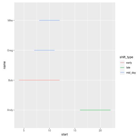
In order to create a gantt chart using ggplot2 that visualizes the start and end times for each worker, we can use the following code:
#install (if not already installed) and load ggplot2
if(!require(ggplot2)){install.packages('ggplot2')}

#create gantt chart that visualizes start and end time for each worker
ggplot(data, aes(x=start, xend=end, y=name, yend=name, color=shift_type)) +
  geom_segment()
This produces the following gantt chart:
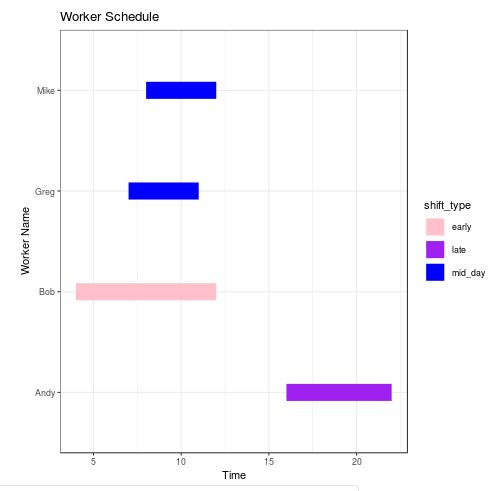
With a couple tweaks to the layout, we can make this gantt chart look much better:
ggplot(data, aes(x=start, xend=end, y=name, yend=name, color=shift_type)) +
  theme_bw()+ #use ggplot theme with black gridlines and white background
  geom_segment(size=8) + #increase line width of segments in the chart
  labs(title='Worker Schedule', x='Time', y='Worker Name')
This produces the following chart:

In addition, if you would like to define the exact colors to be used in the chart, you can use the following code:
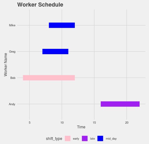
ggplot(data, aes(x=start, xend=end, y=name, yend=name, color=shift_type)) +
  theme_bw()+ #use ggplot theme with black gridlines and white background
  geom_segment(size=8) + #increase line width of segments in the chart
  labs(title='Worker Schedule', x='Time', y='Worker Name') +
  scale_colour_manual(values = c('pink', 'purple', 'blue'))
This produces the following chart with colors pink, purple, and blue to represent the different shift types:
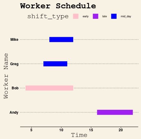
Using Custom Themes
We can take things a step further by using custom themes from the ggthemes library.
For example, we can create a gantt chart that uses a theme inspired by The Wall Street Journal:
#load ggthemes library
library(ggthemes)

#create scatterplot with Wall Street Journal theme
ggplot(data, aes(x=start, xend=end, y=name, yend=name, color=shift_type)) +
  theme_bw()+
  geom_segment(size=8) +
  labs(title='Worker Schedule', x='Time', y='Worker Name') +
  scale_colour_manual(values = c('pink', 'purple', 'blue')) +
  theme_wsj() +
  theme(axis.title = element_text())
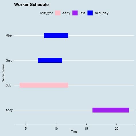
Or we could use a theme inspired by The Economist:
ggplot(data, aes(x=start, xend=end, y=name, yend=name, color=shift_type)) +
  theme_bw()+
  geom_segment(size=8) +
  labs(title='Worker Schedule', x='Time', y='Worker Name') +
  scale_colour_manual(values = c('pink', 'purple', 'blue')) +
  theme_economist() +
  theme(axis.title = element_text())
Or perhaps a theme inspired by Five Thirty Eight:
ggplot(data, aes(x=start, xend=end, y=name, yend=name, color=shift_type)) +
  theme_bw()+
  geom_segment(size=8) +
  labs(title='Worker Schedule', x='Time', y='Worker Name') +
  scale_colour_manual(values = c('pink', 'purple', 'blue')) +
  theme_fivethirtyeight() +
  theme(axis.title = element_text())
For a complete list of themes available in the ggthemes library, check out the documentation page.