Often you may want to convert the x-axis or y-axis scale of a ggplot2 plot into a log scale.
You can use one of the following two methods to do so using only ggplot2:
1. Use scale_y_continuous() or scale_x_continuous()
ggplot(df, aes(x=x, y=y)) +
  geom_point() +
  scale_y_continuous(trans='log10') +
  scale_x_continuous(trans='log10')
2. Use coord_trans()
ggplot(df, aes(x=x, y=y)) +
  geom_point() +
  coord_trans(y ='log10', x='log10')
If you’d like to format the axis labels to show exponents, you can use functions from the scales package:
ggplot(df, aes(x=x, y=y)) +
  geom_point() +
  scale_y_continuous(trans='log10',
                     breaks=trans_breaks('log10', function(x) 10^x),
                     labels=trans_format('log10', math_format(10^.x)))
This tutorial shows examples of how to use these functions in practice.
Example 1: Log Scale Using scale_y_continuous()
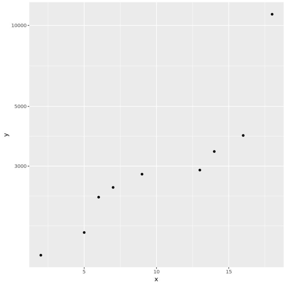
The following code shows how to use the scale_y_continuous() function to create a log scale for the y-axis of a scatterplot:
library(ggplot2)

#create data frame
df #create scatterplot with log scale on y-axis
ggplot(df, aes(x=x, y=y)) +
  geom_point() +
  scale_y_continuous(trans='log10')

Example 2: Log Scale Using coord_trans()
The following code shows how to use the coord_trans() function to create a log scale for the y-axis of a scatterplot:
library(ggplot2)

#create data frame
df #create scatterplot with log scale on y-axis
ggplot(df, aes(x=x, y=y)) +
  geom_point() +
  coord_trans(y='log10')

Example 3: Custom Log Scale Labels
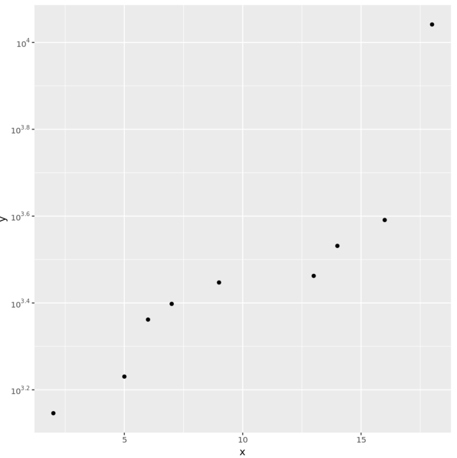
The following code shows how to use functions from the scales package function to create a log scale for the y-axis of a scatterplot and add custom labels with exponents:
library(ggplot2)
library(scales)

#create data frame
df #create scatterplot with log scale on y-axis and custom labels
ggplot(df, aes(x=x, y=y)) +
  geom_point() +
  scale_y_continuous(trans='log10',
                     breaks=trans_breaks('log10', function(x) 10^x),
                     labels=trans_format('log10', math_format(10^.x)))

Notice that the y-axis labels have exponents, unlike the previous two plots.
Additional Resources
The Complete Guide to ggplot2 Titles
A Complete Guide to the Best ggplot2 Themes
How to Create Side-by-Side Plots in ggplot2