Often you may want to find the equation that best fits some curve for a dataset in Google Sheets.

Fortunately this is fairly easy to do using the Trendline function in Google Sheets.
This tutorial provides a step-by-step example of how to fit an equation to a curve in Google Sheets.
Step 1: Create the Data
First, let’s create a fake dataset to work with:

Step 2: Create a Scatterplot
Next, let’s create a scatterplot to visualize the dataset.
Highlight cells A2:B16, then click the Insert tab, then click Chart:

By default, Google Sheets will insert a line chart.
However, we can easily change this to a scatterplot.
In the Chart editor panel that appears on the right side of the screen, click the dropdown arrow next to Chart type and choose Scatter chart:

The following scatterplot will appear:

Step 3: Add a Trendline
Within the Chart editor panel, click the Customize tab. Then click the Series dropdown option. Then check the box next to Trendline.

Then check the box below it that says Show R2.
The following linear trendline will automatically be added to the plot:
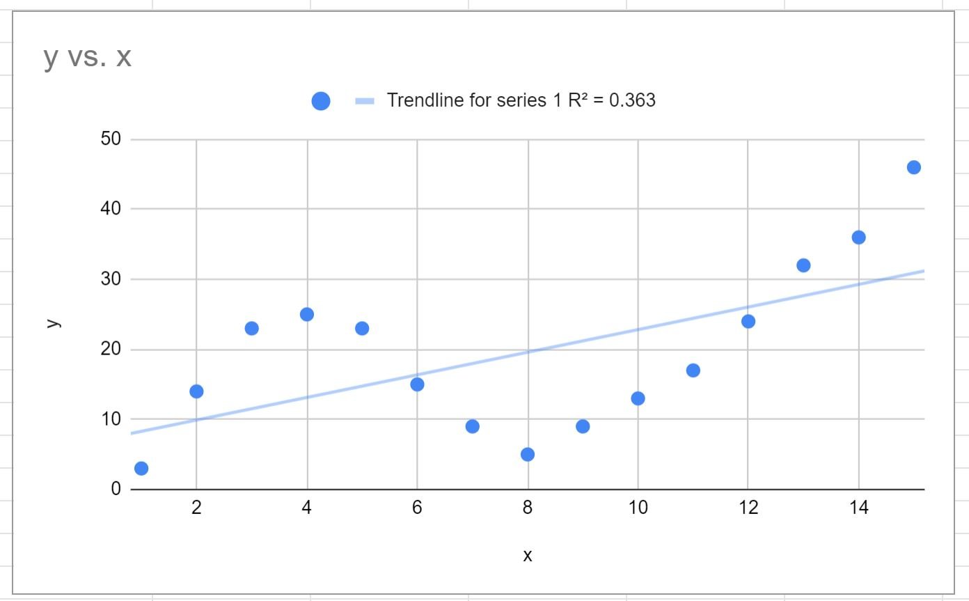
The R-squared tells us the percentage of the variation in the response variable that can be explained by the predictor variables.
The R-squared for this particular curve is 0.363.
Related: What is a Good R-squared Value?
Step 4: Choose the Best Trendline
From the plot above, it’s clear that the linear trendline does a poor job of capturing the behavior of the data.
Instead, we can choose to fit a polynomial curve.
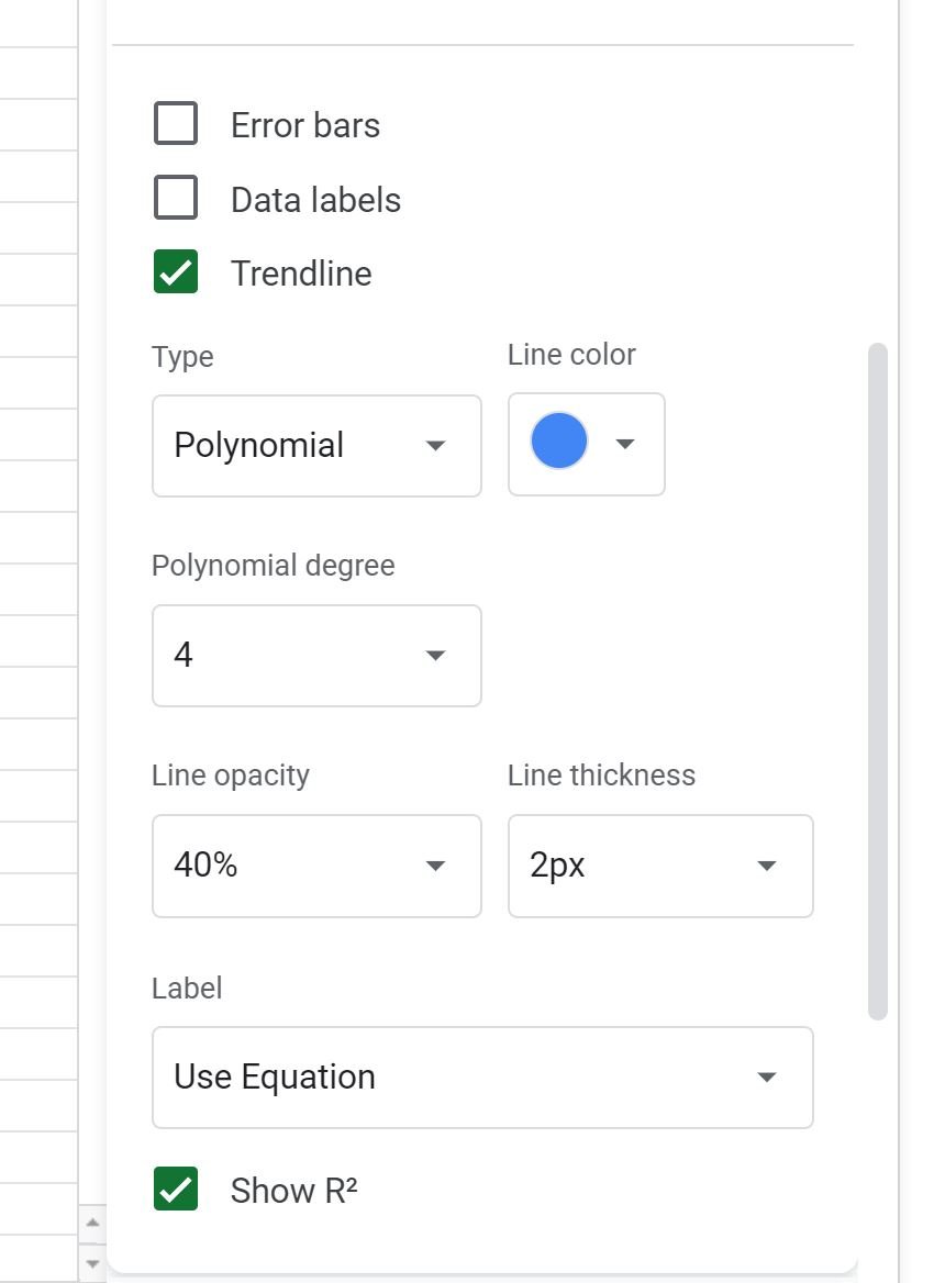
To do so, click the dropdown arrow under Type and choose Polynomial.
Then click the dropdown arrow under Polynomial degree and choose 4.
Lastly, click the dropdown arrow under Label and click Use Equation:
This results in the following curve:
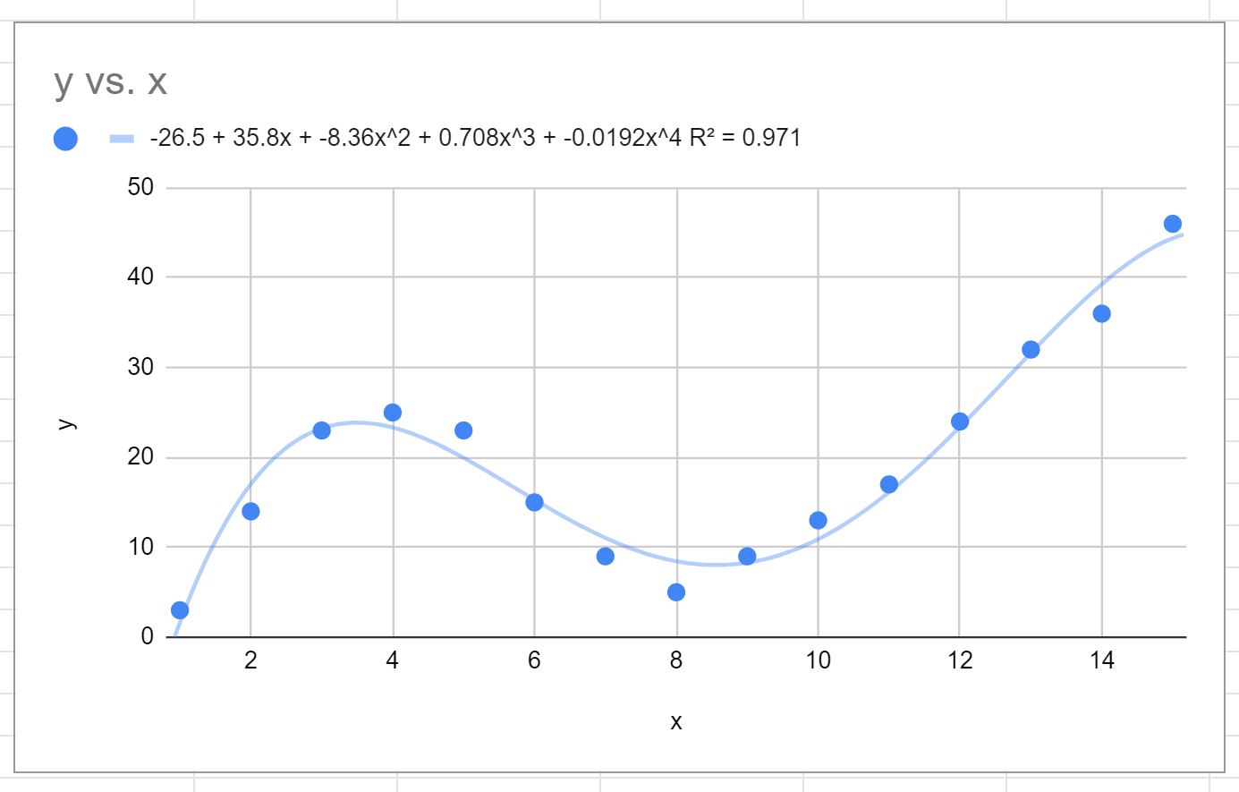
The equation of the curve is as follows:
y = -0.0192x4 + 0.7081x3 – 8.3649x2 + 35.823x – 26.516
The R-squared for this particular curve is 0.971.
This R-squared is considerably higher than that of the previous trendline, which indicates that it fits the dataset much more closely.
We can also use this equation of the curve to predict the value of the response variable based on the predictor variable.
For example if x = 4 then we would predict that y = 23.34:
y = -0.0192(4)4 + 0.7081(4)3 – 8.3649(4)2 + 35.823(4) – 26.516 = 23.34
Note: You may have to play around with the value for the polynomial degree until you find a curve that appears to fit the data well without overfitting.
Additional Resources
The following tutorials explain how to perform other common tasks in Google Sheets:
How to Perform Linear Regression in Google Sheets
How to Find A Line of Best Fit in Google Sheets
How to Create a Forecast in Google Sheets