A scatterplot is a type of plot that we can use to display the relationship between two variables. It helps us visualize both the direction (positive or negative) and the strength (weak, moderate, strong) of the relationship between the two variables.
This tutorial explains how to create and modify scatterplots in Stata.
How to Create Scatterplots in Stata
We’ll use a dataset called auto to illustrate how to create and modify scatterplots in Stata.
First, load the data by typing the following into the Command box:
use http://www.stata-press.com/data/r13/auto
We can get a quick look at the dataset by typing the following into the Command box:
summarize
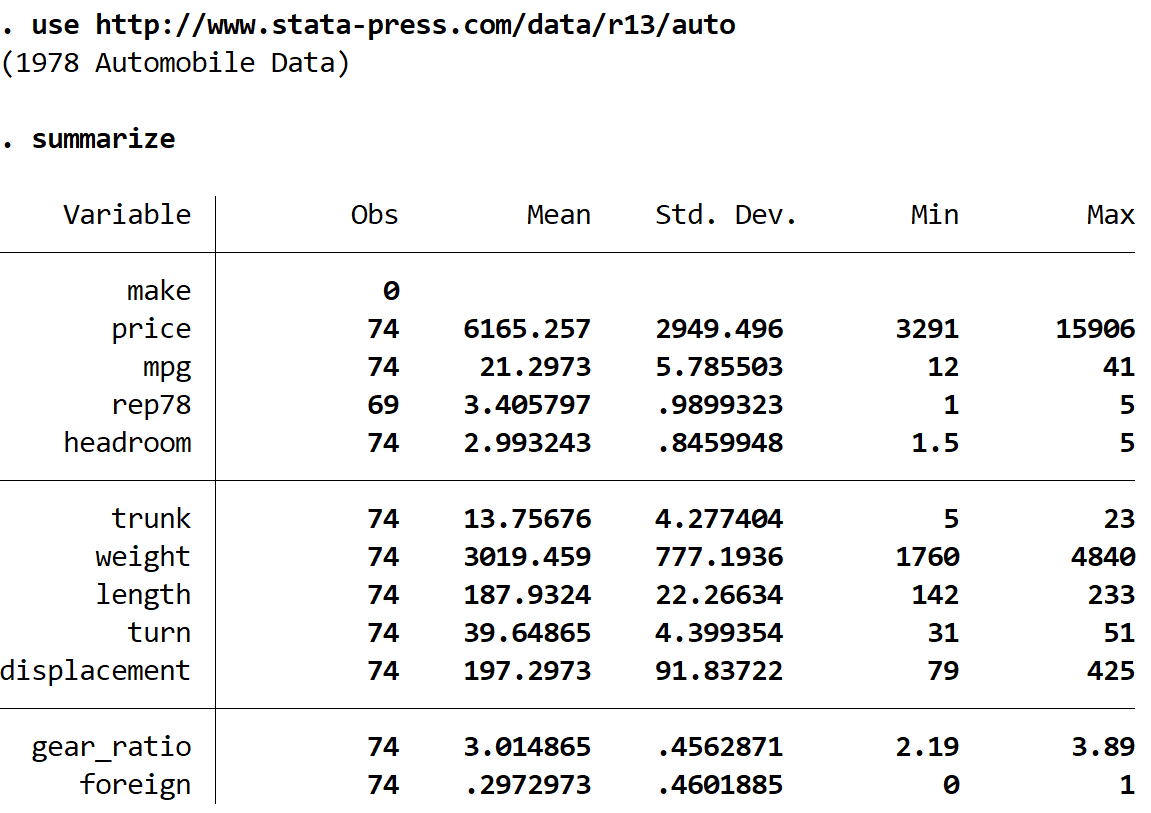
We can see that there are 12 total variables in the dataset.
Basic Scatterplot
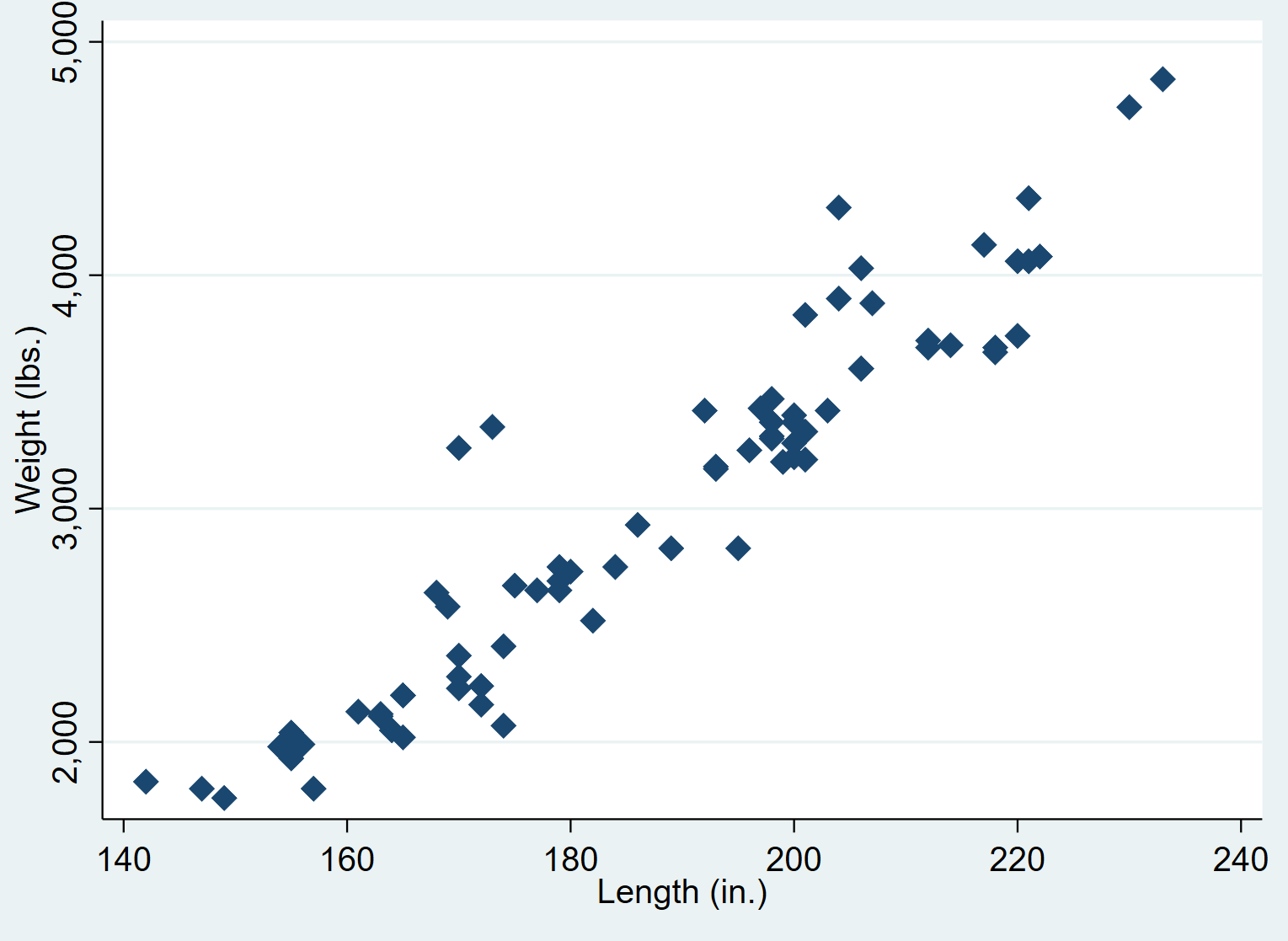
We can create a scatterplot for the variables weight and length by using the scatter command. The first variable you type will go along the y-axis and the second variable will go along the x-axis:
scatter weight length
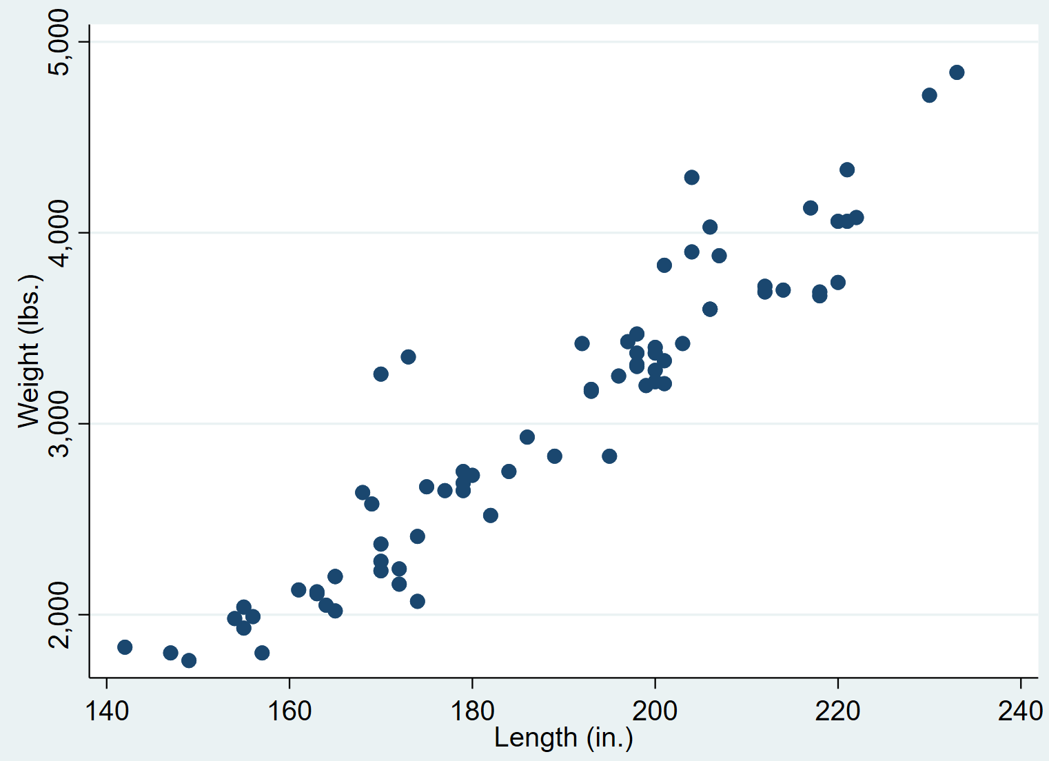
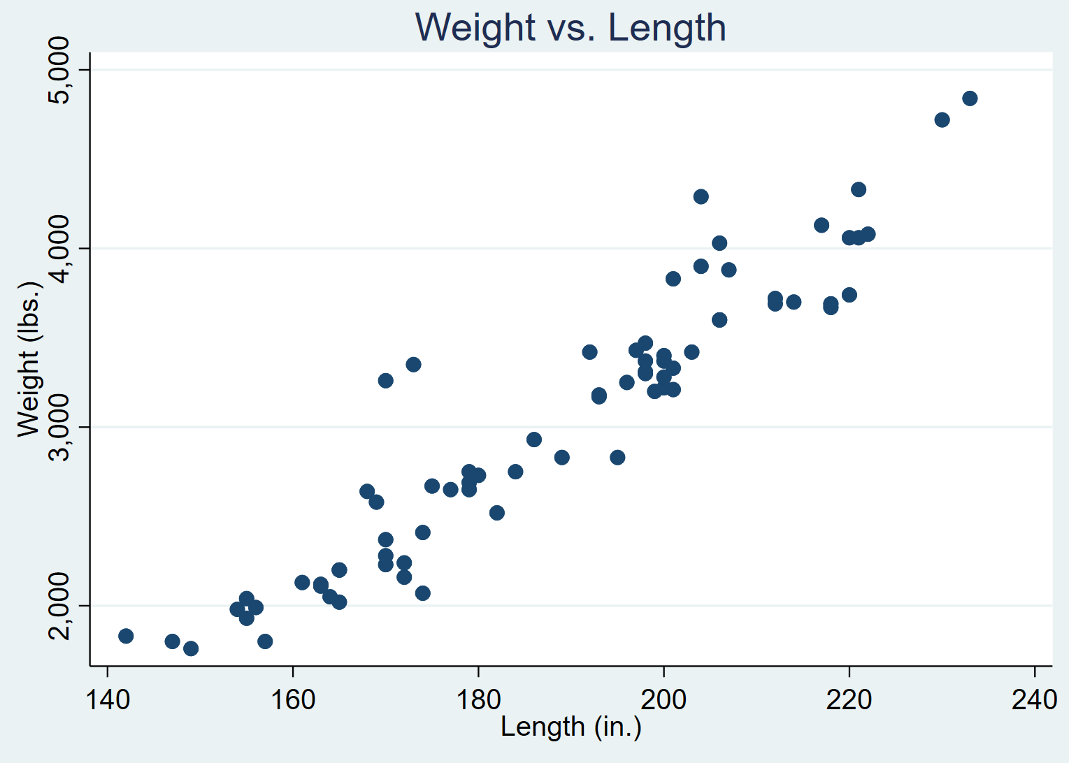
We can see that there is a strong positive correlation between weight and length. That is, cars that weigh more also tend to be longer.
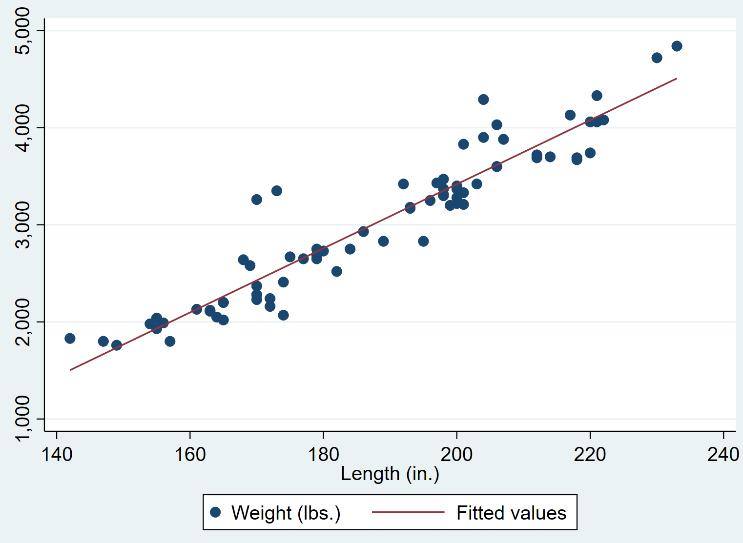
Scatterplot with a Regression Line
You can add a simple linear regression line to the scatterplot by using two “pipe” symbols || along with the lfit command:
scatter weight length || lfit weight length
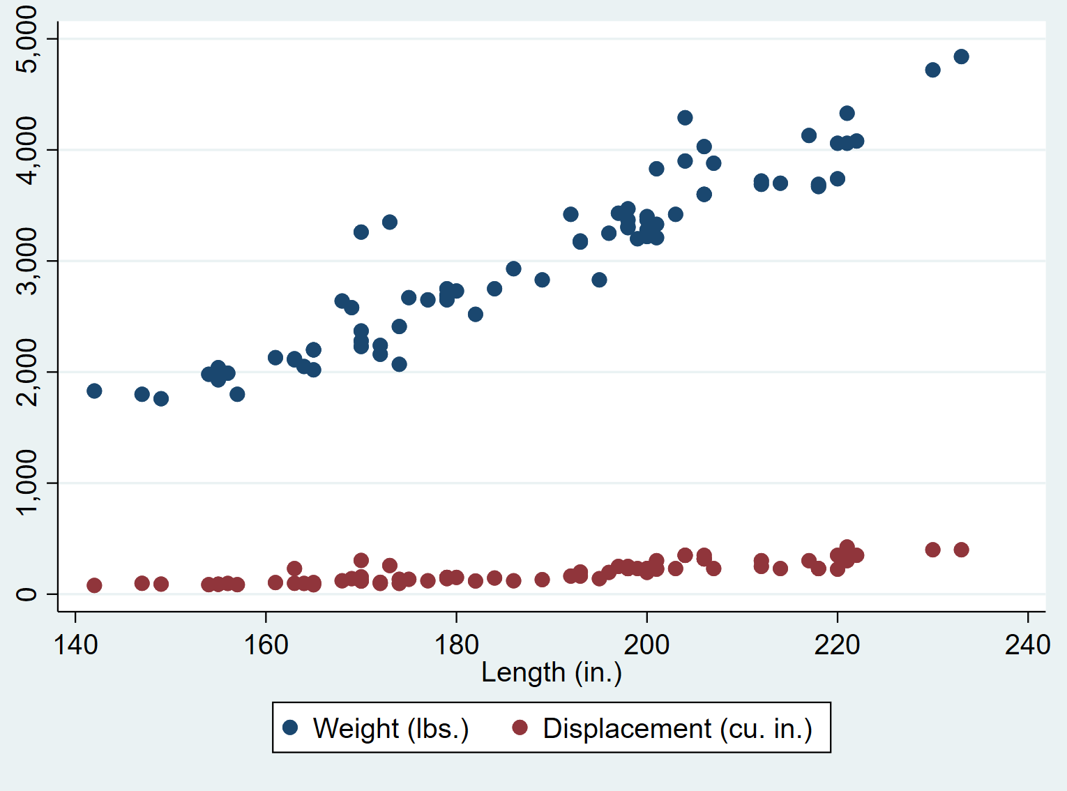
Scatterplot with Multiple Variables
You can create a scatterplot with more than two variables by simply typing more variables after the scatter command. Note that the last variable you type will be used for the x-axis.
For example, the following command tells Stata to create a scatterplot using length as the x-axis variable and weight and displacement as the y-axis variables:
scatter weight displacement length
How to Modify Scatterplots in Stata
We can use several different commands to modify the appearance of the scatterplots.
Adding a Title
We can add a title to the plot using the title() command:
scatter weight length, title(“Weight vs. Length”)
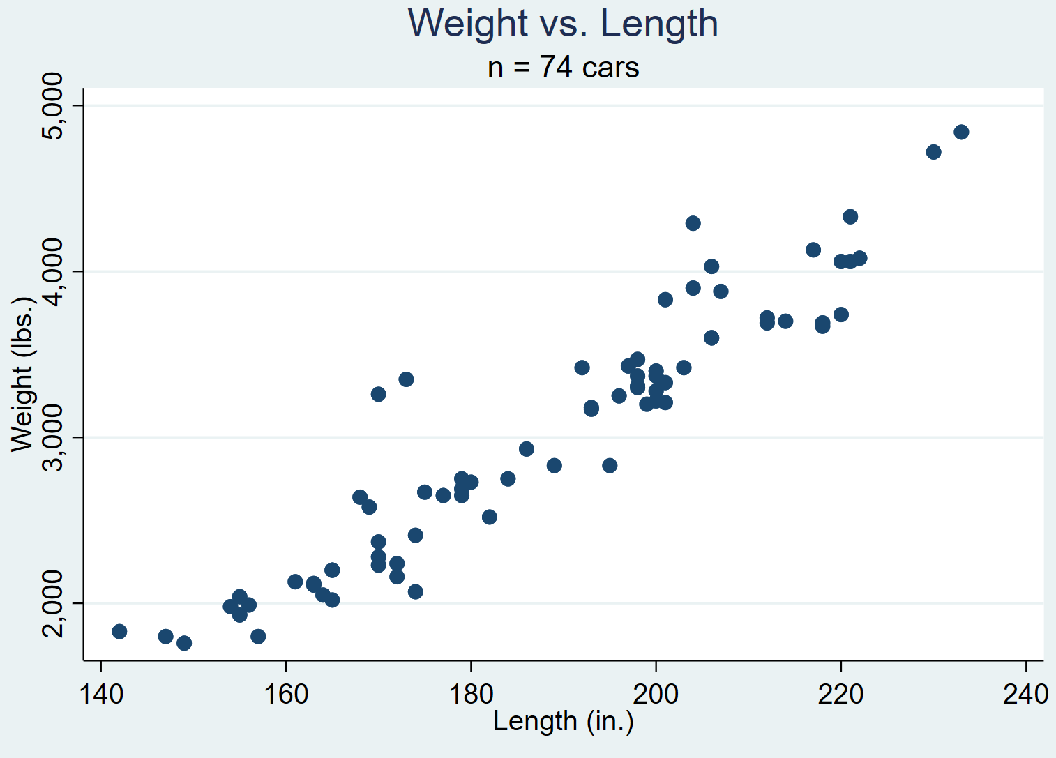
Adding a Subtitle
We can also add a subtitle underneath the title using the subtitle() command:
scatter weight length, title(“Weight vs. Length”) subtitle(“n = 74 cars”)
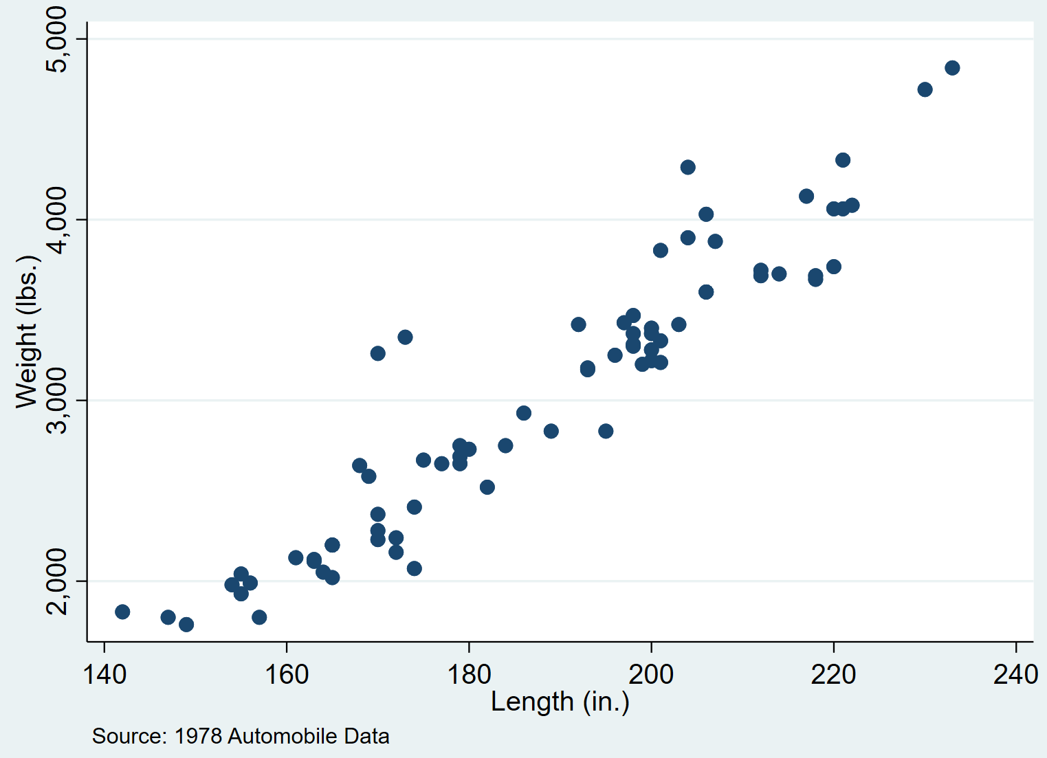
Adding a Comment
We can also add a note or comment at the bottom of the graph by using the note() command:
scatter weight length, note(“Source: 1978 Automobile Data”)
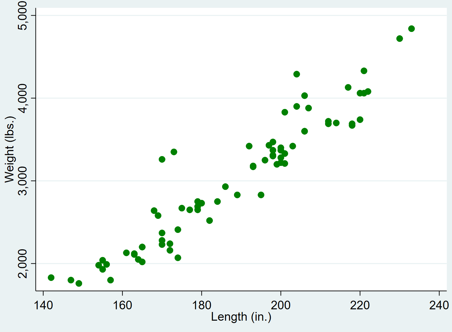
Changing Colors
We can change the color of the points in the scatterplot by using the mcolor() command:
scatter weight length, mcolor(green)
A full list of available colors can be found in the Stata Documentation for colors.
Changing Shapes
We can also change the shape of the points in the scatterplot by using the msymbol() command. For example the symbol “D” corresponds to diamonds:
scatter weight length, msymbol(D)
A full list of available shapes can be found in the Stata Documentation for shapes.