This tutorial explains how to plot multiple lines (i.e. data series) in one chart in R.
To plot multiple lines in one chart, we can either use base R or install a fancier package like ggplot2.
Using Base R
Here are two examples of how to plot multiple lines in one chart using Base R.
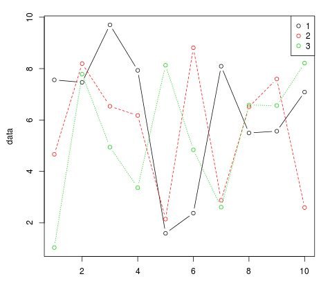
Example 1: Using Matplot
If you have a dataset that is in a wide format, one simple way to plot multiple lines in one chart is by using matplot:
#Create a fake dataset with 3 columns (ncol=3) composed of randomly generated
#numbers from a uniform distribution with minimum = 1 and maximum = 10
data #plot the three columns of the dataset as three lines and add a legend in
#the top right corner of the chart
matplot(data, type = "b",pch=1,col = 1:3)
legend("topright", legend = 1:3, col=1:3, pch=1)
This code generates the following chart:
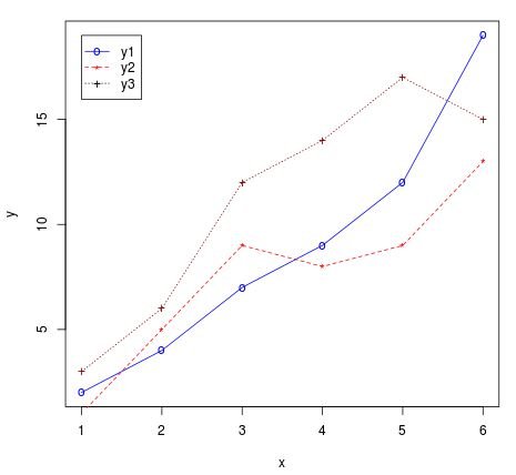
Example 2: Using Points & Lines
Another way to plot multiple lines is to plot them one by one, using the built-in R functions points() and lines(). The code below demonstrates an example of this approach:
#generate an x-axis along with three data series
x
#plot the first data series using plot()
plot(x, y1, type="o", col="blue", pch="o", ylab="y", lty=1)

#add second data series to the same chart using points() and lines()
points(x, y2, col="red", pch="*")
lines(x, y2, col="red",lty=2)

#add third data series to the same chart using points() and lines()
points(x, y3, col="dark red",pch="+")
lines(x, y3, col="dark red", lty=3)

#add a legend in top left corner of chart at (x, y) coordinates = (1, 19)
legend(1,19,legend=c("y1","y2","y3"), col=c("blue","red","black"),
                                   pch=c("o","*","+"),lty=c(1,2,3), ncol=1)
This code generates the following chart:
Using ggplot2
Here is an example of how to plot multiple lines in one chart using ggplot2.
#install (if not already installed) and load ggplot2 package
if(!require(ggplot2)){install.packages('ggplot2')}

#generate fake dataset with three columns 'x', 'value', and 'variable'
data frame(x=rep(1:5, 3),
                   value=sample(1:100, 15),
                   variable=rep(paste0('series', 1:3), each=5))

#view dataset
head(data)
  x value variable
1 1 93    series1
2 2 64    series1
3 3 36    series1
4 4 17    series1
5 5 95    series1
6 1 80    series2

#plot all three series on the same chart using geom_line()
ggplot(data = data, aes(x=x, y=value)) + geom_line(aes(colour=variable))
This generates the following chart:

Additional Resources
The following tutorials explain how to perform other common plotting operations in ggplot2:
How to Change Legend Position in ggplot2
How to Change the Legend Title in ggplot2
How to Modify the Margins in ggplot2