A density plot is a useful way to visualize the distribution of values in a dataset.
Often you may want to visualize the density plots of several variables at once. Fortunately, this is easy to do using the ggplot2 data visualization package in R with the following syntax:
ggplot(data, aes(x=value, fill=variable)) +
  geom_density(alpha=.25)
The alpha argument controls the opacity of each density plot. It’s important to set this value below 1 so that you can see each density plot when they overlay each other.
The following step-by-step example shows how to use this syntax in practice.
Step 1: Create the Data
First, let’s create a fake dataset with three variables:
#make this example reproducible
set.seed(1)

#create data
df frame(var1=rnorm(1000, mean=0, sd=1),
                 var2=rnorm(1000, mean=0, sd=3),
                 var3=rnorm(1000, mean=3, sd=2))

#view first six rows of data
head(df)

        var1       var2       var3
1 -0.6264538  3.4048953  1.2277008
2  0.1836433  3.3357955 -0.8445098
3 -0.8356286 -2.6123329  6.2394015
4  1.5952808  0.6321948  4.0385398
5  0.3295078  0.2081869  2.8883001
6 -0.8204684 -4.9879466  4.3928352
Step 2: Convert the Data from Wide to Long
Next, we need to convert the data from a wide format to a long format to make it compatible with ggplot2:
library(reshape)

#convert from wide format to long format
data #view first six rows
head(data)

  variable      value
1     var1 -0.6264538
2     var1  0.1836433
3     var1 -0.8356286
4     var1  1.5952808
5     var1  0.3295078
6     var1 -0.8204684
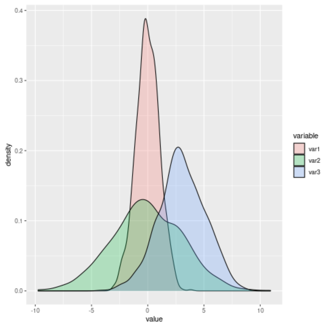
Step 3: Create the Overlaying Density Plots
Lastly, we can create the overlaying density plots:
library(ggplot2)

#create overlaying density plots
ggplot(data, aes(x=value, fill=variable)) +
  geom_density(alpha=.25)
Feel free to adjust the alpha value to make the density plots more or less transparent.
For example, here’s what the plots would look like if we increased the alpha value:
library(ggplot2)

#create overlaying density plots
ggplot(data, aes(x=value, fill=variable)) +
  geom_density(alpha=.7)

Additional Resources
How to Create a Gantt Chart in R Using ggplot2
How to Create a Grouped Boxplot in R Using ggplot2
How to Create Side-by-Side Plots in R Using ggplot2