A dot plot is a type of plot that displays frequencies using dots.
The following step-by-step example shows how to create the following dot plot in Google Sheets:
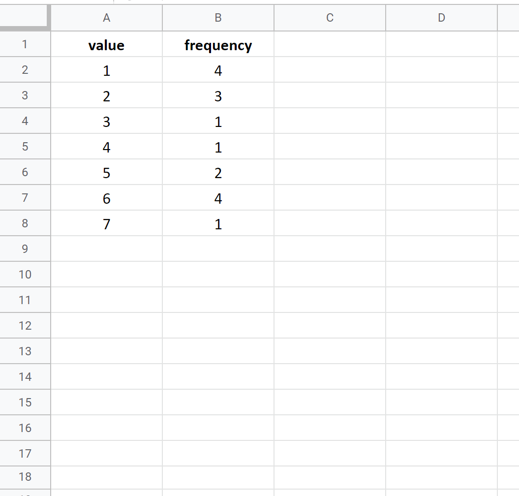
Step 1: Enter the Data
Suppose we have the following frequency table in Google Sheets:
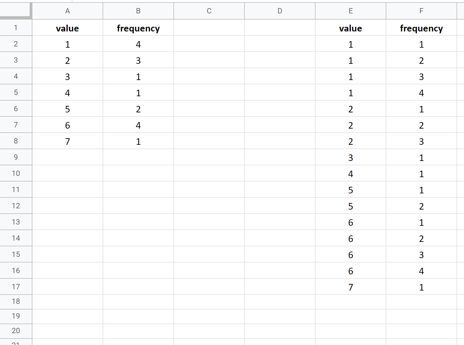
Before we create a dot plot, we need to first reorganize the data into a “long” format:
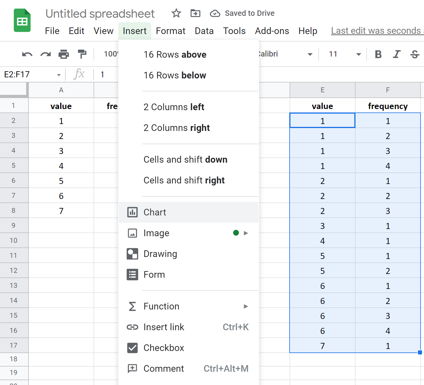
Step 2: Create Dot Plot
Highlight cells E2:F17. Then click the Insert tab, then click Chart.
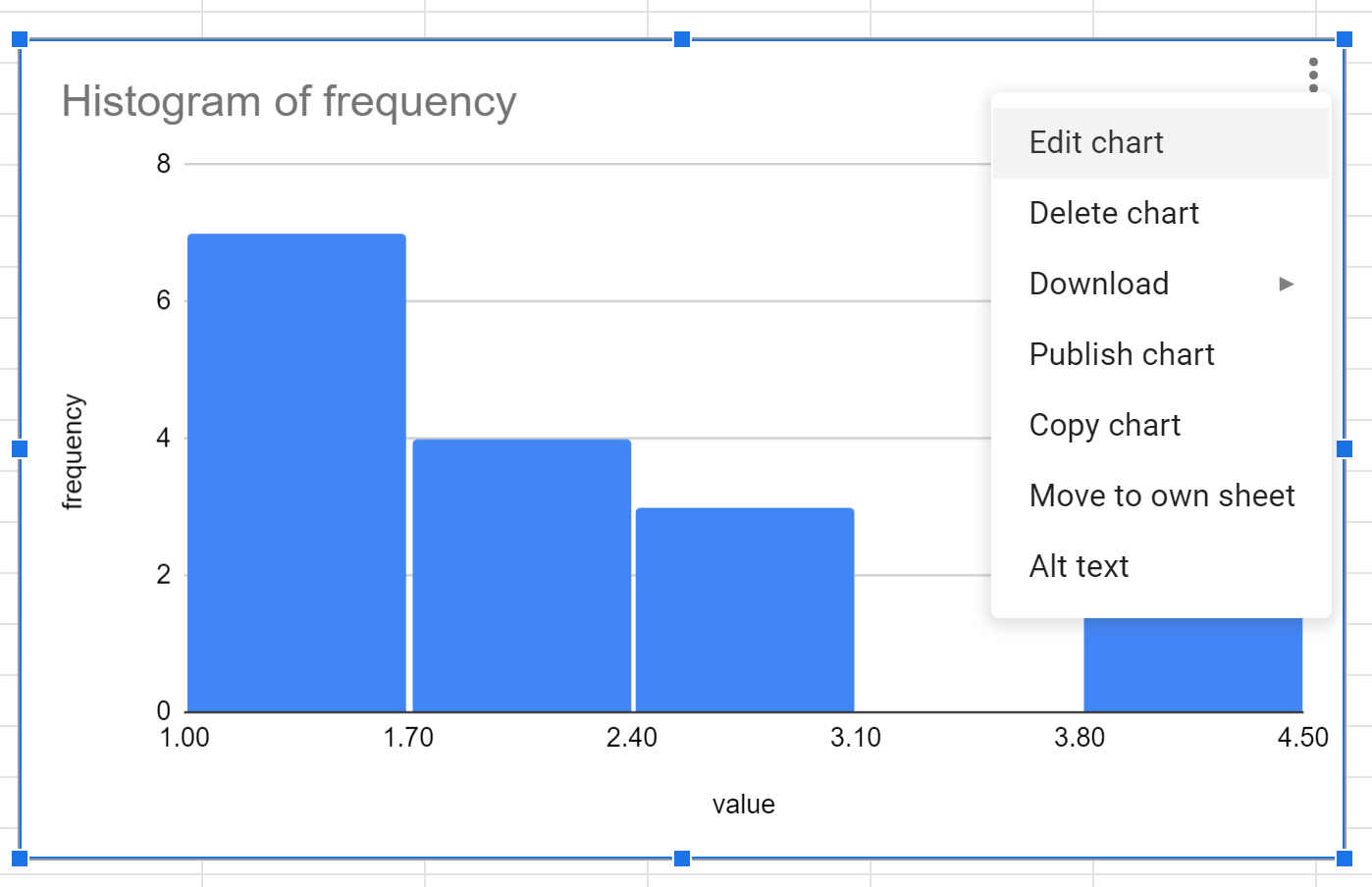
Google Sheets will insert a histogram by default. To turn this into a dot plot, click anywhere on the chart and then click the three vertical dots in the top right corner, then click Edit chart:
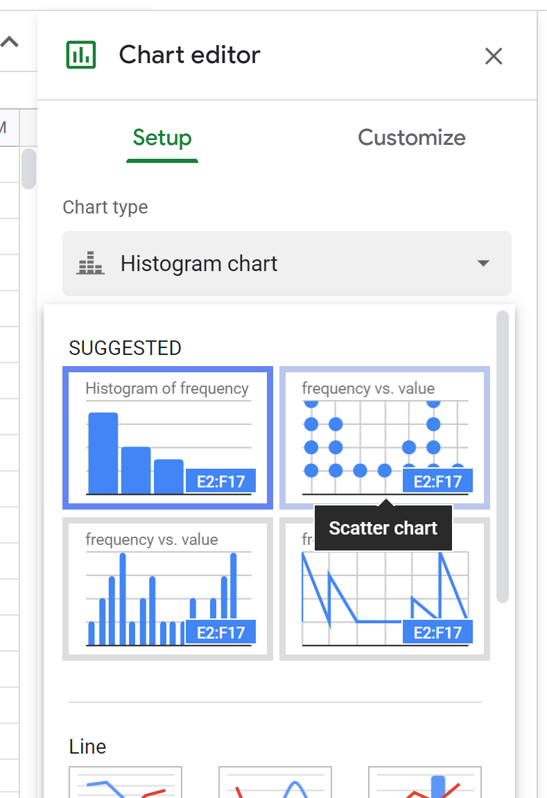
In the Chart editor panel that appears on the right side of the screen, click the Chart type option and then click Scatter chart:
The following plot will appear:
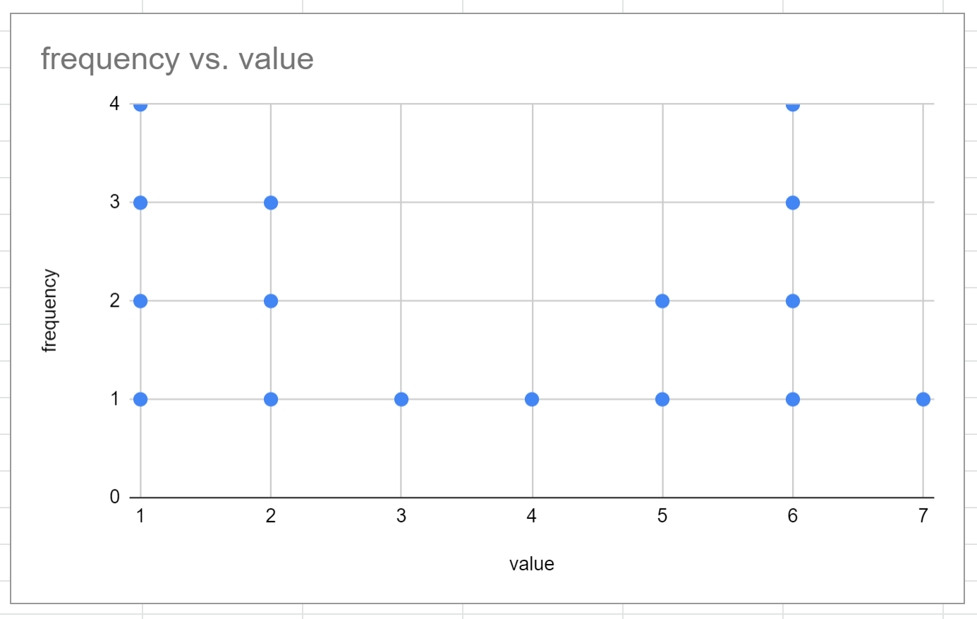
This is a rough version of a dot plot.
Step 3: Customize Dot Plot
Make the following changes to make the dot plot more aesthetically pleasing:
- Double click the y-axis label and delete it.
- Double click the values on the y-axis and change the min value to .75 and the max value to 5.
- Double click the major and minor gridlines and delete both.
- Double click one of the dots in the plot and change the Point size to 14px.
- Double click the title and change it to whatever name you’d like.
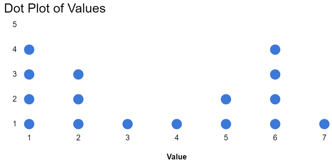
Once we make each of these changes, here’s what our final dot plot looks like:
The individual values are shown along the x-axis and the frequencies of those values are represented by the number of dots.
Additional Resources
The following tutorials explain how to create other common visualizations in Google Sheets:
How to Create a Box Plot in Google Sheets
How to Create a Pie Chart in Google Sheets
How to Create a Bubble Chart in Google Sheets
How to Create a Pareto Chart in Google Sheets