A candlestick chart is a type of financial chart that displays the price movements of securities over time.
The following step-by-step example shows how to create a candlestick chart in Excel.
Step 1: Enter the Data
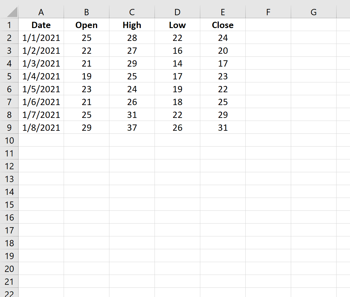
First, let’s enter the prices for a dataset that show the open, high, low, and close price for a certain stock during an 8-day period:

Step 2: Create the Candlestick Chart
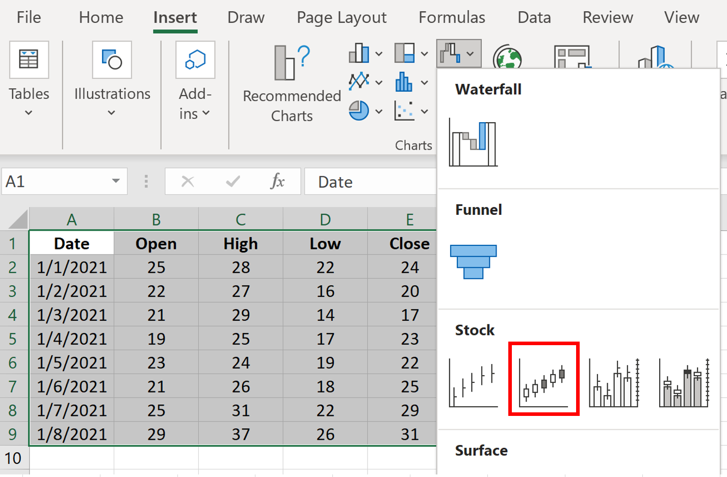
Next, highlight all of the values in the range A1:E9 as follows:

Then click the Insert tab along the top ribbon. Within the Charts group, click the Waterfall icon and then click the Open-High-Low-Close icon:

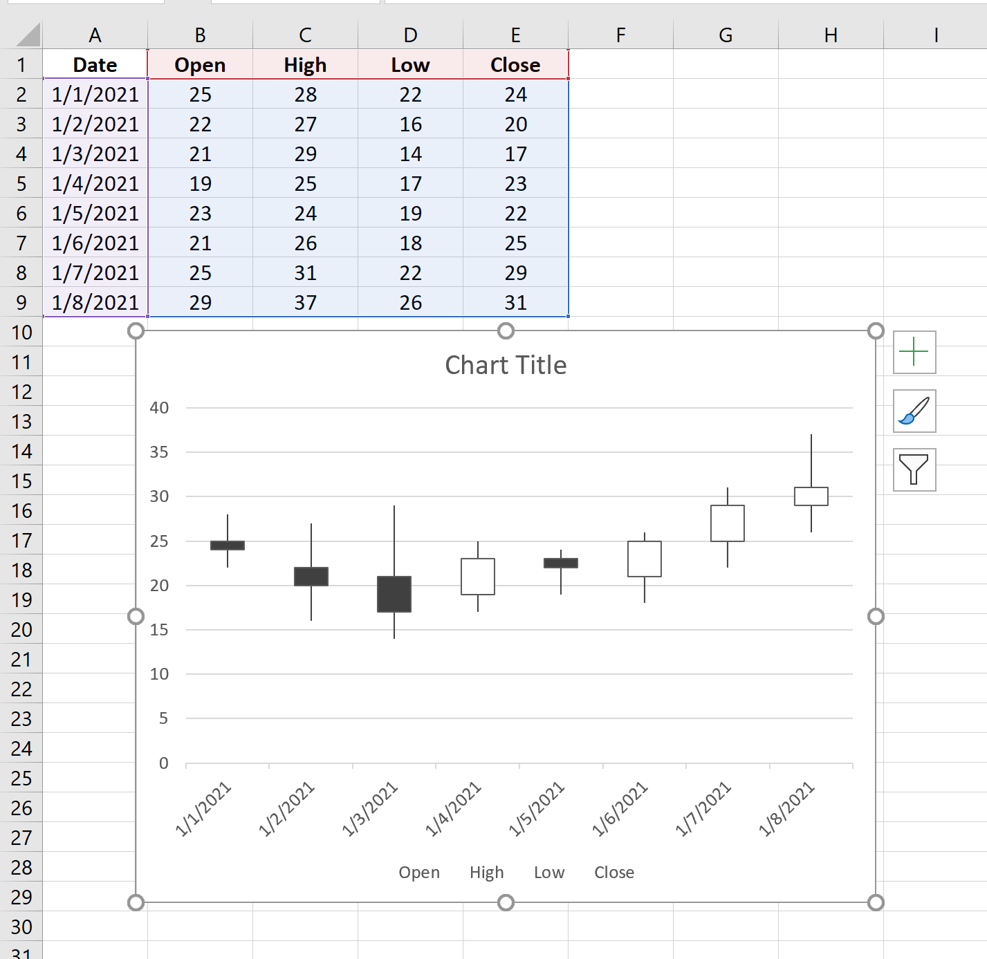
This will automatically create the following candlestick chart:

Step 3: Modify the Candlestick Chart
Feel free to add a title to the chart and delete the legend at the bottom that says ‘Open High Low Close.’
Also feel free to click on the individual candlesticks and change their fill colors.
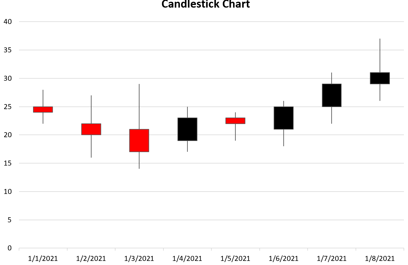
For example, we can change the ‘up’ candles to have a color of black and the ‘down’ candles to have a color of red:

We can now quickly see on which days the stock price ended higher (black) and on which days it ended lower (red).
Additional Resources
The following tutorials explain how to create other common charts in Excel:
How to Create a Gantt Chart in Excel
How to Create an Ogive Graph in Excel
How to Create Side-by-Side Boxplots in Excel