A scatterplot matrix is a matrix of scatterplots that lets you understand the pairwise relationship between different variables in a dataset.
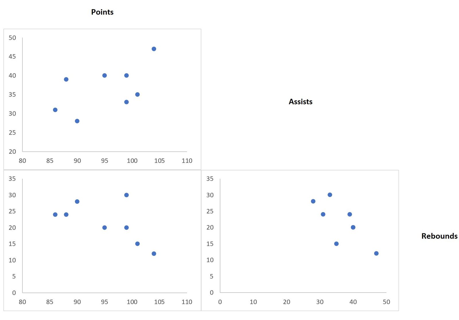
This tutorial explains how to create the following scatterplot matrix in Excel:
Let’s jump in!
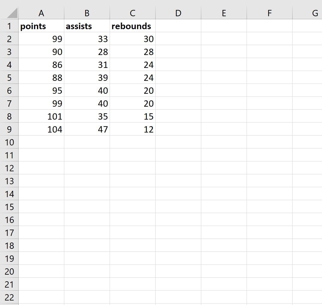
Step 1: Enter the Data
First, let’s enter the following values for a dataset that contains three variables: points, assists, and rebounds.
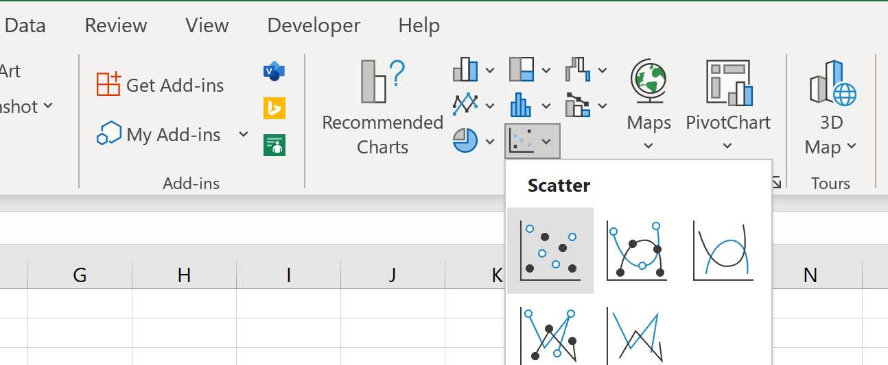
Step 2: Create the Scatterplots
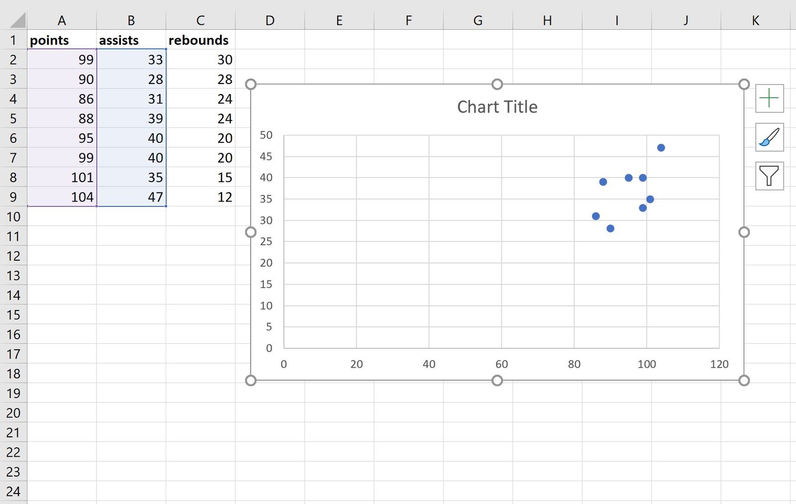
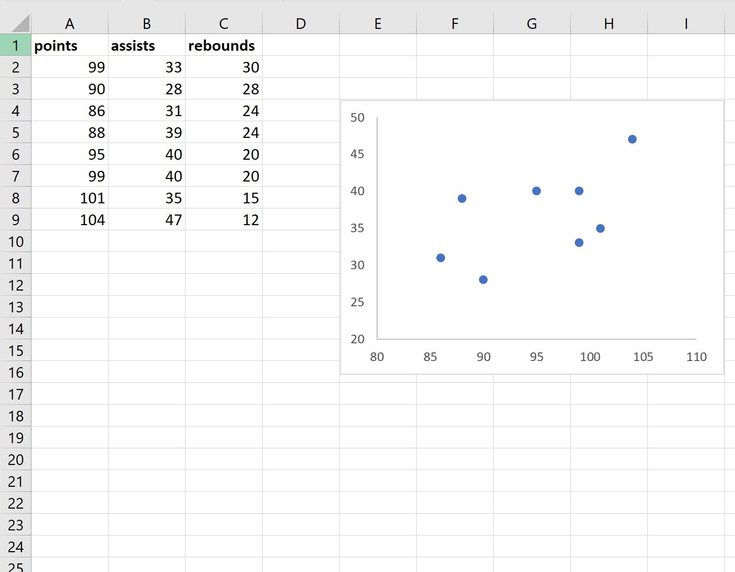
Next, let’s highlight the cell range A2:B9, then click the Insert tab, then click the Scatter button within the Charts group.
The following scatterplot of points vs. assists will automatically be created:
Next, perform the following steps:
- Click on the values on the x-axis and change the minimum axis bound to 80.
- Click the y-axis and change the minimum axis bound to 20.
- Click the Chart Title and delete it.
- Click on the gridlines in the chart and delete them.
- Lastly, resize the chart to make it smaller.
The end result should looking something like this:
Next, repeat these exact same steps for the points and rebounds variables and place the scatterplot under the existing scatterplot:
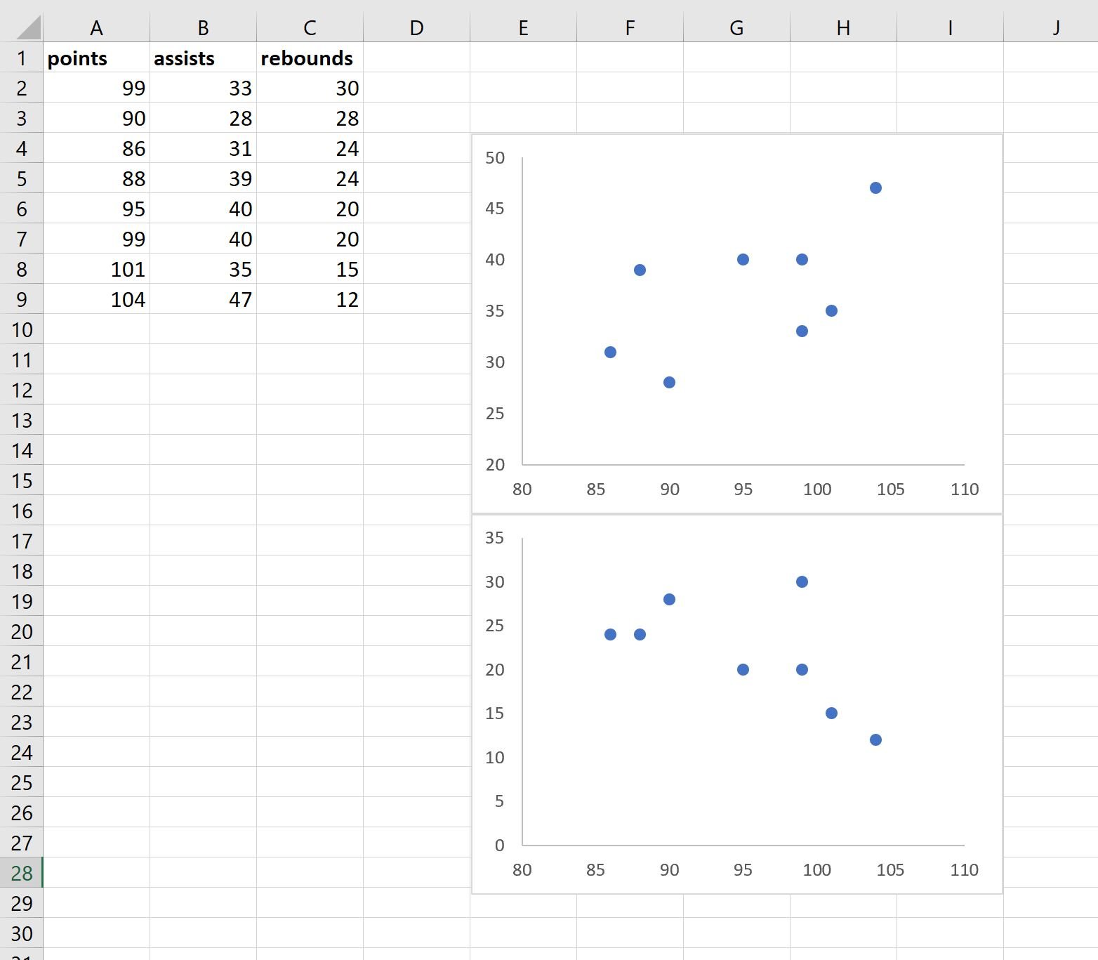
Lastly, repeat these steps for the assists and rebounds variables and place the scatterplot in the bottom right corner:
Step 3: Label the Scatterplots
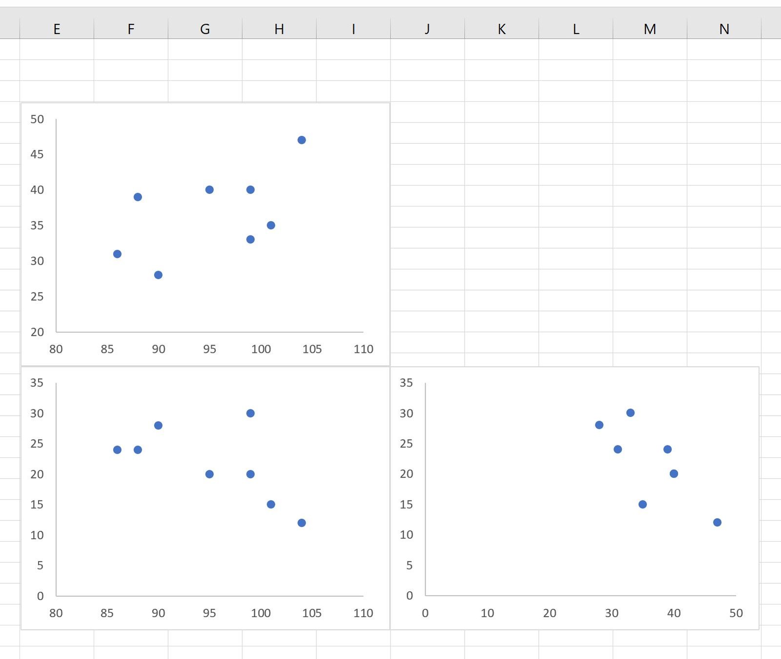
Lastly, type the variable names next to the scatterplots so that it’s easy to understand which scatterplots represent which variables:
Here’s how to interpret the plots:
- The scatterplot in the top left corner represents the relationship between points and assists.
- The scatterplot in the bottom left corner represents the relationship between points and rebounds.
- The scatterplot in the bottom right corner represents the relationship between assists and rebounds.
Note: Feel free to modify the color and size of the points in the scatterplots to make them appear however you’d’ like.
Additional Resources
The following tutorials explain how to perform other common tasks in Excel:
How to Create a Scatterplot with Multiple Series in Excel
How to Create a Correlation Matrix in Excel
How to Perform a Correlation Test in Excel