The following step-by-step example shows how to create a chart in Google Sheets with multiple trendlines.
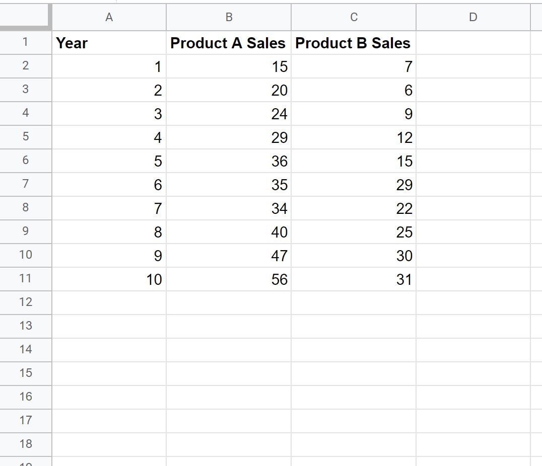
Step 1: Enter the Data
First, let’s enter some values that show the total sales of two different products during various years:
Step 2: Create the Chart
To create a chart to visualize the sales of each product by year, highlight the values in the range A1:C11. Then click the Insert tab and then click Chart:

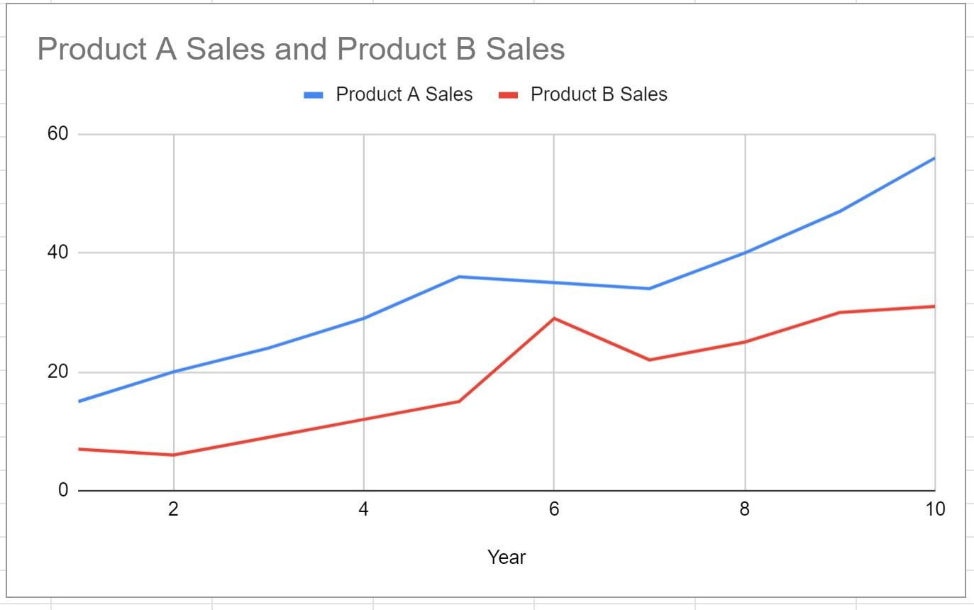
By default, Google Sheets will insert a line chart:
To turn this into a scatterplot, click the Setup tab within the Chart editor panel and choose Scatter chart as Chart type:

The chart will automatically be turned into a scatterplot:
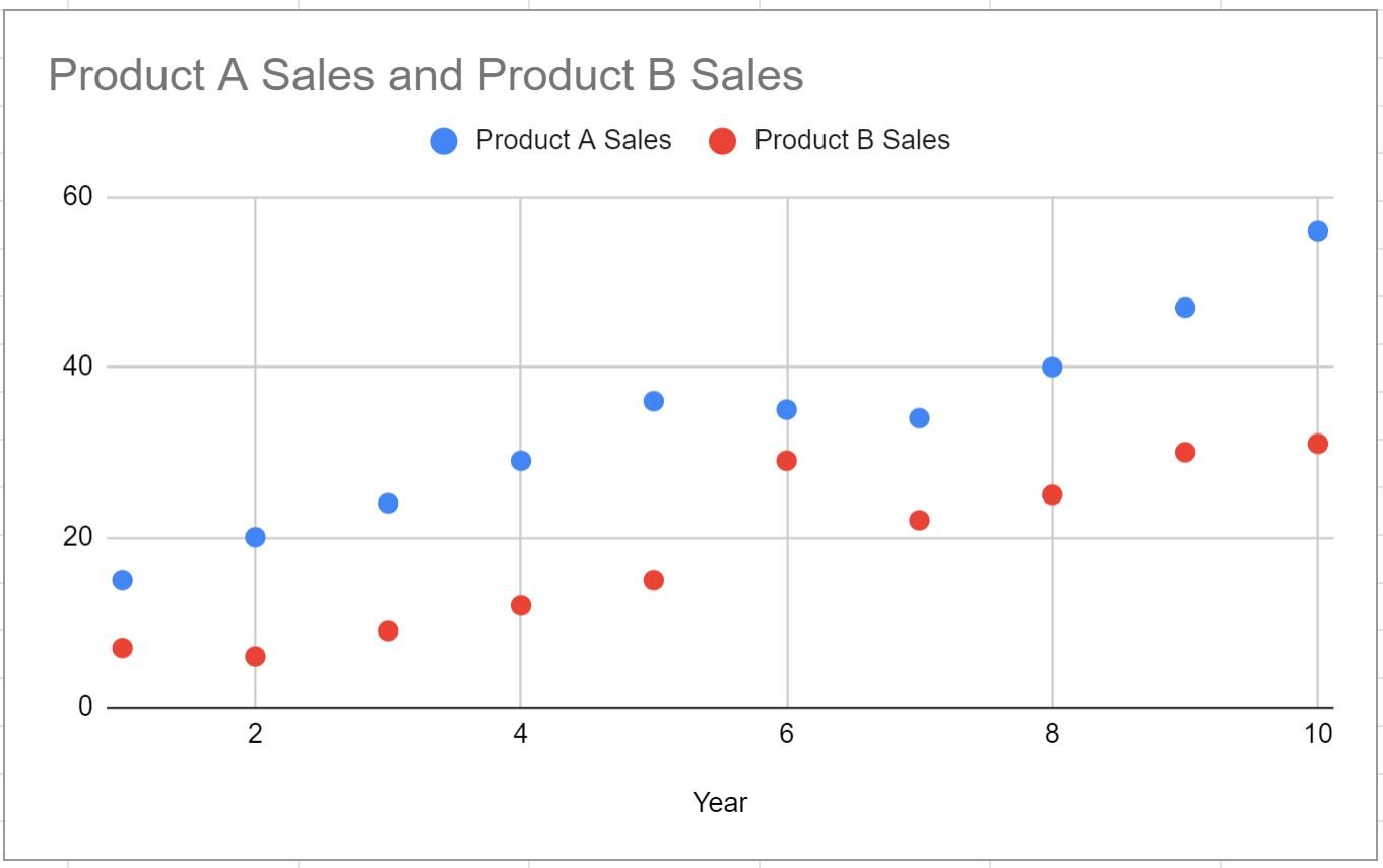
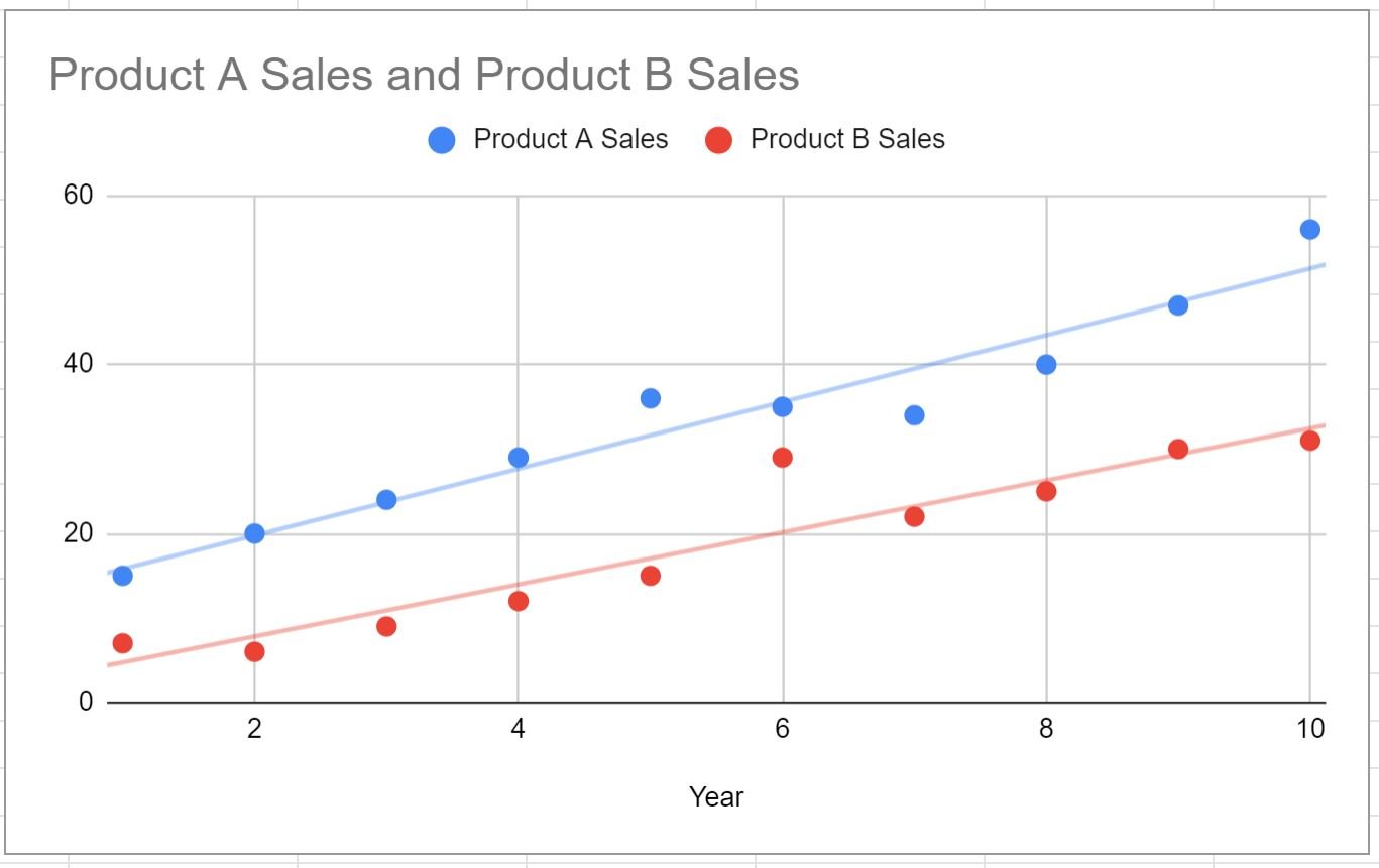
The blue dots show the sales of product A each year and the red dots show the sales of product B each year.
Step 3: Add Multiple Trendlines
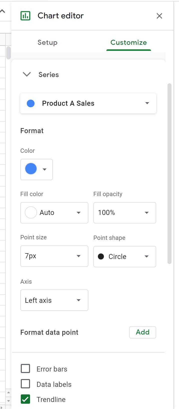
In the Chart editor panel that appears on the right side of the screen, use the following steps to add a trendline to the blue dots:
- Click the Customize tab.
- Then click the Series dropdown.
- Then choose Product A Sales from the dropdown list.
- Then check the box next to Trendline.
Repeat this process, except choose Product B Sales from the dropdown:

The trendlines for Product A Sales and Product B Sales will both be added to the chart:
Note that within the Customize tab you can also modify the color, line thickness and opacity of each trendline.
Also note that Google Sheets uses a linear trendline by default, but within the Customize tab you can also choose to use exponential, polynomial, or other trendlines.
Additional Resources
The following tutorials explain how to perform other common tasks in Google Sheets:
How to Create a Box Plot in Google Sheets
How to Create a Bubble Chart in Google Sheets
How to Create a Pie Chart in Google Sheets
How to Create a Pareto Chart in Google Sheets