A scatterplot is a type of plot that we can use to display the relationship between two variables. It helps us visualize both the direction (positive or negative) and the strength (weak, moderate, strong) of the relationship between the two variables.
This tutorial explains how to create and interpret scatterplots in SPSS.
How to Create Scatterplots in SPSS
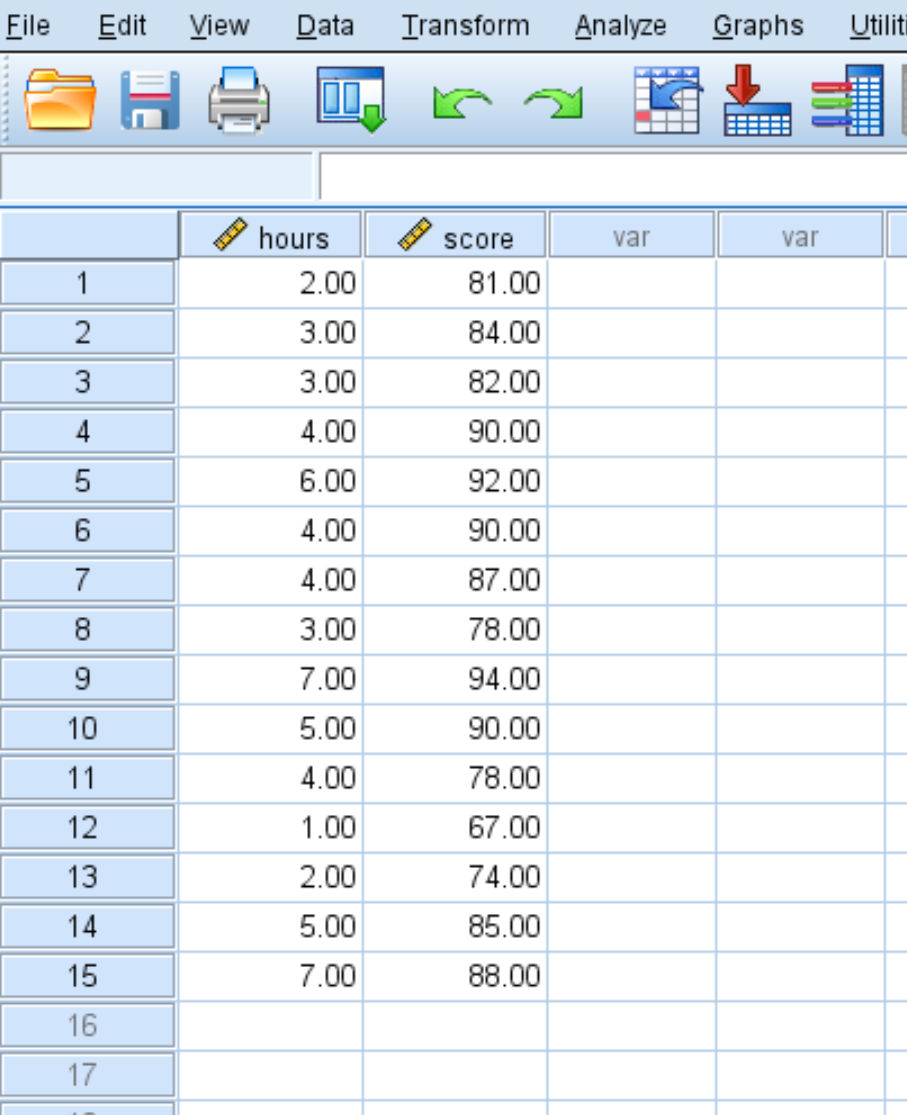
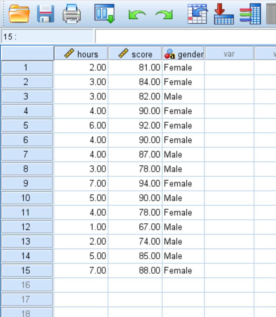
Suppose we have the following dataset that displays the hours studied and exam score received for 15 students:
We can create a scatterplot to visualize the relationship between hours studied and exam score received.
Basic Scatterplot
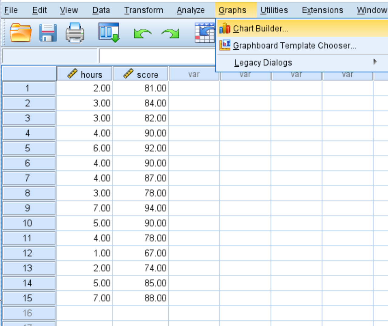
We can create a basic scatterplot in SPSS by clicking on the Graphs tab, then Chart Builder:
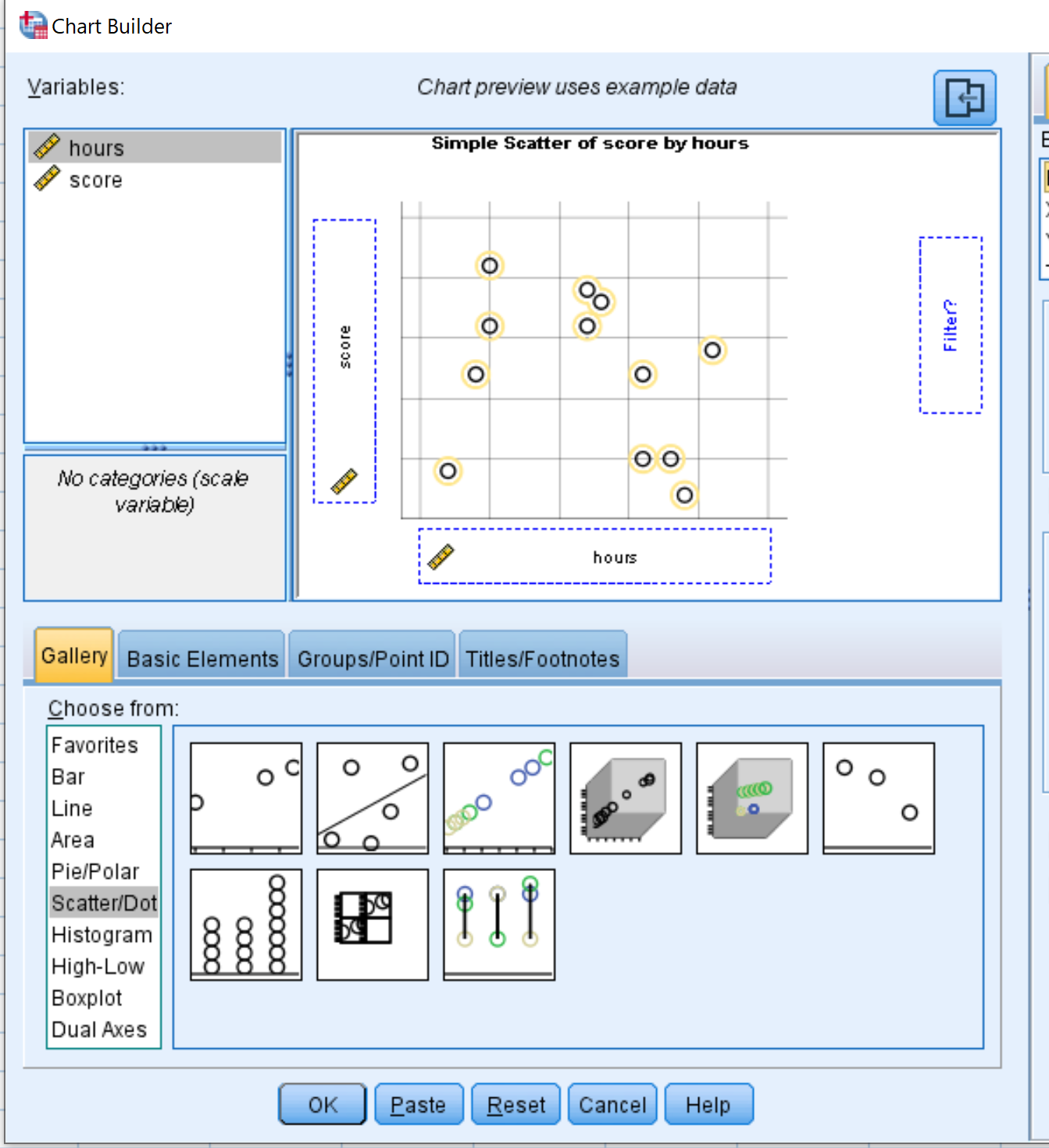
In the window that pops up, click Scatter/Dot in the Choose from: list. Then drag the first option that says Simple Scatter into the editing window. Drag the variable hours into the x-axis and score into the y-axis:
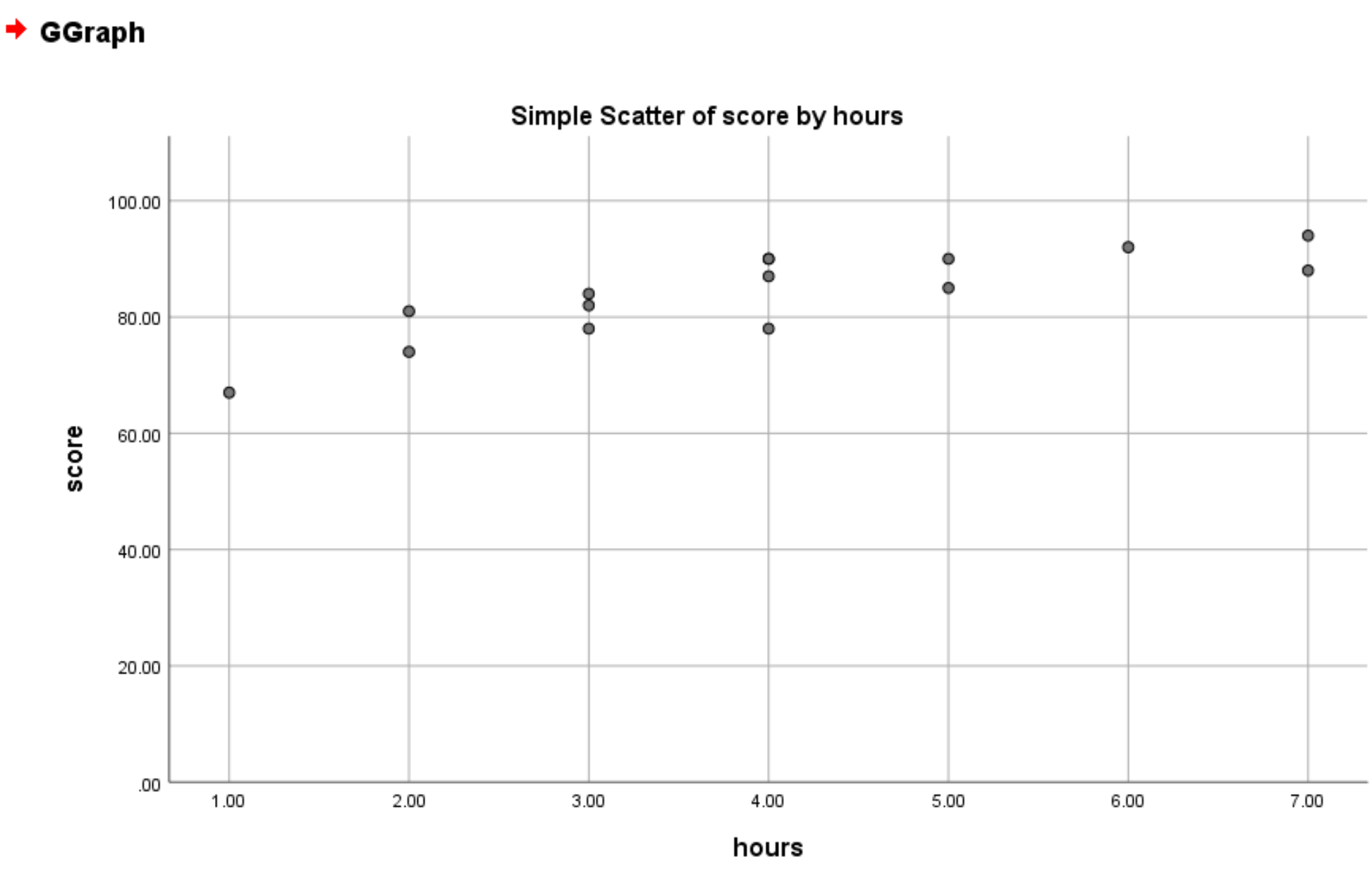
Once you click OK, the following scatterplot will appear:
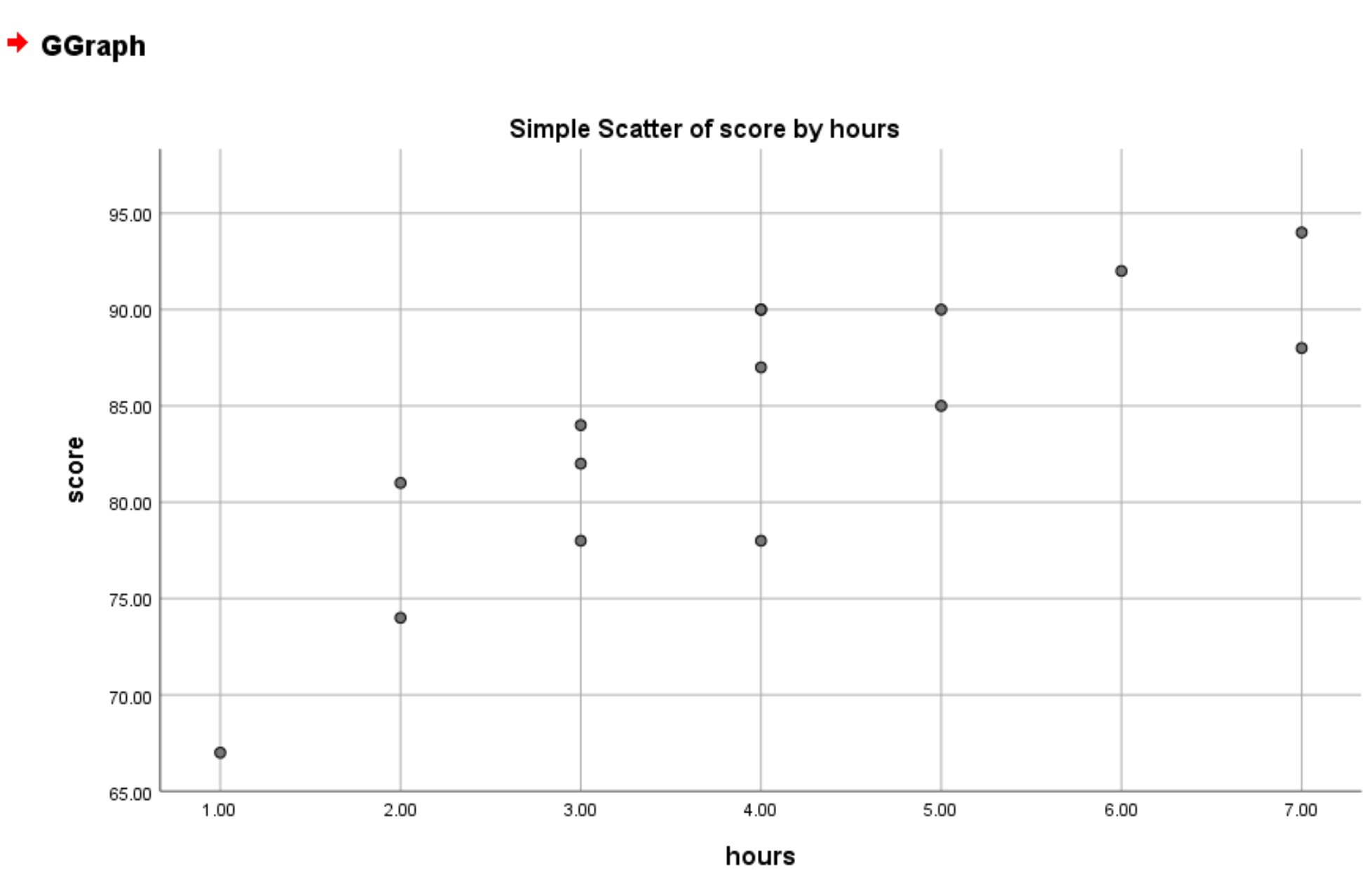
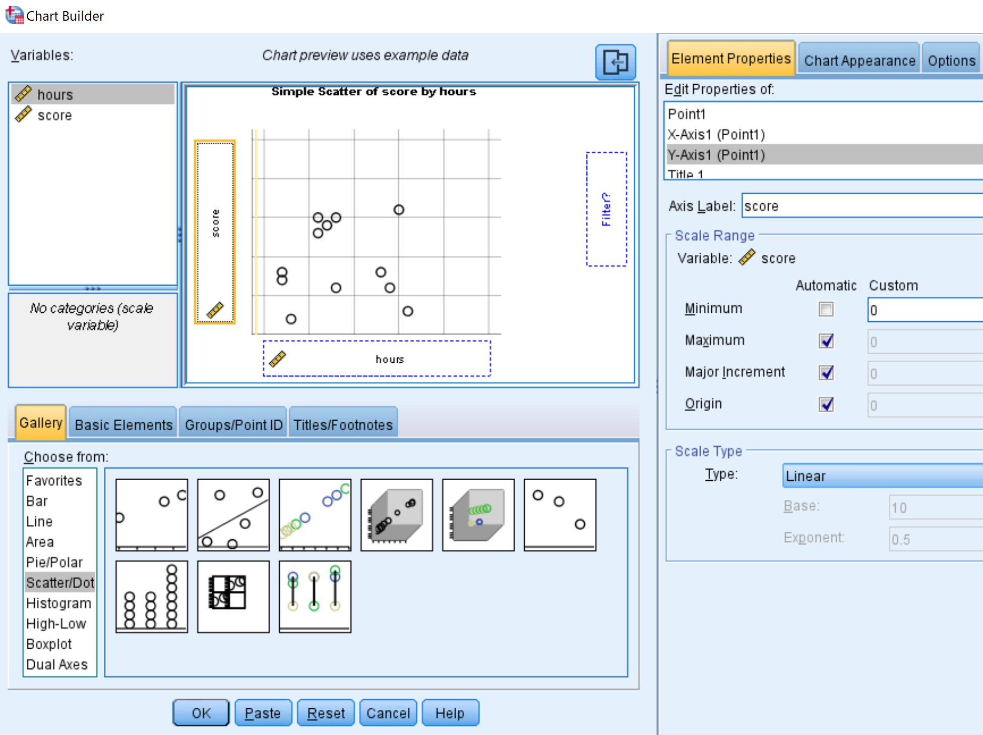
By default, SPSS chooses a minimum point for the y-axis based on the smallest value in your dataset. In this example the minimum point on the y-axis is 65. To change this to 0, click Y-Axis1 (Point1) in the Element Properties box and set the Minimum value to 0:
Once you click OK, a new scatterplot will appear with the y-axis minimum value set to 0:
Scatterplot with Regression Line
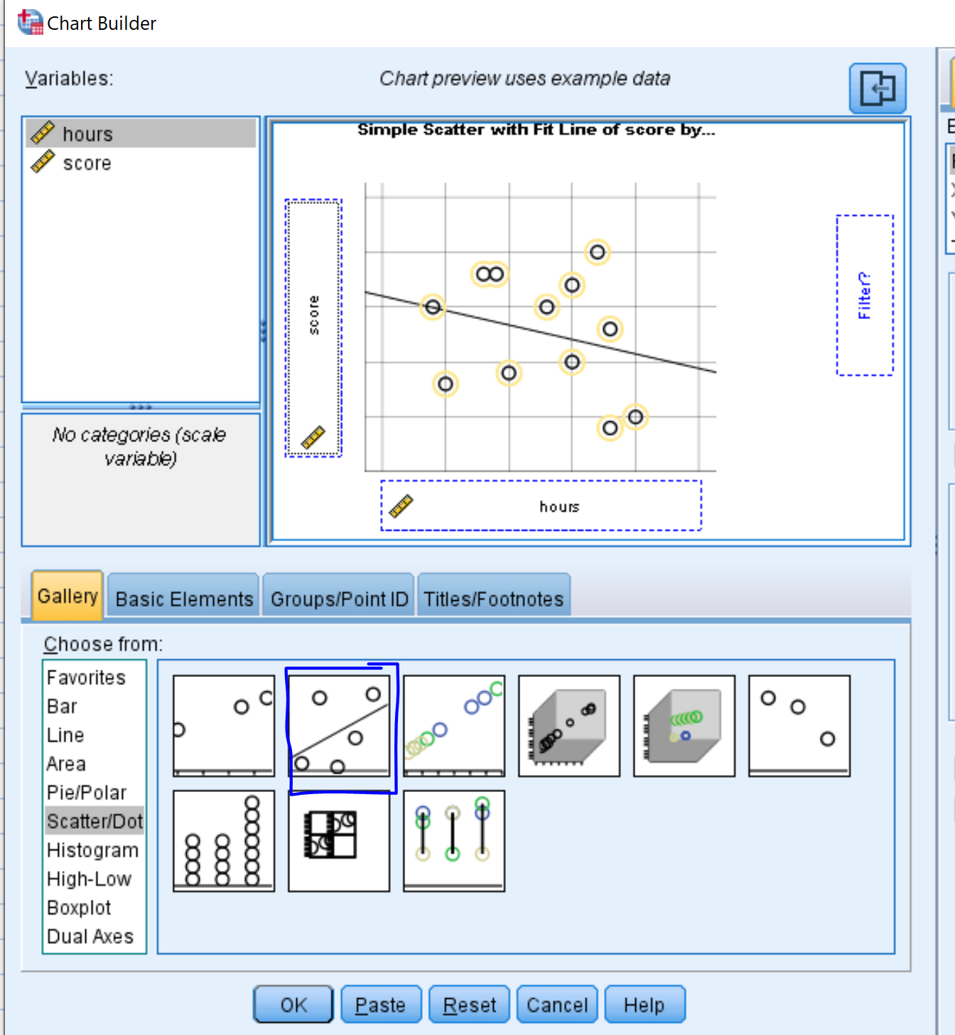
We can also produce a scatterplot with a line of best fit by selecting the option called Simple Scatter with Fit Line in the Chart Builder window:
Once we click OK, a scatterplot with a line of best fit will appear:
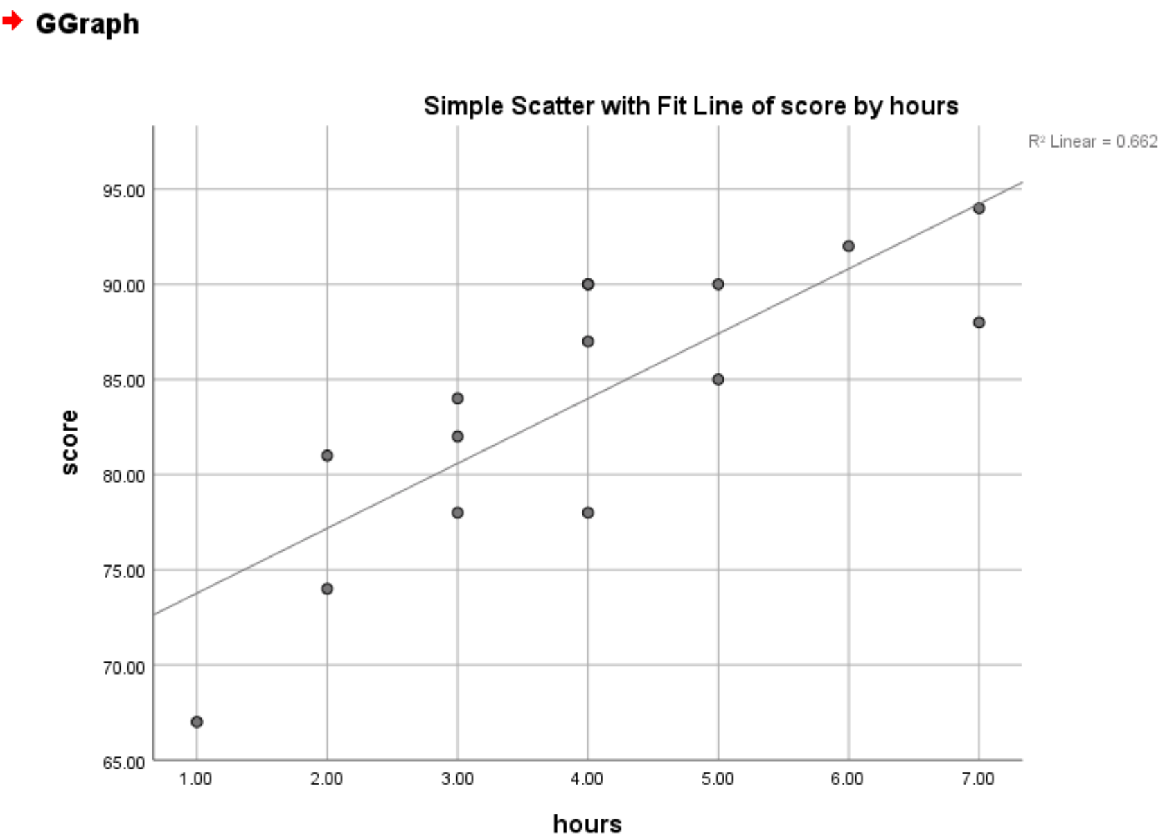
The R2 value also appears in the top right hand corner of the plot. This represents the percentage of variation in the response variable that can be explained by the predictor variable. In this case, it means 66.2% of the variation in exam scores can be explained by the number of hours spent studying.
Grouped Scatterplot
Suppose we also have a categorical variable in our dataset, such as gender:
In this case, we could create a scatterplot of hours studied vs. exam score, grouped by gender.
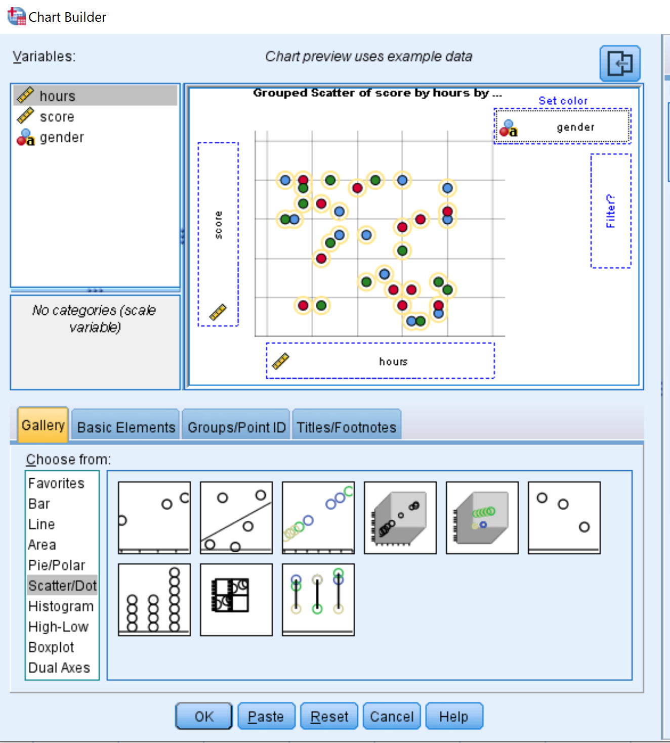
To do so, we can once again open the Chart Builder and choose Grouped Scatter as the chart type. Once again we’ll place the variable hours on the x-axis and score on the y-axis, but this time we’ll add gender as the variable under Set color:
Once we click OK, the following grouped scatterplot appears:
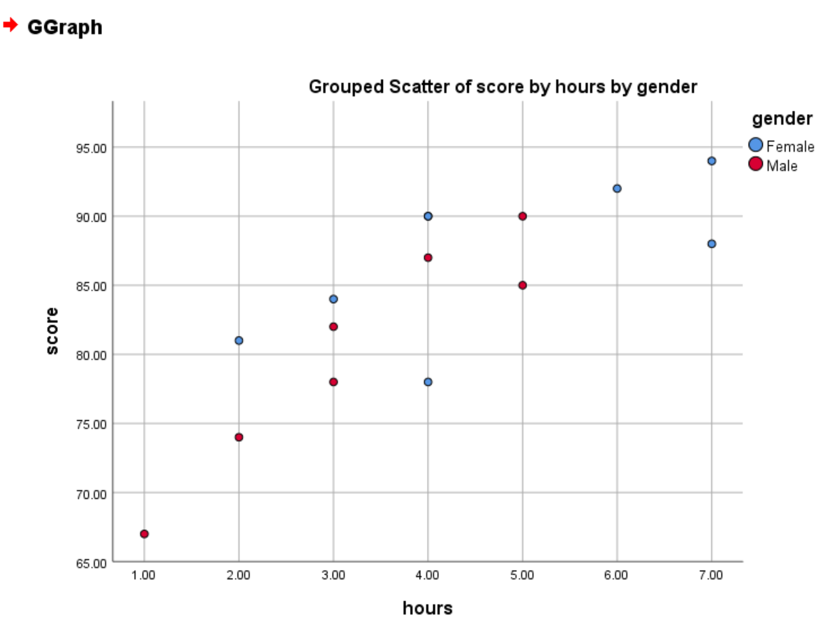
The red circles represent males and the blue circles represent females.