Often in statistics you will encounter tables that display information about frequencies. Frequencies simply tell us how many times a certain event has occurred.
For example, the following table shows how many items a particular shop sold in a week based on the price of the item:
| Item Price | Frequency |
|---|---|
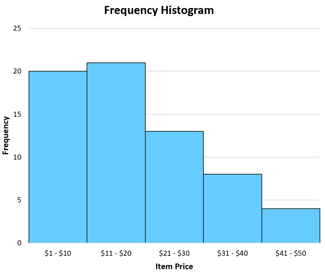
| $1 – $10 | 20 |
| $11 – $20 | 21 |
| $21 – $30 | 13 |
| $31 – $40 | 8 |
| $41 – $50 | 4 |
This type of table is known as a frequency table. In one column we have the “class” and in the other column we have the frequency of the class.
Often we use frequency histograms to visualize the values in a frequency table since it’s typically easier to gain an understanding of data when we can visualize the numbers.
A histogram lists the classes along the x-axis of a graph and uses bars to represent the frequency of each class along the y-axis. The following frequency histogram provides a visual representation of the frequency table above:
A close cousin of a frequency table is a relative frequency table, which simply lists the frequencies of each class as a percentage of the whole.
The following table shows the relative frequencies of the same dataset we saw earlier:
| Item Price | Frequency | Relative Frequency |
|---|---|---|
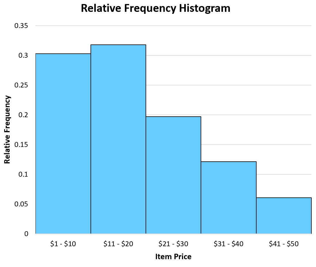
| $1 – $10 | 20 | 0.303 |
| $11 – $20 | 21 | 0.318 |
| $21 – $30 | 13 | 0.197 |
| $31 – $40 | 8 | 0.121 |
| $41 – $50 | 4 | 0.061 |
In total, there were 66 items sold. Thus, we found the relative frequency of each class by taking the frequency of each class and dividing by the total items sold.
For example, there were 20 items sold in the price range of $1 – $10. Thus, the relative frequency of the class $1 – $10 is 20 / 66 = 0.303.
Next, there were 21 items sold in the price range of $11 – $20. Thus, the relative frequency of the class $11 – $20 is 21 / 66 = 0.318.
We perform the same calculation for each class to get the relative frequencies.
Once we have the relative frequency of each class, we can then create a relative frequency histogram to visualize these relative frequencies.
Similar to a frequency histogram, this type of histogram displays the classes along the x-axis of the graph and uses bars to represent the relative frequencies of each class along the y-axis.
The only difference is the labels used on the y-axis. Instead of displaying raw frequencies, a relative frequency histogram displays percentages.
When to Use a Relative Frequency Histogram
A frequency histogram can be useful when you’re interested in raw data values. For example, a shop might have a goal to sell at least 10 items each week in the $41 – $50 range.
By creating a frequency histogram of their data, they can easily see that they’re not meeting their goal of selling 10 items per week in this price range:
Conversely, a relative frequency histogram is useful when you’re interested in percentage values. For example, a shop might have a goal of selling 5% of their total items in the $41 – $50 price range.
By creating a relative frequency histogram of their data, they can see that they are meeting this goal:
Note that a frequency histogram and a relative frequency histogram will both look the exact same. The only difference is the values displayed on the y-axis.
Additional Resources
The following tutorials explain how to create relative frequency histograms in different statistical software:
How to Create a Relative Frequency Histogram in R
How to Create a Relative Frequency Histogram in Python