A histogram is a type of chart that uses rectangular bars to represent frequencies. It’s a helpful chart for visualizing the distribution of values in a dataset.
This tutorial explains how to create and modify histograms in SPSS.
Example: Histograms in SPSS
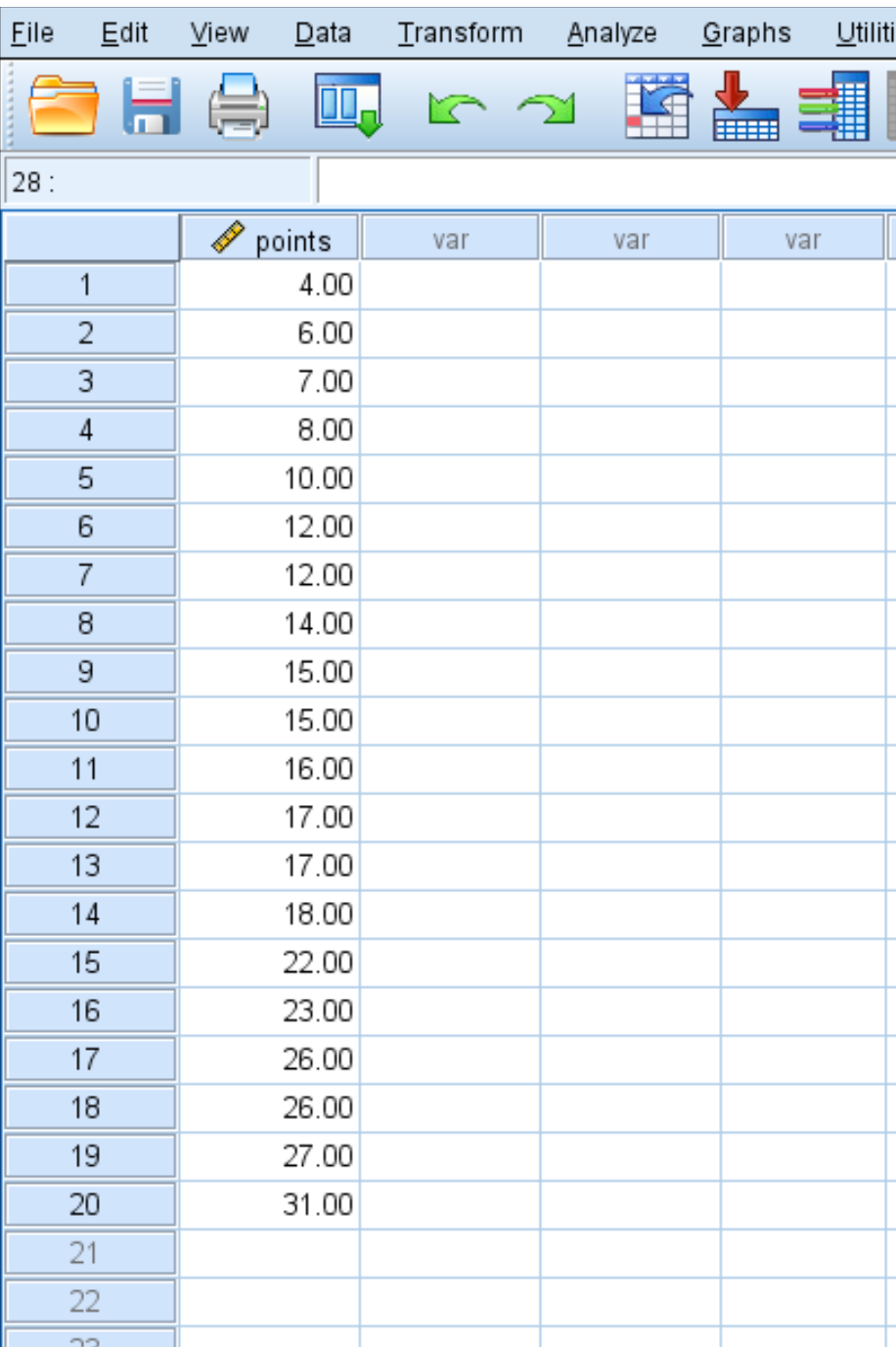
Suppose we have the following dataset that shows the average number of points scored per game by 20 different basketball players:
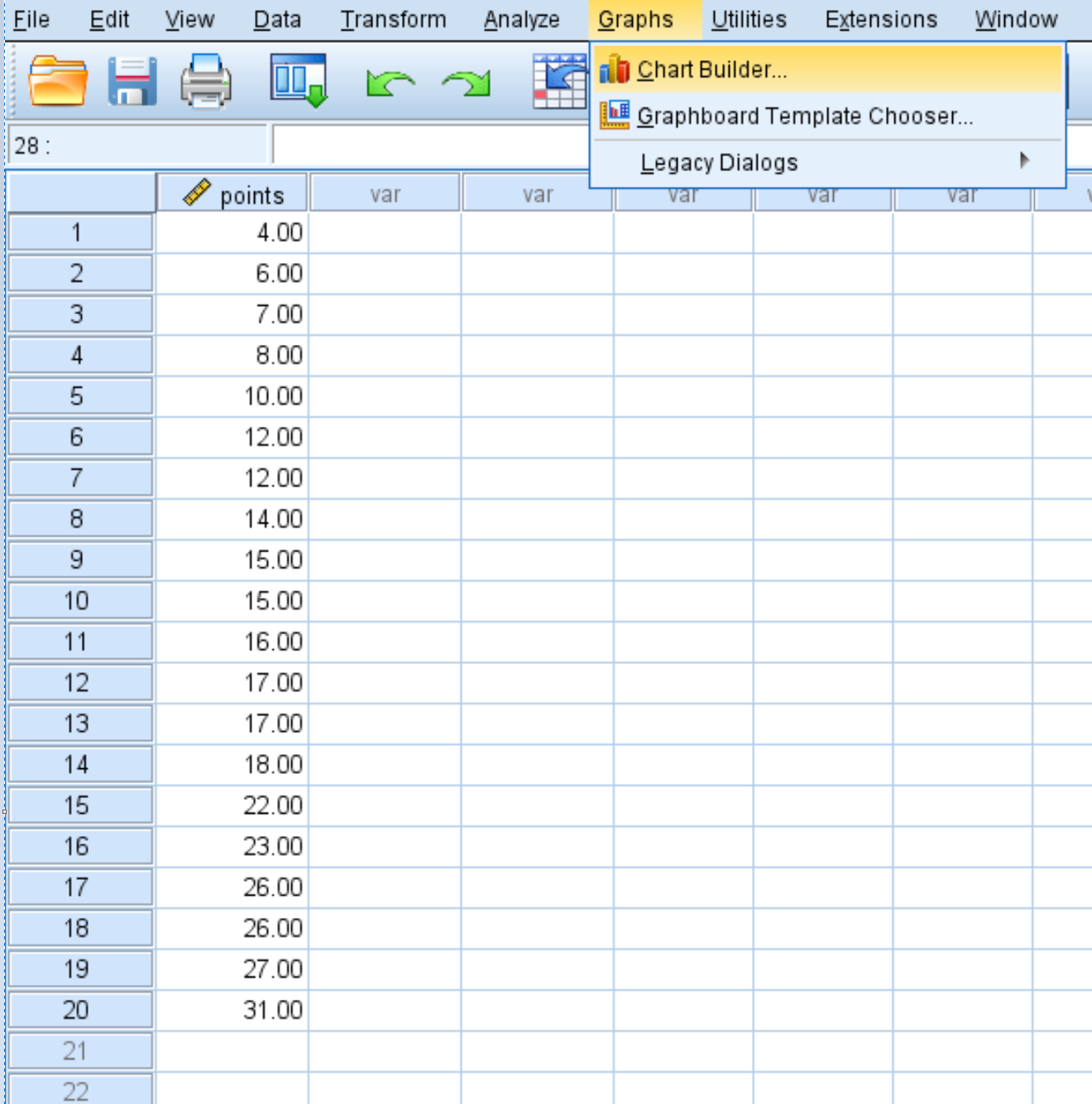
To create a histogram for this dataset, we can click on the Graphs tab, then Chart Builder.
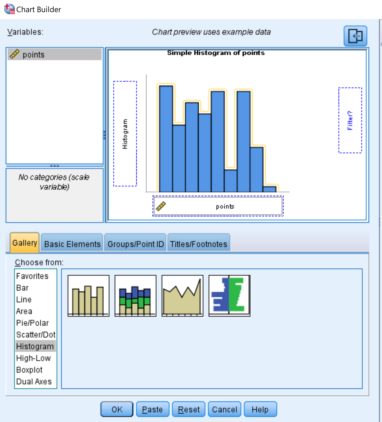
In the window that pops up, select Histogram in the Choose from list and drag it into the editing window. Then drag the variable points into the x-axis:
Once you click OK, the following histogram will appear:
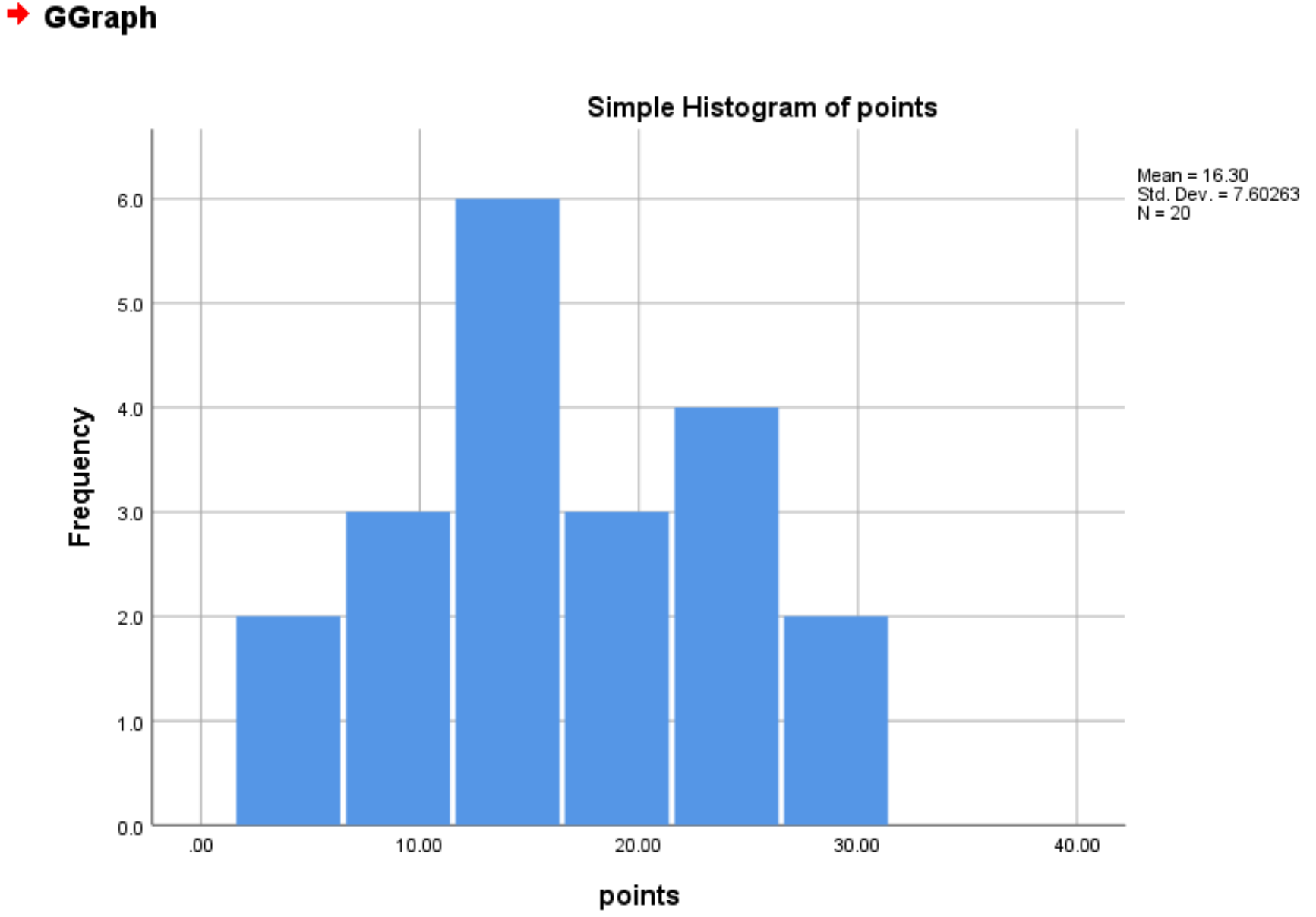
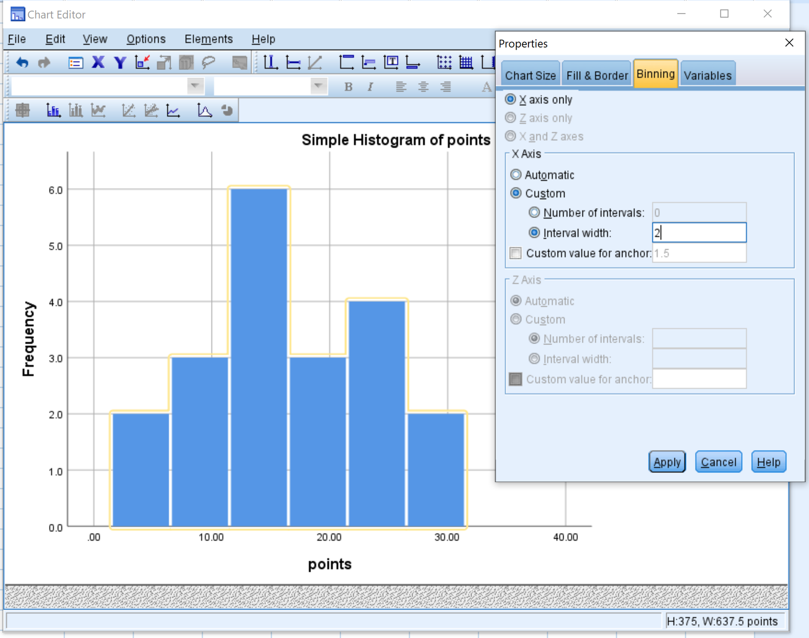
By default, SPSS chooses an interval width to use for the bars in the graph. However, you can change this width by right clicking on any of the bars in the graph and then clicking Edit Content > In Separate Window.
In the new window that pops up, double click on any of the bars to bring up a Properties window. You can then choose the exact interval width you’d like to use. For example, we could use a width of 2:
Once we click Apply, the histogram will be updated with a new interval width of 2:
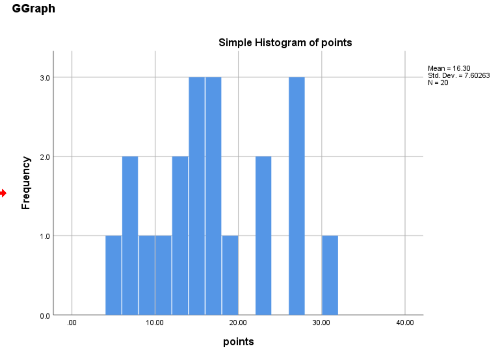
Note that the smaller the interval width, the more bars will appear in the histogram. The larger the interval width, the fewer bars will appear in the histogram.