Often you may want to create a scatter plot in Google Sheets with each of the points in the plot connected by lines.
Unfortunately Google Sheets doesn’t offer this type of built-in chart, but you can create it using a line chart as a workaround.
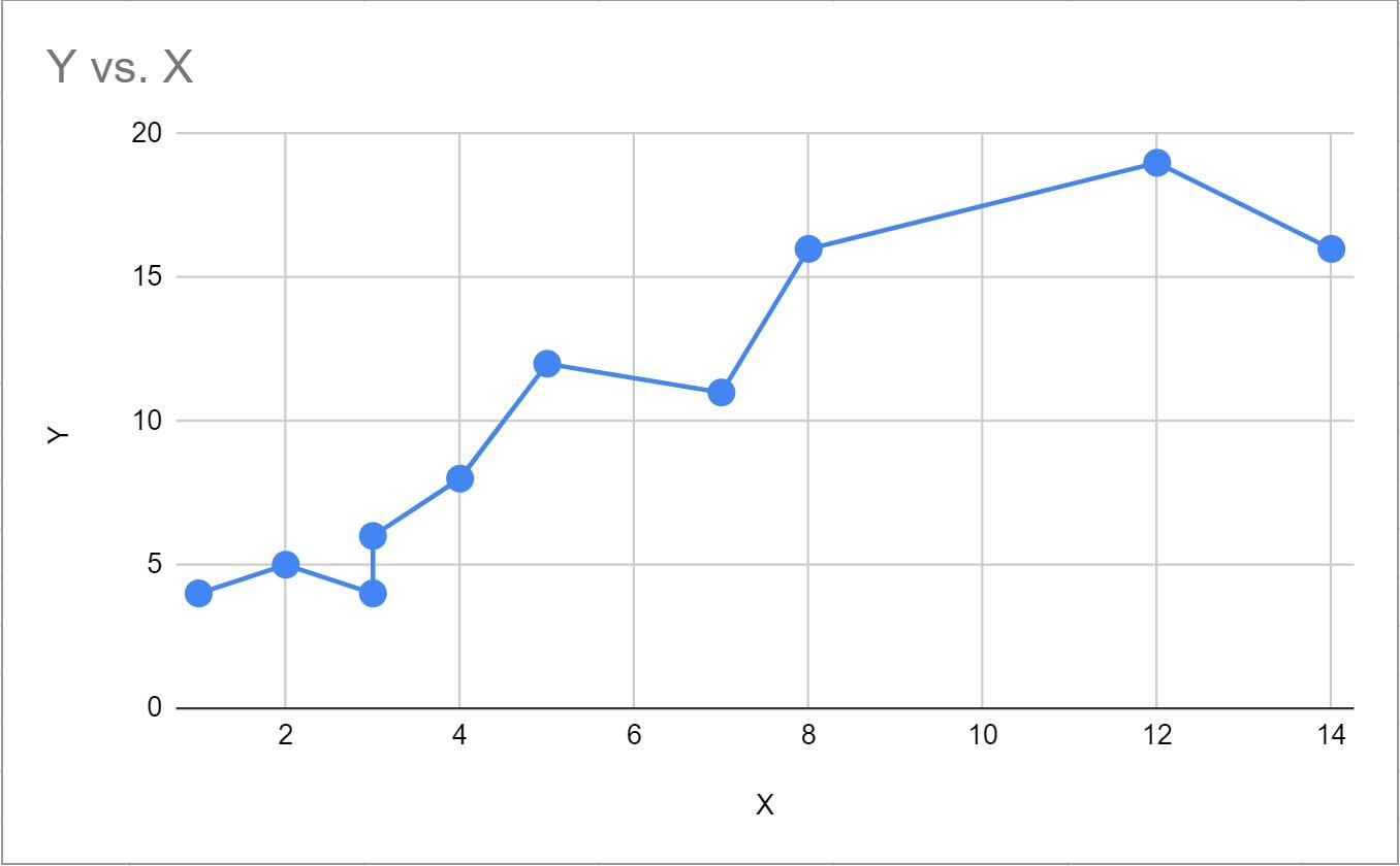
This tutorial provides a step-by-step example of how to create the following scatter plot with lines in Google Sheets:
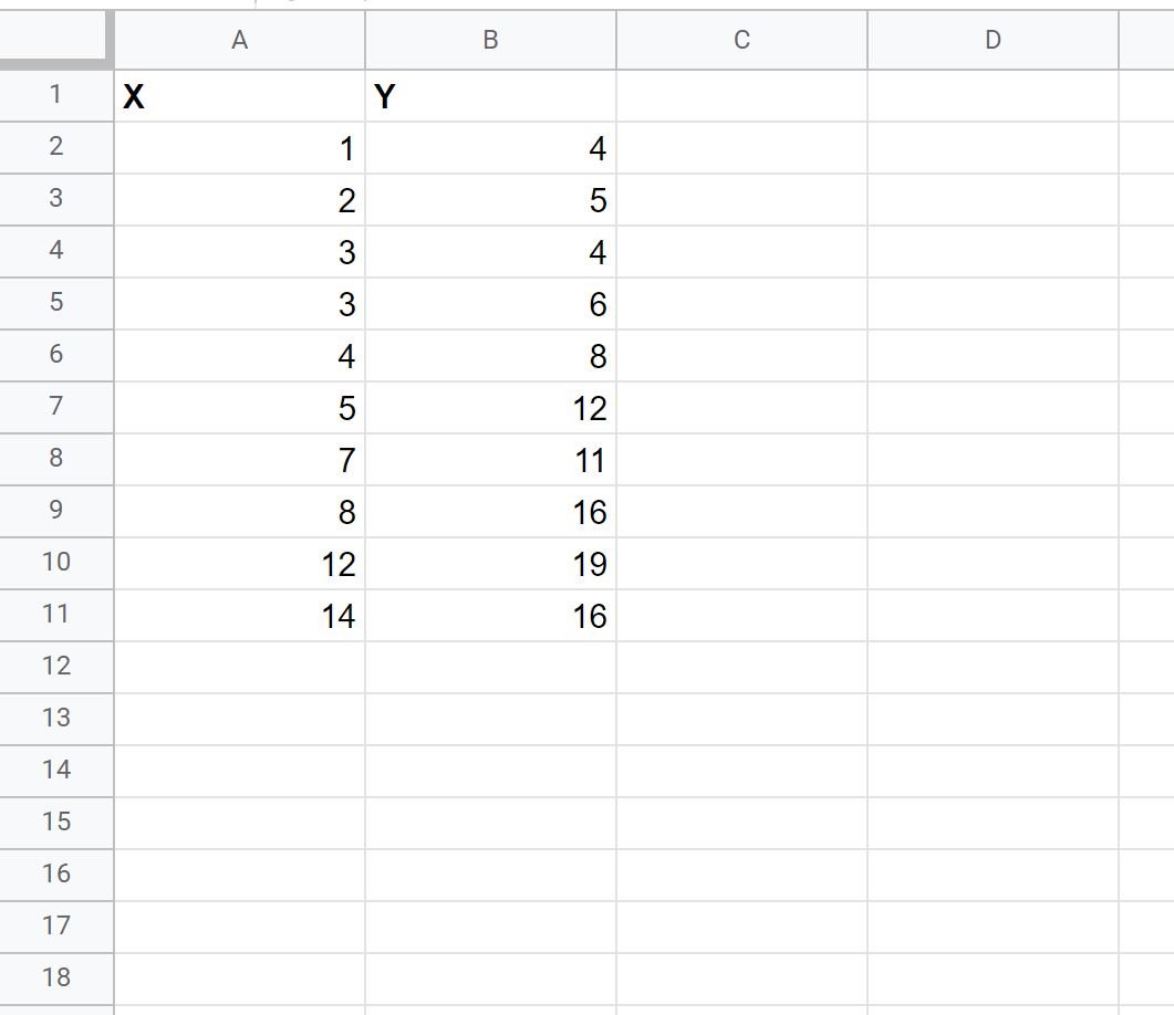
Step 1: Create the Data
First, let’s create a dataset that contains the following values:
Step 2: Create a Line Chart
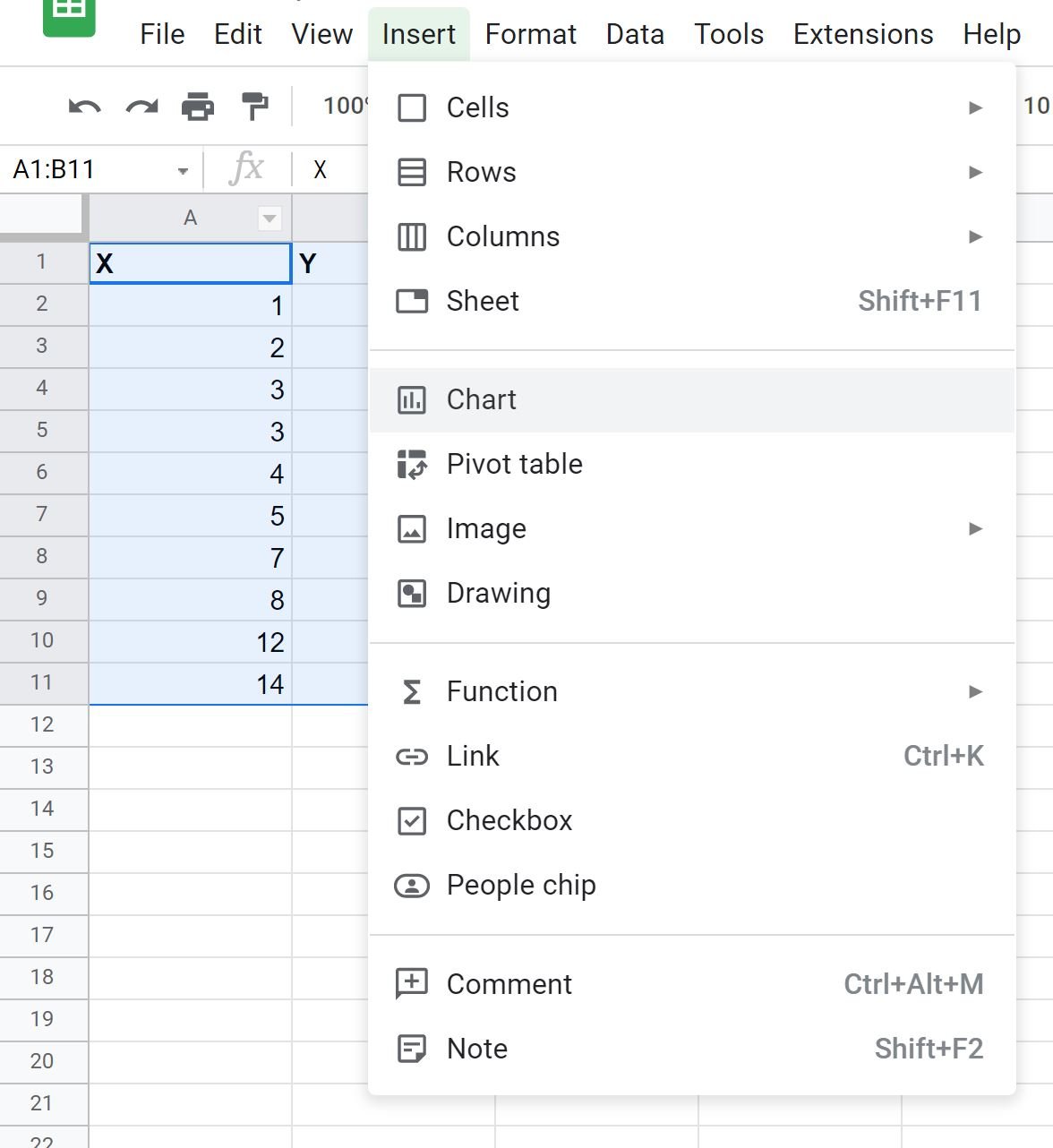
Next, highlight the values in the range A1:11, then click Insert, then click Chart:
The following scatter plot will be inserted by default:

To convert this into a line chart, simply click Chart type in the Chart editor that appears on the right of the screen.
Then scroll down and click Line chart.

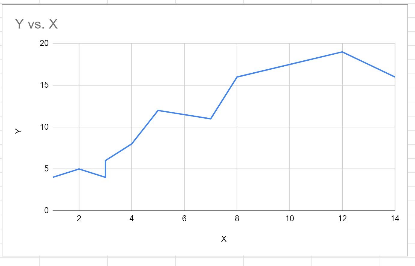
This will automatically produce the following line chart:
Step 3: Add Points to the Line Chart
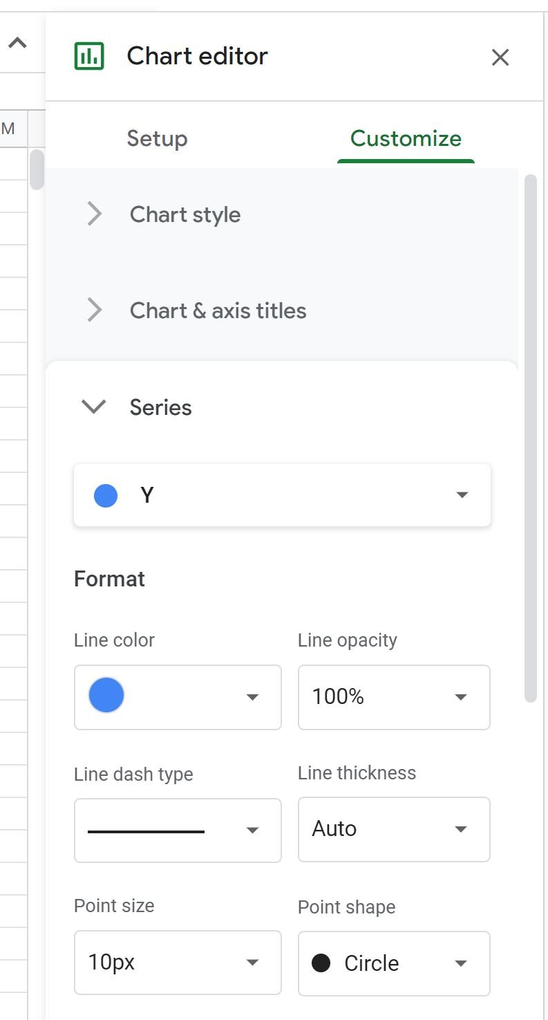
To add points to the line chart, click the Customize tab in the Chart editor panel.
Then click the dropdown arrow next to Series, then choose 10px as the Point size:
Points will automatically be added to the line chart:
The chart now resembles a scatter plot with each point in the plot connected by a line.
Feel free to play around with the Format options in the Chart editor panel to modify the color and size of the points and lines in the chart.
Additional Resources
The following tutorials explain how to create other common visualizations in Google Sheets:
How to Make a Box Plot in Google Sheets
How to Create a Pareto Chart in Google Sheets
How to Create an Area Chart in Google Sheets