A histogram is a type of chart that helps us visualize the frequency of values in a dataset.
A symmetric histogram is a type of histogram that has perfectly identical halves if we were to draw a line down the center of it.
There are two common types of symmetric histograms:
- Unimodal symmetric histogram: A histogram with one peak
- Bimodal symmetric histogram: A histogram with two peaks
The following examples show what each of these histograms looks like.
Example 1: Unimodal Symmetric Histogram
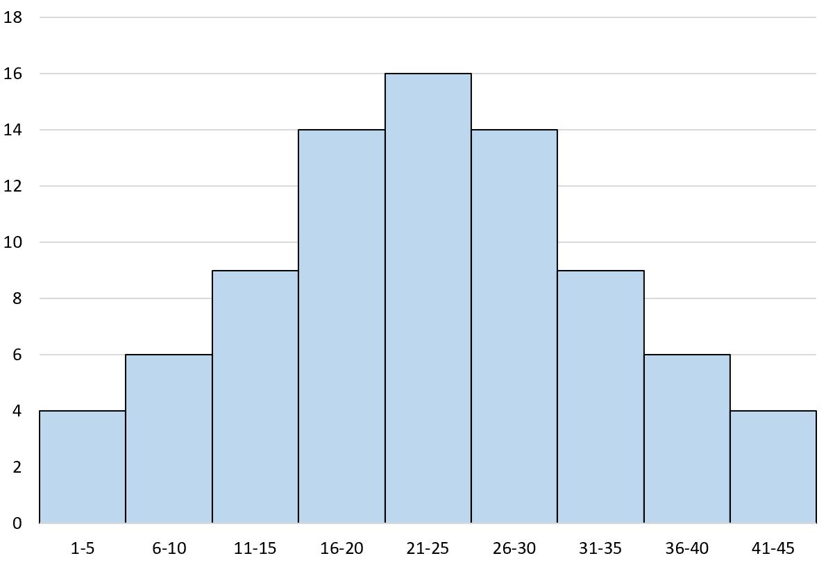
The following histogram is an example of a unimodal symmetric histogram:
If we were to draw a line down the center of the histogram, both the left and right sides would look the exact same:
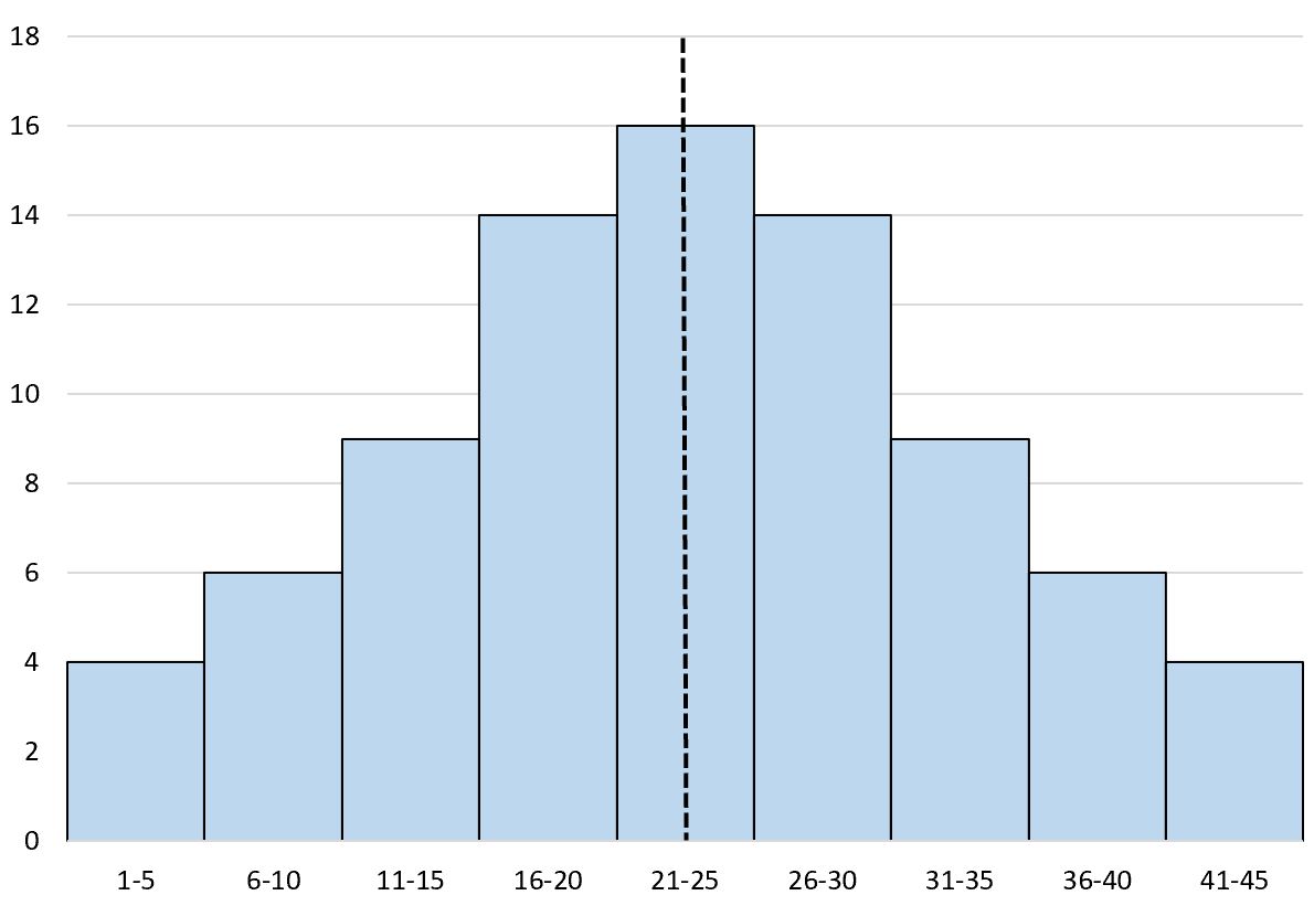
We refer to this as a unimodal symmetric histogram because “uni” means “one” and this histogram only has one peak directly in the middle.
Example 2: Bimodal Symmetric Histogram
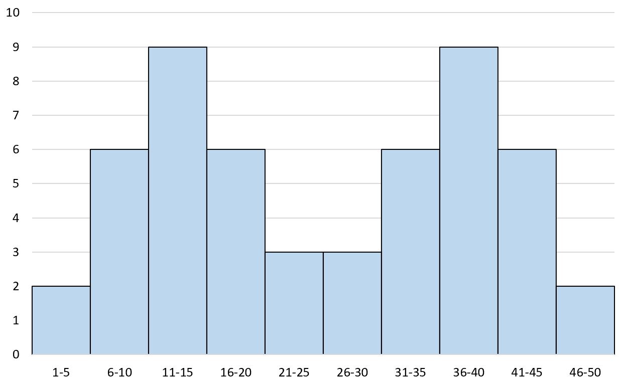
The following histogram is an example of a bimodal symmetric histogram:
If we were to draw a line down the center of the histogram, both the left and right sides would look the exact same:
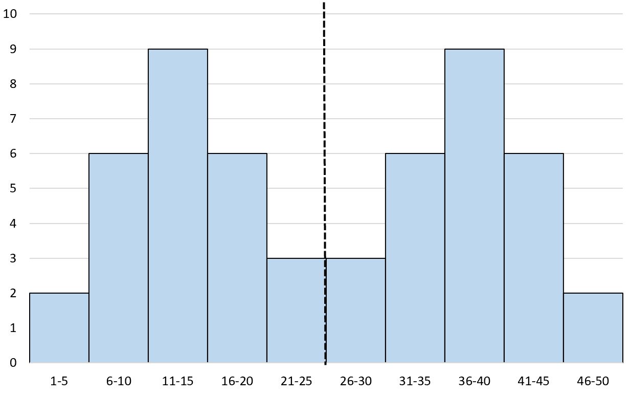
We refer to this as a bimodal symmetric histogram because “bi” means “two” and this histogram has two peaks.
Related: An Introduction to Bimodal Distributions
What is a Roughly Symmetric Histogram?
In the real world, there are rarely perfectly symmetrical histograms but there are often roughly symmetrical histograms.
These are histograms that are “roughly” symmetrical, meaning the two sides look roughly the same if you draw a line down the center of the histogram.
One example of this would be the distribution of the weights of newborn babies.
It’s well known that newborn weights follow a unimodal distribution with an average around 7.5 lbs.
If we create a histogram of baby weights, we’ll see a “peak” at 7.5 lbs with some babies weighing more and some weighing less:
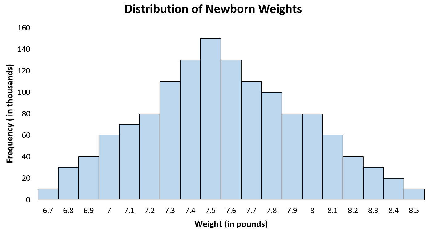
This is a roughly symmetrical histogram. If we drew a vertical line down the center, each side would look roughly the same.
Another real-world example is the distribution of ACT scores for high school students in the U.S.
The average score is about 21 with some students scoring less and some scoring higher. If we create a histogram of ACT scores for all students in the U.S. we’ll see a single “peak” at 21 with some students scoring higher and some scoring lower:
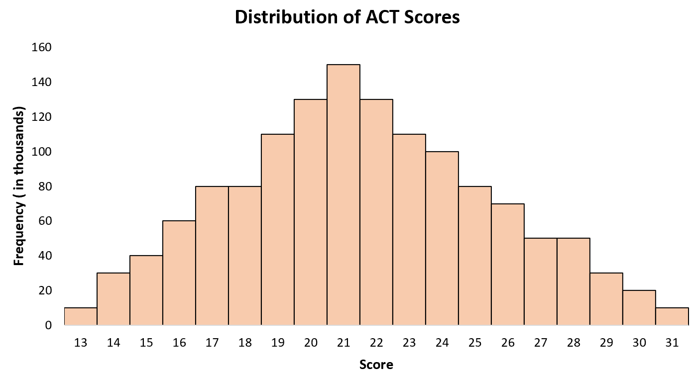
This is also a roughly symmetrical histogram. If we drew a vertical line down the center, each side would look roughly the same.
When working with real-world datasets, you’ll rarely encounter perfectly symmetrical histograms but you will often encounter roughly symmetrical histograms.
Additional Resources
The following tutorials provide additional information about histograms:
How to Describe the Shape of Histograms
How to Compare Histograms
How to Estimate the Mean and Median of Any Histogram