Principal components analysis (PCA) is an unsupervised machine learning technique that finds principal components (linear combinations of the predictor variables) that explain a large portion of the variation in a dataset.
When we perform PCA, we’re interested in understanding what percentage of the total variation in the dataset can be explained by each principal component.
One of the easiest ways to visualize the percentage of variation explained by each principal component is to create a scree plot.
This tutorial provides a step-by-step example of how to create a scree plot in Python.
Step 1: Load the Dataset
For this example we’ll use a dataset called USArrests, which contains data on the number of arrests per 100,000 residents in each U.S. state in 1973 for various crimes.
The following code shows how to import this dataset and prep it for principal components analysis:
import pandas as pd
from sklearn.preprocessing import StandardScaler

#define URL where dataset is located
url = "https://raw.githubusercontent.com/JWarmenhoven/ISLR-python/master/Notebooks/Data/USArrests.csv"

#read in data
data = pd.read_csv(url)

#define columns to use for PCA
df = data.iloc[:, 1:5]

#define scaler
scaler = StandardScaler()

#create copy of DataFrame
scaled_df=df.copy()

#created scaled version of DataFrame
scaled_df=pd.DataFrame(scaler.fit_transform(scaled_df), columns=scaled_df.columns)
Step 2: Perform PCA
Next, we’ll use the PCA() function from the sklearn package perform principal components analysis.
from sklearn.decomposition import PCA

#define PCA model to use
pca = PCA(n_components=4)

#fit PCA model to data
pca_fit = pca.fit(scaled_df)
Step 3: Create the Scree Plot
Lastly, we’ll calculate the percentage of total variance explained by each principal component and use matplotlib to create a scree plot:
import matplotlib.pyplot as plt
import numpy as np

PC_values = np.arange(pca.n_components_) + 1
plt.plot(PC_values, pca.explained_variance_ratio_, 'o-', linewidth=2, color='blue')
plt.title('Scree Plot')
plt.xlabel('Principal Component')
plt.ylabel('Variance Explained')
plt.show()
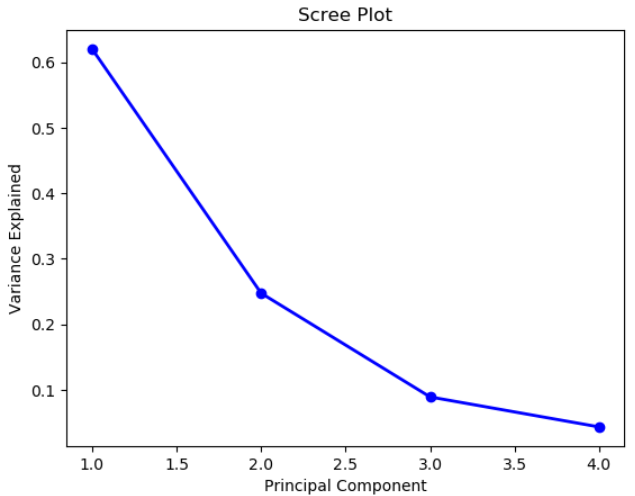
The x-axis displays the principal component and the y-axis displays the percentage of total variance explained by each individual principal component.
We can also use the following code to display the exact percentage of total variance explained by each principal component:
print(pca.explained_variance_ratio_)

[0.62006039 0.24744129 0.0891408  0.04335752]
We can see:
- The first principal component explains 62.01% of the total variation in the dataset.
- The second principal component explains 24.74% of the total variation.
- The third principal component explains 8.91% of the total variation.
- The fourth principal component explains 4.34% of the total variation.
Note that the percentages sum to 100%.
You can find more machine learning tutorials on this page.