Often you may want to create a chart in Google Sheets that uses multiple ranges of data.
Fortunately this is easy to do and the following step-by-step example shows how to do so.
Step 1: Enter the Data
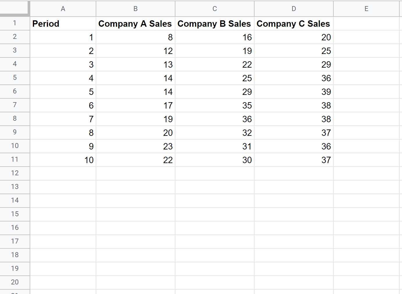
First, let’s enter some data in the following format that shows the total sales for three different companies during 10 consecutive sales periods:
Step 2: Create the Chart
To create a line chart with multiple lines, we can first highlight all of the cells in the range A1:D11, then click Insert and then click Chart:

By default, Google Charts will insert a line chart with multiple lines:
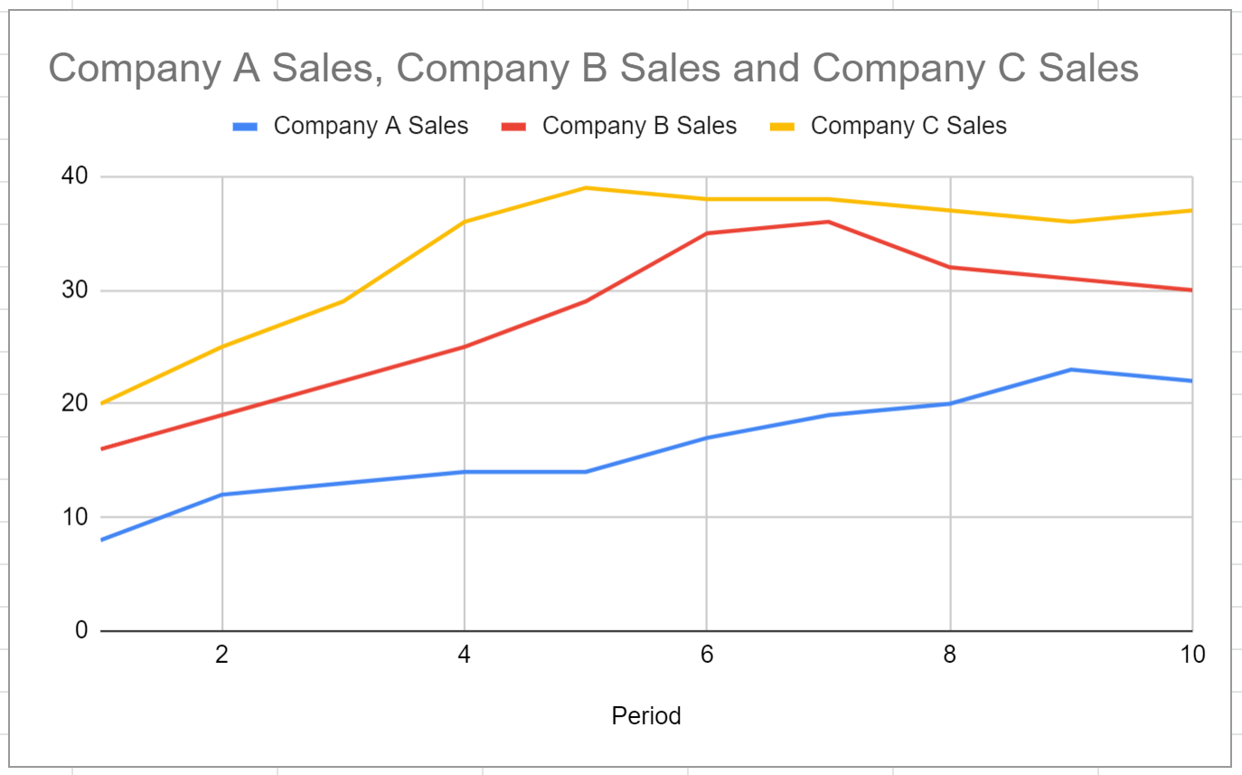
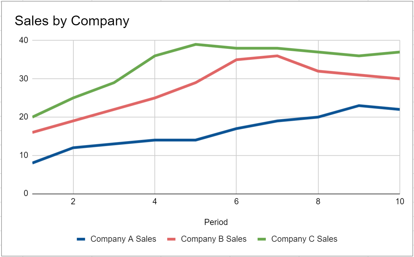
Each line represents the sales for each of the three companies during the 10 sales periods.
Step 3: Customize the Chart
To customize the appearance of the chart, click anywhere on the chart and then click the three vertical dots in the top right corner, then click Edit chart:

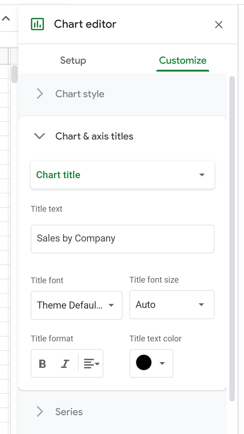
In the Chart editor panel that appears on the right side of the screen, click the Customize tab and then click Chart & axis titles.
Then type in whatever title you’d like in the box called Title text:
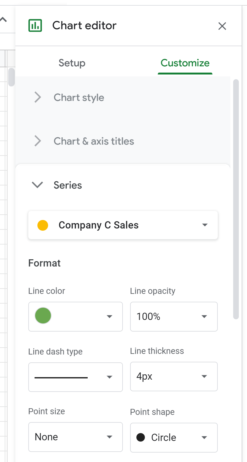
Next, click Series and feel free to change the color, line type, and line thickness of each individual line:
Next, click Legend and change the Position to wherever you’d like:

Here’s what our final chart looks like:
Additional Resources
The following tutorials explain how to create other common visualizations in Google Sheets:
How to Create a Box Plot in Google Sheets
How to Create a Pie Chart in Google Sheets
How to Create a Bubble Chart in Google Sheets
How to Create a Pareto Chart in Google Sheets