You can use the bins argument to specify the number of bins to use in a histogram in ggplot2:
library(ggplot2)

ggplot(df, aes(x=x)) +
  geom_histogram(bins=10)
The following examples show how to use this argument in practice.
Example: Set Number of Bins for Histogram in ggplot2
The following code shows how to create a dataset in R that contains 10,000 random values that follow a Poisson distribution with a mean value of 2:
#make this example reproducible
set.seed(0)

#create data frame with 10,000 random values that follow Poisson distribution
df frame(values=rpois(n=10000, lambda=2))

#view first five rows of data frame
head(df)

  values
1      4
2      1
3      1
4      2
5      4
6      1
We can use the following code to create a histogram in ggplot2 to visualize the distribution of values in the data frame:
library(ggplot2)

ggplot(df, aes(x=values)) +
  geom_histogram(fill='steelblue', col='black')
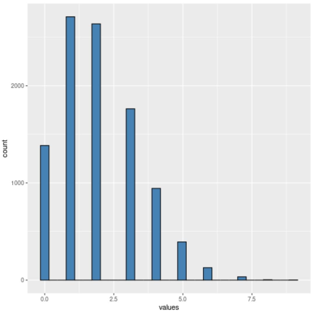
By default, ggplot2 will automatically pick a certain number of bins to use in the histogram.
However, we can use the following syntax to specify that we want the histogram to use 10 bins:
library(ggplot2)

ggplot(df, aes(x=values)) +
  geom_histogram(fill='steelblue', col='black', bins=10)

Notice that the histogram now has exactly 10 bins.
Or we could use the following syntax to specify that we want the histogram to use 5 bins:
library(ggplot2)

ggplot(df, aes(x=values)) +
  geom_histogram(fill='steelblue', col='black', bins=5)
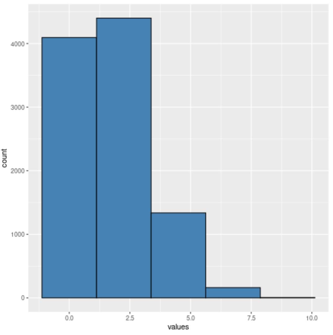
Notice that the histogram now has exactly 5 bins.
You’ll find that the fewer bins you use, the wider each bin will be.
In general, if you use too few bins then the true underlying distribution of values will be hidden.
However, if you use too many bins then you may just be visualizing the noise in the data.
One way to find the optimal number of bins to use in a histogram is by using Sturges’ Rule. Read more about that rule here.
Note: You can find the complete documentation for the geom_histogram function here.
Additional Resources
The following tutorials explain how to create other common charts in R:
How to Create a Relative Frequency Histogram in R
How to Plot Multiple Boxplots in One Chart in R
How to Plot Multiple Lines in One Chart in R