A line of best fit is a line that best “fits” the trend in a given dataset.
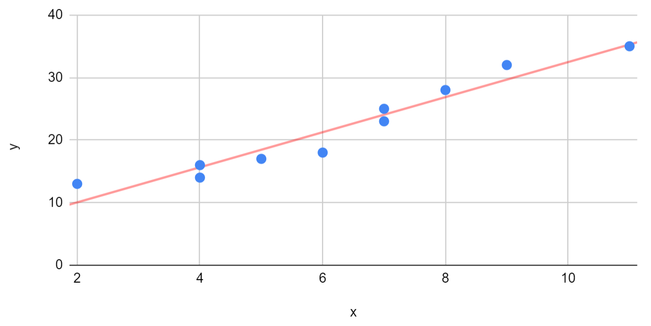
This tutorial provides a step-by-step example of how to create a line of best fit in Google Sheets.
Step 1: Create the Dataset
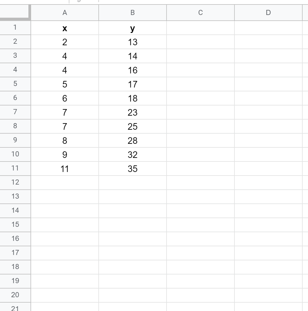
First, let’s create a fake dataset to work with:
Step 2: Create a Scatterplot
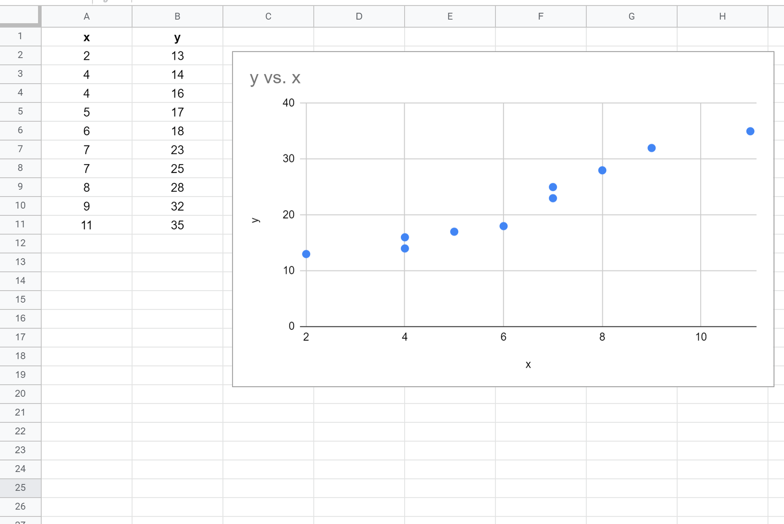
Next, we’ll create a scatterplot to visualize the data.
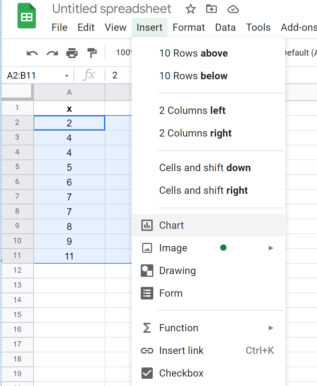
First, highlight cells A2:B11 as follows:

Next, click the Insert tab and then click Chart from the dropdown menu:
Google Sheets will automatically insert a scatterplot:
Step 3: Add the Line of Best Fit
Next, double click anywhere on the scatterplot to bring up the Chart Editor window on the right:
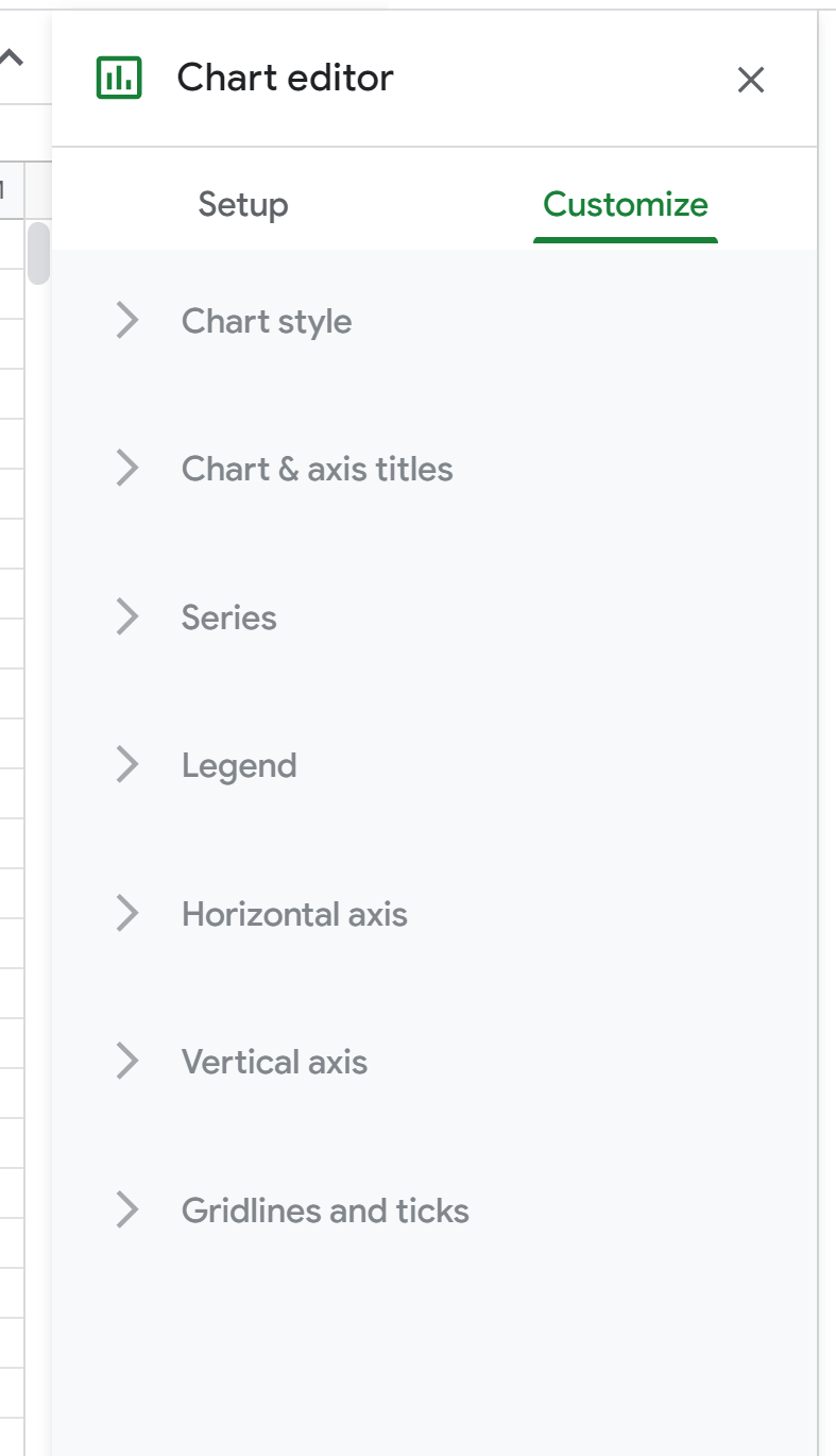
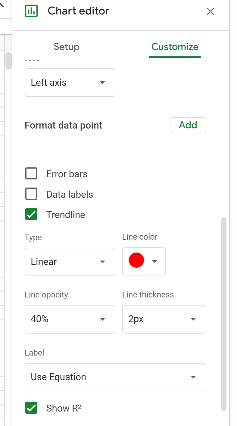
Next, click Series. Then, scroll down and check the box next to Trendline and change the line color to whatever you’d like. We’ll choose Red. For Label, choose Use Equation and then check the box next to Show R2.
The following trendline will automatically be added to the chart:
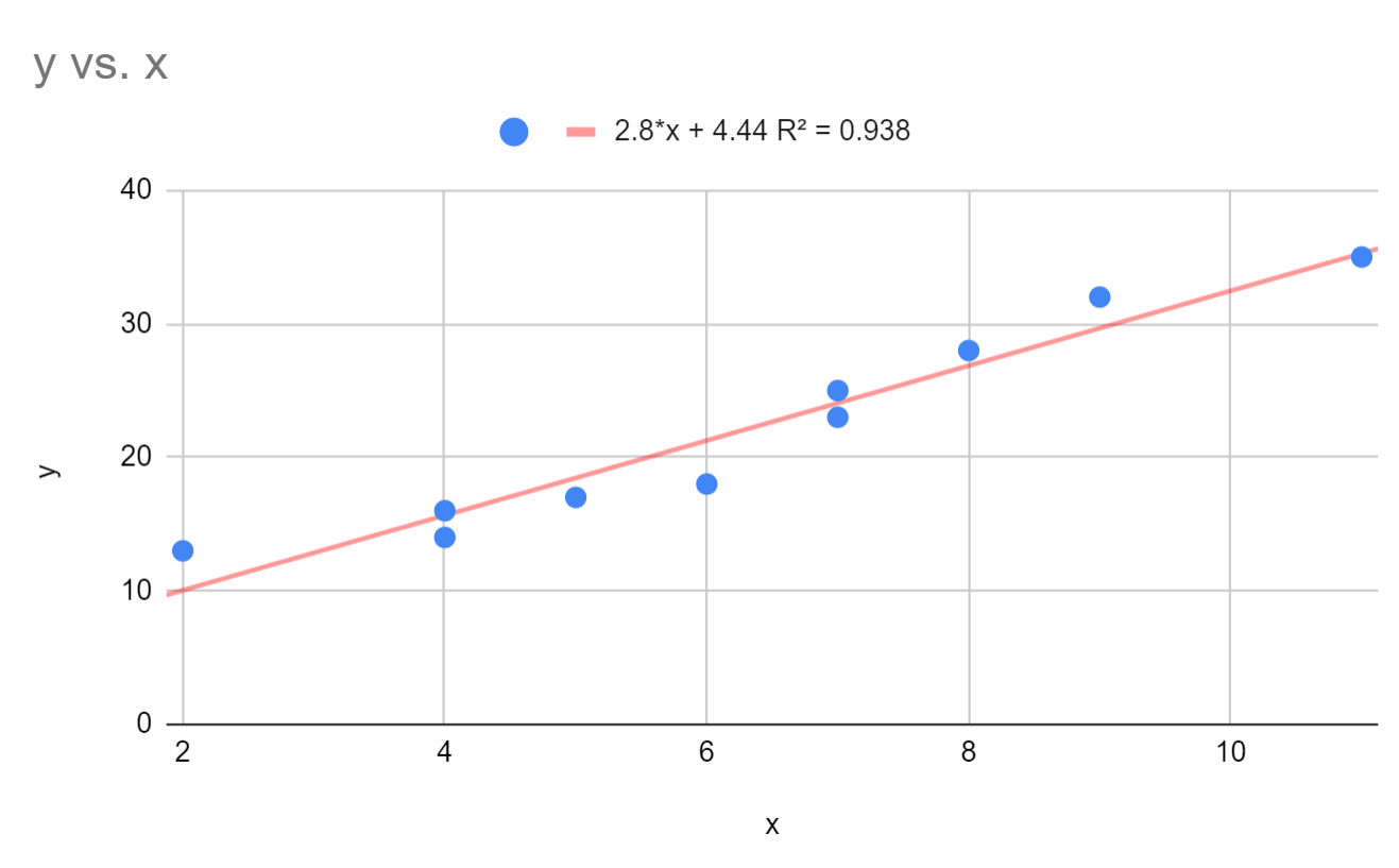
We can see that the line of best fit seems to capture the trend in the data quite well.
Above the scatterplot, we see that the equation for this line of best fit is as follows:
y = 2.8*x + 4.44
The R-squared for this line turns out to be .938. This indicates that 93.8% of the variation in the response variable, y, can be explained by the predictor variable, x.
We can also use the equation for the line of best fit to find the estimated value of y based on the value of x. For example, if x = 3 then y is estimated to be 12.84:
y = 2.8*(3) + 4.44 = 12.84
Additional Resources
How to Perform Linear Regression in Google Sheets
How to Perform Polynomial Regression in Google Sheets