A simple linear regression line represents the line that best “fits” a dataset.
This tutorial provides a step-by-step example of how to quickly add a simple linear regression line to a scatterplot in Excel.
Step 1: Create the Data
First, let’s create a simple dataset to work with:

Step 2: Create a Scatterplot
Next, highlight the cell range A2:B21. On the top ribbon, click the INSERT tab, then click INSERT Scatter (X, Y) or Bubble Chart in the Charts group and click the first option to create a scatterplot:

The following scatterplot will appear:

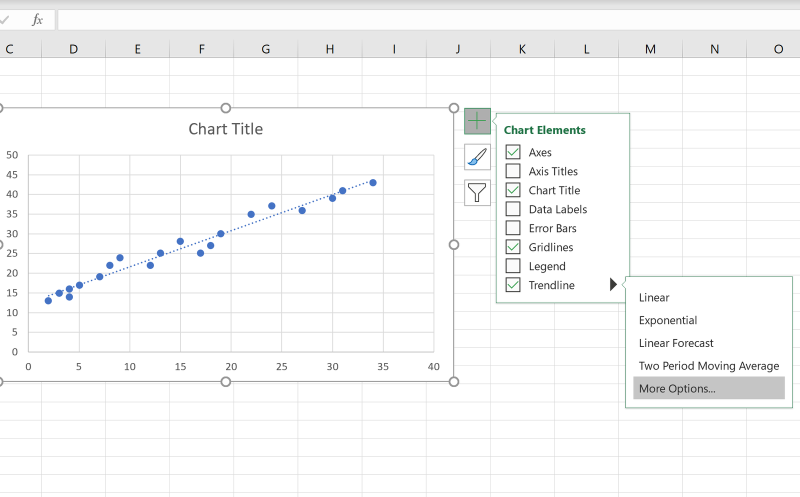
Step 3: Add a Regression Line
Next, click anywhere on the scatterplot. Then click the plus (+) sign in the top right corner of the plot and check the box that says Trendline.
This will automatically add a simple linear regression line to your scatterplot:
Step 4: Add a Regression Line Equation
You can also add the equation of the regression line to the chart by clicking More Options. In the box that appears to the right, check the box next to Display Equation on chart.
The simple linear regression equation will automatically appear on the scatterplot:
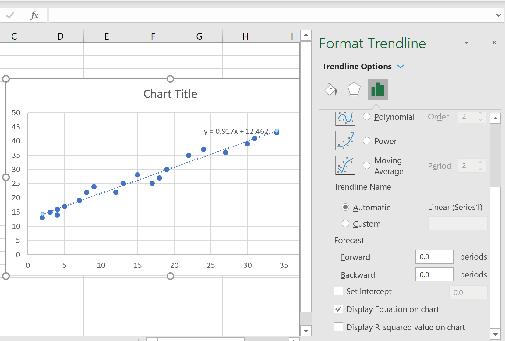
For this particular example, the regression line turns out to be:
y = 0.917x + 12.462
The way to interpret this is as follows:
- For each additional one unit increase in the x variable, the average increase in the y variable is 0.917.
- When the x variable is equal to zero, the average value for the y variable is 12.462.
We can also use this equation to estimate the value of y based on the value of x. For example, when x is equal to 15, the expected value for y is 26.217:
y = 0.917*(15) + 12.462 = 26.217
Find more Excel tutorials here.