A pie chart is a type of chart that is shaped like a circle and uses slices to represent proportions of a whole.
This tutorial explains how to create and modify pie charts in R using the ggplot2 data visualization library.
How to Make a Basic Pie Chart
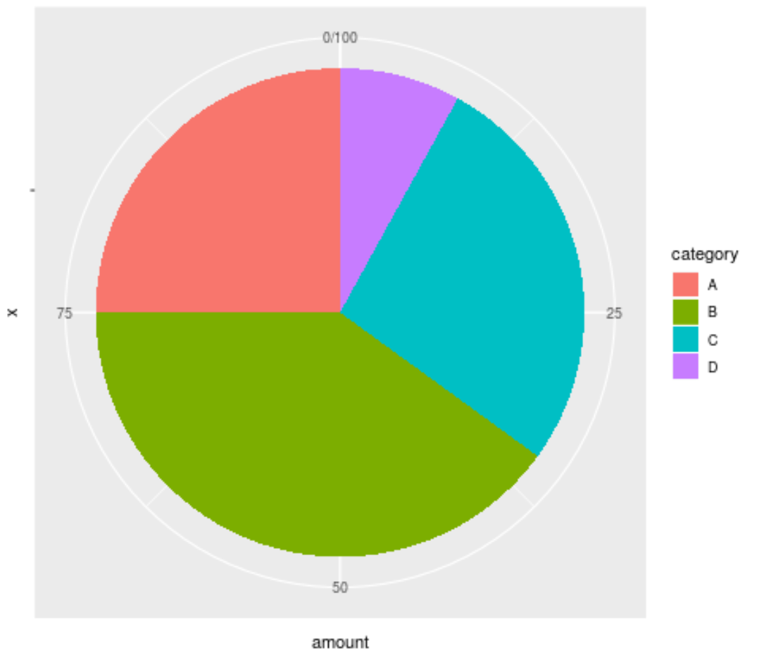
The following code shows how to create a basic pie chart for a dataset using ggplot2:
library(ggplot2)

#create data frame
data category" = c('A', 'B', 'C', 'D'),
                   "amount" = c(25, 40, 27, 8))

#create pie chart
ggplot(data, aes(x="", y=amount, fill=category)) +
  geom_bar(stat="identity", width=1) +
  coord_polar("y", start=0)
How to Modify the Appearance of the Pie Chart
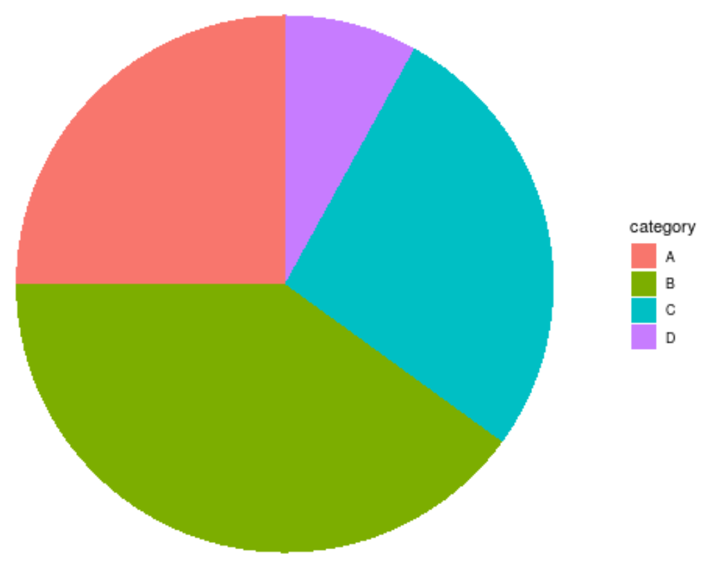
The default pie chart in ggplot2 is quite ugly. The simplest way to improve the appearance is to use theme_void(), which removes the background, the grid, and the labels:
ggplot(data, aes(x="", y=amount, fill=category)) +
  geom_bar(stat="identity", width=1) +
  coord_polar("y", start=0) +
  theme_void()
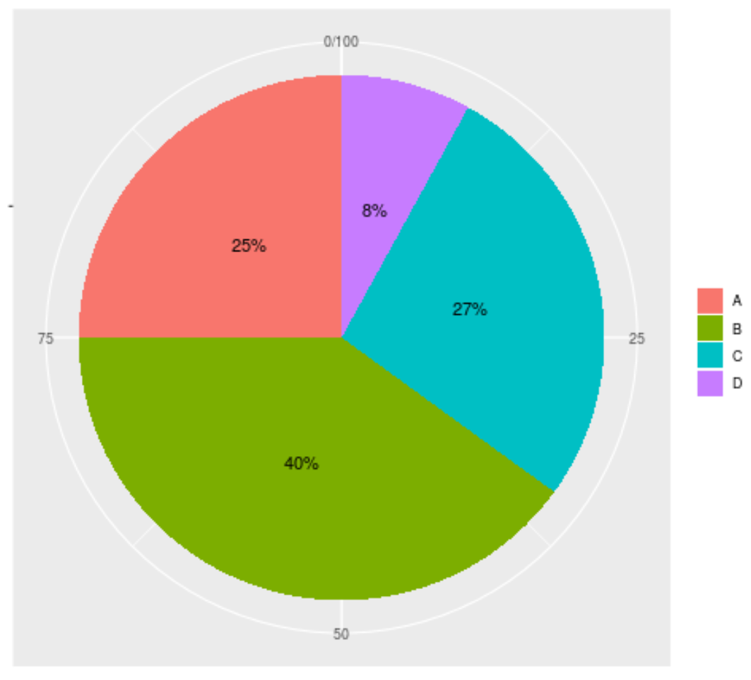
We can further improve the appearance of the chart by adding labels inside the slices:
ggplot(data, aes(x="", y=amount, fill=category)) +
  geom_bar(stat="identity", width=1) +
  coord_polar("y", start=0) +
  geom_text(aes(label = paste0(amount, "%")), position = position_stack(vjust=0.5)) +
  labs(x = NULL, y = NULL, fill = NULL)
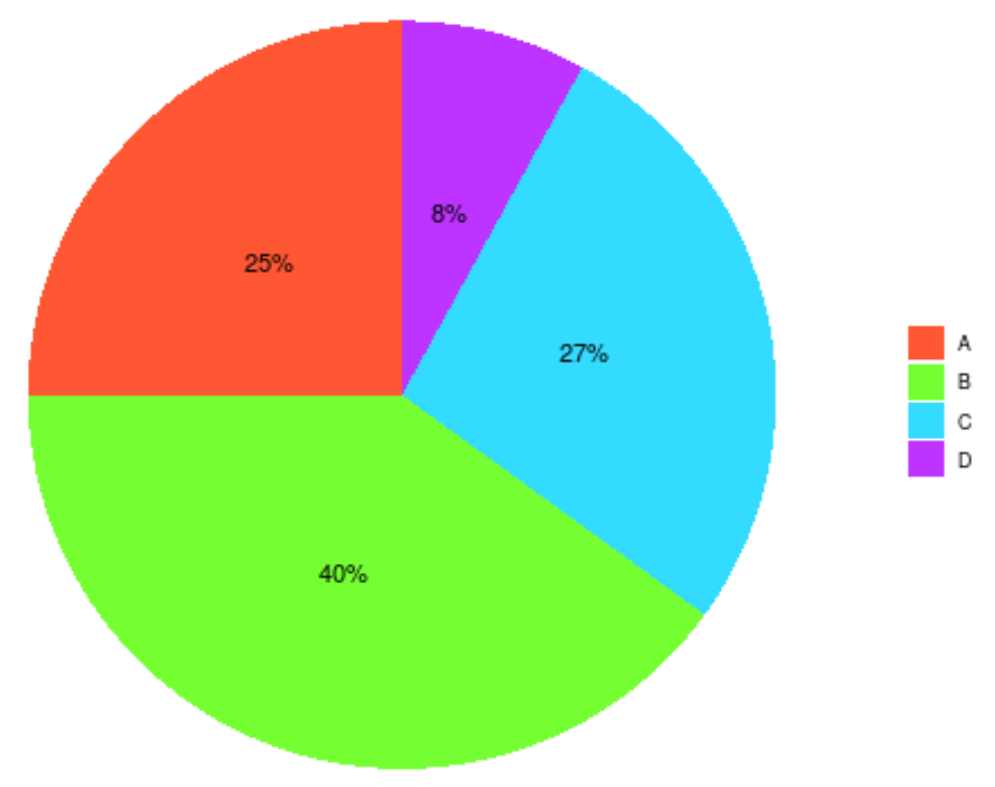
We can customize the chart even further by specifying our own hex colors to use for the slices with the scale_fill_manual() argument:
ggplot(data, aes(x="", y=amount, fill=category)) +
  geom_bar(stat="identity", width=1) +
  coord_polar("y", start=0) +
  geom_text(aes(label = paste0(amount, "%")), position = position_stack(vjust=0.5)) +
  labs(x = NULL, y = NULL, fill = NULL) +
  theme_classic() +
  theme(axis.line = element_blank(),
          axis.text = element_blank(),
          axis.ticks = element_blank()) +
  scale_fill_manual(values=c("#FF5733", "#75FF33", "#33DBFF", "#BD33FF"))
Tip: Use this Hex Color Picker to find combinations of hex color codes that go well together.
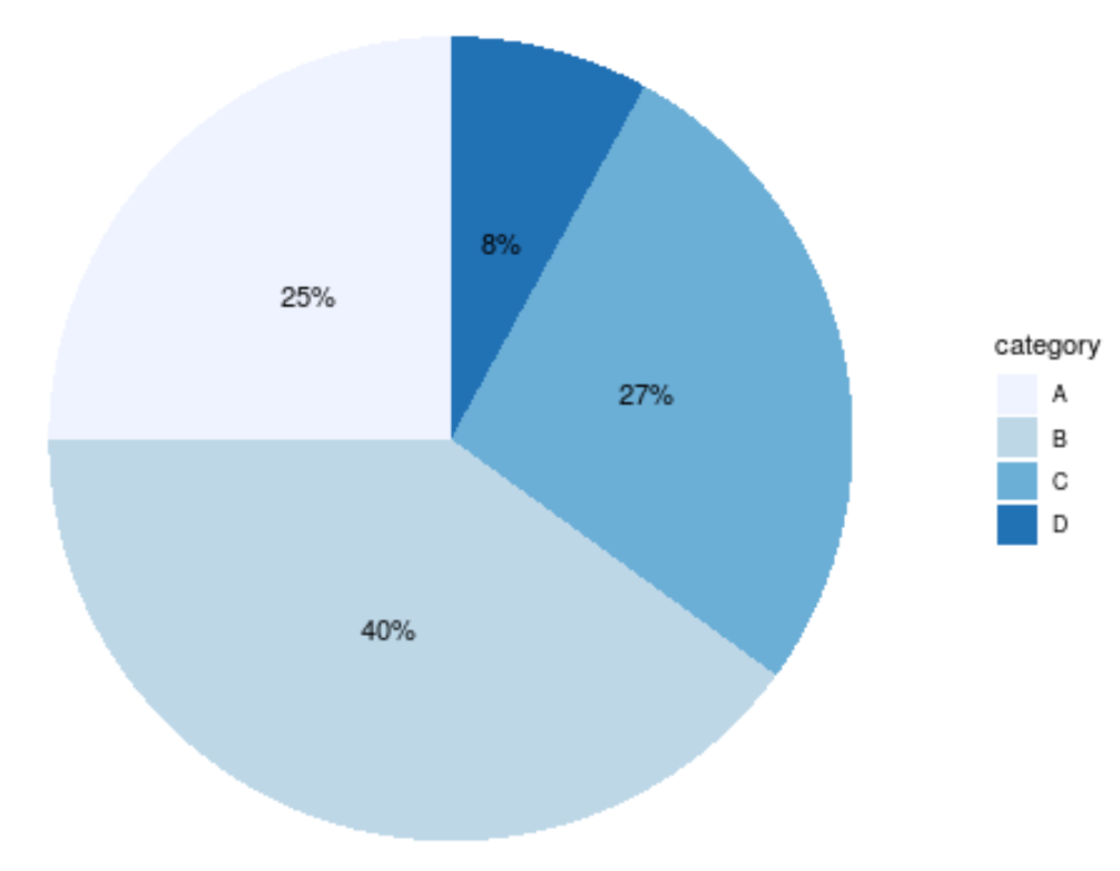
You can also customize the colors of the slices by simply choosing one of the brewer color scales. For example, here’s what the “blues” color scale looks like:
ggplot(data, aes(x="", y=amount, fill=category)) +
  geom_bar(stat="identity", width=1) +
  coord_polar("y", start=0) +
  geom_text(aes(label = paste0(amount, "%")), position = position_stack(vjust=0.5)) +
  labs(x = NULL, y = NULL) +
  theme_classic() +
  theme(axis.line = element_blank(),
          axis.text = element_blank(),
          axis.ticks = element_blank()) +
  scale_fill_brewer(palette="Blues")
Additional Resources
How to Create a Grouped Boxplot in R Using ggplot2
How to Create a Heatmap in R Using ggplot2
How to Create a Gantt Chart in R Using ggplot2