Often you may want to add labels to scatterplot points in Excel, such as in the scatterplot below:
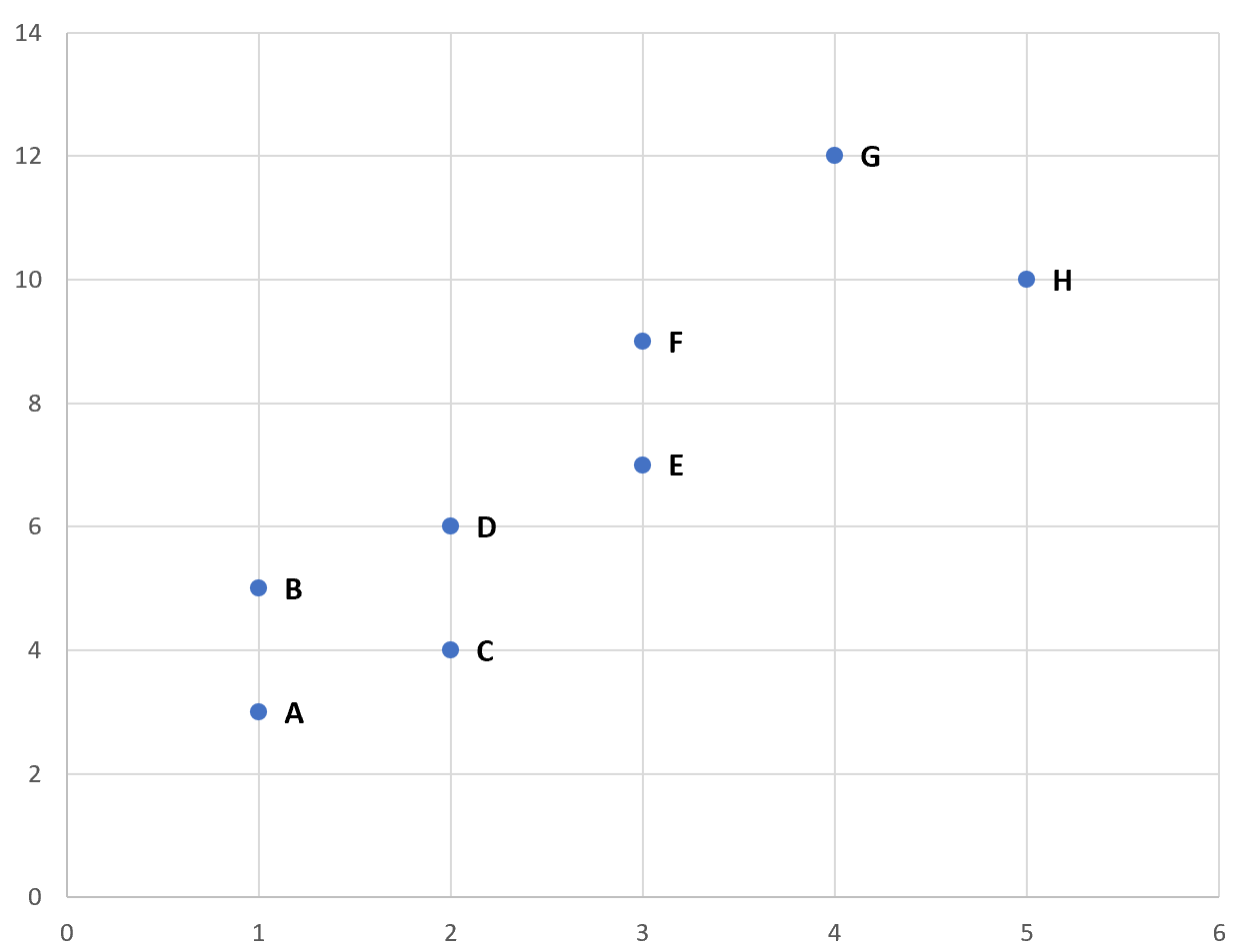
Fortunately this is fairly easy to do in Excel and the following step-by-step example shows exactly how.
Step 1: Create the Data
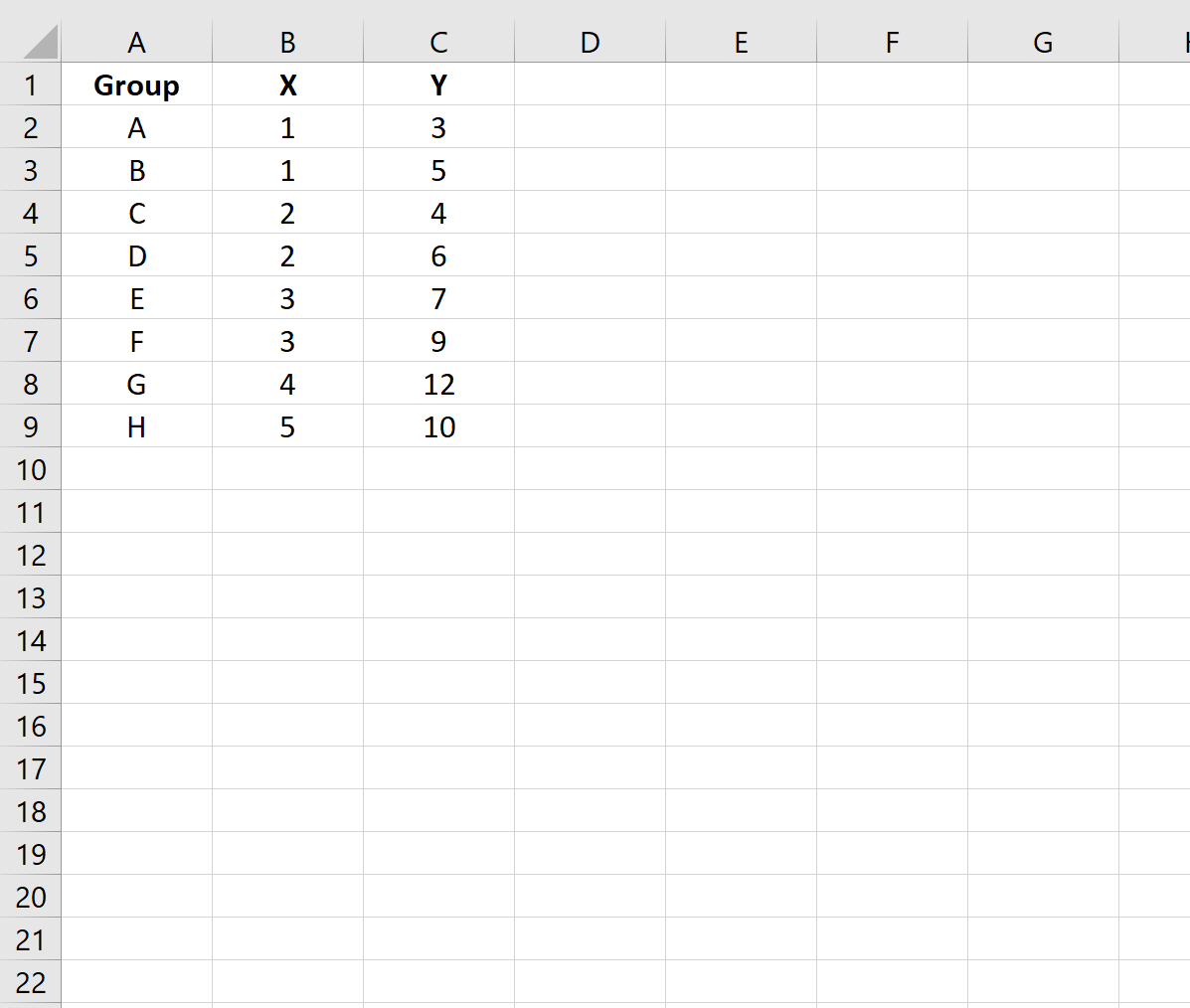
First, let’s create the following dataset that shows (X, Y) coordinates for eight different groups:
Step 2: Create the Scatterplot
Next, highlight the cells in the range B2:C9. Then, click the Insert tab along the top ribbon and click the Insert Scatter (X,Y) option in the Charts group.
The following scatterplot will appear:

Step 3: Add Labels to Points
Next, click anywhere on the chart until a green plus (+) sign appears in the top right corner. Then click Data Labels, then click More Options…
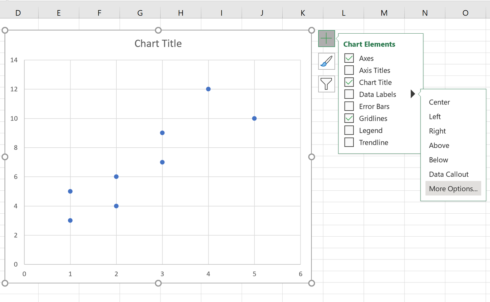
In the Format Data Labels window that appears on the right of the screen, uncheck the box next to Y Value and check the box next to Value From Cells.
In the window that appears, choose A2:A9 as the Data Label Range:
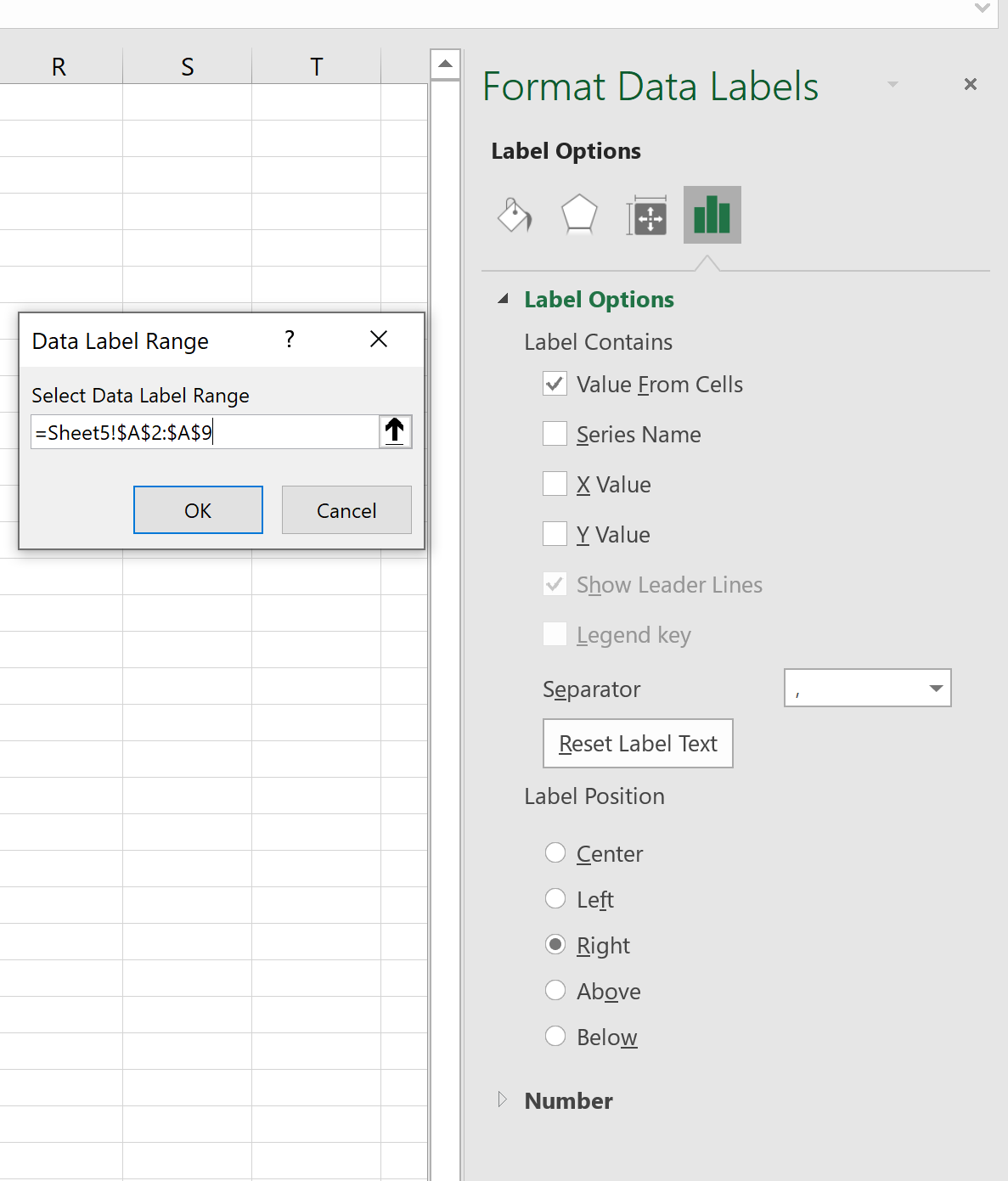
Once you click OK, the following labels will automatically appear next to the scatterplot points:
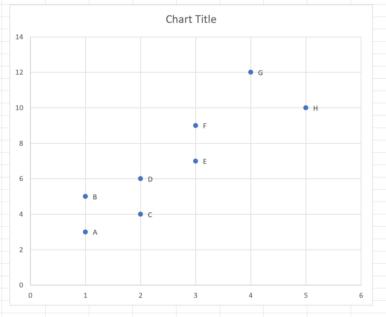
Feel free to click on the labels to modify their style or increase their font size:

Additional Resources
The following tutorials explain how to perform other common functions with scatterplots in Excel:
How to Create a Scatterplot with Multiple Series in Excel
How to Add a Regression Line to a Scatterplot in Excel
How to Add a Horizontal Line to a Scatterplot in Excel