A Q-Q plot, short for “quantile-quantile” plot, is often used to assess whether or not a set of data potentially came from some theoretical distribution. In most cases, this type of plot is used to determine whether or not a set of data follows a normal distribution.
This tutorial explains how to create a Q-Q plot for a set of data in Excel.
Example: Q-Q Plot in Excel
Perform the follow steps to create a Q-Q plot for a set of data.
Step 1: Enter and sort the data.
Enter the following data into one column:
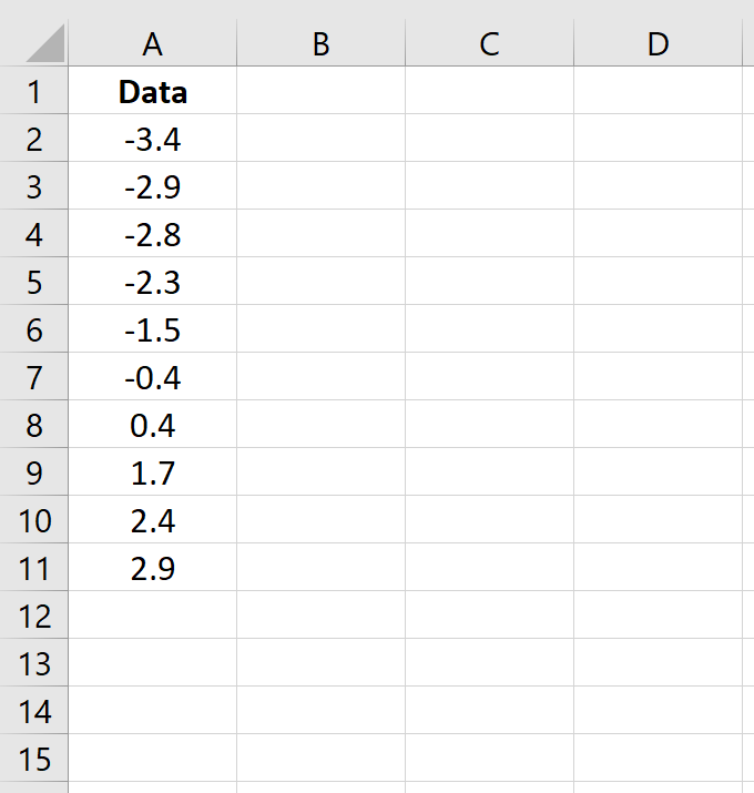
Note that this data is already sorted from smallest to largest. If your data is not already sorted, go to the Data tab along the top ribbon in Excel, then go to the Sort & Filter group, then click the Sort A to Z icon.
Step 2: Find the rank of each data value.
Next, use the following formula to calculate the rank of the first value:
=RANK(A2, $A$2:$A$11, 1)
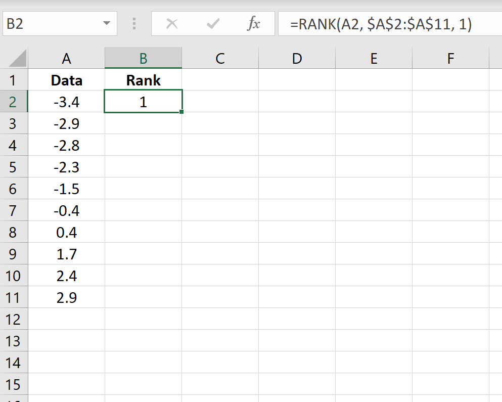
Copy this formula down to all of the other cells in the column:
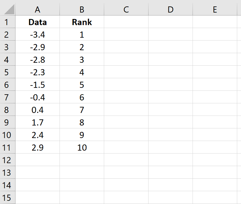
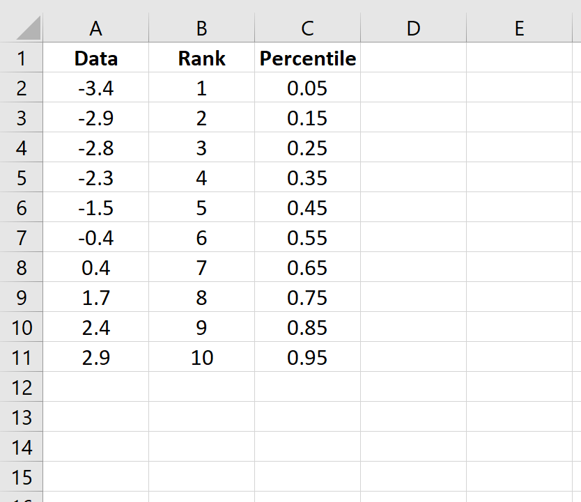
Step 3: Find the percentile of each data value.
Next, use the following formula to calculate the percentile of the first value:
=(B2-0.5)/COUNT($B$2:$B$11)
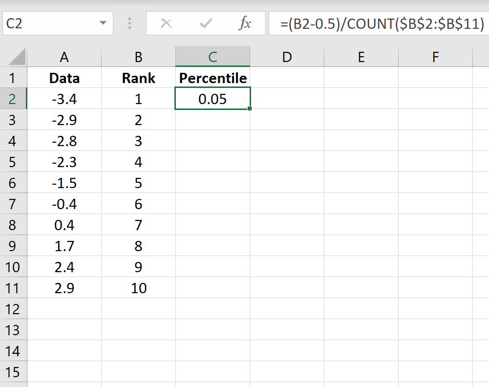
Copy this formula down to all of the other cells in the column:
Step 4: Calculate the z-score for each data value.
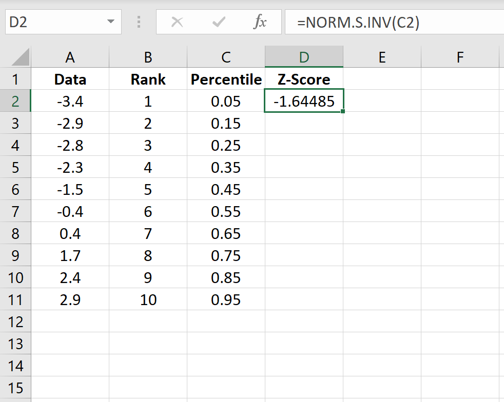
Use the following formula to calculate the z-score for the first data value:
=NORM.S.INV(C2)
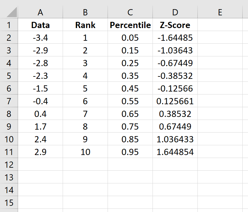
Copy this formula down to all of the other cells in the column:
Step 5: Create the Q-Q plot.
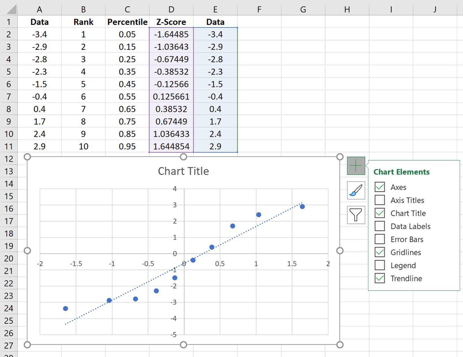
Copy the original data from column A into column E, then highlight the data in columns D and E.
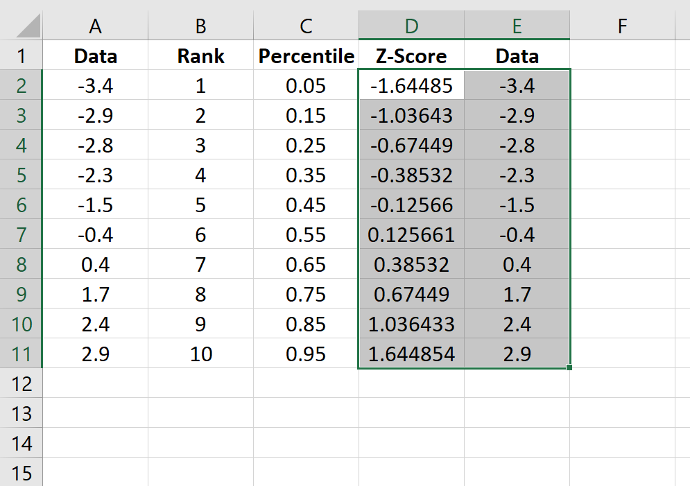
Along the top ribbon, go to Insert. Within the Charts group, choose Insert Scatter (X, Y) and click the option that says Scatter. This will produce the follow Q-Q plot:

Click the plus sign on the top right-hand corner of the graph and check the box next to Trendline. This will add the following line to the chart:
Feel free to add labels for the title and axes of the graph to make it more aesthetically pleasing:
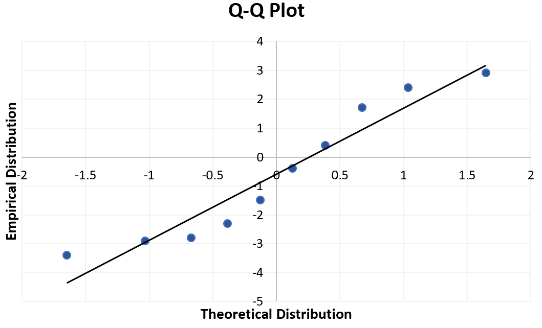
The way to interpret a Q-Q plot is simple: if the data values fall along a roughly straight line at a 45-degree angle, then the data is normally distributed. We can see in our Q-Q plot above that the data values tend to deviate from the 45-degree line quite a bit, especially on the tail ends, which could be an indication that the data set is not normally distributed.
Although a Q-Q plot isn’t a formal statistical test, it offers an easy way to visually check whether or not a data set is normally distributed.