The term univariate analysis refers to the analysis of one variable. You can remember this because the prefix “uni” means “one.”
The purpose of univariate analysis is to understand the distribution of values for a single variable. You can contrast this type of analysis with the following:
- Bivariate Analysis: The analysis of two variables.
- Multivariate Analysis: The analysis of two or more variables.
For example, suppose we have the following dataset:
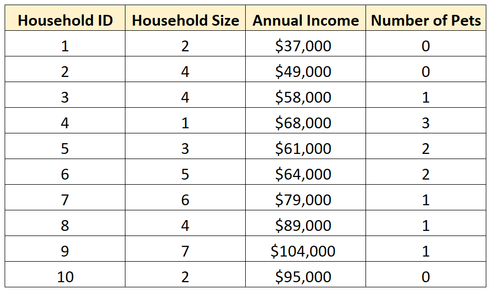
We could choose to perform univariate analysis on any of the individual variables in the dataset to gain a better understanding of its distribution of values.
For example, we may choose to perform univariate analysis on the variable Household Size:
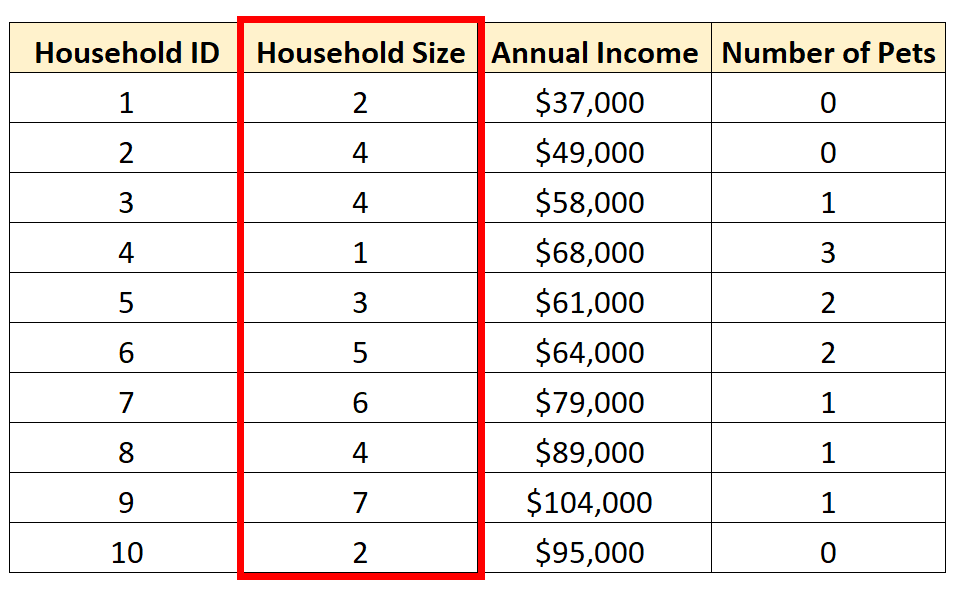
There are three common ways to perform univariate analysis:
1. Summary Statistics
The most common way to perform univariate analysis is to describe a variable using summary statistics.
There are two popular types of summary statistics:
- Measures of central tendency: these numbers describe where the center of a dataset is located. Examples include the mean and the median.
- Measures of dispersion: these numbers describe how spread out the values are in the dataset. Examples include the range, interquartile range, standard deviation, and variance.
2. Frequency Distributions
Another way to perform univariate analysis is to create a frequency distribution, which describes how often different values occur in a dataset.
3. Charts
Yet another way to perform univariate analysis is to create charts to visualize the distribution of values for a certain variable.
Common examples include:
- Boxplots
- Histograms
- Density Curves
- Pie Charts
The following examples show how to perform each type of univariate analysis using the Household Size variable from our dataset mentioned earlier:

Summary Statistics
We can calculate the following measures of central tendency for Household Size:
- Mean (the average value): 3.8
- Median (the middle value): 4
These values give us an idea of where the “center” value is located.
We can also calculate the following measures of dispersion:
- Range (the difference between the max and min): 6
- Interquartile Range (the spread of the middle 50% of values): 2.5
- Standard Deviation (an average measure of spread): 1.87
These values give us an idea of how spread out the values are for this variable.
Frequency Distributions
We can also create the following frequency distribution table to summarize how often different values occur:
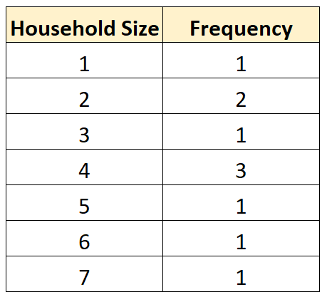
This allows us to quickly see that the most frequent household size is 4.
Resource: You can use this Frequency Calculator to automatically produce a frequency distribution for any variable.
Charts
We can create the following charts to help us visualize the distribution of values for Household Size:
1. Boxplot
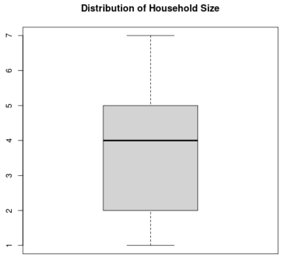
A boxplot is a plot that shows the five-number summary of a dataset.
The five-number summary includes:
- The minimum value
- The first quartile
- The median value
- The third quartile
- The maximum value
Here’s what a boxplot would look like for the variable Household Size:
Resource: You can use this Boxplot Generator to automatically produce a boxplot for any variable.
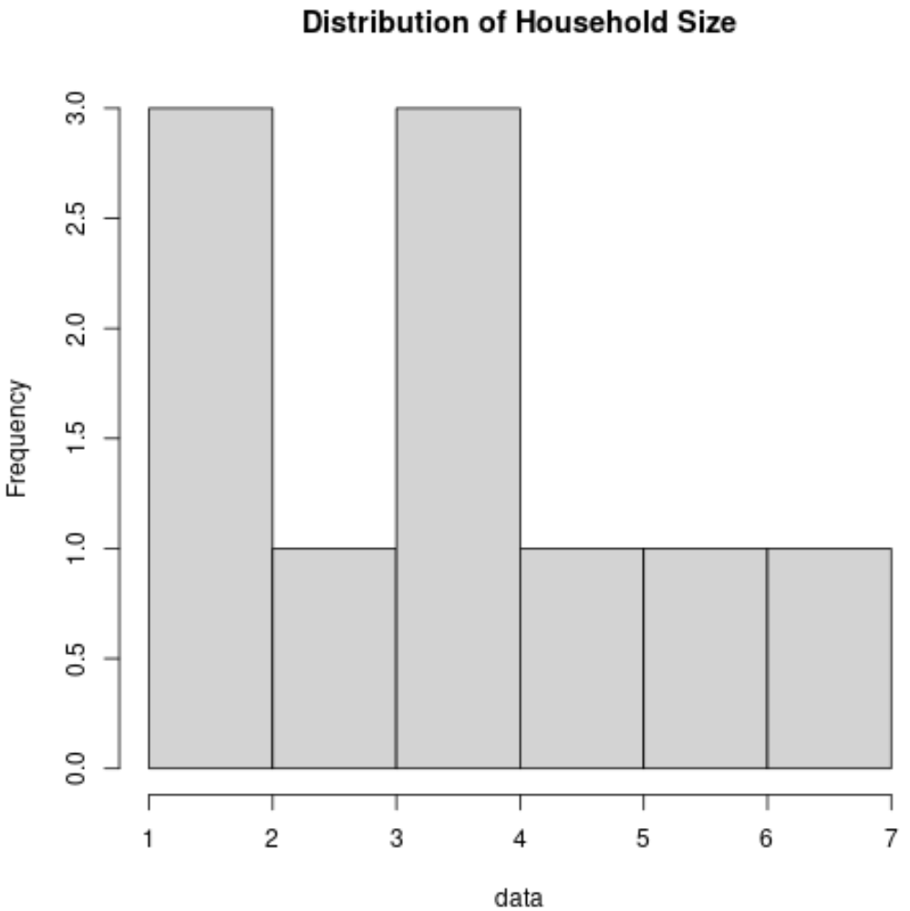
2. Histogram
A histogram is a type of chart that uses vertical bars to display frequencies. This type of chart is a useful way to visualize the distribution of values in a dataset.
Here’s what a histogram would look like for the variable Household Size:
3. Density Curve
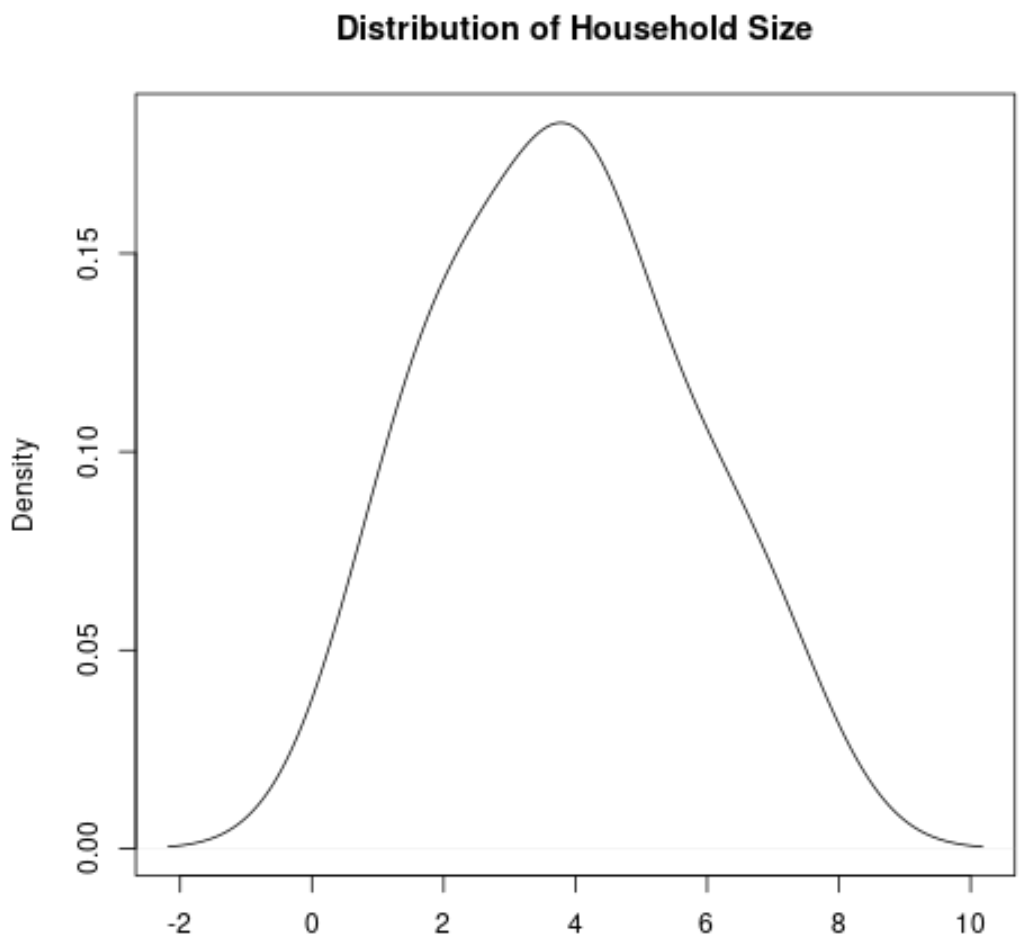
A density curve is a curve on a graph that represents the distribution of values in a dataset.
It’s particularly useful for visualizing the “shape” of a distribution, including whether or not a distribution has one or more “peaks” of frequently occurring values and whether or not the distribution is skewed to the left or the right.
Here’s what a density curve would look like for the variable Household Size:
4. Pie Chart
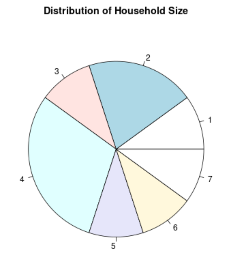
A pie chart is a type of chart that is shaped like a circle and uses slices to represent proportions of a whole.
Here’s what a pie chart would look like for the variable Household Size:
Depending on the type of data, one of these charts may be more useful for visualizing the distribution of values than the others.