In statistics, tabular data refers to data that is organized in a table with rows and columns.
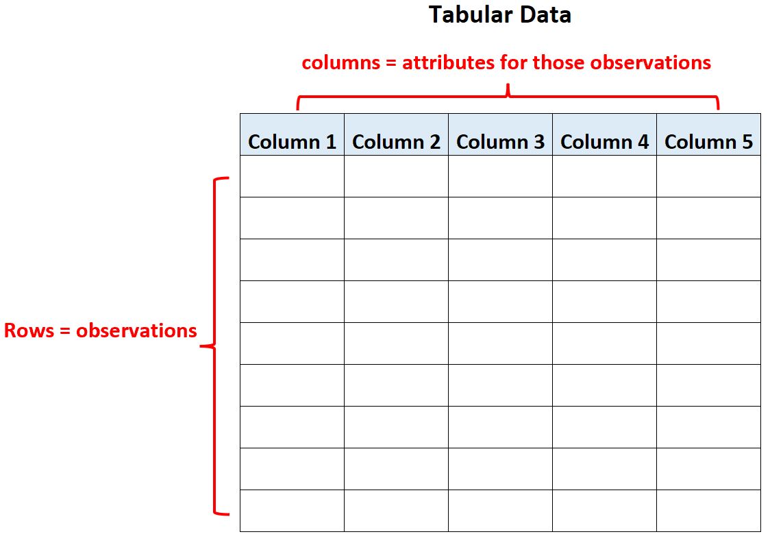
Within the table, the rows represent observations and the columns represent attributes for those observations.
For example, the following table represents tabular data:
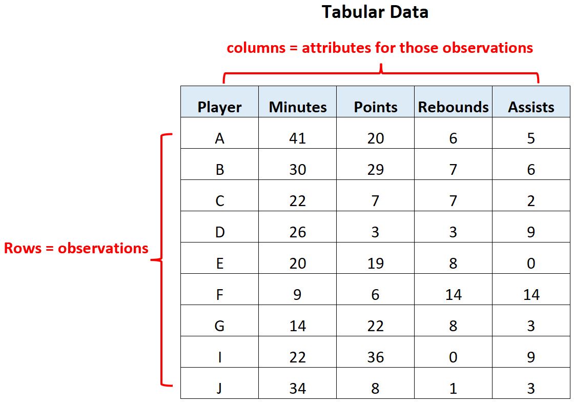
This dataset has 9 rows and 5 columns.
Each row represents one basketball player and the five columns describe different attributes about the player including:
- Player name
- Minutes played
- Point
- Rebounds
- Assists
The opposite of tabular data would be visual data, which would be some type of plot or chart that helps us visualize the values in a dataset.
For example, we might have the following bar chart that helps us visualize the total minutes played by each player in the dataset:
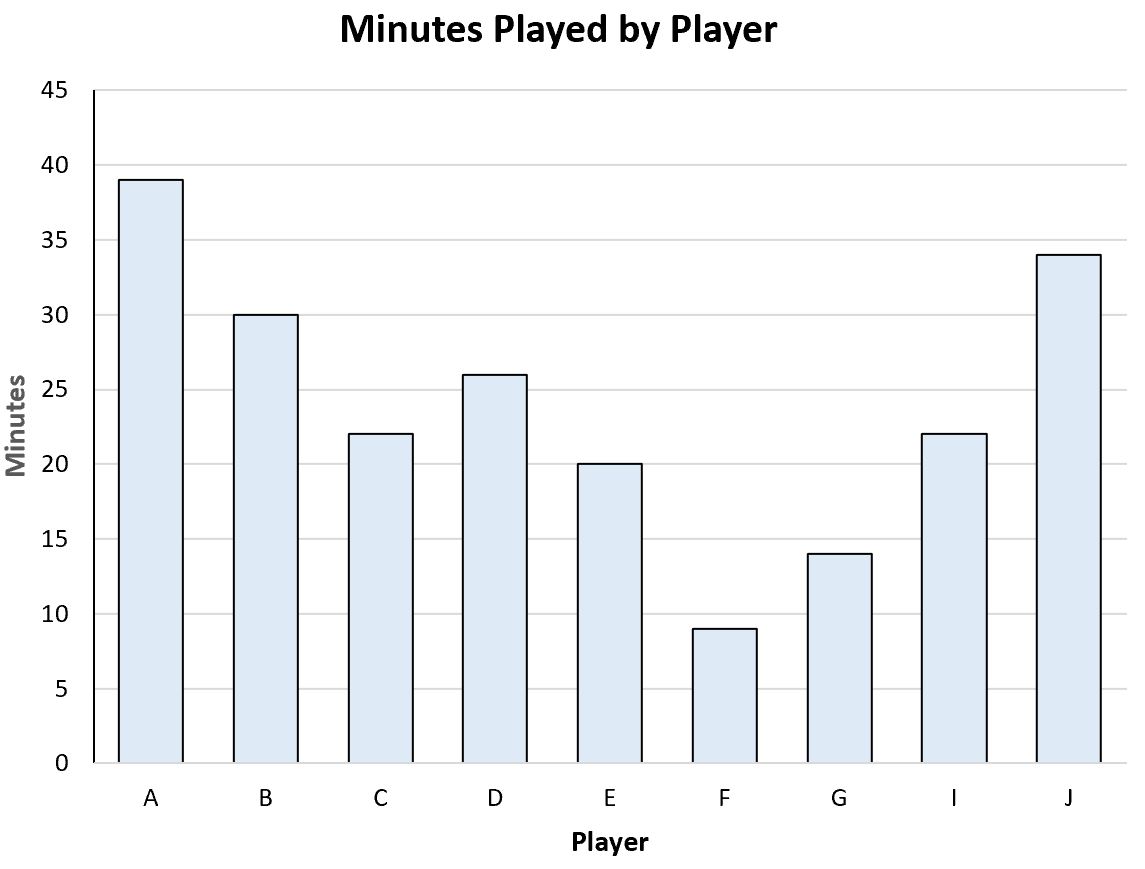
This would be an example of visual data.
It contains the exact same information about player names and minutes played for the players in the dataset, but it’s simply displayed in a visual form instead of a tabular form.
Or we might have the following scatterplot that helps us visualize the relationship between minutes played and points scored for each player:
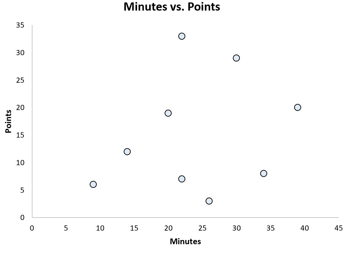
This is another example of visual data.
When is Tabular Data Used in Practice?
In practice, tabular data is the most common type of data that you’ll run across in the real world.
In the real world, most data that is saved in an Excel spreadsheet is considered tabular data because the rows represent observations and the columns represent attributes for those observations.
For example, here’s what our basketball dataset from earlier might look like in an Excel spreadsheet:
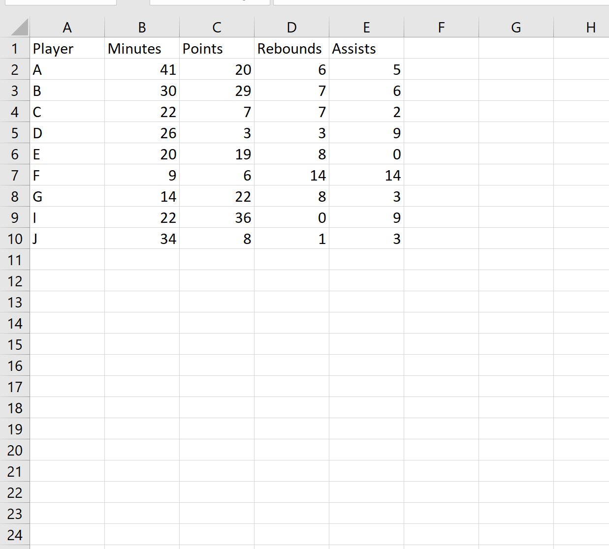
This format is one of the most natural ways to collect and store values in a dataset, which is why it’s used so often.
Additional Resources
The following tutorials explain other common terms in statistics:
Why is Statistics Important?
Why is Sample Size Important in Statistics?
What is an Observation in Statistics?
What is Considered Raw Data in Statistics?