A segmented bar chart is a type of chart that uses segmented bars that add up to 100% to help us visualize the distribution of categorical data.
The following step-by-step example shows how to create a segmented bar chart for a dataset.
Step 1: Collect the Data
Suppose we go out and ask 100 students at a certain college to tell us their favorite sport. The following table shows the results of the survey, based on gender and favorite sport:

Step 2: Convert the Data to Percentages
Next, let’s convert the raw frequencies into percentages.
For example, here’s how to convert the frequencies into percentages for the baseball category:
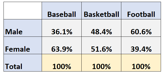
- Number of respondents who were male: 13/36 = 36.1%
- Number of respondents who were female: 23/36 = 63.9%
We can repeat the same process for basketball:
- Number of respondents who were male: 15/31 = 48.4%
- Number of respondents who were female: 16/31 = 51.6%
And we can repeat this process for football:
- Number of respondents who were male: 20/33 = 60.6%
- Number of respondents who were female: 13/33 = 39.4%
This leaves us with the following table:
Step 3: Create the Segmented Bar Chart
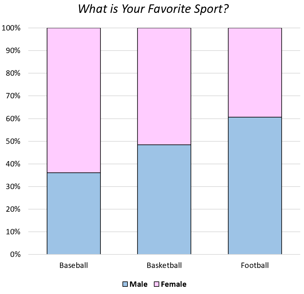
Lastly, we can create the segmented bar chart by using three separate bars (one for each sport) and filling in the bars according to the percentage of respondents who were male or female:

This helps us quickly understand the breakdown of the percentage of students who prefer each sport, based on gender.
For example, we can see that out of the respondents who chose football as their favorite sport, about 60% of them were male.
Conversely, out of the respondents who chose baseball as their favorite sport, less than 40% of them were male.
Pros & Cons of Segmented Bar Charts
The biggest pro of a segmented bar chart is the fact that it lets us quickly understand the composition of categorical data.
For example, suppose we only had this table of data:

It’s hard to tell right away what percentage of respondents chose each sport as their favorite, based on gender.
However, we can quickly understand the breakdown of respondents by gender with a segmented bar chart:

The biggest con of a segmented bar chart is that it doesn’t tell us the total frequency of respondents in each category.
For example, suppose 90 out of 100 students chose baseball as their favorite sport. Using a segmented bar chart, we wouldn’t have access to this information because each bar in the chart is forced to add up to 100%.
Keep this in mind when deciding whether or not to use a segmented bar chart to visualize your categorical data.
How to Make a Segmented Bar Chart in Excel
Suppose we have the following data in Excel:

To create a segmented bar chart for this data, simply highlight the cells in the range C7:E8 as follows:
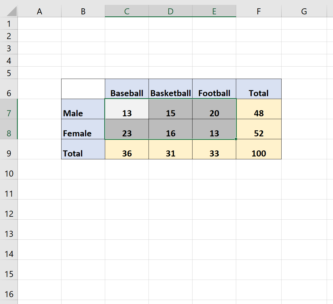
Then click the Insert tab along the top ribbon. Within the Charts group, click Insert Column or Bar Chart and then click the option titled 100% Stacked Column.
This will automatically produce the following segmented bar chart:
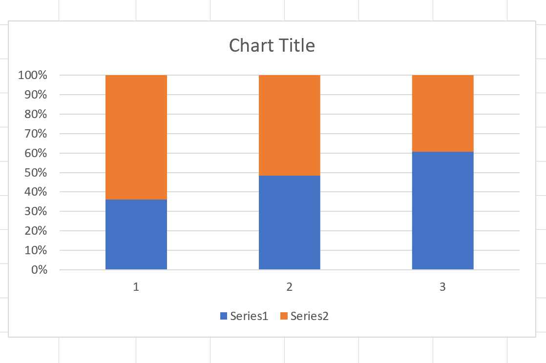
Feel free to modify the colors, title, and axis labels to make the chart more aesthetically pleasing.