Often you may want to plot a table along with a chart in R.
Fortunately this is easy to do using functions from the gridExtra package.
The following example shows how to use functions from this package to plot a table in practice.
Example: Plot a Table in R
Suppose we have the following data frame in R:
#create data frame
df frame(x=c(1, 2, 3, 4, 5, 6, 7),
                 y=c(3, 4, 4, 8, 6, 10, 14))

#view data frame
df

  x  y
1 1  3
2 2  4
3 3  4
4 4  8
5 5  6
6 6 10
7 7 14
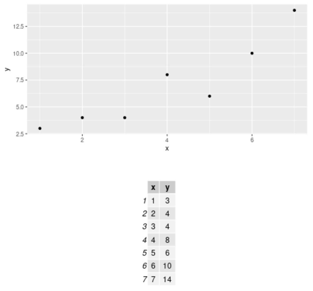
Now suppose we would like to create a scatterplot to visualize the values in the data frame and also plot a table that shows the raw values.
We can use the following syntax to do so:
library(gridExtra)
library(ggplot2)

#define scatterplot
my_plot #define table
my_table #create scatterplot and add table underneath it
grid.arrange(my_plot, my_table)

Here is how this code worked:
- We used ggplot() to generate the scatterplot
- We used tableGrob() to convert the data frame to a table object
- We used grid.arrange() to plot both the scatterplot and the table
By default, the grid.arrange() function arranges the scatterplot and the table in the same column.
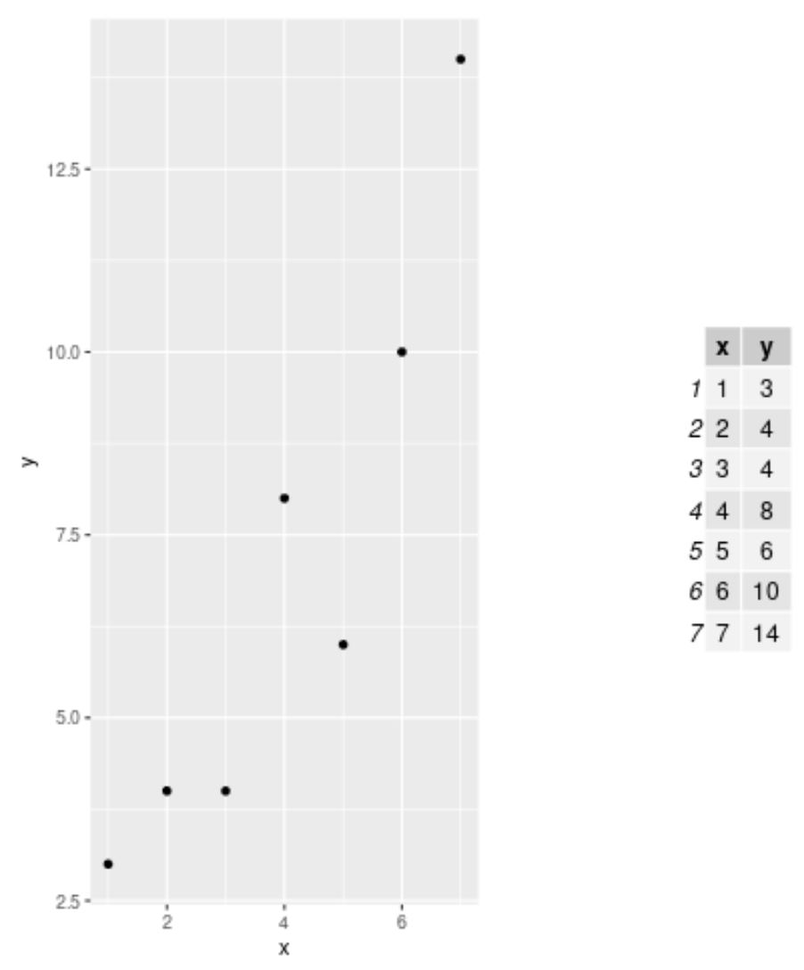
However, you can use the ncol argument to display the scatterplot and table in two columns, i.e. side by side:
library(gridExtra)
library(ggplot2)

#define scatterplot
my_plot #define table
my_table #create scatterplot and add table next to it
grid.arrange(arrangeGrob(my_plot, my_table, ncol=2))

The table is now shown to the side of the plot rather than underneath it.
Note: In this example we only plotted one table, but you can specify multiple tables within the grid.arrange() function to plot multiple tables at once.
Additional Resources
The following tutorials explain how to perform other common tasks in R:
How to Label Points on a Scatterplot in R
How to Add Text Outside of a Plot in R
How to Create a Scatterplot with a Regression Line in R