Often you may want to overlay a normal curve on a histogram in R.
The following examples show how to do so in base R and in ggplot2.
Example 1: Overlay Normal Curve on Histogram in Base R
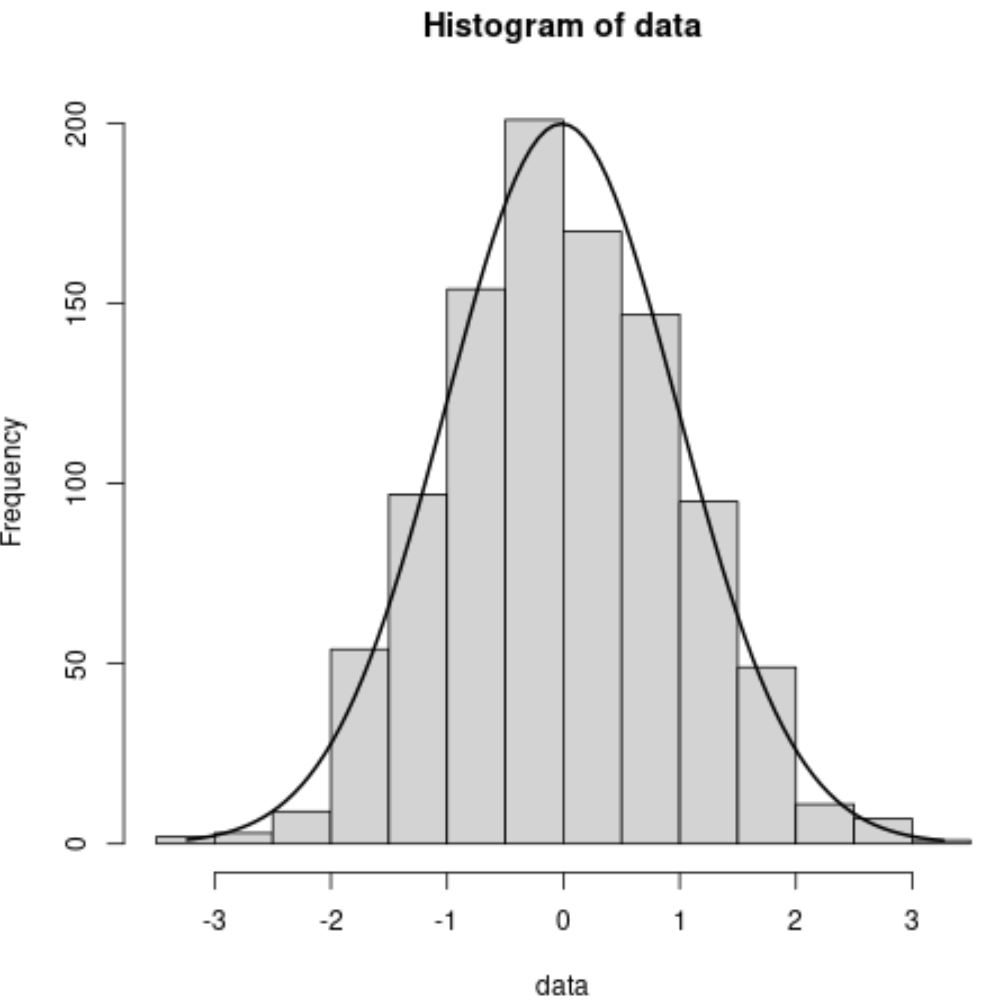
We can use the following code to create a histogram in base R and overlay a normal curve on the histogram:
#make this example reproducible
set.seed(0)

#define data
data 1000)

#create histogram
hist_data #define x and y values to use for normal curve
x_values 100)
y_values #overlay normal curve on histogram
lines(x_values, y_values, lwd = 2)

The black curve in the plot represents the normal curve.
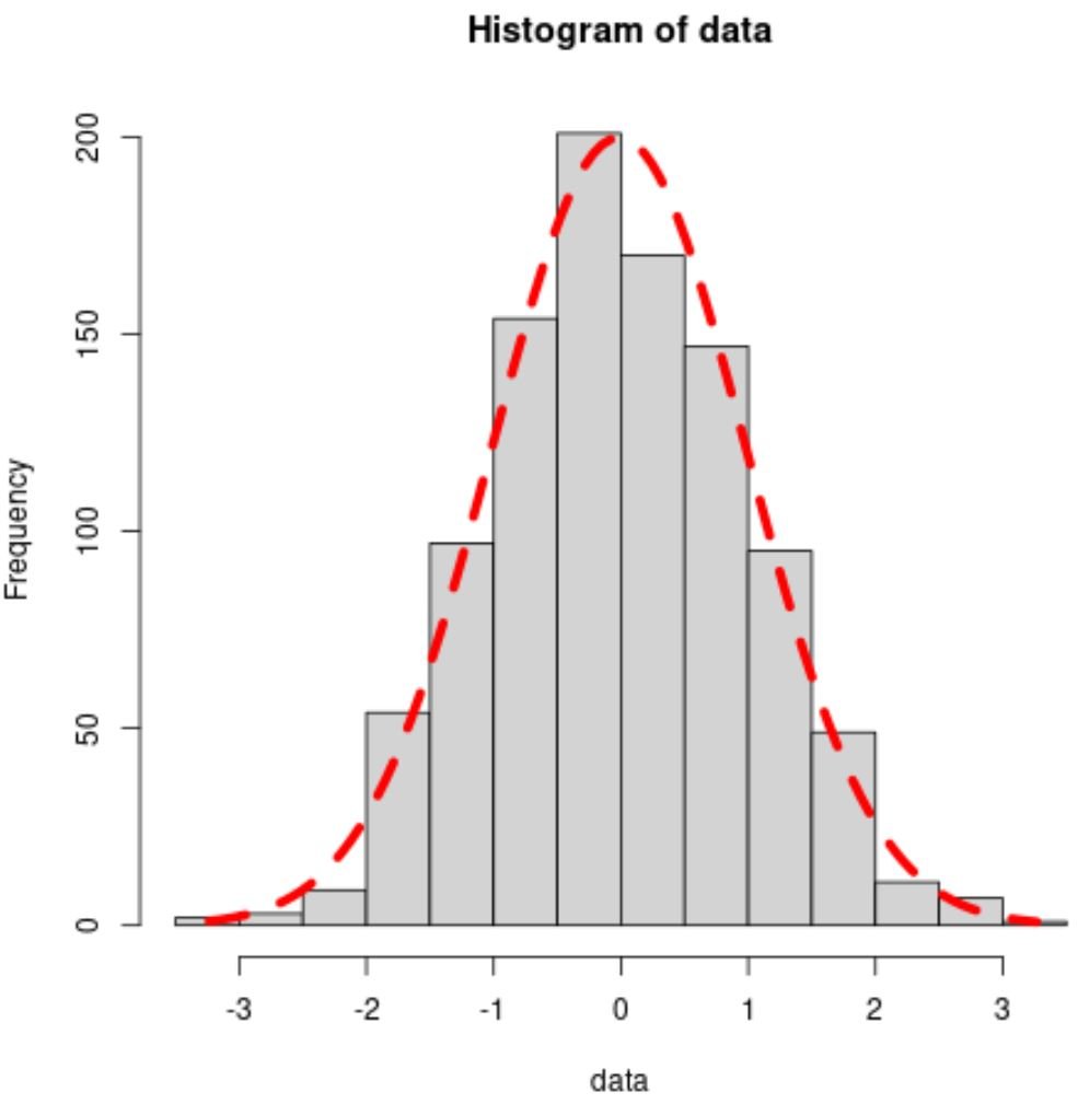
Feel free to use the col, lwd, and lty arguments to modify the color, line width, and type of the line, respectively:
#overlay normal curve with custom aesthetics
lines(x_values, y_values, col='red', lwd=5, lty='dashed')

Example 2: Overlay Normal Curve on Histogram in ggplot2
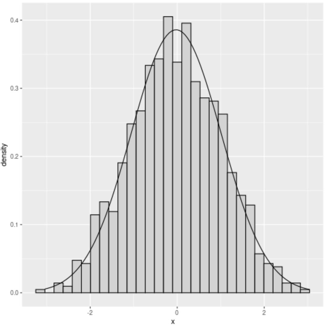
We can use the following code to create a histogram in ggplot2 and overlay a normal curve on the histogram:
library(ggplot2)

#make this example reproducible
set.seed(0)

#define data
data frame(x=rnorm(1000))

#create histogram and overlay normal curve
ggplot(data, aes(x)) +
  geom_histogram(aes(y = ..density..), fill='lightgray', col='black') +
  stat_function(fun = dnorm, args = list(mean=mean(data$x), sd=sd(data$x)))

The black curve in the plot represents the normal curve.
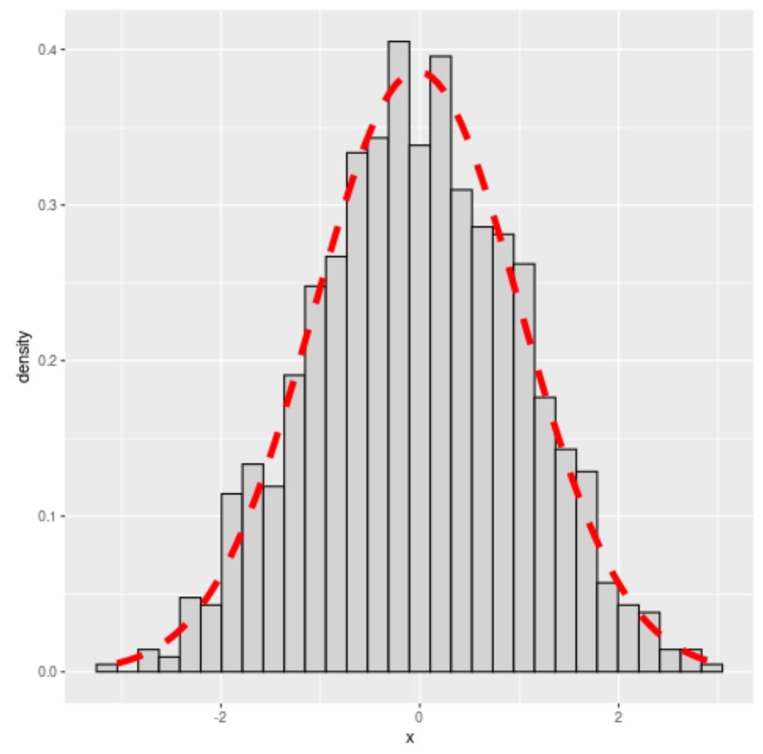
Feel free to use the col, lwd, and lty arguments to modify the color, line width, and type of the line, respectively:
#overlay normal curve with custom aesthetics
ggplot(data, aes(x)) +
  geom_histogram(aes(y = ..density..), fill='lightgray', col='black') +
  stat_function(fun = dnorm, args = list(mean=mean(data$x), sd=sd(data$x)),
                col='red', lwd=2, lty='dashed'))

Note: You can find the complete documentation for stat_function here.
Additional Resources
The following tutorials explain how to perform other common operations in R:
How to Create a Relative Frequency Histogram in R
How to Specify Histogram Breaks in R