Ordinary least squares (OLS) regression is a method that allows us to find a line that best describes the relationship between one or more predictor variables and a response variable.
This method allows us to find the following equation:
ŷ = b0 + b1x
where:
- ŷ: The estimated response value
- b0: The intercept of the regression line
- b1: The slope of the regression line
This equation can help us understand the relationship between the predictor and response variable, and it can be used to predict the value of a response variable given the value of the predictor variable.
The following step-by-step example shows how to perform OLS regression in R.
Step 1: Create the Data
For this example, we’ll create a dataset that contains the following two variables for 15 students:
- Total hours studied
- Exam score
We’ll perform OLS regression, using hours as the predictor variable and exam score as the response variable.
The following code shows how to create this fake dataset in R:
#create dataset
df frame(hours=c(1, 2, 4, 5, 5, 6, 6, 7, 8, 10, 11, 11, 12, 12, 14),
                 score=c(64, 66, 76, 73, 74, 81, 83, 82, 80, 88, 84, 82, 91, 93, 89))

#view first six rows of dataset
head(df)

  hours score
1     1    64
2     2    66
3     4    76
4     5    73
5     5    74
6     6    81
Step 2: Visualize the Data
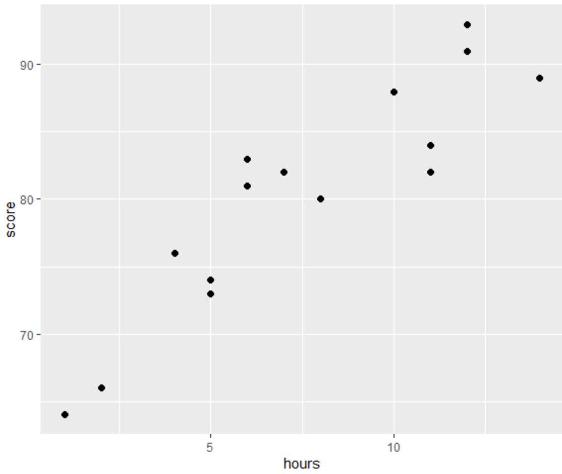
Before we perform OLS regression, let’s create a scatter plot to visualize the relationship between hours and exam score:
library(ggplot2)

#create scatter plot
ggplot(df, aes(x=hours, y=score)) +
  geom_point(size=2)

One of the four assumptions of linear regression is that there is a linear relationship between the predictor and response variable.
From the plot we can see that the relationship does appear to be linear. As hours increases, score tends to increase as well in a linear fashion.
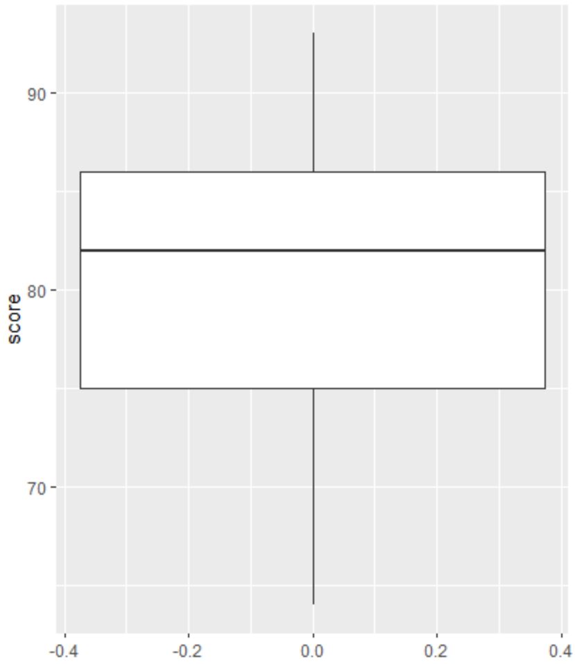
Next, we can create a boxplot to visualize the distribution of exam scores and check for outliers.
Note: R defines an observation to be an outlier if it is 1.5 times the interquartile range greater than the third quartile or 1.5 times the interquartile range less than the first quartile.
If an observation is an outlier, a tiny circle will appear in the boxplot:
library(ggplot2)

#create scatter plot
ggplot(df, aes(y=score)) +
  geom_boxplot()

There are no tiny circles in the boxplot, which means there are no outliers in our dataset.
Step 3: Perform OLS Regression
Next, we can use the lm() function in R to perform OLS regression, using hours as the predictor variable and score as the response variable:
#fit simple linear regression model
model #view model summary
summary(model)

Call:
lm(formula = score ~ hours)

Residuals:
   Min     1Q Median     3Q    Max
-5.140 -3.219 -1.193  2.816  5.772

Coefficients:
            Estimate Std. Error t value Pr(>|t|)
(Intercept)   65.334      2.106  31.023 1.41e-13 ***
hours          1.982      0.248   7.995 2.25e-06 ***
---
Signif. codes:  0 '***' 0.001 '**' 0.01 '*' 0.05 '.' 0.1 ' ' 1

Residual standard error: 3.641 on 13 degrees of freedom
Multiple R-squared:  0.831,	Adjusted R-squared:  0.818
F-statistic: 63.91 on 1 and 13 DF,  p-value: 2.253e-06
From the model summary we can see that the fitted regression equation is:
Score = 65.334 + 1.982*(hours)
This means that each additional hour studied is associated with an average increase in exam score of 1.982 points.
The intercept value of 65.334 tells us the average expected exam score for a student who studies zero hours.
We can also use this equation to find the expected exam score based on the number of hours that a student studies.
For example, a student who studies for 10 hours is expected to receive an exam score of 85.15:
Score = 65.334 + 1.982*(10) = 85.15
Here is how to interpret the rest of the model summary:
- Pr(>|t|): This is the p-value associated with the model coefficients. Since the p-value for hours (2.25e-06) is significantly less than .05, we can say that there is a statistically significant association between hours and score.
- Multiple R-squared: This number tells us the percentage of the variation in the exam scores can be explained by the number of hours studied. In general, the larger the R-squared value of a regression model the better the predictor variables are able to predict the value of the response variable. In this case, 83.1% of the variation in scores can be explained hours studied.
- Residual standard error: This is the average distance that the observed values fall from the regression line. The lower this value, the more closely a regression line is able to match the observed data. In this case, the average observed exam score falls 3.641 points away from the score predicted by the regression line.
- F-statistic & p-value: The F-statistic (63.91) and the corresponding p-value (2.253e-06) tell us the overall significance of the regression model, i.e. whether predictor variables in the model are useful for explaining the variation in the response variable. Since the p-value in this example is less than .05, our model is statistically significant and hours is deemed to be useful for explaining the variation in score.
Step 4: Create Residual Plots
Lastly, we need to create residual plots to check the assumptions of homoscedasticity and normality.
The assumption of homoscedasticity is that the residuals of a regression model have roughly equal variance at each level of a predictor variable.
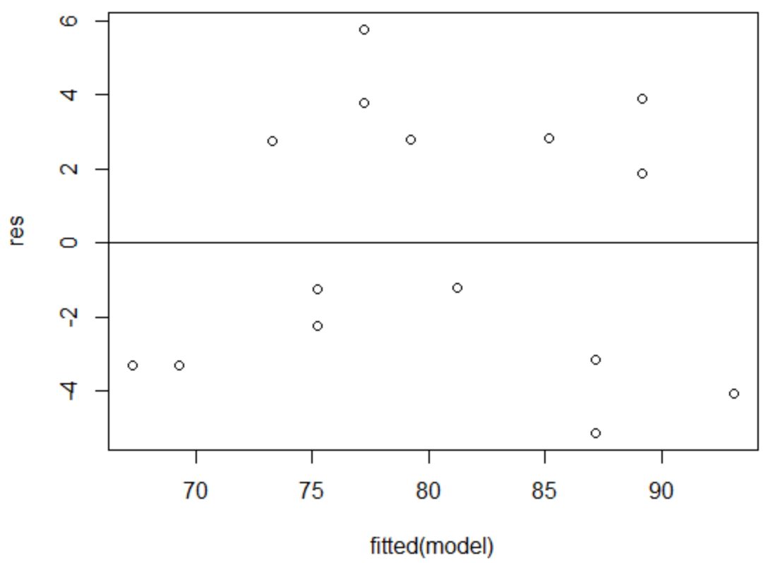
To verify that this assumption is met, we can create a residuals vs. fitted plot.
The x-axis displays the fitted values and the y-axis displays the residuals. As long as the residuals appear to be randomly and evenly distributed throughout the chart around the value zero, we can assume that homoscedasticity is not violated:
#define residuals
res #produce residual vs. fitted plot
plot(fitted(model), res)

#add a horizontal line at 0
abline(0,0)

The residuals appear to be randomly scatted around zero and don’t exhibit any noticeable patterns, so this assumption is met.
The assumption of normality states that the residuals of a regression model are roughly normally distributed.
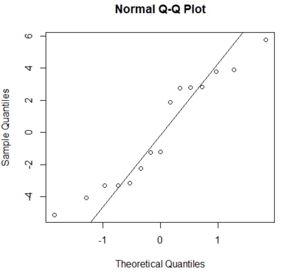
To check if this assumption is met, we can create a Q-Q plot. If the points in the plot fall along a roughly straight line at a 45-degree angle, then the data is normally distributed:
#create Q-Q plot for residuals
qqnorm(res)

#add a straight diagonal line to the plot
qqline(res)

The residuals stray from the 45-degree line a bit, but not enough to cause serious concern. We can assume that the normality assumption is met.
Since the residuals are normally distributed and homoscedastic, we’ve verified that the assumptions of the OLS regression model are met.
Thus, the output from our model is reliable.
Note: If one or more of the assumptions was not met, we could attempt transforming our data.
Additional Resources
The following tutorials explain how to perform other common tasks in R:
How to Perform Multiple Linear Regression in R
How to Perform Exponential Regression in R
How to Perform Weighted Least Squares Regression in R