A log-log plot is a plot that uses logarithmic scales on both the x-axis and the y-axis.
This type of plot is useful for visualizing two variables when the true relationship between them follows some type of power law.
This tutorial explains how to create a log-log plot in R using both base R and the data visualization package ggplot2.
Method 1: Create a Log-Log Plot in Base R
Suppose we have the following dataset in R:
#create data
df frame(x=3:22,
                 y=c(3, 4, 5, 7, 9, 13, 15, 19, 23, 24, 29,
                     38, 40, 50, 56, 59, 70, 89, 104, 130))

#create scatterplot of x vs. y
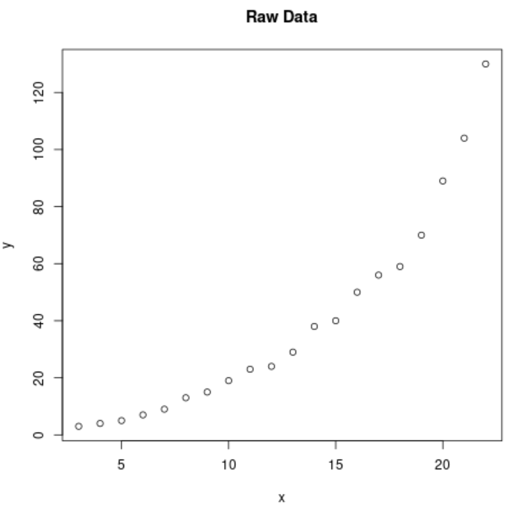
plot(df$x, df$y, main='Raw Data')

Clearly the relationship between variables x and y follows a power law.
The following code shows how to create a log-log plot for these two variables in base R:
#create log-log plot of x vs. y
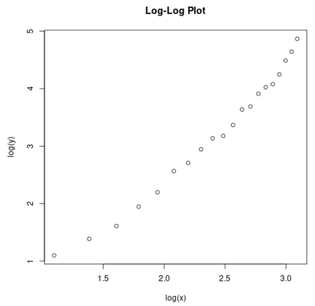
plot(log(df$x), log(df$y), main='Log-Log Plot')

Notice how the relationship between log(x) and log(y) is much more linear compared to the previous plot.
Method 2: Create a Log-Log Plot in ggplot2
The following code shows how to create a log-log plot for the exact same dataset using ggplot2:
library(ggplot2)

#create data
df frame(x=3:22,
                 y=c(3, 4, 5, 7, 9, 13, 15, 19, 23, 24, 29,
                     38, 40, 50, 56, 59, 70, 89, 104, 130))

#define new data frame
df_log frame(x=log(df$x),
                     y=log(df$y))

#create scatterplot using ggplot2
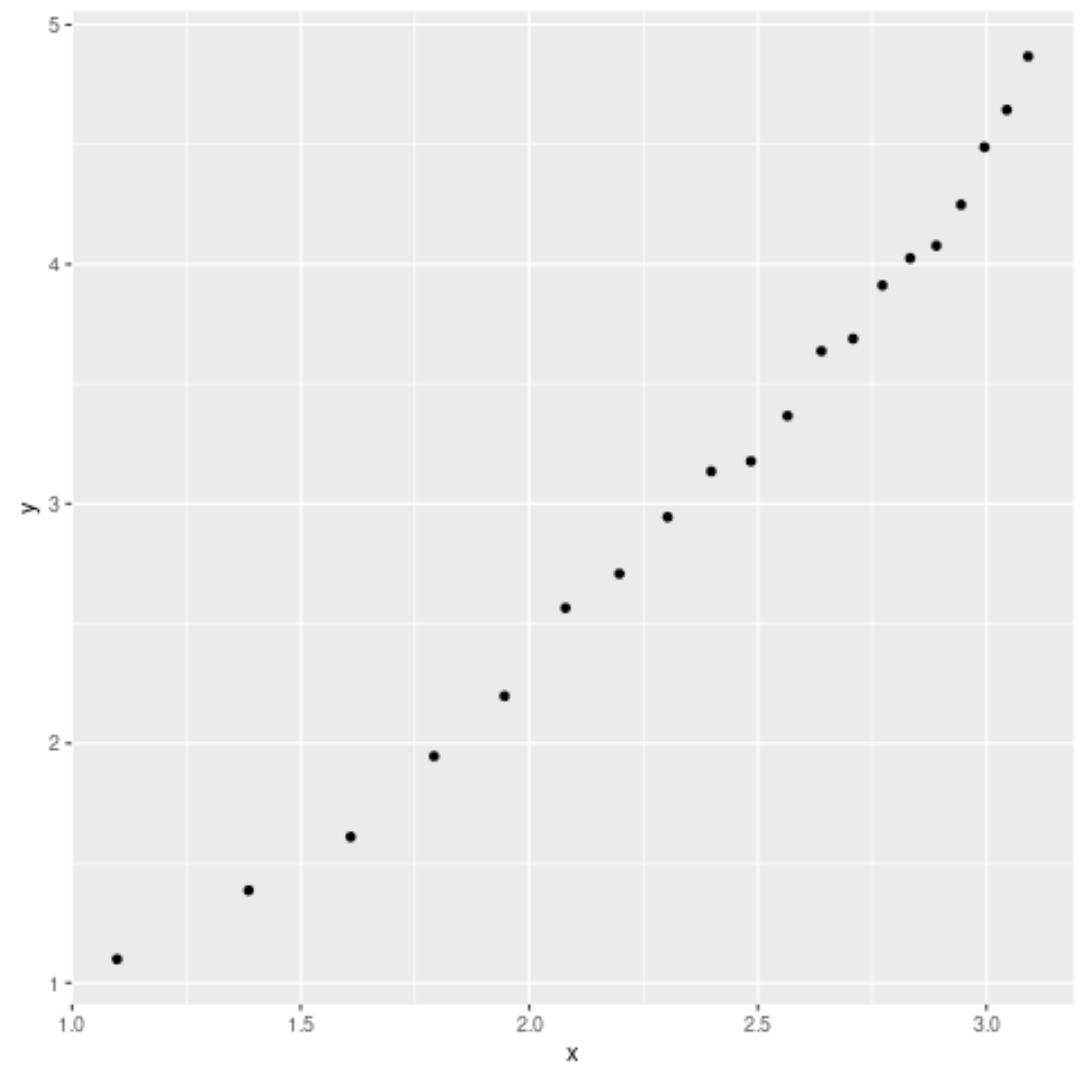
ggplot(df_log, aes(x=x, y=y)) +
  geom_point()

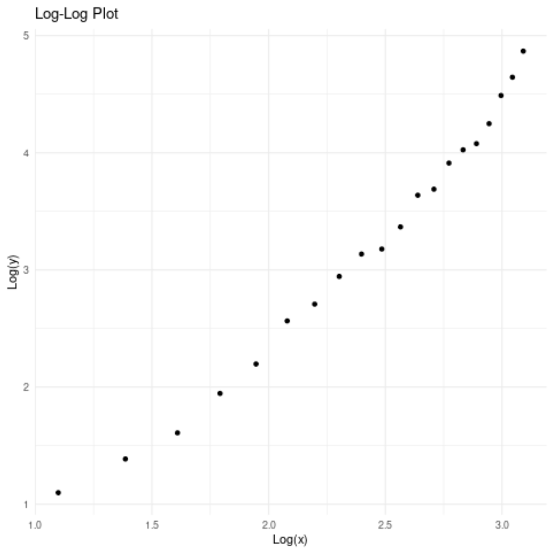
Feel free to customize the title, axis labels, and theme to make the plot more aesthetically pleasing:
ggplot(df_log, aes(x=x, y=y)) +
  geom_point() +
  labs(title='Log-Log Plot', x='Log(x)', y='Log(y)') +
  theme_minimal()

Additional Resources
How to Plot Multiple Lines in One Chart in R
How to Plot Multiple Boxplots in One Chart in R
How to Create a Stacked Barplot in R