Logistic Regression is a statistical method that we use to fit a regression model when the response variable is binary. To assess how well a logistic regression model fits a dataset, we can look at the following two metrics:
- Sensitivity: The probability that the model predicts a positive outcome for an observation when the outcome is indeed positive.
- Specificity: The probability that the model predicts a negative outcome for an observation when the outcome is indeed negative.
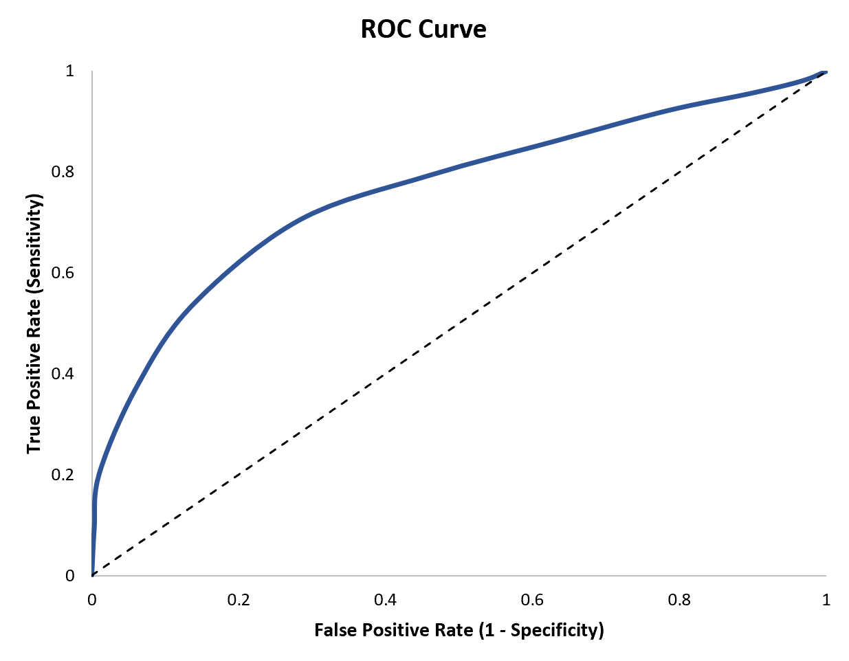
An easy way to visualize these two metrics is by creating a ROC curve, which is a plot that displays the sensitivity and specificity of a logistic regression model.

This tutorial explains how to create and interpret a ROC curve.
How to Create a ROC Curve
Once we’ve fit a logistic regression model, we can use the model to classify observations into one of two categories.
For example, we might classify observations as either “positive” or “negative.”
The true positive rate represents the proportion of observations that are predicted to be positive when indeed they are positive.
Conversely, the false positive rate represents the proportion of observations that are predicted to be positive when they’re actually negative.
When we create a ROC curve, we plot pairs of the true positive rate vs. the false positive rate for every possible decision threshold of a logistic regression model.

How to Interpret a ROC Curve
The more that the ROC curve hugs the top left corner of the plot, the better the model does at classifying the data into categories.
To quantify this, we can calculate the AUC (area under the curve) which tells us how much of the plot is located under the curve.

The closer AUC is to 1, the better the model.
A model with an AUC equal to 0.5 would be a perfectly diagonal line and it would represent a model that is no better than a model that makes random classifications.

It’s particularly useful to calculate the AUC for multiple logistic regression models because it allows us to see which model is best at making predictions.
For example, suppose we fit three different logistic regression models and plot the following ROC curves for each model:

Suppose we calculate the AUC for each model as follows:
- Model A: AUC = 0.923
- Model B: AUC = 0.794
- Model C: AUC = 0.588
Model A has the highest AUC, which indicates that it has the highest area under the curve and is the best model at correctly classifying observations into categories.
Additional Resources
The following tutorials explain how to create ROC curves using different statistical software: