You can use the following basic syntax to group by two columns when creating a plot in ggplot2:
ggplot(df, aes(x=var1, y=var2, color=var3, shape=var4,
       group=interaction(var3, var4))) +
  geom_point() +
  geom_line()
This particular code produces a line plot where the points are grouped by the columns var3 and var4 in the data frame.
The following example shows how to use this syntax in practice.
Example: Group by Two Columns in ggplot2
Suppose we have the following data frame in R that shows the total sales during various weeks at two different stores when two different promotions were run:
#create data frame
df frame(store=rep(c('A', 'B'), each=8),
                 promo=rep(c('Promo 1', 'Promo 2'), each=4, times=2),
                 week=rep(c(1:4), times=4),
                 sales=c(1, 2, 6, 7, 2, 3, 5, 6, 3, 4, 7, 8, 3, 5, 8, 9))

#view data frame
df

   store   promo week sales
1      A Promo 1    1     1
2      A Promo 1    2     2
3      A Promo 1    3     6
4      A Promo 1    4     7
5      A Promo 2    1     2
6      A Promo 2    2     3
7      A Promo 2    3     5
8      A Promo 2    4     6
9      B Promo 1    1     3
10     B Promo 1    2     4
11     B Promo 1    3     7
12     B Promo 1    4     8
13     B Promo 2    1     3
14     B Promo 2    2     5
15     B Promo 2    3     8
16     B Promo 2    4     9
We can use the following code to create a line chart in ggplot2 in which the data values are grouped by the store and promo columns:
library(ggplot2)

#create line plot with values grouped by store and promo
ggplot(df, aes(x=week, y=sales, color=store, shape=promo,
               group=interaction(store, promo))) +
  geom_point(size=3) +
  geom_line()
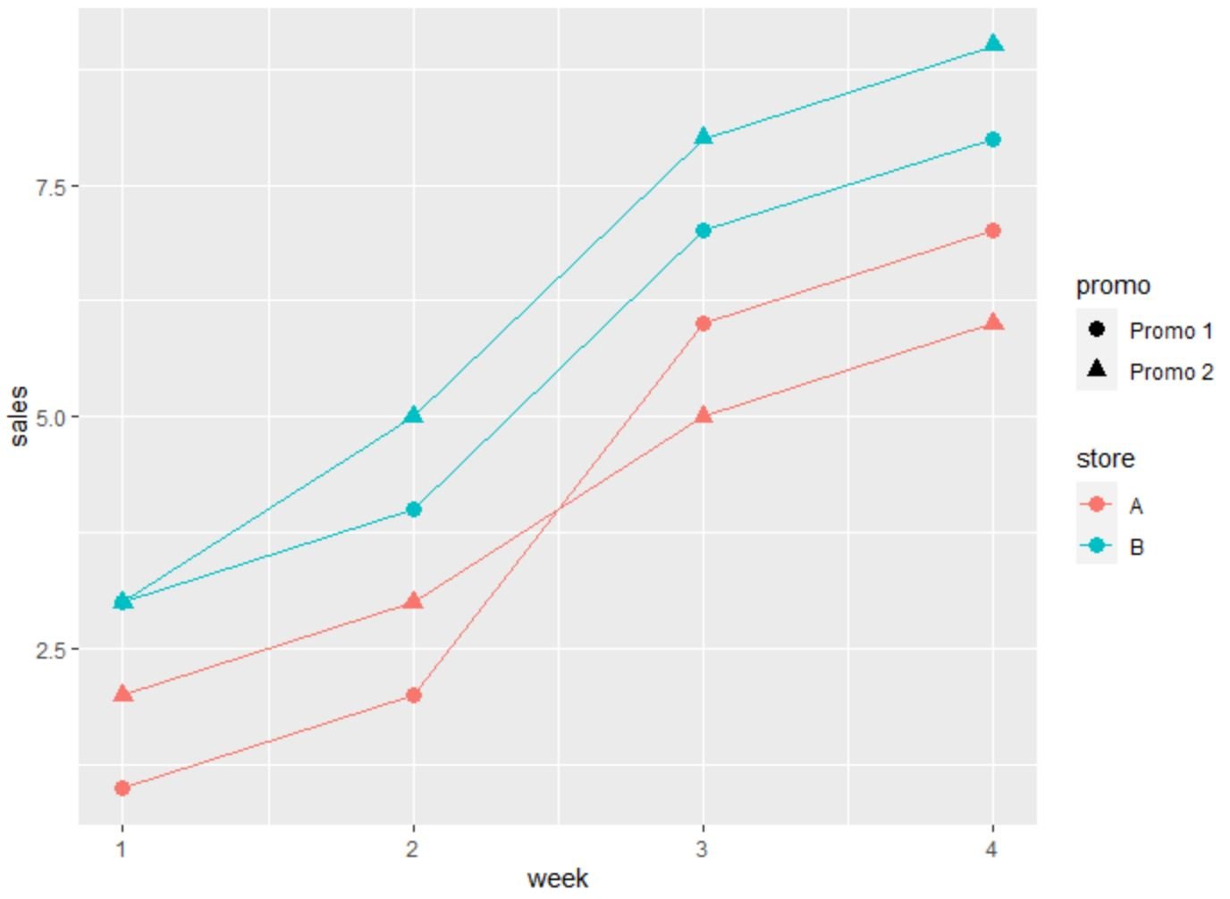
The result is a line chart in which each line represents the sales values for each combination of store and promo.
In particular, the four lines represent the sales values for the following combinations:
- Promo 1 at Store A
- Promo 2 at Store A
- Promo 1 at Store B
- Promo 1 at Store B
The two legends on the side of the plot indicate which lines represents which combinations.
Additional Resources
The following tutorials explain how to perform other common tasks in ggplot2:
How to Rotate Axis Labels in ggplot2
How to Set Axis Breaks in ggplot2
How to Set Axis Limits in ggplot2
How to Change Legend Labels in ggplot2