You can use the following basic syntax to plot multiple lines on the same plot using seaborn in Python:
import seaborn as sns

sns.lineplot(data=df[['col1', 'col2', 'col3']]
This particular example will create a plot with three different lines.
The following example shows how to use this syntax in practice.
Example: Plot Multiple Lines in Seaborn
Suppose we have the following pandas DataFrame that contains information about the sales made by four different retail stores (A, B, C, and D) during eight consecutive years:
import pandas as pd

#create DataFrame
df = pd.DataFrame({'year': [1, 2, 3, 4, 5, 6, 7, 8],
                   'A': [10, 12, 14, 15, 15, 14, 13, 18],
                   'B': [18, 18, 19, 14, 14, 11, 20, 28],
                   'C': [5, 7, 7, 9, 12, 9, 9, 4],
                   'D': [11, 8, 10, 6, 6, 5, 9, 12]})

#view DataFrame
print(df)

   year   A   B   C   D
0     1  10  18   5  11
1     2  12  18   7   8
2     3  14  19   7  10
3     4  15  14   9   6
4     5  15  14  12   6
5     6  14  11   9   5
6     7  13  20   9   9
7     8  18  28   4  12
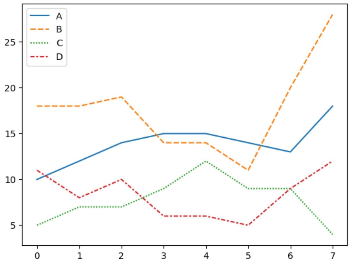
We can use the lineplot() function in seaborn to create a plot that displays four lines to represent the sales made by each store during each year:
import seaborn as sns

#plot sales of each store as a line
sns.lineplot(data=df[['A', 'B', 'C', 'D']])

Each line represents the values for one of the four stores.
The legend in the top left corner shows which color corresponds to which store.
Note that we can also use the palette argument to specify our own colors to use in the plot:
import seaborn as sns

#plot sales of each store with custom colors
sns.lineplot(data=df[['A', 'B', 'C', 'D']], palette=['red', 'blue', 'purple', 'pink'])
Notice that the colors of the lines now correspond to the four colors that we specified in the palette argument.
If you’d like each of the lines to be solid, you can use the pandas melt() function to melt the DataFrame into a long format and then use the following syntax to plot the lines:
import seaborn as sns

#plot sales of each store with custom colors
sns.lineplot(x='year', y='value', hue='variable',
             data=pd.melt(df, ['year']),
             palette=['red', 'blue', 'purple', 'pink'])

Each of the lines are now solid instead of having their own line styles.
Note: If you have trouble importing seaborn in a Jupyter notebook, you may first need to run the command %pip install seaborn.
Additional Resources
The following tutorials explain how to perform other common tasks in seaborn:
How to Add a Title to Seaborn Plots
How to Change Font Size in Seaborn Plots
How to Adjust the Figure Size of a Seaborn Plot