You can use the following methods to set the color of bars in a seaborn barplot:
Method 1: Set Color for All Bars
#use steelblue for the color of all bars
sns.barplot(x=xvar, y=yvar, color='steelblue')
Method 2: Set Color for Bar with Max Value
#use orange for bar with max value and grey for all other bars
cols = ['grey' if (x max(df.yvar)) else 'orange' for x in df.yvar]

#create barplot using specified colors
sns.barplot(x=df.xvar, y=df.yvar, palette=cols)
Method 3: Set Color for Bars Based on Condition
#use red for bars with value less than 10 and green for all other bars
cols = ['red' if x else 'green' for x in df.yvar]

#create barplot using specified colors
sns.barplot(x=df.xvar, y=df.yvar, palette=cols)
The following examples show how to use each method in practice with the following pandas DataFrame:
import pandas as pd

#create DataFrame
df = pd.DataFrame({'employee': ['Andy', 'Bert', 'Chad', 'Doug', 'Eric', 'Frank'],
                   'sales': [22, 14, 9, 7, 29, 20]})

#view DataFrame
print(df)

  employee  sales
0     Andy     22
1     Bert     14
2     Chad      9
3     Doug      7
4     Eric     29
5    Frank     20
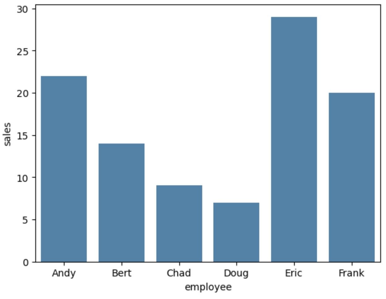
Example 1: Set Color for All Bars
The following code shows how to create a barplot in seaborn and use the color ‘steelblue’ for all bars in the plot:
import seaborn as sns

#create barplot using steelblue as color for each bar
sns.barplot(x=df.employee, y=df.sales, color='steelblue')
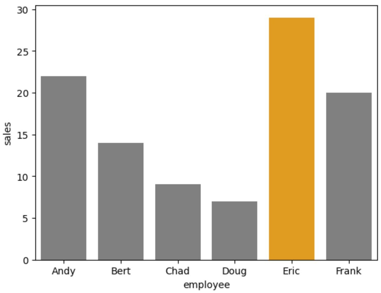
Example 2: Set Color for Bar with Max Value
The following code shows how to use orange for the bar with the max value in the barplot and grey for all other bars:
import seaborn as sns

#use orange for bar with max value and grey for all other bars
cols = ['grey' if (x max(df.sales)) else 'orange' for x in df.sales]

#create barplot with custom colors
sns.barplot(x=df.employee, y=df.sales, palette=cols)
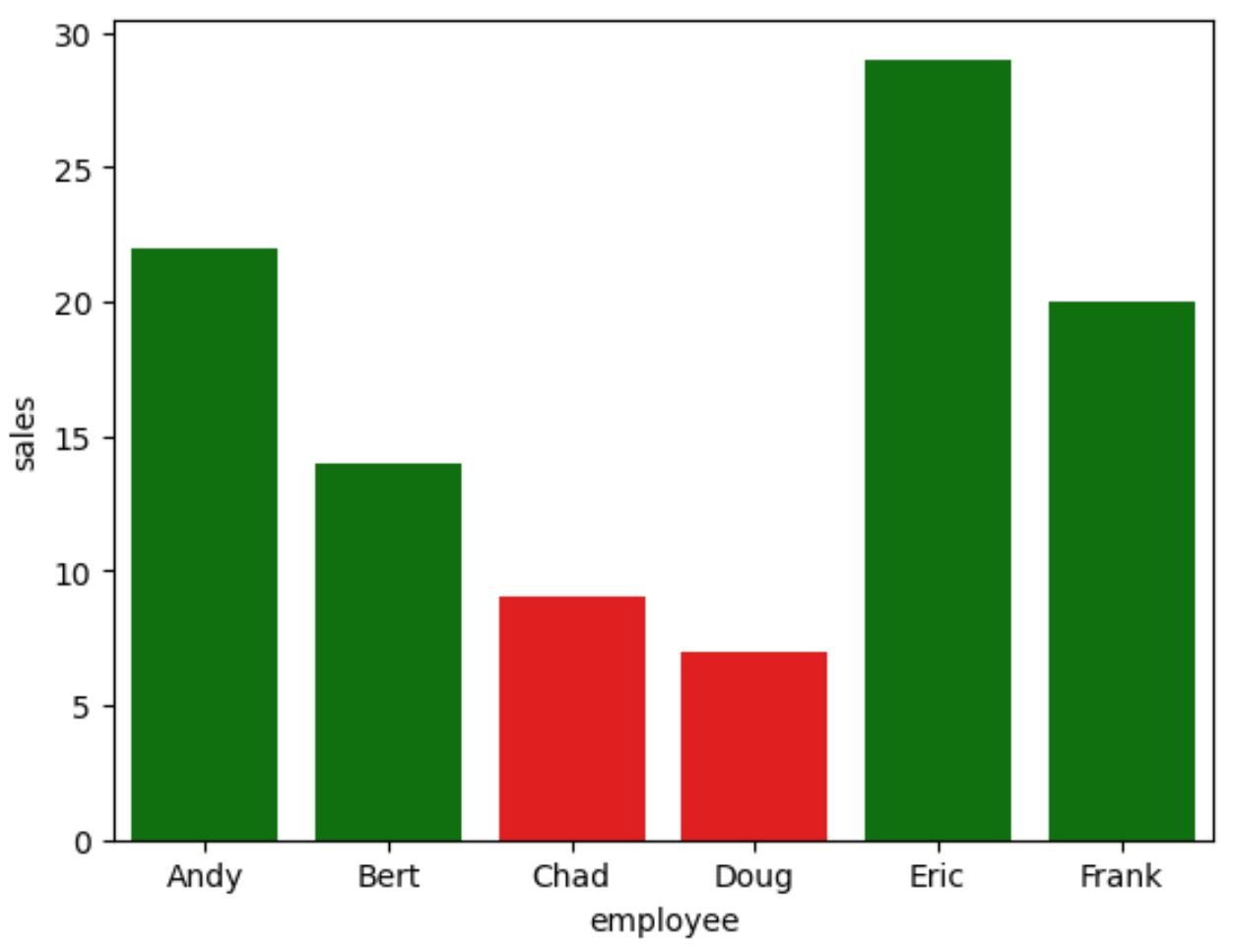
Example 3: Set Color for Bar with Max Value
The following code shows how to use orange for the bar with the max value in the barplot and grey for all other bars:
import seaborn as sns

#use red for bars with value less than 10 and green for all other bars
cols = ['red' if x else 'green' for x in df.sales]

#create barplot with custom colors
sns.barplot(x=df.employee, y=df.sales, palette=cols)
Additional Resources
The following tutorials explain how to perform other common functions in seaborn:
How to Create a Grouped Barplot in Seaborn
How to Create a Pie Chart in Seaborn
How to Create Multiple Seaborn Plots in One Figure