You can use proc sgplot to quickly create a scatterplot with a regression line in SAS.
The following examples show how to use this procedure in practice.
Example 1: Create Basic Scatterplot with Regression Line
The following code shows how to create a basic scatterplot with a regression line using the built-in SAS class dataset:
/*create scatterplot with regression line*/
proc sgplot data=sashelp.class;
   reg y=height x=weight;
run;
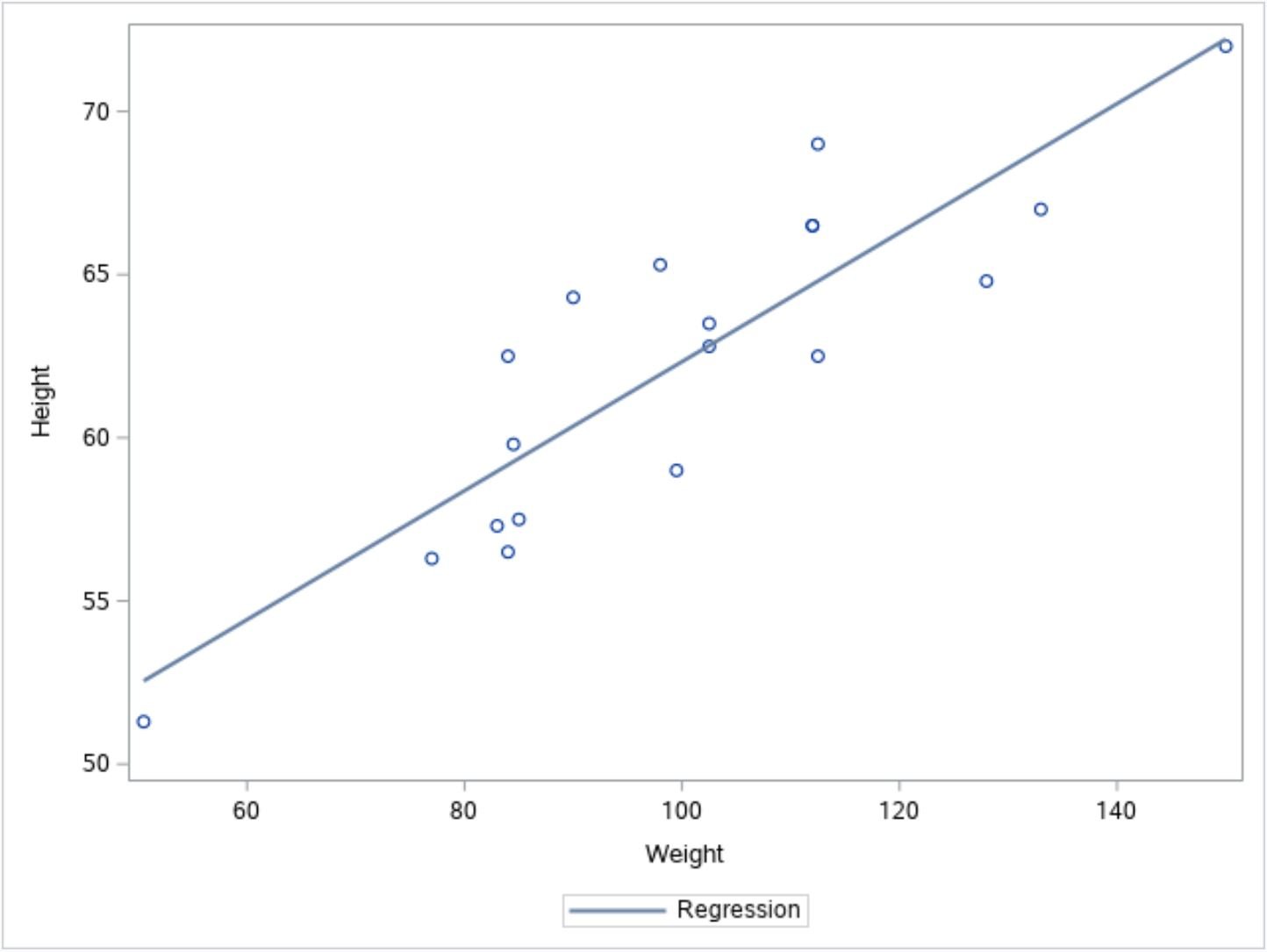
The points in the plot display the individual observations from the dataset and the blue line displays the fitted regression line.
Example 2: Create Custom Scatterplot with Regression Line
Note that proc sgplot can create highly customizable scatterplots.
For example, you can:
- Add a title to the chart
- Modify the axis labels
- Remove the legend
- Customize the color and thickness of the regression line
- Customize the appearance of the points in the plot
The following code shows how to customize each of these aspects of the plot:
/*create custom scatterplot with regression line*/
proc sgplot data=sashelp.class noautolegend;
   title 'Regression Model';
   xaxis label='Weight (pounds)';
   yaxis label='Height (inches)';
   reg y=height x=weight /
   lineattrs=(color=red thickness=2)
   markerattrs=(color=green size=12px symbol=circlefilled);
run;
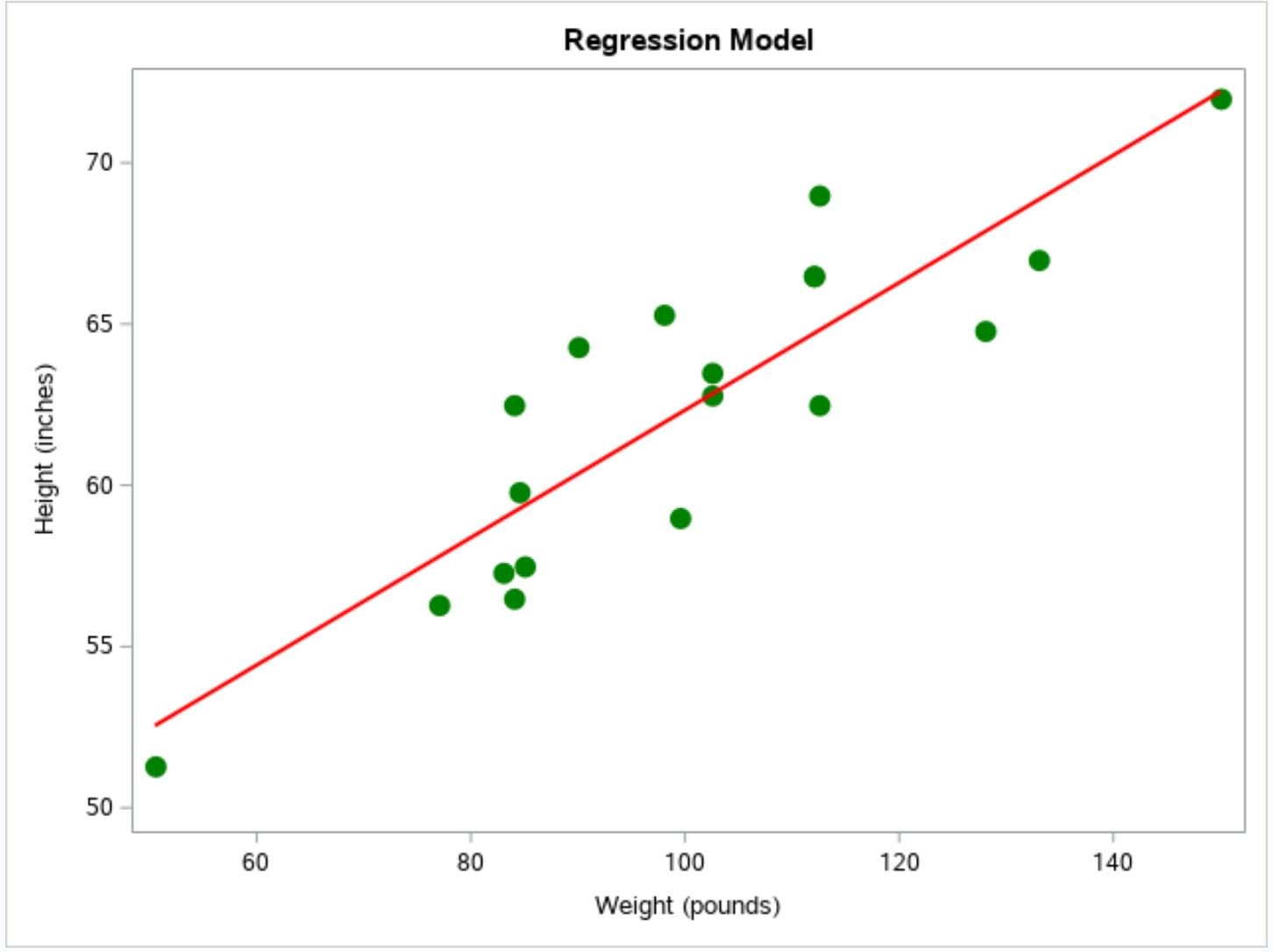
Notice that the title, axis labels, individual points, and the regression line have all been modified.
Additional Resources
The following tutorials explain how to perform other common tasks in SAS:
How to Perform Simple Linear Regression in SAS
How to Calculate Correlation in SAS