A scatter matrix is exactly what it sounds like – a matrix of scatterplots.
This type of matrix is useful because it allows you to visualize the relationship between multiple variables in a dataset at once.
You can use the scatter_matrix() function to create a scatter matrix from a pandas DataFrame:
pd.plotting.scatter_matrix(df)
The following examples show how to use this syntax in practice with the following pandas DataFrame:
import pandas as pd
import numpy as np

#make this example reproducible
np.random.seed(0)

#create DataFrame
df = pd.DataFrame({'points': np.random.randn(1000),
                   'assists': np.random.randn(1000),
                   'rebounds': np.random.randn(1000)})

#view first five rows of DataFrame
df.head()

	points	        assists	        rebounds
0	1.764052	0.555963	-1.532921
1	0.400157	0.892474	-1.711970
2	0.978738	-0.422315	0.046135
3	2.240893	0.104714	-0.958374
4	1.867558	0.228053	-0.080812
Example 1: Basic Scatter Matrix
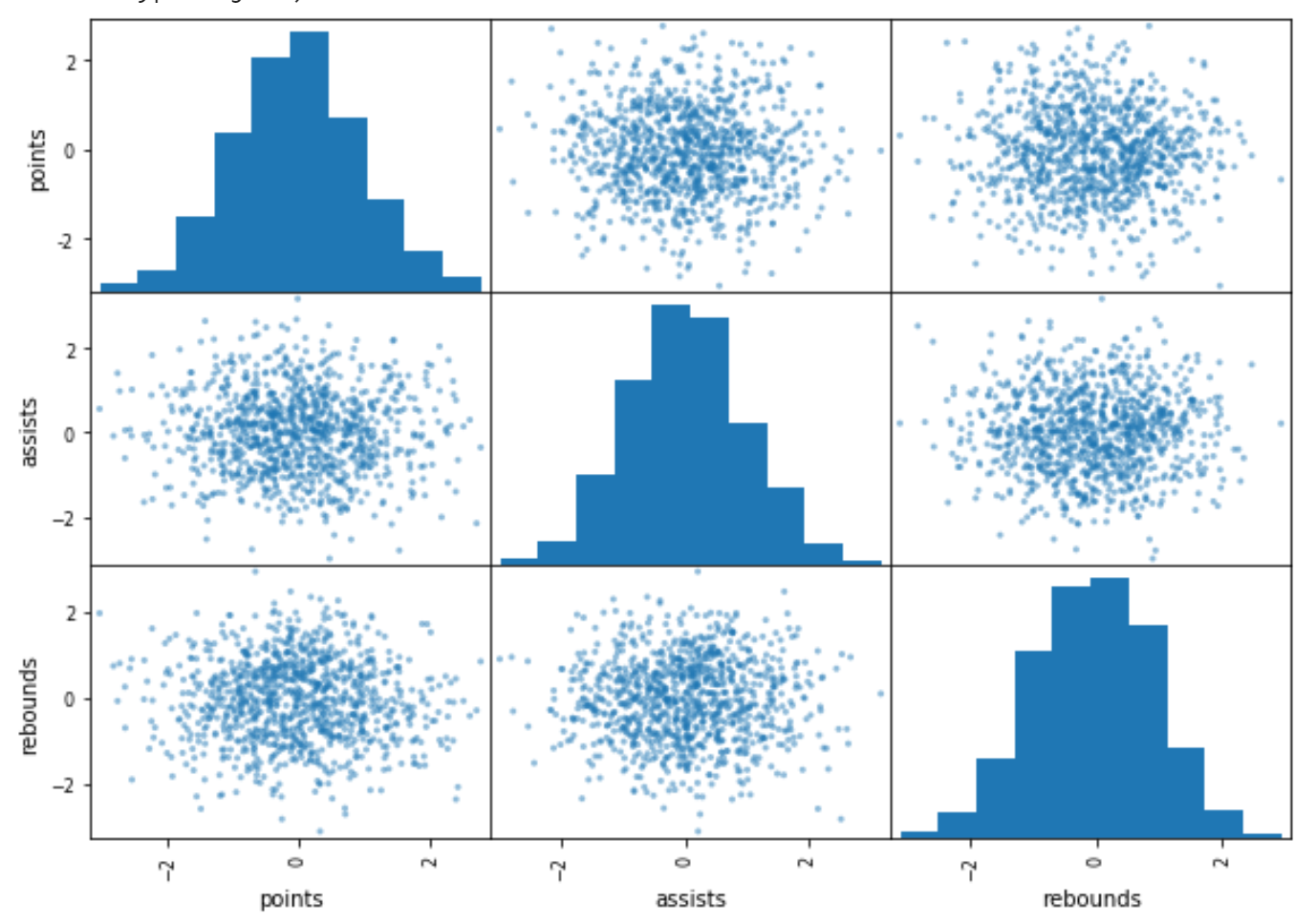
The following code shows how to create a basic scatter matrix:
pd.plotting.scatter_matrix(df)

Example 2: Scatter Matrix for Specific Columns
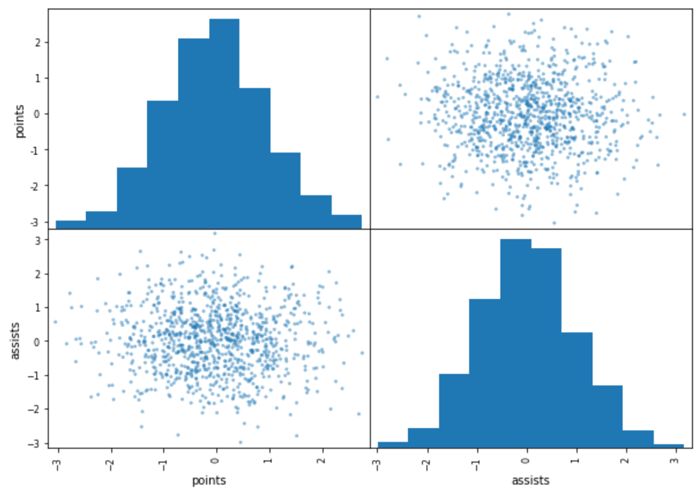
The following code shows how to create a scatter matrix for just the first two columns in the DataFrame:
pd.plotting.scatter_matrix(df.iloc[:, 0:2])

Example 3: Scatter Matrix with Custom Colors & Bins
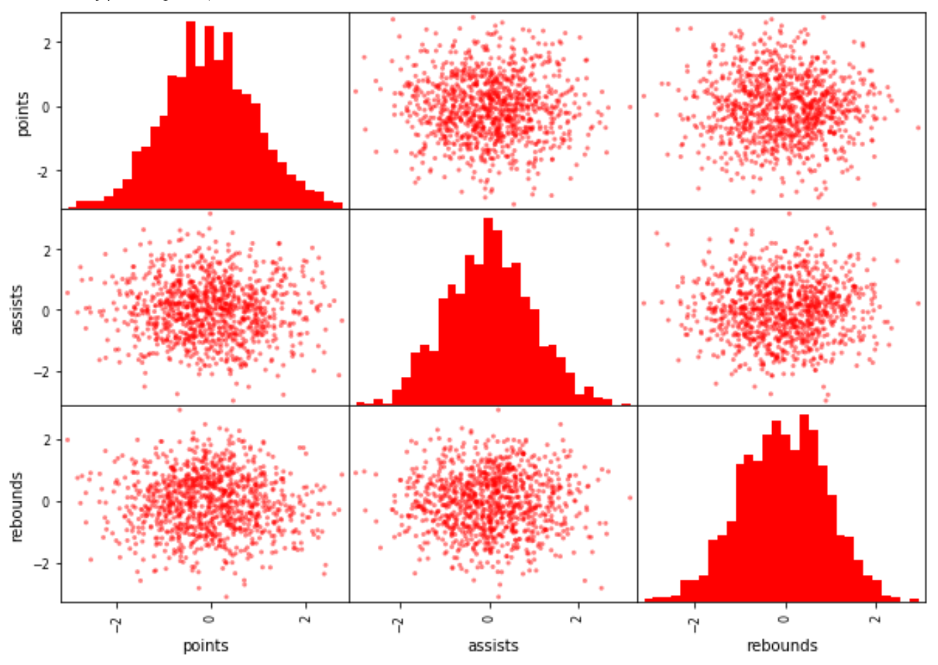
The following code shows how to create a scatter matrix with custom colors and a specific number of bins for the histograms:
pd.plotting.scatter_matrix(df, color='red', hist_kwds={'bins':30, 'color':'red'})

Example 4: Scatter Matrix with KDE Plot
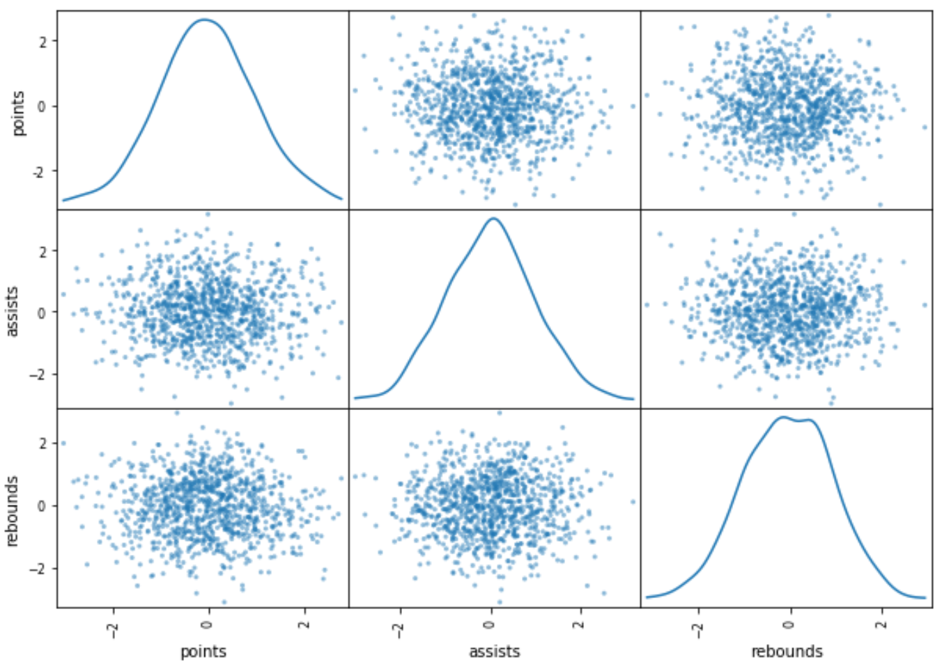
The following code shows how to create a scatter matrix with a kernel density estimate plot along the diagonals of the matrix instead of a histogram:
pd.plotting.scatter_matrix(df, diagonal='kde')

You can find the complete online documentation for the scatter_matrix() function here.
Additional Resources
The following tutorials explain how to create other common charts in Python:
How to Create Heatmaps in Python
How to Create a Bell Curve in Python
How to Create an Ogive Graph in Python