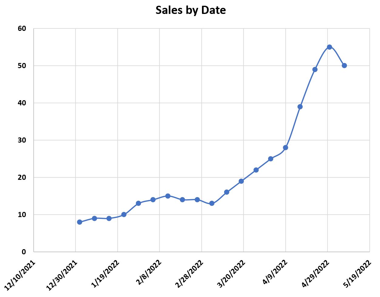
This tutorial provides a step-by-step example of how to plot the following time series in Excel:
Let’s jump in!
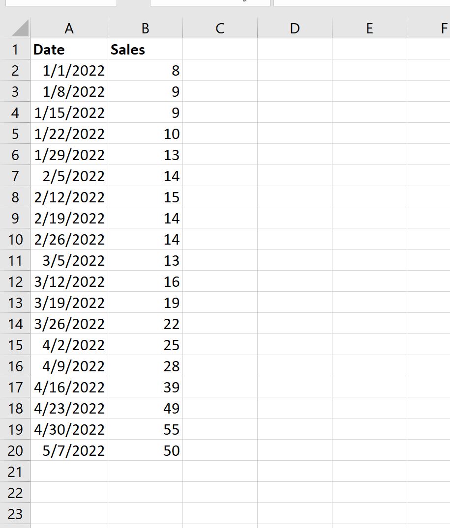
Step 1: Enter the Time Series Data
First, let’s enter the following values for a time series dataset in Excel:
Step 2: Plot the Time Series
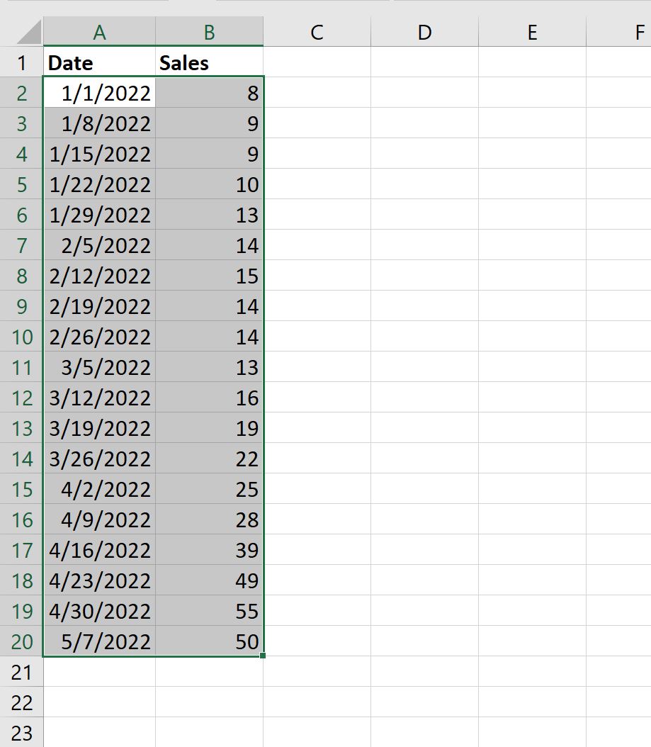
Next, highlight the values in the range A2:B20:
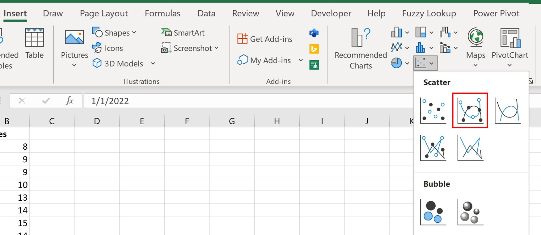
Then click the Insert tab along the top ribbon, then click the icon called Scatter with Smooth Lines and Markers within the Charts group:
The following chart will automatically appear:
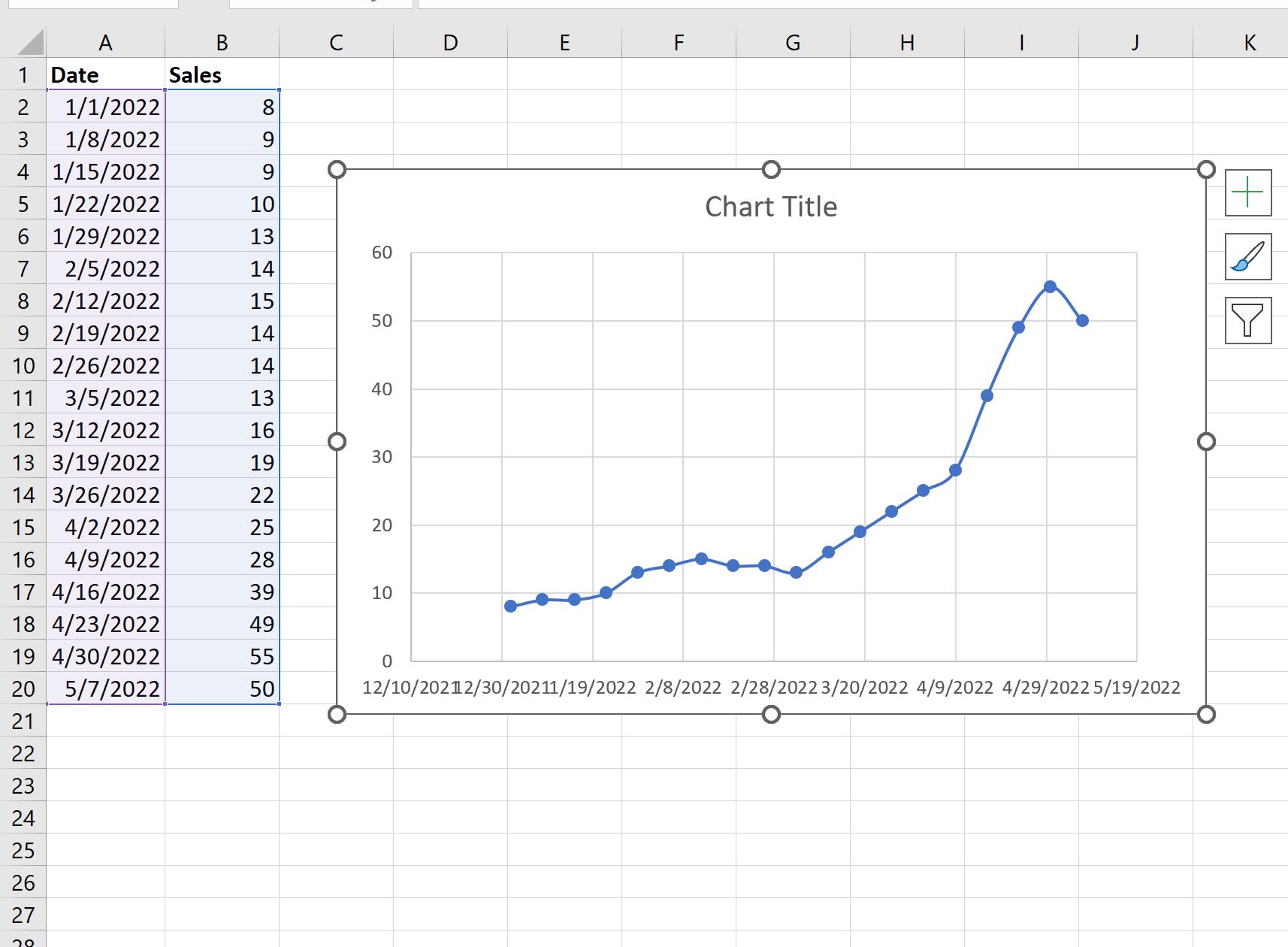
The x-axis shows the date and the y-axis shows the sales.
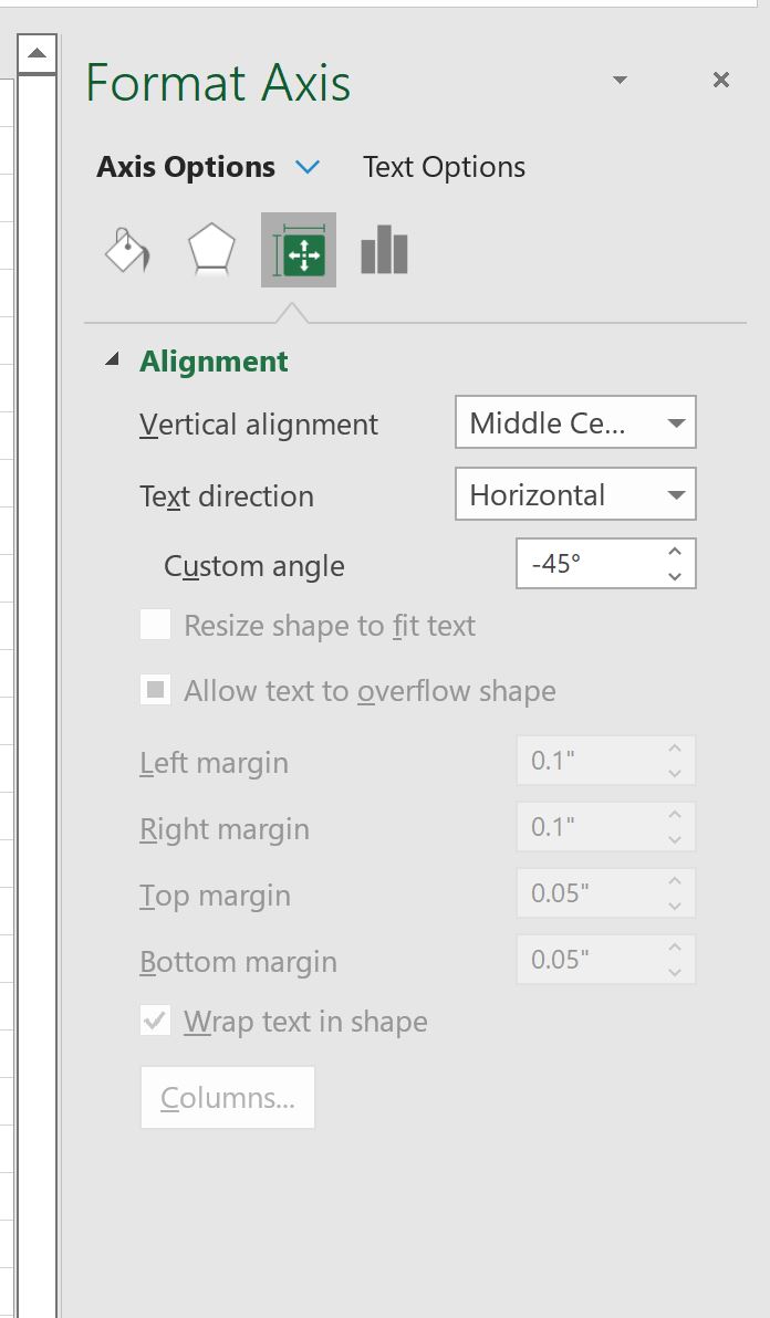
Step 3: Customize the Time Series Plot
Lastly, we can customize the plot to make it easier to read.
Double click any of the values on the x-axis. In the Format Axis panel that appears, click the icon called Size & Properties and type -45 in the box titled Custom angle:
The x-axis labels will be rotated at a 45 degree angle to make them easier to read:
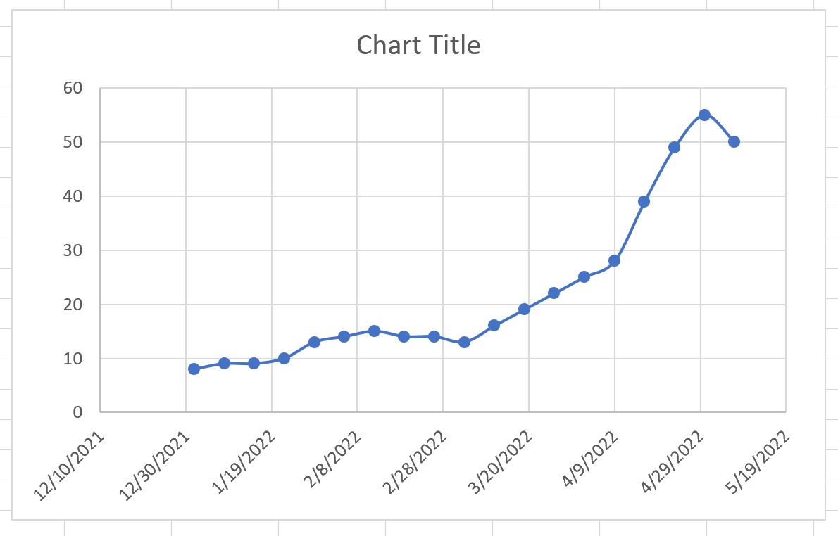
Lastly, click on the Chart Title and change it to whatever you’d like.
Then click the labels on each axis and make them bold:
The time series plot is now complete.
Additional Resources
The following tutorials explain how to perform other common tasks in Excel:
How to Add Labels to Scatterplot Points in Excel
How to Change Axis Scales in Excel Plots
How to Add a Vertical Line to Charts in Excel