To plot the probability density function for a t distribution in R, we can use the following functions:
- dt(x, df) to create the probability density function
- curve(function, from = NULL, to = NULL) to plot the probability density function
To plot the probability density function, we need to specify df (degrees of freedom) in the dt() function along with the from and to values in the curve() function.
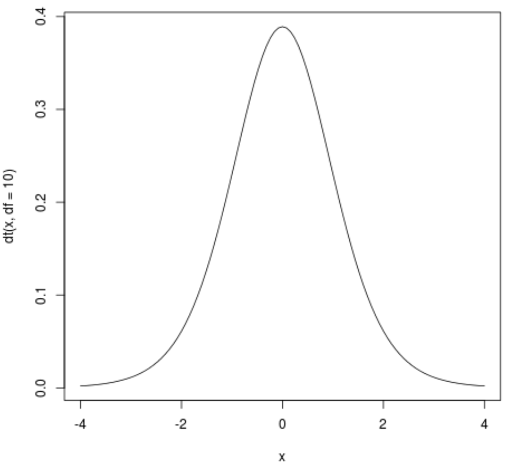
For example, the following code illustrates how to plot a probability density function for a t distribution with 10 degrees of freedom where the x-axis of the plot ranges from -4 to 4:
curve(dt(x, df=10), from=-4, to=4)

Similar to the normal distribution, the t distribution is symmetrical around a mean of 0.
We can add a title, change the y-axis label, increase the line width, and even change the line color to make the plot more aesthetically pleasing:
curve(dt(x, df=10), from=-4, to=4,
    main = 't Distribution (df = 10)', #add title
    ylab = 'Density', #change y-axis label
    lwd = 2, #increase line width to 2
    col = 'steelblue') #change line color to steelblue

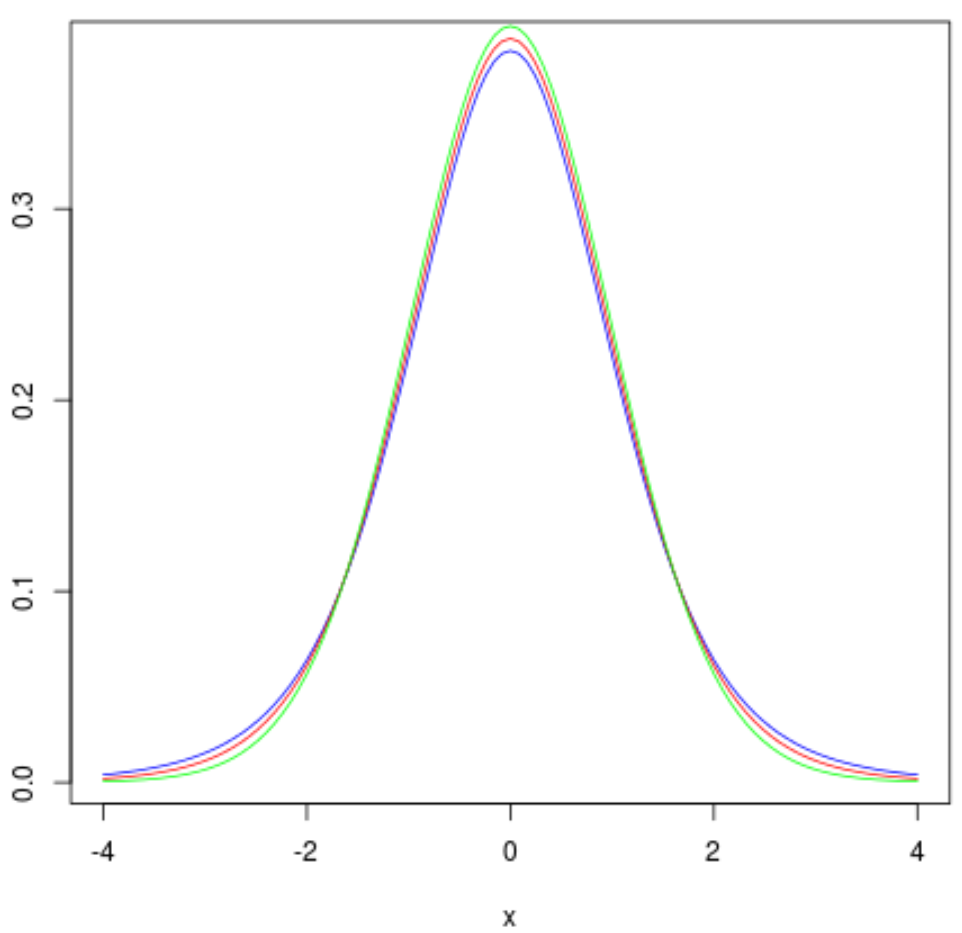
We can also add more than one curve to the graph to compare t distributions with different degrees of freedom. For example, the following code creates t distribution plots with df = 6, df = 10, and df = 30:
curve(dt(x, df=6), from=-4, to=4, col='blue')
curve(dt(x, df=10), from=-4, to=4, col='red', add=TRUE)
curve(dt(x, df=30), from=-4, to=4, col='green', add=TRUE)

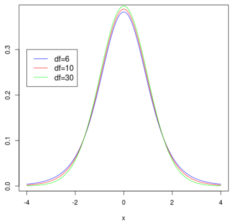
We can add a legend to the plot by using the legend() function, which takes on the following syntax:
legend(x, y=NULL, legend, fill, col, bg, lty, cex)
where:
- x, y: the x and y coordinates used to position the legend
- legend: the text to go in the legend
- fill: fill color inside the legend
- col: the list of colors to be used for the lines inside the legend
- bg: the background color for the legend
- lty: line style
- cex: text size in the legend
In our example we will use the following syntax to create a legend:
#create density plots
curve(dt(x, df=6), from=-4, to=4, col='blue')
curve(dt(x, df=10), from=-4, to=4, col='red', add=TRUE)
curve(dt(x, df=30), from=-4, to=4, col='green', add=TRUE)

#add legend
legend(-4, .3, legend=c("df=6", "df=10", "df=30"),
       col=c("blue", "red", "green"), lty=1, cex=1.2)
