Often you may be interested in plotting an equation or a function in Excel. Fortunately this is easy to do with built-in Excel formulas.
This tutorial provides several examples of how to plot equations/functions in Excel.
Example 1: Plot a Linear Equation
Suppose you’d like to plot the following equation:
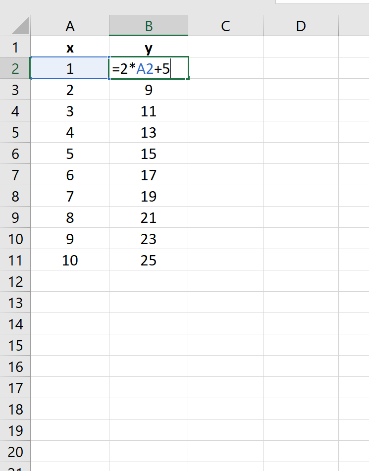
y = 2x + 5
The following image shows how to create the y-values for this linear equation in Excel, using the range of 1 to 10 for the x-values:
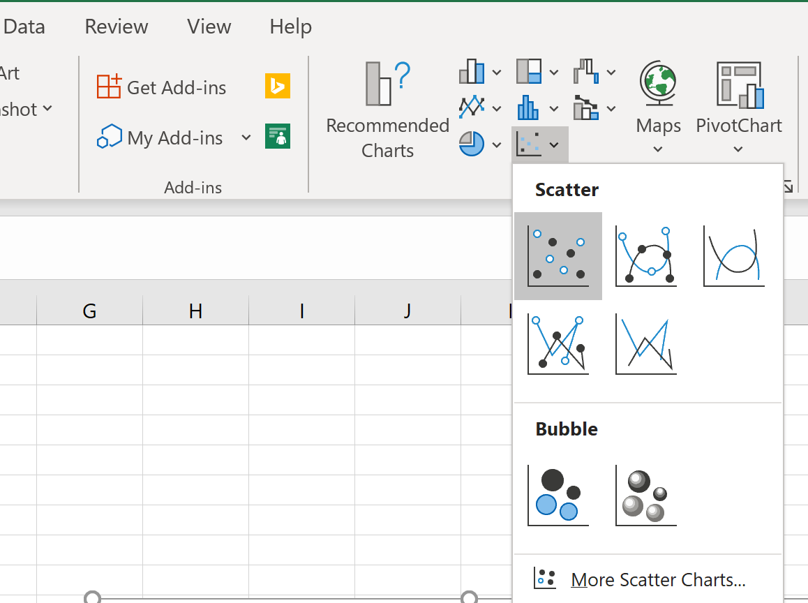
Next, highlight the values in the range A2:B11. Then click on the Insert tab. Within the Charts group, click on the plot option called Scatter.
The following plot will automatically appear:
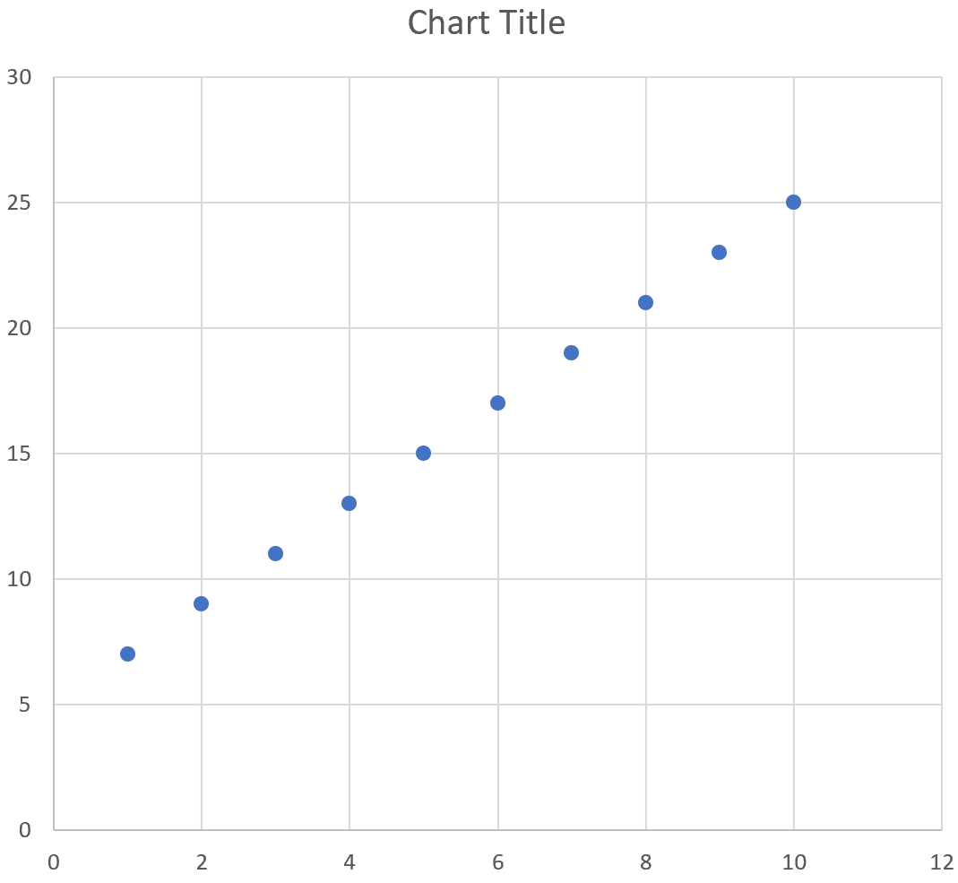
We can see that the plot follows a straight line since the equation that we used was linear in nature.
Example 2: Plot a Quadratic Equation
Suppose you’d like to plot the following equation:
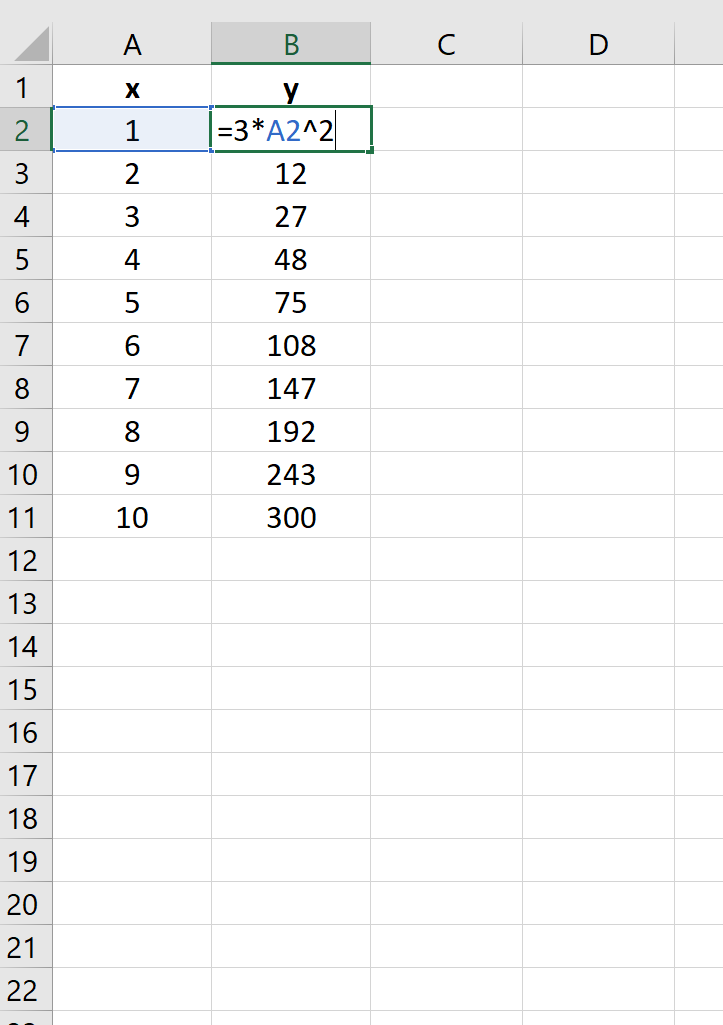
y = 3x2
The following image shows how to create the y-values for this equation in Excel, using the range of 1 to 10 for the x-values:
Next, highlight the values in the range A2:B11. Then click on the Insert tab. Within the Charts group, click on the plot option called Scatter.
The following plot will automatically appear:
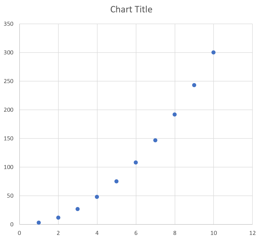
We can see that the plot follows a curved line since the equation that we used was quadratic.
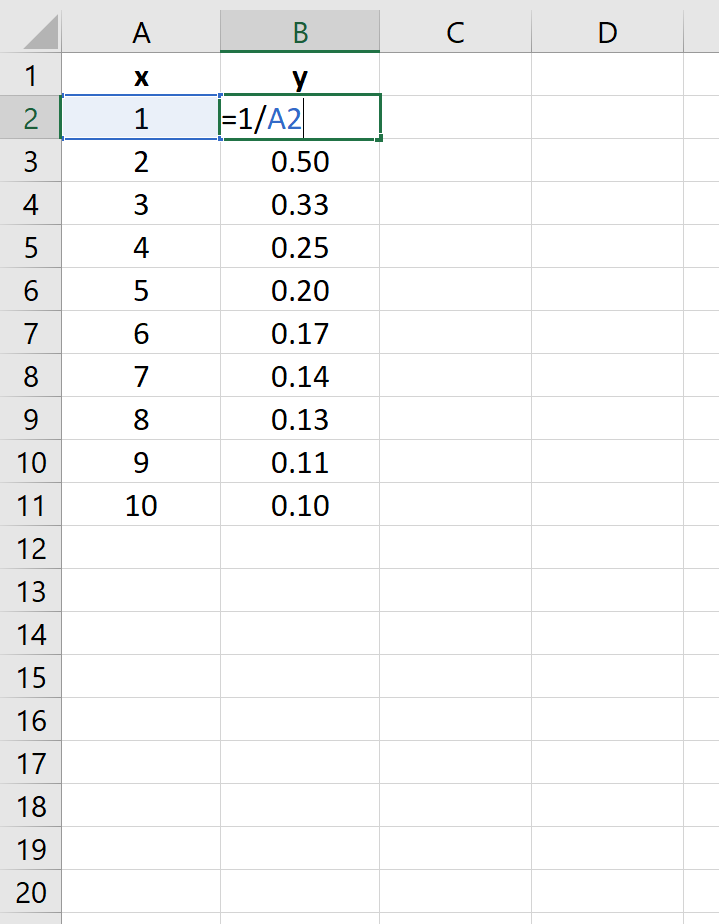
Example 3: Plot a Reciprocal Equation
Suppose you’d like to plot the following equation:
y = 1/x
The following image shows how to create the y-values for this equation in Excel, using the range of 1 to 10 for the x-values:
Next, highlight the values in the range A2:B11. Then click on the Insert tab. Within the Charts group, click on the plot option called Scatter.
The following plot will automatically appear:
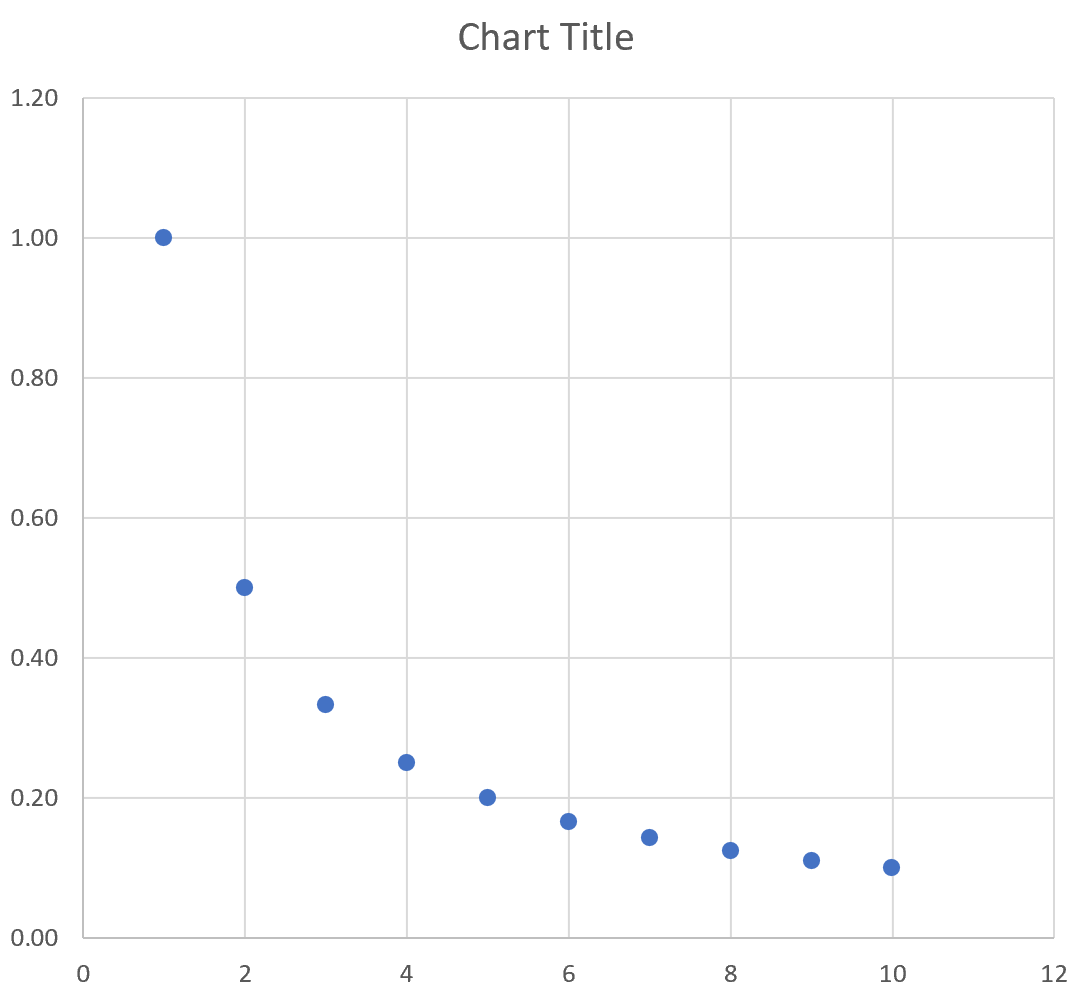
We can see that the plot follows a curved line downwards since this represents the equation y = 1/x.
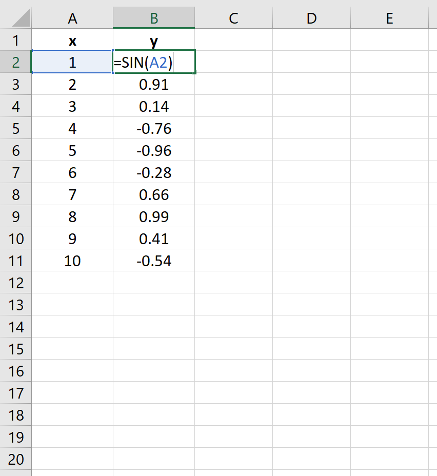
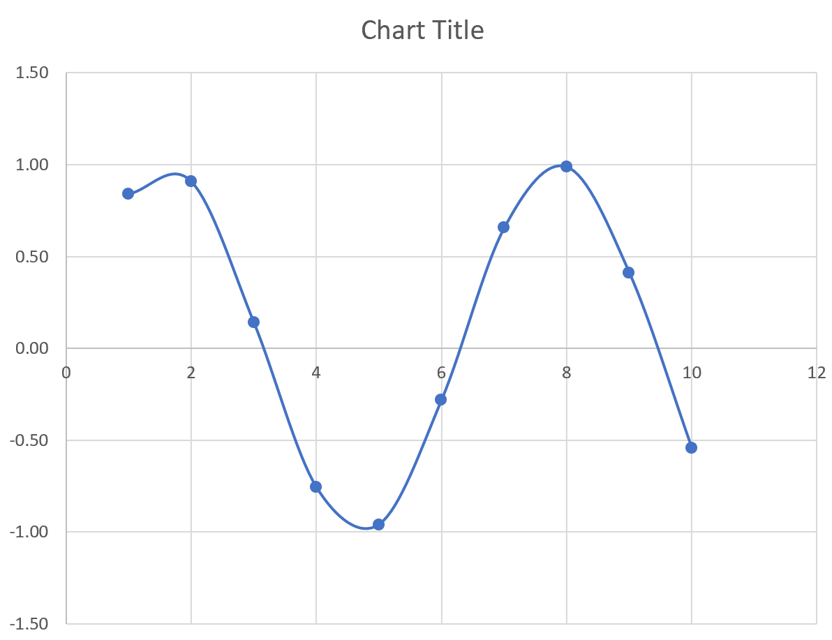
Example 4: Plot a Sine Equation
Suppose you’d like to plot the following equation:
y = sin(x)
The following image shows how to create the y-values for this equation in Excel, using the range of 1 to 10 for the x-values:
Next, highlight the values in the range A2:B11. Then click on the Insert tab. Within the Charts group, click on the plot option called Scatter with Smooth Lines and Markers.
The following plot will automatically appear:
Conclusion
You can use a similar technique to plot any function or equation in Excel. Simply choose a range of x-values to use in one column, then use an equation in a separate column to define the y-values based on the x-values.